The living room is the heart of your home—a space where comfort, serenity, and style meet. If you want a space that feels calm yet effortlessly beautiful, embracing a Wabi Sabi Colour Palette can transform your living room into a peaceful retreat. Wabi Sabi celebrates simplicity, natural textures, and the beauty of imperfection, making it perfect for homeowners seeking a warm and inviting environment. In this article, we’ll explore soothing colour combinations, textures, and design tips to help you create a living room that feels naturally balanced.
Embrace Earthy Neutrals
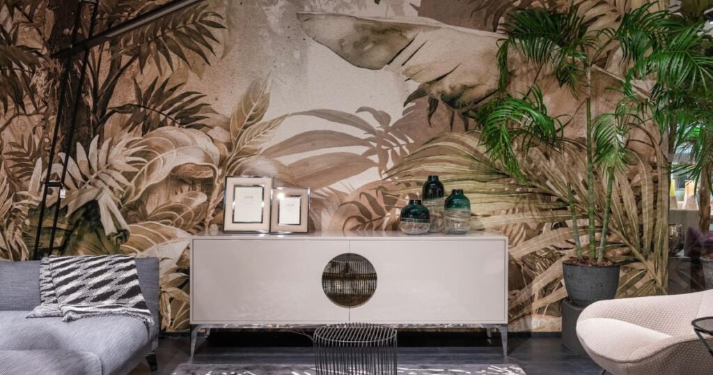
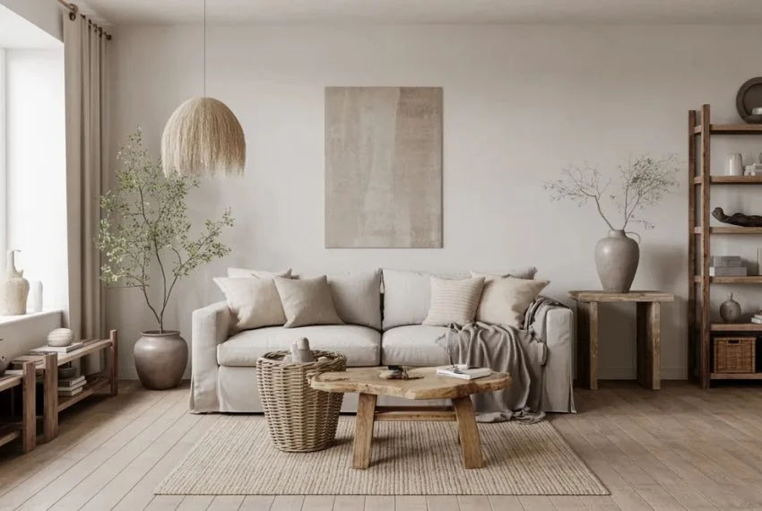
Earthy neutrals are the backbone of any Wabi Sabi Colour Palette. Soft browns, warm taupes, creamy whites, and gentle greys create a sense of calm and balance. These shades serve as a perfect backdrop for natural materials like linen, wood, and clay, allowing textures to shine rather than bold colours.
Tips:
- Use off-white or cream walls to brighten the space naturally.
- Add furniture in soft browns or muted greys for a grounded look.
- Layer textures such as wool rugs, cotton throws, and rattan baskets for warmth.
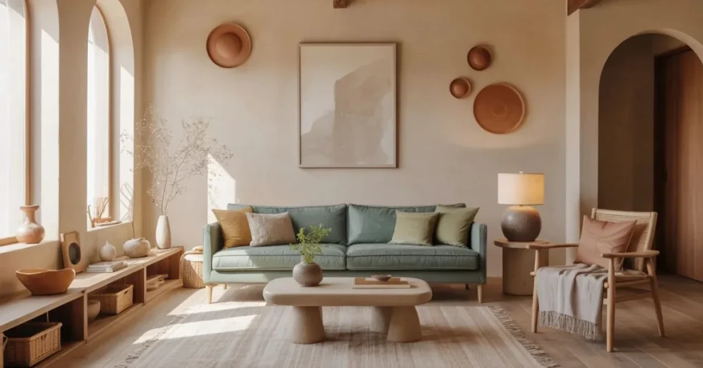
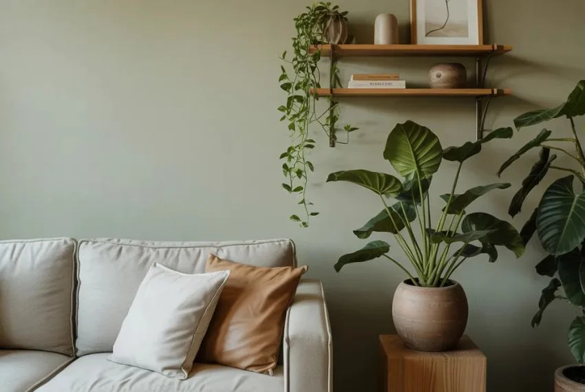
Soft Greens and Mossy Hues
Incorporating soft greens inspired by nature can bring a refreshing yet subtle energy to your living room. Shades like sage, moss, or muted olive fit perfectly into a Wabi Sabi Colour Palette, evoking calmness and tranquility.
Tips:
- Introduce greenery through potted plants or hanging planters.
- Paint an accent wall in a soft green for a peaceful focal point.
- Pair greens with earthy neutrals to maintain harmony.
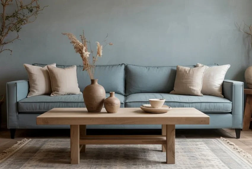
Muted Blues and Dusty Tones
Muted blues, dusty periwinkle, or soft slate tones add a serene vibe to the room while keeping the Wabi Sabi Colour Palette understated. These colours work beautifully on walls, upholstery, or decorative accents.
Tips:
- Choose a dusty blue sofa paired with neutral cushions for a balanced look.
- Incorporate ceramics or artwork in soft blue shades for subtle contrast.
- Avoid overly bright blues; stick to muted and natural tones.
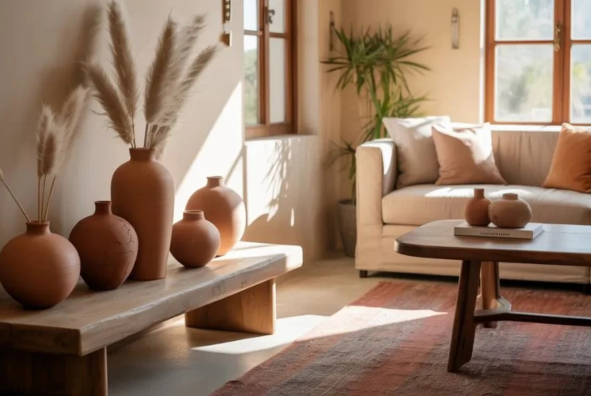
Warm Terracotta and Rust Accents
Warm terracotta, rust, or burnt orange tones add depth and an earthy richness to your living room. In a Wabi Sabi Colour Palette, these colours complement neutrals and create a cozy, lived-in feel.
Tips:
- Use terracotta planters, pottery, or rugs as accent pieces.
- Combine rust tones with soft beige or grey for a grounded effect.
- Let imperfections in handmade décor pieces enhance the Wabi Sabi aesthetic.
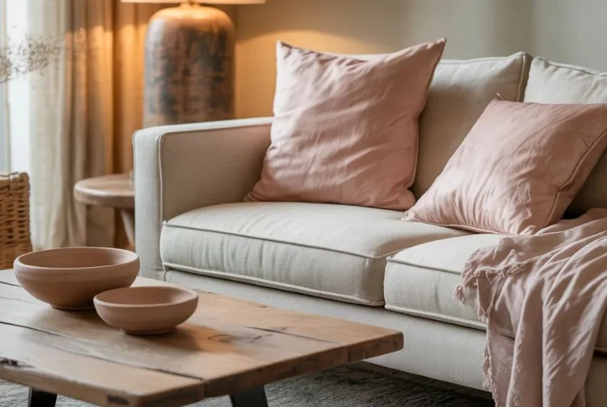
Soft Pink and Clay Undertones
Soft pinks or clay-inspired hues can soften a room and create a gentle, inviting atmosphere. These subtle colours work as accents in cushions, ceramics, or wall art without overpowering the Wabi Sabi Colour Palette.
Tips:
- Pair muted pink with neutral walls and natural wood furniture.
- Incorporate handmade clay décor for texture and warmth.
- Keep it minimal; small touches are enough to enhance calmness.
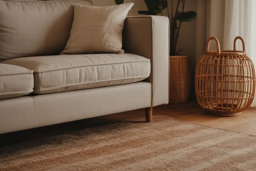
Layering Textures and Natural Materials
The essence of a Wabi Sabi Colour Palette lies not only in colour but in the tactile experience of the space. Layering textures like linen curtains, wool rugs, rattan furniture, and reclaimed wood creates depth and comfort. Imperfections in these materials add authenticity and charm.
Tips:
- Mix smooth and rough textures to create visual interest.
- Opt for furniture with natural finishes rather than polished perfection.
- Let irregular shapes or handmade items become focal points.
Final Thoughts
Adopting a Wabi Sabi Colour Palette for your living room encourages a space that feels calm, balanced, and inviting. By combining earthy neutrals, soft greens, muted blues, warm terracotta, and subtle pinks with natural textures, you can create a home that embraces imperfection and celebrates simplicity. Your living room can become more than just a space to entertain—it can be a sanctuary where you feel relaxed and grounded every day.
Also Read About Spanish Hacienda Style Home Décor Ideas for a Beautifully Traditional Space.
FAQs
Q1: Can I mix bright colours with a Wabi Sabi Colour Palette?
A: Wabi Sabi favours muted and natural tones. Bright colours can disrupt the calm aesthetic, so it’s best to use them sparingly as tiny accent pieces.
Q2: What materials work best with Wabi Sabi colours?
A: Natural and tactile materials like linen, wool, clay, rattan, and reclaimed wood enhance the aesthetic and complement the muted colour palette.
Q3: How do I maintain a Wabi Sabi vibe in a small living room?
A: Stick to earthy neutrals and soft muted shades, use minimal furniture, and add texture through fabrics and décor rather than bold colours.