There is a reason Bridgerton Interiors feel instantly memorable. The rooms are romantic without looking fragile, elegant without feeling cold, and grand without becoming stiff. The show’s designers built a world that borrows from Regency taste but pushes it into a brighter, more theatrical direction. Architectural Digest noted the use of custom-built interiors, lavish drapery, patterned fabrics, and distinct family palettes, while House & Garden described the show’s design language as bold, colorful, and intentionally pastiche rather than strict period reconstruction.
- The Real Magic Starts with a Powdered Color Story
- Use Classical Bones Before Decorative Flourish
- Think of Ornament as Jewellery, Not Clothing
- Drapery and Florals Carry the Romance
- Gold Works Best When the Room Still Breathes
- Every Room Should Feel Like a Character
- How to Make the Look Feel Modern Instead of Costume-Like
- A Gentle Final Touch
That is exactly why this look works so well in real homes. You do not need to recreate a palace or copy a film set. You only need to understand the formula: soft color, classical lines, gentle symmetry, floral romance, and a light touch of gold. Real Regency style drew heavily from Greek and Roman antiquity, with later tastes also embracing Egyptian motifs, lacquer, brass inlay, and integrated room design. Bridgerton Interiors take that historical base and make it warmer, lighter, and more emotionally expressive.
The Real Magic Starts with a Powdered Color Story
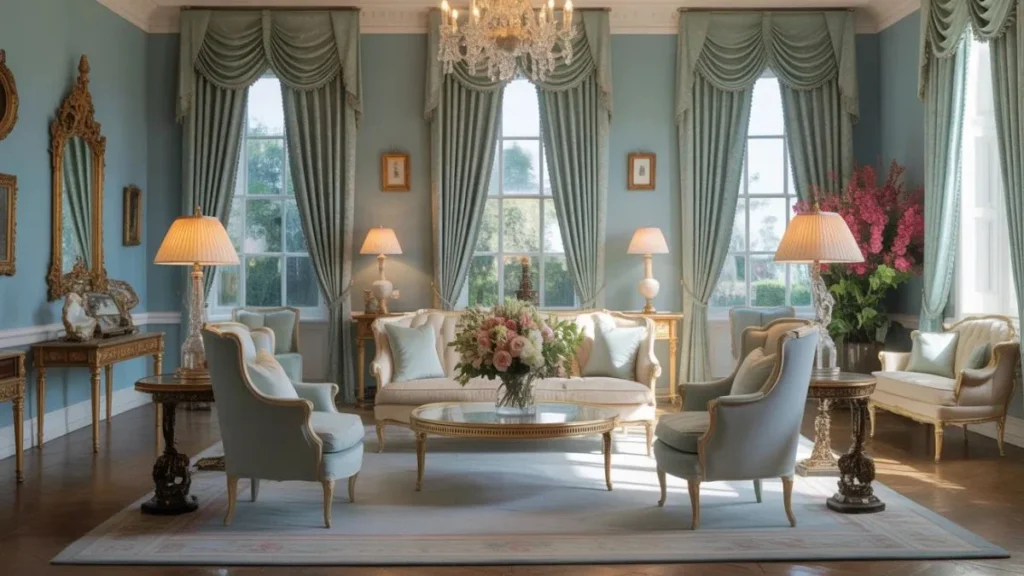
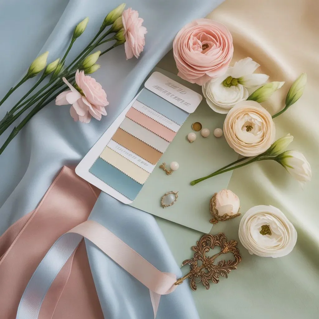
If you want this look to feel soft and regal, start with color before you buy a single piece of furniture. The show often uses airy blues, creams, florals, and warm pastels for the Bridgerton world, while other homes lean into citrus, acid green, or stronger golds to create a different mood. In Season 3, production designer Alison Gartshore even described pushing the color further, while Kate and Anthony’s rooms were warmed with buttery creams, soft pinks, and sunset-like tones.
Historically, Regency interiors were not always muted. Little Greene notes that Regency decoration often used strong, vibrant color, including Celestial Blue, Pea Green, Yellow-Pink, and Blue Verditer, often paired with vertically striped wallpaper. The V&A also points to pale yellow, bluish green, black, and gold in Thomas Hope’s interiors. So the best modern version of Bridgerton Interiors is not plain beige with one gold mirror. It is a controlled pastel palette with one or two richer notes underneath.
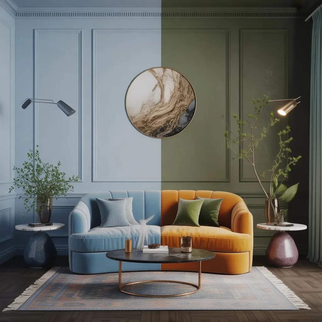
A simple way to get there is to choose one lead shade for the room, one creamy neutral, and one accent with a little depth. For example, powder blue plus warm ivory plus antique gold works beautifully in a sitting room. Blush plus pale stone plus olive can make a bedroom feel romantic without becoming sugary. This is where many people go wrong: they use too many loud shades at once. The softer version of Bridgerton Interiors depends on restraint.
Use Classical Bones Before Decorative Flourish
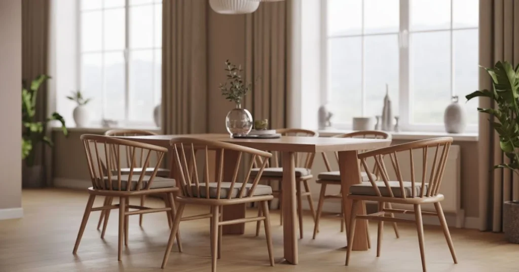
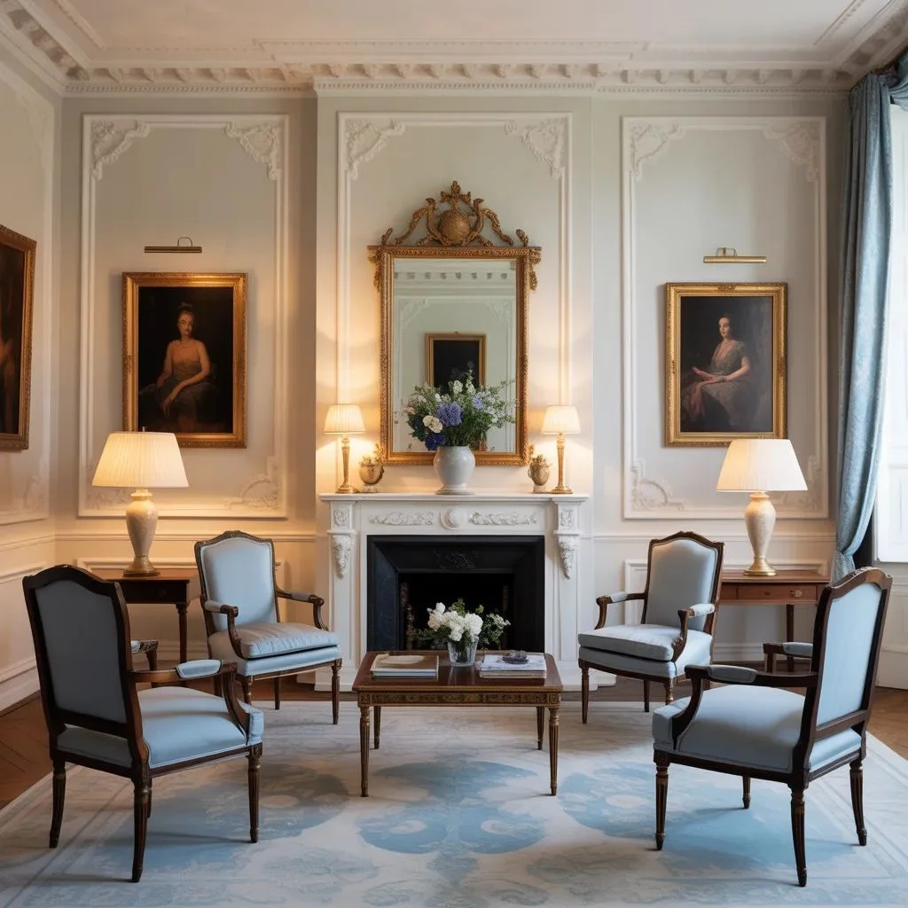
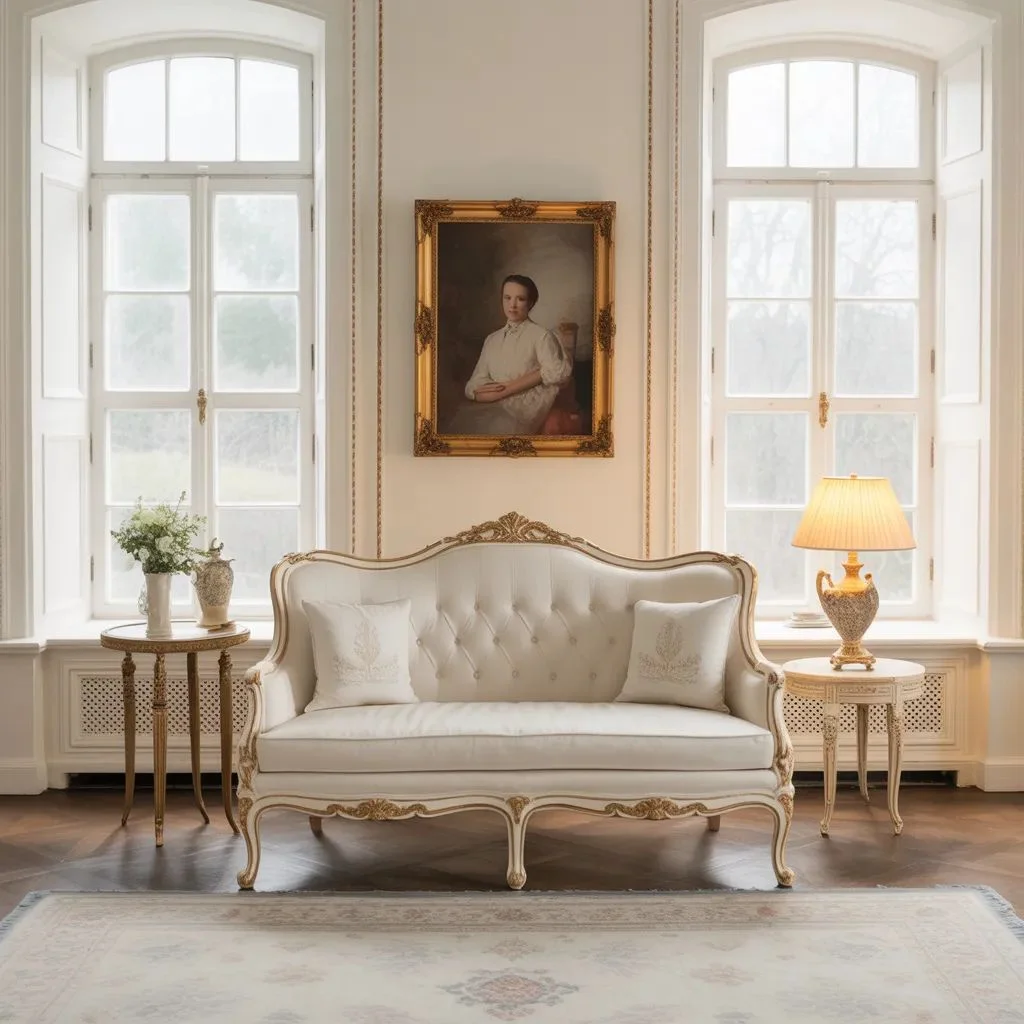
The rooms in the show may feel dreamy, but their structure is disciplined. That is the secret. You will notice symmetry, repeated shapes, framed wall sections, balanced furniture placement, and references to neoclassical design. Britannica describes Regency style as a classical revival focused on purity of detail and structure, drawing heavily from Greek and Roman antiquity. National Trust interiors from the same broader tradition feature plasterwork ceilings, classically inspired furnishings, pier glasses, candle stands, and tables.
This means your room should have a clear backbone before you layer in romance. Start with matching side chairs, a centered mirror, a fireplace wall, or evenly spaced lamps. If your architecture is plain, create order with panel molding, tall curtains, framed art, or repeated silhouettes. In the Featherington interiors, even the more playful rooms still rely on swags, rosettes, friezes, and formal composition.
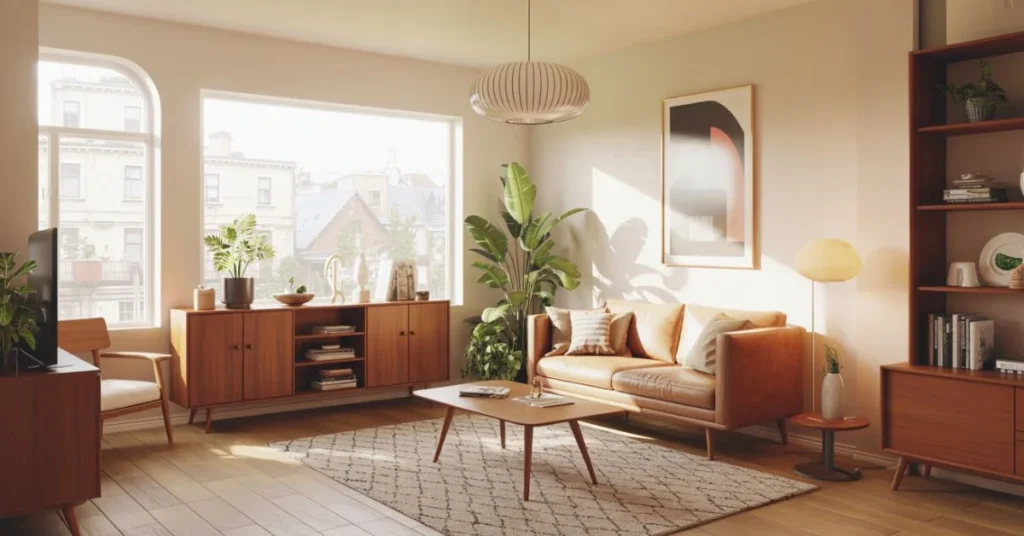
In a modern home, this can be as simple as placing two chairs opposite a sofa, centering artwork over a console, or using matching lamps on each side of a bed. The room should feel composed before it feels decorated. That balance is what makes Bridgerton Interiors look expensive rather than busy.
Think of Ornament as Jewellery, Not Clothing
One of the easiest ways to ruin this style is to overdecorate every surface. The better approach is to add a few pieces of ornament the way you would add jewelry to an outfit. Regency taste loved detail, but it did not always rely on heavy carving. Britannica notes that the richness of Regency furniture often came from veneers, metal application, painting, and marquetry instead of overly complicated shapes.
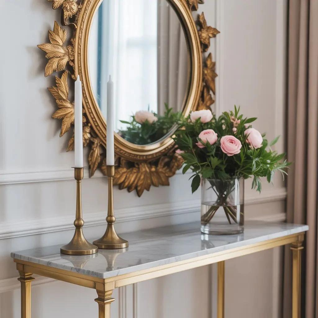
That gives you a very useful rule for decorating today. Choose a few elegant highlights: a gilt mirror, a marble-look console, brass candleholders, a trim of tassels, a painted chest, or one table with inlaid detail. In the show, the production design uses marquetry-style surfaces, lavish drapery, and carefully chosen insignia to build character. The Bridgertons use a bee motif, while the Featheringtons use butterflies.
You do not need literal bees or butterflies unless you love a themed look. A softer version of Bridgerton Interiors can use hidden repetition instead. Pick one recurring shape and let it appear quietly across the room. It could be an oval mirror, a floral medallion, a scalloped trim, or a ribbon motif in fabric and accessories. Repetition creates polish. Too many unrelated decorative ideas create noise.
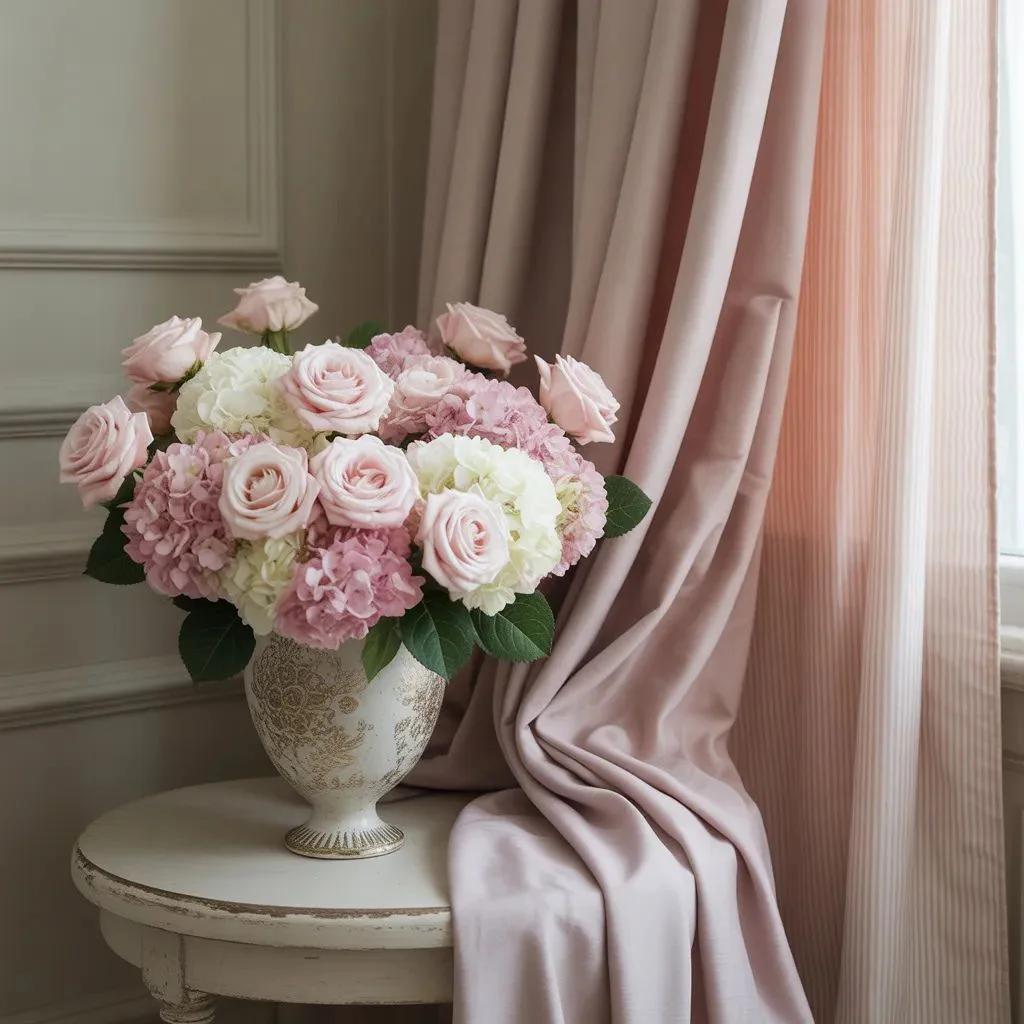
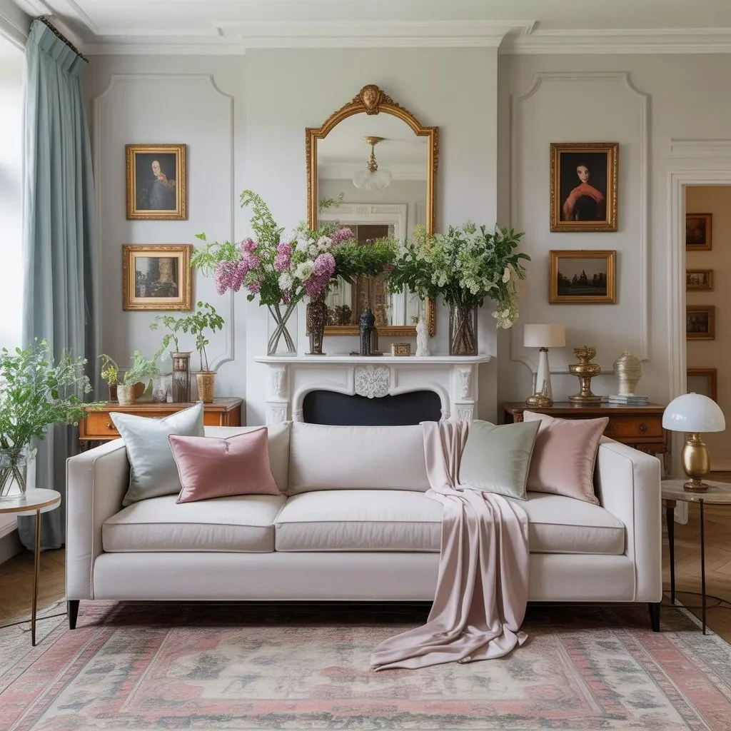
Drapery and Florals Carry the Romance
If the architecture gives the room its structure, fabric gives it its emotion. One reason the show feels lush is its generous use of drapery, trims, layered textiles, and floral movement. Architectural Digest highlighted swag and jabot draperies, patterned fabrics, and fully built treatments across the sets. House & Garden also describes the series as a world of pastel colors, decadent flower arrangements, and a heightened sense of softness and fantasy.
To bring that home, do not stop at plain curtains and one throw pillow. Use full-length curtains hung high and wide. Let the fabric puddle slightly if the room can handle it. Add a patterned cushion, a quilted bench, or a floral lampshade. Choose fabrics that feel gentle rather than harsh: linen blends, cotton sateen, velvet accents, jacquard, or a delicate stripe.
Florals matter too, but the best florals for Bridgerton Interiors feel arranged, not random. Think branches, garden roses, hydrangeas, ranunculus, or wisteria-like movement. Season 3’s set tour even emphasized blue and yellow blooms cascading through Bridgerton spaces. In real life, one generous arrangement on a mantel, dining table, or console will do more than six tiny vases scattered around the room.
Gold Works Best When the Room Still Breathes
A soft regal room always has a hint of glow. The important word is hint. Gold should catch the eye, not dominate the room. In historical Regency design, gilding was a real part of the visual language. House & Garden notes that gilding became fashionable enough to add visual weight to plasterwork, while Royal Collection Trust explains gilding as the application of very thin sheets of gold leaf to surfaces.
This is why one gold mirror, a pair of sconces, or a gilded frame can transform a room. But if every surface is shiny, the softness disappears. The prettiest Bridgerton Interiors mix glow with airiness. A creamy wall, pale upholstery, and daylight keep gold from feeling heavy. Even the show’s most elaborate rooms work because color and ornament are balanced against space, symmetry, and light.
If you are styling on a budget, try antique brass instead of bright yellow gold. It reads warmer, older, and more believable. The effect is still elegant, just less theatrical.
Every Room Should Feel Like a Character
One of the smartest design lessons from the show is that every house tells a story. The Bridgertons feel poised and airy. The Featheringtons feel flamboyant and socially ambitious. The Cowpers in Season 3 feel more austere and emotionally cold. Alison Gartshore explained that the design process begins with character, using color palettes and textures to support personality and narrative.
This is the most useful takeaway for real homes. Do not decorate every room the same way. A living room can feel polished and social, while a bedroom can feel romantic and cocooning. A dining space can carry a little more shine and ceremony. A reading corner can lean quieter and more introspective. When people fail with Bridgerton Interiors, they often treat the style like a shopping list instead of a mood with emotional range.
Try asking one question before you style a room: who is this room when no one is looking? Is it gracious, dreamy, flirtatious, calm, or dramatic? That single answer will guide your choices better than any trend roundup.
How to Make the Look Feel Modern Instead of Costume-Like
This style becomes beautiful when it is edited. It becomes fake when every piece screams “period drama.” House & Garden’s experts make an important point: productions like Bridgerton are not trying to recreate one fixed historical interior with total purity. They are creating a Regency feeling, or what the article calls “Regencycore,” shaped for visual pleasure and storytelling.
That gives you permission to adapt the look for modern life. Keep your comfortable sofa. Use hidden storage. Mix one ornate mirror with a cleaner lamp. Pair a classical chest with a simpler rug. Let one wall have molding, not all four. The goal is not to live inside a set. The goal is to let your home borrow the grace, softness, and ceremony of Bridgerton Interiors without losing ease.
A good rule is the 70/30 balance. Let about seventy percent of the room stay practical and calm. Then let thirty percent carry the romance: the drapery, the chandelier, the flowers, the gilt accents, the soft palette, the graceful shapes. That is where the soft regal effect comes alive.
A Gentle Final Touch
At its best, this look is not about excess. It is about refinement with feeling. Use color like watercolor, symmetry like structure, ornament like jewellery, and florals like movement. Give each room a point of view. Let a little gold glow at the edges. And always leave enough breathing space for the room to feel inviting.
That is the real secret behind Bridgerton Interiors. They may look luxurious, but what makes them unforgettable is their softness.
Editors Pick: Best DIY Room Divider Ideas for Privacy Without Renovation.