Choosing the right carpet with periwinkle walls should not feel like a guessing game — but for many homeowners, it does. Periwinkle sits in a beautiful but tricky spot on the color spectrum, blending soft blue with a hint of violet, and the wrong carpet choice can either wash the room out or make it feel chaotic.
- Why Periwinkle Walls Are a Decorating Dream
- Understanding Periwinkle: The Color Behind the Name
- The Best Carpet Colors to Pair With Periwinkle Walls
- Carpet Tones to Approach With Care
- How Texture and Pile Affect Your Carpet Choice
- Thinking About the Whole Room, Not Just the Carpet
- Room-by-Room Guide: Carpet With Periwinkle Walls
- Helpful Resources
- Your Room Is Closer Than You Think
The good news is that once you understand how periwinkle interacts with other tones, the decision becomes surprisingly straightforward. This guide covers everything from color theory to texture, room type to lighting — so you can walk away with a carpet choice you are genuinely confident in.
Why Periwinkle Walls Are a Decorating Dream
Periwinkle is one of those colors that looks effortlessly stylish on a mood board but raises real questions once the paint dries. It is soft enough to feel airy and calm, but it carries enough color saturation to demand a thoughtful response from everything around it — including your floor.
What makes periwinkle especially interesting is its versatility. Depending on the light in your room, it can lean more blue in the morning and shift toward lavender by afternoon. That shifting quality means your carpet with periwinkle walls needs to work across different lighting conditions, not just one.
When it works, periwinkle creates a room that feels both calming and elevated. When the carpet clashes, the whole space feels unsettled. Getting it right is the difference between a room you love and one you keep meaning to change.
Understanding Periwinkle: The Color Behind the Name
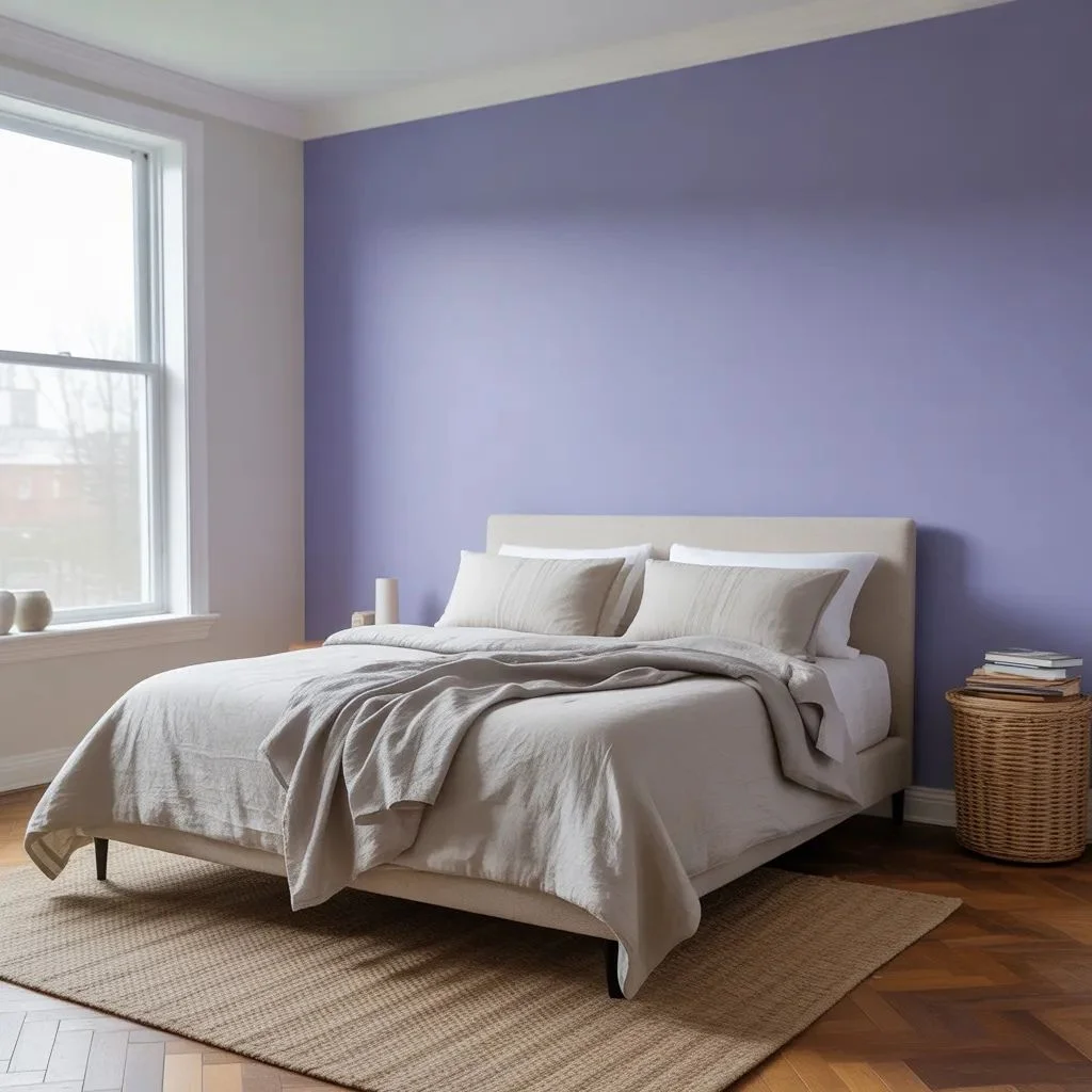
Before you can match anything to periwinkle, it helps to understand what it actually is. Periwinkle is a mid-tone blue-violet — lighter than navy, softer than cobalt, and warmer than ice blue. It sits on the color wheel between blue and purple, which means it has both cool and slightly warm undertones depending on the specific shade.
Common periwinkle variations you might have on your walls include:
- True periwinkle — balanced blue-violet, the most classic version
- Blue-leaning periwinkle — closer to a dusty or cornflower blue, cools down the room
- Lavender-leaning periwinkle — warmer and slightly purple, feels more romantic
Identifying which version you have helps narrow down the best carpet color for periwinkle walls considerably. Blue-leaning periwinkle pairs especially well with warm neutrals. Lavender-leaning versions can handle cooler grays and creamy whites without feeling cold.
The Best Carpet Colors to Pair With Periwinkle Walls
When it comes to carpet with periwinkle walls, certain colors consistently work well across different room types and lighting conditions. Here are the top choices and what makes each one effective.
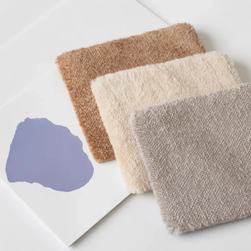
Warm Beige and Greige
This is arguably the most reliable pairing. Warm beige — especially tones with a slight yellow or sand undertone — creates beautiful contrast with periwinkle without competing with it. The warmth of the carpet grounds the coolness of the walls and prevents the room from feeling cold or clinical.
Greige (a blend of gray and beige) works similarly well and feels more contemporary. Look for greige carpets with warm rather than cool undertones to avoid making the walls look too purple.
Soft Ivory and Cream
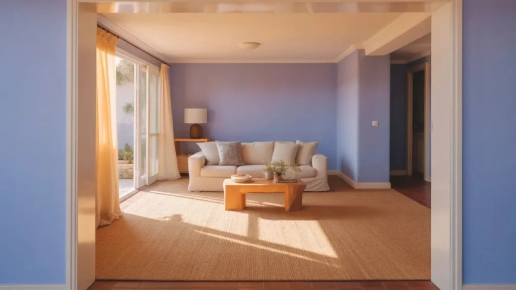
Ivory and cream carpets allow periwinkle walls to shine without any interference. They are bright enough to open up the space but warm enough to stop the room from feeling stark. This combination works especially well in rooms with natural light, where the contrast feels fresh and airy.
A pure white carpet can work in minimalist spaces, but in most rooms it amplifies the coolness of periwinkle rather than balancing it. Cream is almost always the better choice.
Light to Medium Gray
Gray is a natural companion for periwinkle because they share cool undertones. A light or medium gray carpet creates a cohesive, sophisticated look — especially when paired with white trim and wood accents. This combination works well in living rooms and bedrooms where a calm, polished aesthetic is the goal.
The key is to choose a gray that does not have strong blue undertones, or it can make the room feel monotone. Warm-toned or neutral grays tend to work better as a carpet color for periwinkle walls.
Caramel, Tan, and Warm Brown
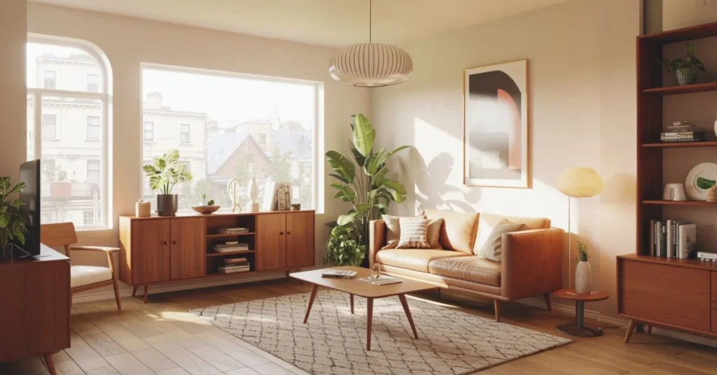
Earthy warm tones like caramel, tan, and light brown add richness and contrast to periwinkle walls. The complementary tension between warm and cool creates a room that feels dynamic and inviting rather than flat. This pairing is particularly effective in living rooms and family spaces where you want the room to feel cozy.
Dusty Rose and Blush
This one surprises people, but blush and dusty rose carpets can be stunning with periwinkle walls. Since periwinkle has a violet element, it shares a subtle relationship with pink tones on the color wheel. The result is a room that feels feminine and romantic without veering into overly trendy territory. Best suited for bedrooms.
Carpet Tones to Approach With Care
Not all carpet colors are created equal when it comes to periwinkle wall decor. Some pairings require more finesse, and others are best avoided altogether.
- Cool-toned blue carpet — can create a monotone, washed-out look unless the contrast in shade is very strong
- Olive or yellow-green carpet — these can clash with the violet undertone in periwinkle, creating visual tension
- Bright orange or deep red — too much contrast; overpowers the calm quality of periwinkle walls
- Very dark navy or charcoal carpet — can work in some moody, intentional schemes but generally makes the room feel heavy
The general rule is to avoid colors that fight with periwinkle for attention, especially on the warm side of the spectrum where the contrast becomes jarring rather than pleasing.
How Texture and Pile Affect Your Carpet Choice
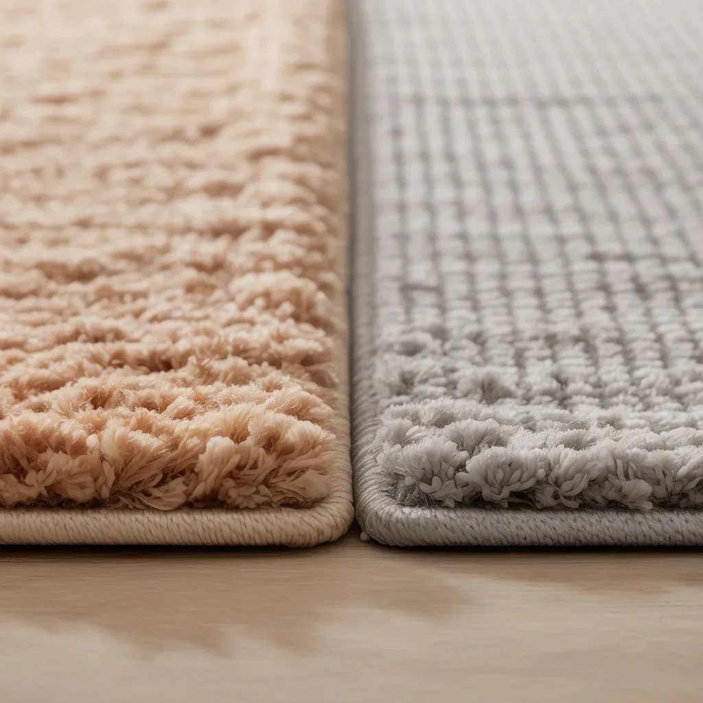
Color is only part of the equation. The texture and pile height of your carpet also affect how it reads alongside periwinkle walls, especially in terms of light reflection.
High-pile or plush carpets absorb more light, which makes them feel warmer and cozier. This can work in your favor if you are using a lighter color like cream or beige — it softens the room without making it feel cold. Low-pile or flatweave carpets reflect more light and give the room a cleaner, more modern look.
Pattern is another consideration. A subtle textured or tone-on-tone pattern adds visual interest without competing with periwinkle walls. Bolder geometric or floral patterns can work, but they need to include at least one color from the wall to tie the room together.
Thinking About the Whole Room, Not Just the Carpet
Carpet color does not exist in a vacuum. The best way to choose the right carpet with periwinkle walls is to think about all the elements in the room at once.
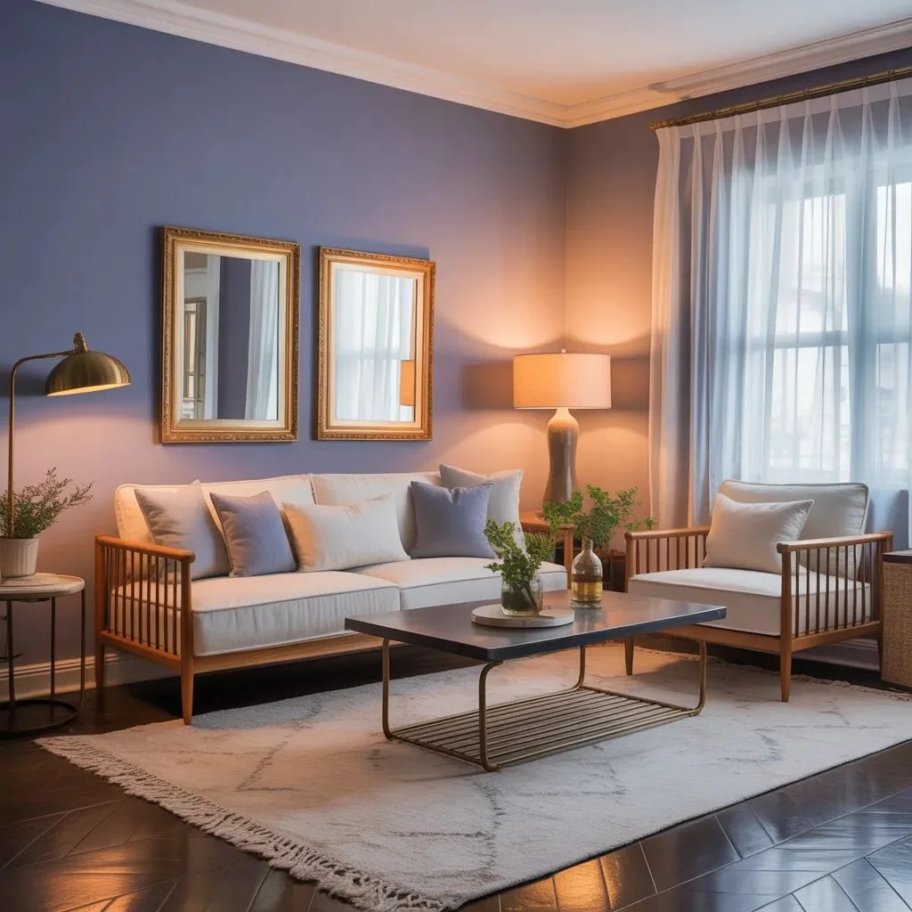
- Trim and ceiling color — white trim and a white ceiling are the most versatile choices and let both wall and carpet colors breathe
- Furniture — wood tones (especially medium to warm woods) add warmth that balances the coolness of periwinkle; darker woods create drama
- Lighting — warm-toned bulbs (2700–3000K) soften periwinkle and make warm carpet tones shine; cooler bulbs can make the room feel clinical
- Metallic accents — gold and brass work beautifully with periwinkle walls; silver and chrome are cooler alternatives for a more modern feel
The 60-30-10 rule is helpful here: your wall color is the 60%, your carpet and larger furniture pieces share the 30%, and your accents and decor make up the 10%. When you balance it this way, choosing a carpet color for periwinkle walls becomes much more intuitive.
Room-by-Room Guide: Carpet With Periwinkle Walls
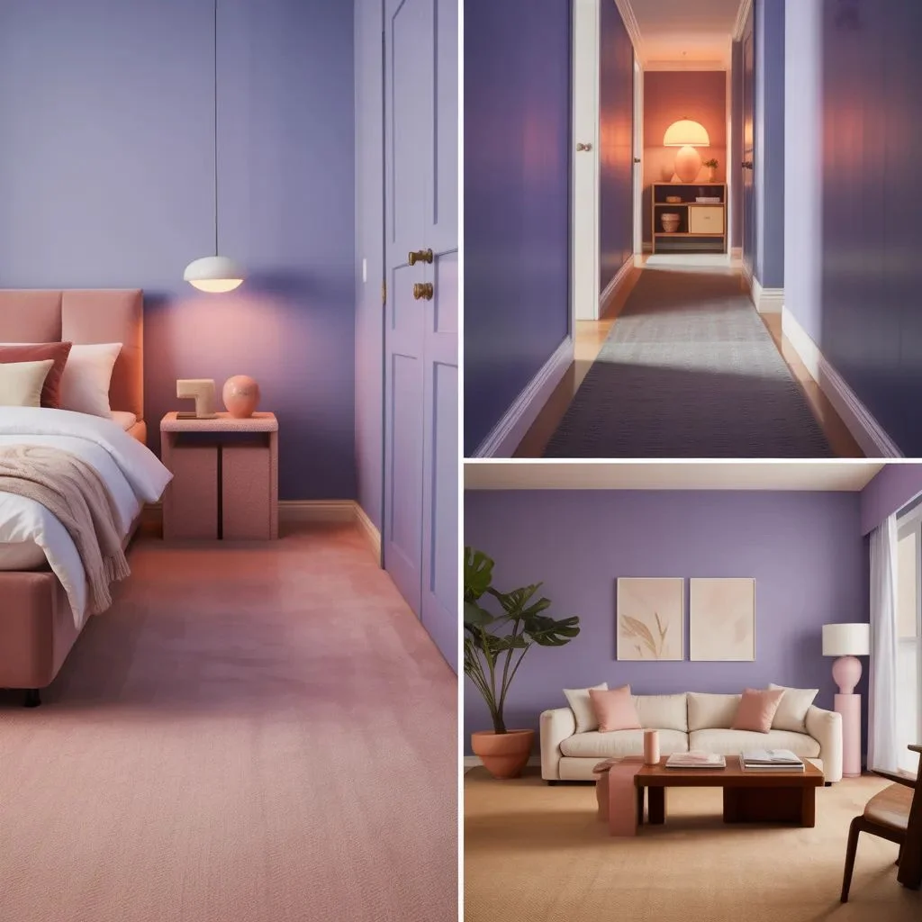
Living Room
In a living room, you want a carpet that anchors the space. Warm beige, greige, or a medium neutral work best. If you prefer a bolder look, a patterned carpet with periwinkle as one of its tones can tie the whole room together seamlessly.
Bedroom
Bedrooms benefit from softer, more serene combinations. Cream, blush, or a warm gray carpet with periwinkle walls creates a room that feels relaxed and comfortable. Avoid anything too stimulating in terms of pattern or color contrast.
Hallway or Entryway
Hallways take more foot traffic, so durability matters alongside aesthetics. A mid-tone warm gray or a tan carpet handles dirt well while still complementing periwinkle wall decor. Keep patterns subtle in narrow spaces to avoid visual clutter.
Home Office
For a home office with periwinkle walls, choose a carpet that supports focus without feeling sterile. Medium gray or a warm sand tone works well. The periwinkle walls themselves are already a gentle productivity booster — the carpet should support, not distract.
Helpful Resources
For more guidance on color matching and undertones, the Sherwin-Williams Color Visualizer is a free tool that lets you preview wall and floor color combinations. You can also explore carpet pile and texture options through the Carpet and Rug Institute’s consumer guide.
Your Room Is Closer Than You Think
Matching carpet with periwinkle walls is far less complicated than it seems once you understand what you are working with. The goal is simply to balance the cool, airy quality of periwinkle with something that adds warmth, depth, or grounding — and there are plenty of ways to do that.
Start with a warm beige or cream if you want a foolproof combination. Explore dusty rose or caramel if you want something with more character. And when in doubt, grab a few large carpet samples and live with them in the room for a day or two. Natural and artificial light will tell you everything you need to know.
Your periwinkle room has real potential — the right carpet is the final piece that brings it all together.
Highly Recommended: How to Choose the Right Carpet Color for Your Walnut Furniture.