A bedroom covered in plastic butterfly stickers reads like a leftover from a teenage sleepover, not a considered adult space. That fear is exactly what stops most people from trying butterfly wall decor in the first place. The truth is that butterflies can look elegant, moody, even architectural, when the material, scale, and placement are chosen with a bit of restraint. Below are bedroom setups that keep the whimsy intact without tipping into nursery territory.
Before You Commit
- Metal, paper, and resin butterflies behave very differently on a wall, so material matters more than butterfly count.
- Odd numbers, varied sizes, and a loose flight path read as intentional; tight symmetrical grids read as leftover stickers.
- Muted or metallic finishes photograph better in low bedroom lighting than bright plastic colours ever will.
- The biggest styling mistake is committing an entire wall to butterflies instead of letting them interact with existing art or a headboard.
Setting the Scene Before You Buy a Single Butterfly
Before any butterfly wall decor goes up, the wall itself needs a proper look. A busy, patterned wallpaper will fight with the shapes and turn the whole thing into visual noise.
Plain, matte walls in warm neutrals (think putty, sage, or soft charcoal) give butterflies room to breathe. Glossy paint works against you here, since it bounces light unevenly across metal wings.
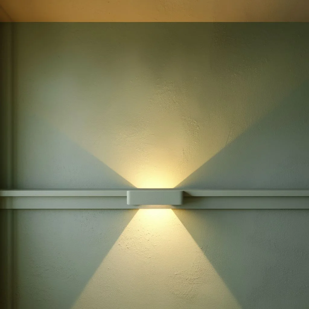
Lighting also does more work than most people expect. A wall washed in warm, low-angle light from a bedside lamp throws soft shadows behind each butterfly, which is what actually creates that layered, dimensional look rather than a flat cutout effect.
I’d always test placement with paper templates taped up for a day or two before committing to nails or adhesive. It sounds tedious, but it’s the single easiest way to catch an arrangement that looked good on paper but feels cramped at eye level.
Ceiling height matters too, more than most people plan for. In a room with standard eight-foot ceilings, keep the arrangement below the halfway point of the wall so it reads as bedroom art rather than something spilling out of a storage box. In taller rooms, a vertical cluster that climbs closer to the cornice can actually make the ceiling feel higher, which is a useful trick in an older house with boxy proportions.
It’s also worth deciding early whether the butterflies are the main feature or a supporting detail. Trying to make them do both jobs at once, competing with a bold accent wall while also being the headline piece, is usually where an otherwise nice idea starts to feel busy.
Metallic Butterfly Clusters Above a Statement Headboard
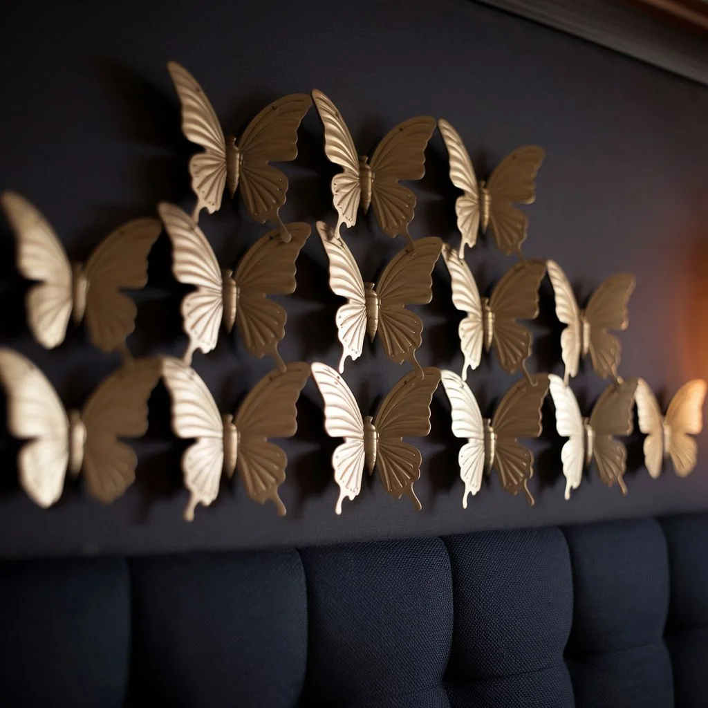
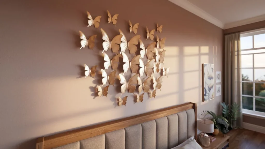
A cluster of gold, brass, or copper butterflies rising above a tall, upholstered headboard is one of the most reliable ways to make this trend feel grown up rather than girlish.
The metallic finish is doing most of the heavy lifting. Matte gold and aged brass catch light without looking cheap, and they sit comfortably alongside darker, moodier bedroom palettes that plastic butterflies simply can’t match.
Why this works: the headboard acts as a visual anchor, so the butterflies read as an intentional flourish rather than the main event. Keep the cluster loosely triangular, wider at the base and narrowing as it climbs, so the eye naturally travels upward instead of stalling in one dense patch.
A real-world scenario worth borrowing: a client with a deep navy headboard used twenty-two brushed brass butterflies in three sizes, clustered off-centre above one side of the bed. The asymmetry, paired with the metallic tone, made the whole wall feel like a considered piece of art rather than a novelty purchase.
Ombre Butterfly Wall Decor Waves Flowing Down a Feature Wall
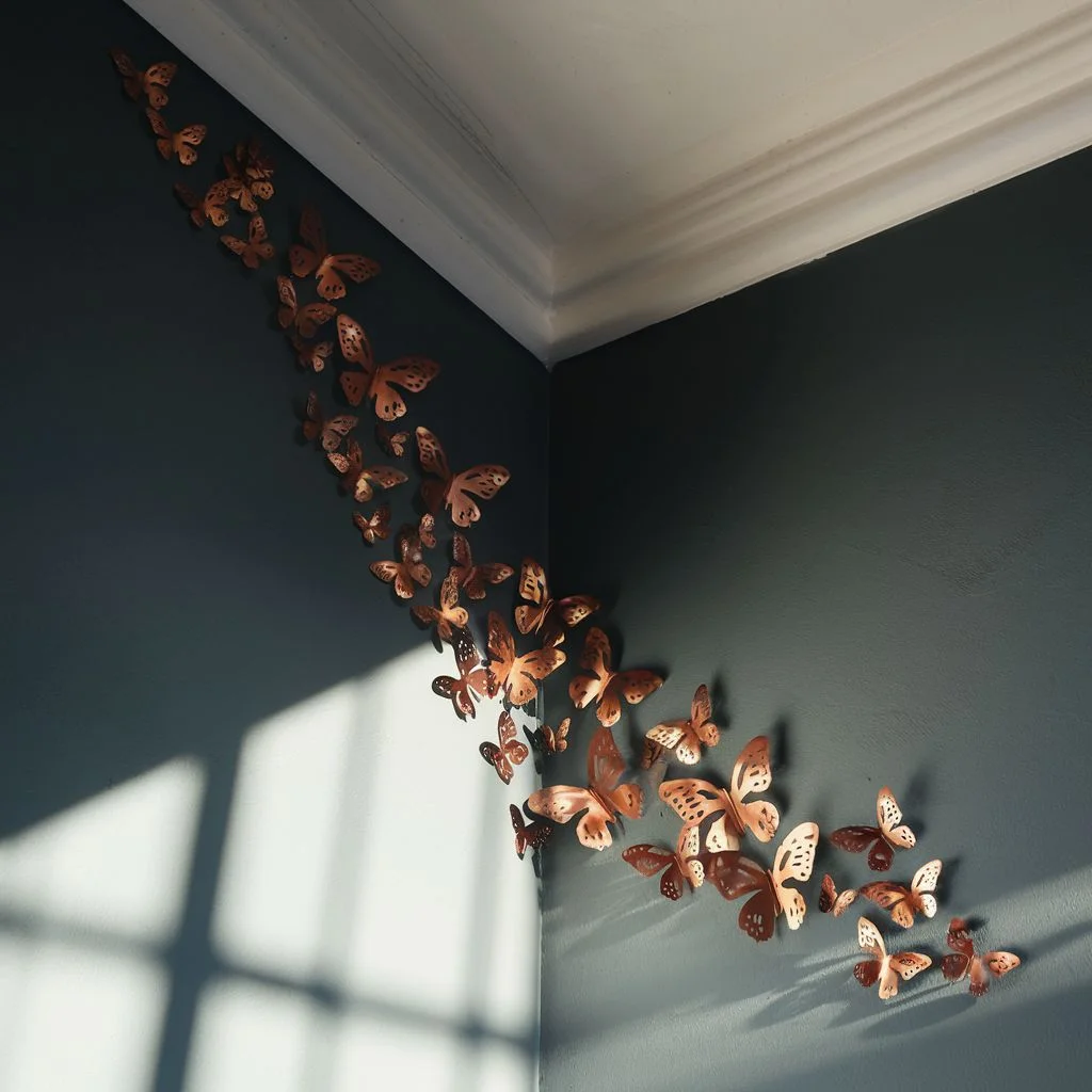
Instead of clustering butterflies in one spot, an ombre wave of butterfly wall decor running diagonally from ceiling to floor creates movement across an entire feature wall.
Start with darker or larger butterflies at the top corner and gradually shift to lighter tones and smaller sizes as the wave descends, as though a gust of wind carried them down the wall.
This setup works particularly well in bedrooms with high ceilings or an awkward blank corner, since the diagonal line draws the eye across the whole space instead of leaving one section looking neglected.
Spacing needs more attention here than in a tight cluster. Leave generous gaps between butterflies near the bottom of the wave so the arrangement tapers off naturally rather than stopping abruptly, which is what separates a considered wave from a scattered mess.
Watercolour Paper Butterflies for a Softer Palette
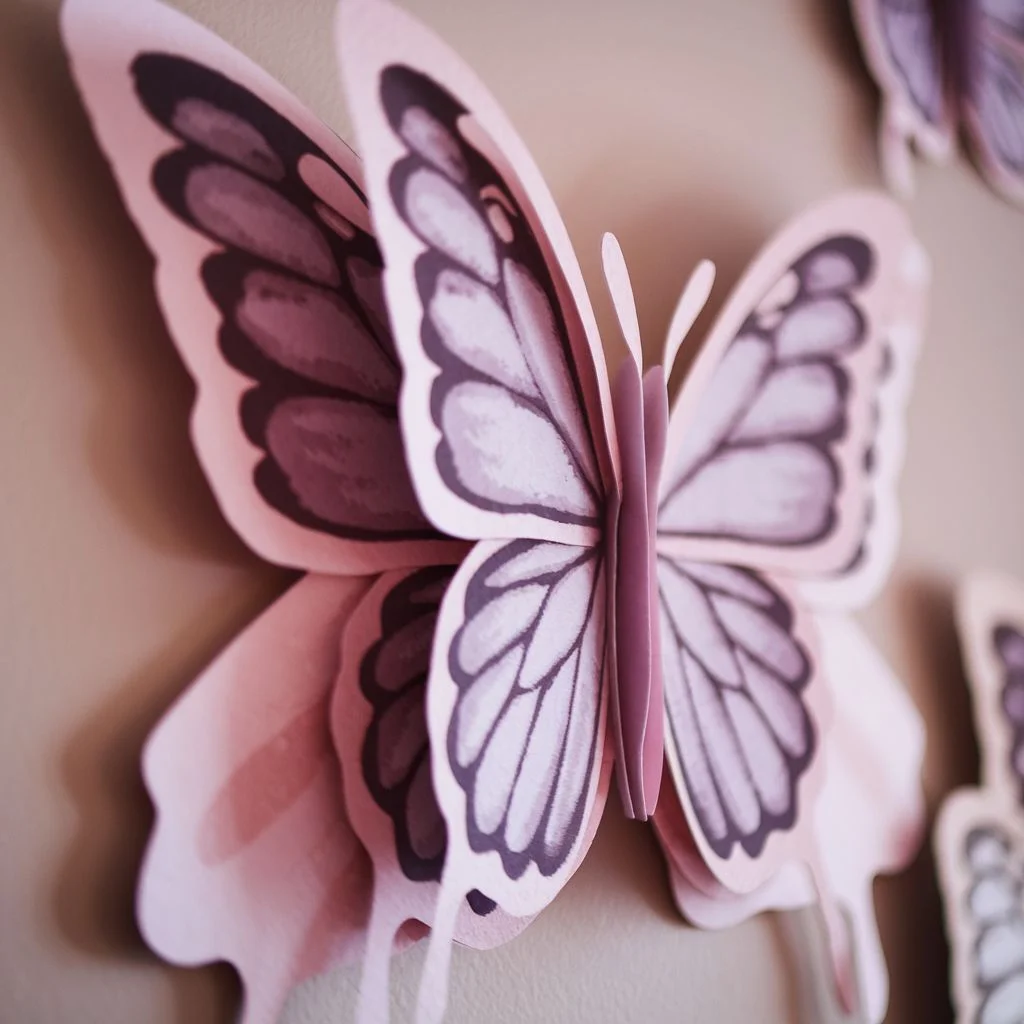
Paper butterflies with a hand-painted, watercolour finish bring a completely different mood to butterfly wall decor than metal does, and they’re a strong choice for anyone drawing on a dusty pink, sage, or lavender colour scheme.
The soft gradients on watercolour paper butterflies mimic the natural variation you’d see on a real wing, which keeps the eye interested even when the arrangement itself is fairly simple.
Why this works: because the colours are muted rather than saturated, the butterflies blend into a soft, romantic bedroom palette instead of competing with it the way bold plastic colours would.
One genuinely useful trick is layering two or three paper butterflies of slightly different shades directly on top of each other at a slight offset, which adds a subtle sense of depth without needing 3D materials at all.
Oversized Single Butterflies as Minimalist Focal Points
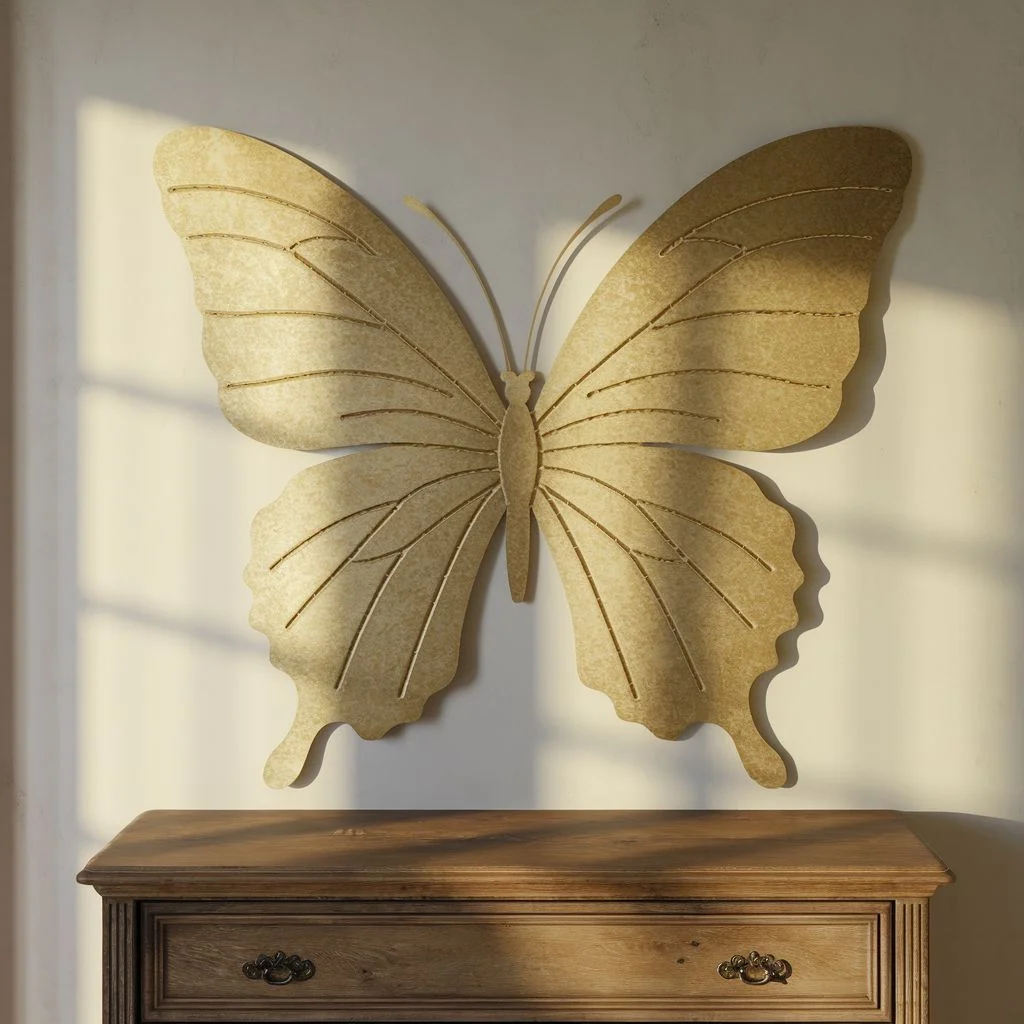
Not every bedroom needs a swarm. A single, oversized butterfly, sometimes thirty centimetres or wider, can act as the entire piece of wall art above a dresser or reading chair.
This is the most minimalist take on butterfly wall decor, and it tends to suit smaller bedrooms where a large cluster would feel overwhelming rather than whimsical.
Choose a butterfly with clean, symmetrical wing detailing rather than an overly intricate design, since a single oversized piece needs strong silhouette more than fine detail to hold its own on a blank wall.
I find this option works especially well for renters, since it’s one item to remove rather than a cluster of nail holes to patch when moving out.
Mixed Metal Butterfly Wall Decor Finishes for Depth and Dimension
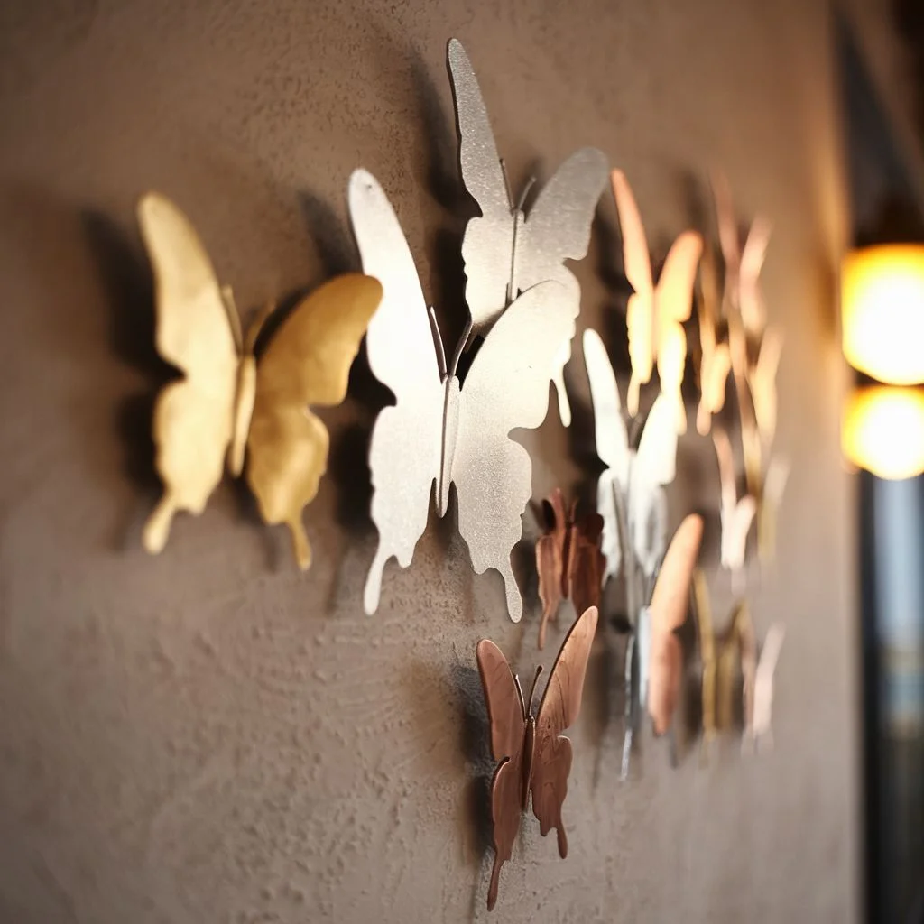
Sticking to a single metal finish is safe, but mixing matte gold, brushed silver, and aged copper butterflies within the same butterfly wall decor arrangement adds a level of depth that a monochrome cluster can’t reach.
The trick is proportion rather than randomness. Roughly sixty percent of one dominant finish, with the remaining butterflies split between two accent metals, keeps the mix looking curated instead of mismatched.
This setup pairs particularly well with industrial or transitional bedroom styles, where mixed metal fixtures already appear in door handles, lamp bases, or picture frames elsewhere in the room.
A common oversight is ignoring the room’s existing hardware finishes entirely. Pulling at least one metal tone from an existing lamp or mirror frame ties the butterfly arrangement into the rest of the room rather than leaving it looking like an afterthought.
Texture is another lever worth pulling. A hammered or brushed surface catches light unevenly, which reads as handcrafted, while a flat, polished finish can look plasticky under warm bedroom bulbs even when the material itself is genuine metal. Mixing a hammered gold piece with a smooth silver one, rather than two identical finishes, is usually what gives the wall its sense of quiet contrast.
Butterfly Wall Decor Paired With Botanical Prints
Placing a few butterflies alongside framed botanical prints or a small gallery wall grounds the whimsy in something more editorial, and it’s one of the easiest ways to avoid the childish look altogether.
The framed prints give the wall structure and a sense of intention, while three or four butterflies scattered around the frames, rather than crowding them, suggest the butterflies simply landed there naturally.
Why this works: the eye reads framed art as inherently more grown up, so a handful of butterflies borrowed from that same visual language feel sophisticated rather than novelty.
Keep the botanical prints in muted, botanical illustration styles rather than bright floral photography, since the illustrated line work echoes the delicacy of a butterfly’s wing far better than a glossy photo print would.
Frame choice matters here more than people expect. Thin, black or brushed brass frames keep the gallery wall feeling current, while chunky ornate frames tend to drag the whole arrangement toward a more traditional, dated look that fights with the lightness of the butterflies. If the frames are mismatched sizes, keep the gap between each one consistent, roughly five centimetres, so the irregularity looks planned rather than accidental.
Common Mistakes That Make Butterfly Decor Look Childish
A few habits are almost always behind the “nursery” complaints, and they’re worth avoiding deliberately.
Overcrowding is the biggest one. Filling every inch of a wall in identical butterflies, all facing the same direction, at the same size, is what reads as a kit rather than a design choice.
Bright, primary-coloured plastic is the second culprit. Even a well-planned layout looks juvenile if the material itself looks like it came from a party supply aisle rather than a homeware shop.
Finally, ignoring scale relative to the wall trips up a lot of otherwise good arrangements. A handful of small butterflies scattered across a large, empty wall looks sparse and accidental rather than deliberate, so the butterfly size should always be proportional to the wall it’s covering.
There’s a subtler mistake too, which is treating every butterfly as identical. Real wings vary slightly in size and angle, so an arrangement built entirely from one mould, all facing the exact same way, tends to look manufactured no matter how expensive the individual pieces are. Turning a handful of butterflies at slightly different angles, even by ten or fifteen degrees, is a small adjustment that makes a noticeable difference once the whole wall is finished.
Where Whimsy Meets Good Taste
Bedroom butterfly wall decor doesn’t have to choose between playful and polished. The material, the finish, and the arrangement do far more work than the butterfly motif itself, and once those three elements are dialled in, the whimsy becomes a feature rather than something to apologise for.
Pick one setup from above that matches your existing palette, test the layout with paper cut outs first, and commit once it feels balanced rather than crowded.
Editor Choice: Moody Elegance Black Nouveau Bedroom Inspiration For Bold Home.