The front door is the first thing a visitor sees, and a sign on it says something about the people who live inside before anyone knocks. It can be warm, funny, formal, or quietly personal — a name, a welcome, a joke, or a set of house rules. The best door signage ideas do not need a big budget or a renovation; they need a clear message, the right size for the door, and a finish that can handle the weather. These 17 ideas show how different signs — wooden, chalkboard, metal, acrylic, enamel, and more — can turn an ordinary entrance into one that feels like yours.
# Wooden Name Sign on the Front Door
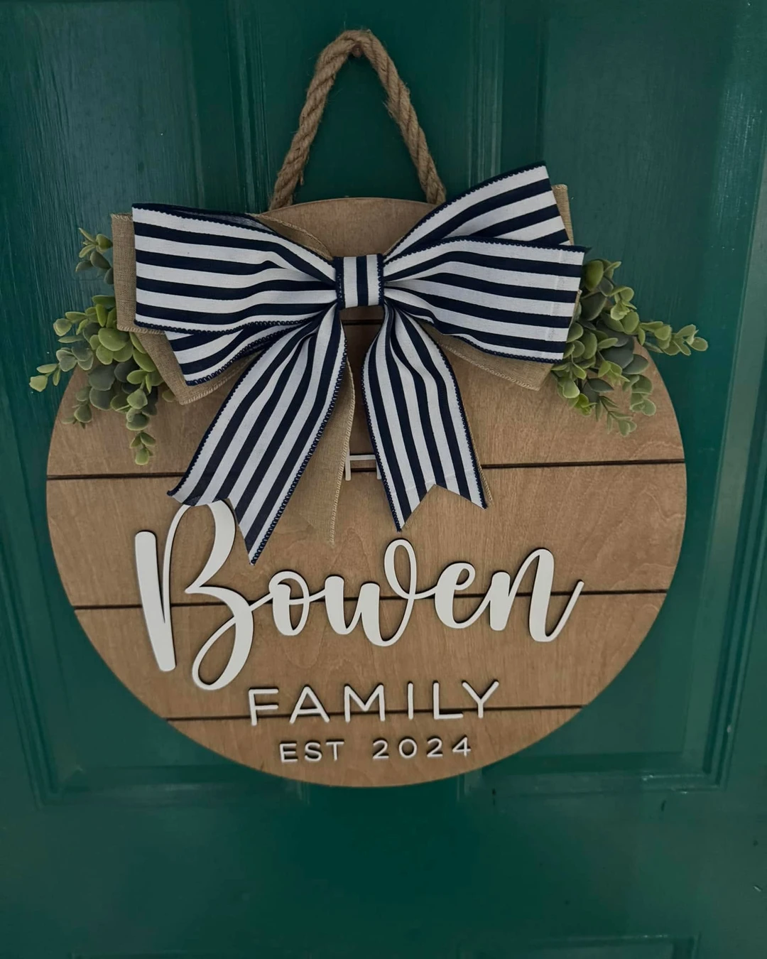
A name on the door makes a house feel claimed in the best sense. Here a round wooden sign hangs by a rope loop on a dark green paneled front door, with a family name in large script across the centre and the words “FAMILY” and “EST 2024” in smaller block letters below. A large navy-and-white striped bow sits at the top over a burlap accent, with small eucalyptus sprigs at the sides. The sign is clearly a family name sign, and the name itself is part of the decoration rather than something the article needs to repeat.
The practical point: hang a name sign at eye level, where visitors naturally look, and use a sturdy hook rather than a nail, since a round wooden sign is heavier than it looks. Seal the wood with an outdoor varnish so rain and sun do not fade the lettering. If hanging a sign on the door feels fiddly, the same advice applies to hanging anything heavy on a door — The Right Way to Hang Pictures on the Wall Without Making Common Mistakes covers fixings, height, and the mistakes that make things hang crooked.
# Chalkboard Door Sign
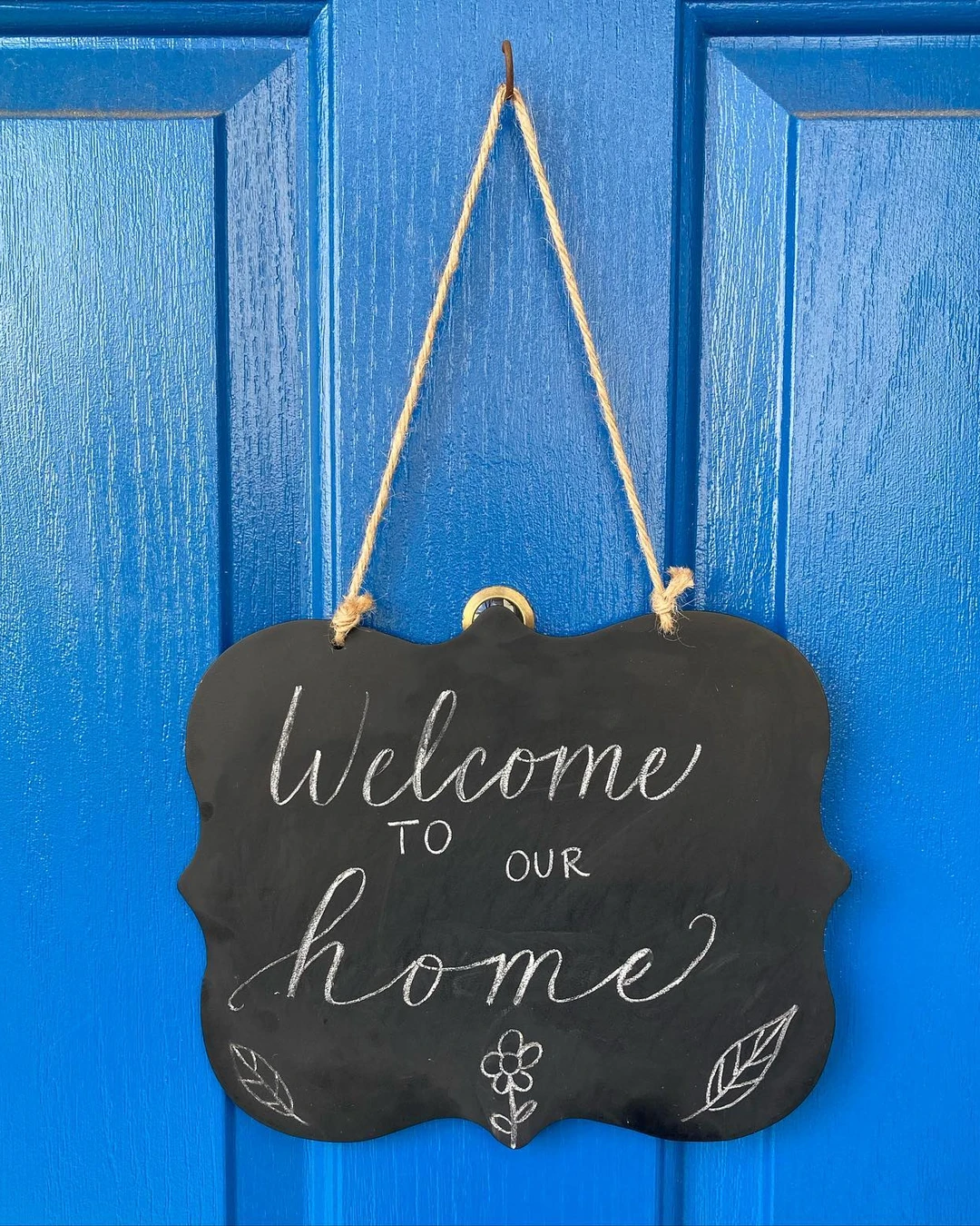
A chalkboard sign is the one sign you can rewrite whenever the mood changes. Here a black chalkboard-style sign with a scalloped edge hangs by twine from a hook on a bright blue painted wooden door. White hand-lettered chalk reads “Welcome TO OUR home”, with small chalk leaf and flower drawings at the bottom, and a brass peephole is partly visible behind the top of the sign. The chalk lettering is the sign’s own writing, and it is what makes the whole door feel handmade.
The practical point: use chalk markers instead of plain chalk for the lettering, since they stay sharp longer and do not smudge when the door opens and closes. Seal the finished writing with a light spray fixative, and keep a damp cloth nearby for the next rewrite.
# Hand-Painted Welcome Sign
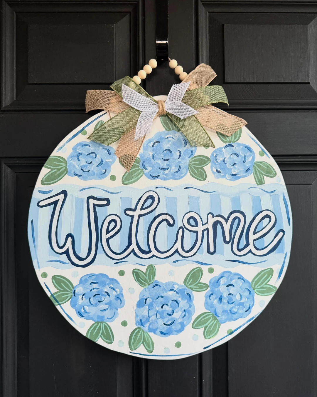
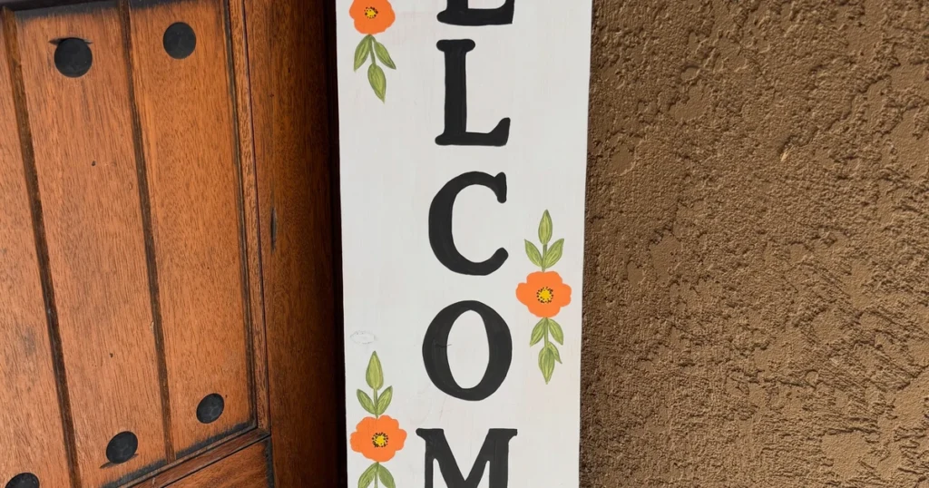
A hand-painted sign has a warmth that printed lettering cannot copy. Here a round wooden sign hangs on a black paneled front door, with the word “Welcome” in large white cursive outlined in dark blue on a light blue striped band, and six painted blue hydrangea-style flowers with green leaves above and below on a cream background. A ribbon bow in burlap, olive green, and white hangs from a beaded loop over a black door hook. The post presents this sign as a product for sale by its creator, but the photo itself is a real photo of the sign hanging on a door, which is what matters here.
The practical point: pick paint colours that contrast with the door, so the lettering reads from the path and not just from the step. A dark door suits light lettering, and a light door suits dark lettering. Seal painted wood with outdoor varnish, since hand-painted work fades fastest in direct sun.
# Metal House Number Sign
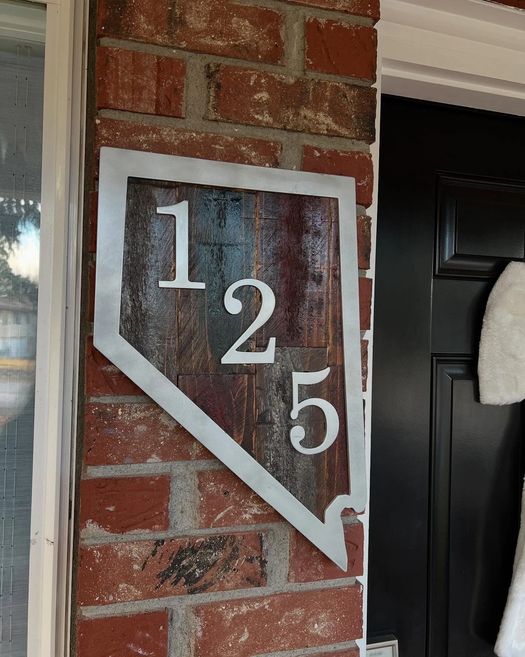
House numbers are the most useful sign a door can carry, and they can look good too. Here a home-plate-shaped plaque is mounted on a red brick wall beside a black front door, with a silver metal border and large white metal numerals arranged diagonally. The numerals and the border are metal, but the backing is reclaimed wood, so this is a mixed wood-and-metal sign rather than an all-metal plaque — and the mix is part of its charm, since the warm wood softens the sharp metal numbers. A white fuzzy decoration hangs on the door at the right edge of the frame.
The practical point: make the numbers readable from the street first and stylish second. Large numerals in a light colour on a dark backing work best, and the sign should sit at eye level beside the door rather than above it, where visitors have to look up.
# Wreath With a Sign
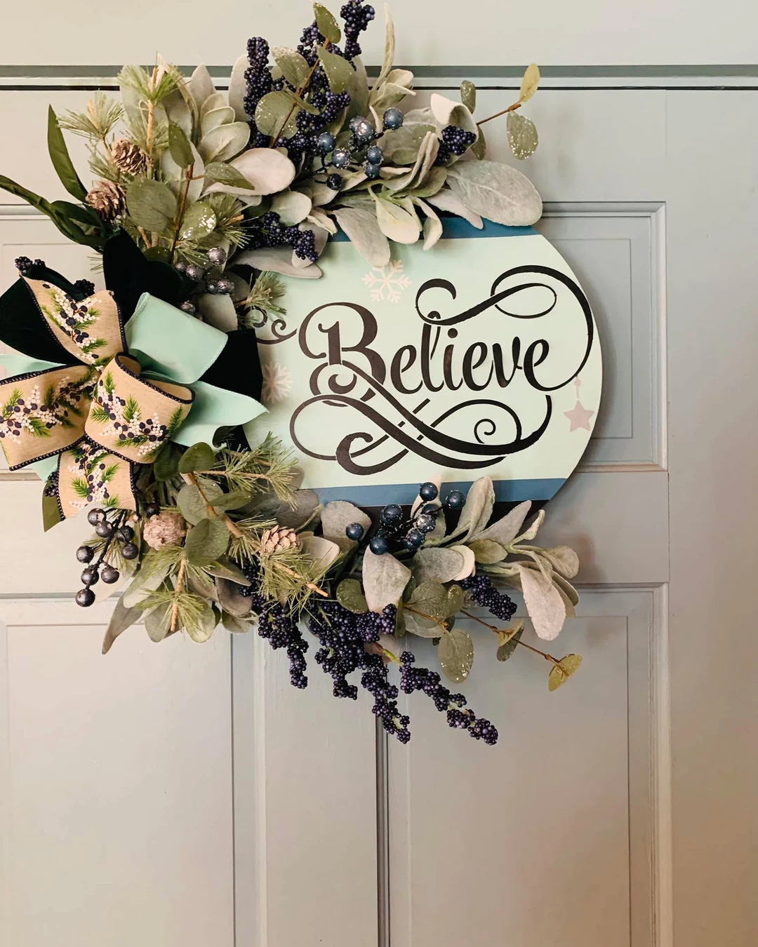
A wreath and a sign together do the work of two decorations at once. Here a festive wreath hangs on a light gray paneled front door, with a round sign in its centre on a pale mint background reading “Believe” in large ornate black script, with small white snowflakes and a faint pink star. The wreath itself is artificial greenery — silvery-green eucalyptus, pine sprigs, small pinecones, and dark blue and purple berries — finished with a large bow of black velvet and patterned beige ribbon. This one is Christmas and winter themed, so the sign and the wreath belong to the same season.
The practical point: keep the sign smaller than the wreath opening, with a clear ring of greenery around it, so both pieces read at a glance. A wreath base can stay up all year if you swap the centre sign with the seasons — a spring sign, a summer sign, and a Christmas sign on the same greenery.
# Rustic Farmhouse Door Sign
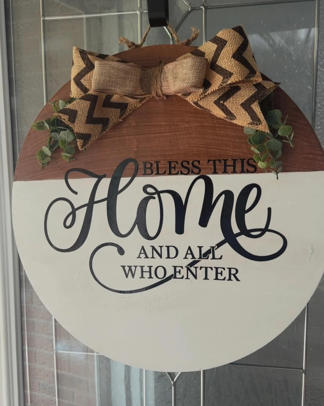
Farmhouse style suits a door sign because it is simple, warm, and easy to read. Here a round wooden door hanger hangs on a glass-paneled front door, reading “BLESS THIS Home AND ALL WHO ENTER” in black script and block lettering on a two-tone board — wood at the top, white at the bottom — with a burlap chevron bow and eucalyptus sprigs at the top. The message is the decoration, and the natural materials keep it from feeling formal.
The practical point: keep the bow small enough that it does not cover the words, and place it at the top of the sign rather than across the middle. Distressed wood and simple lettering carry the farmhouse look on their own; extra decoration usually gets in the way.
# Modern Acrylic Door Sign
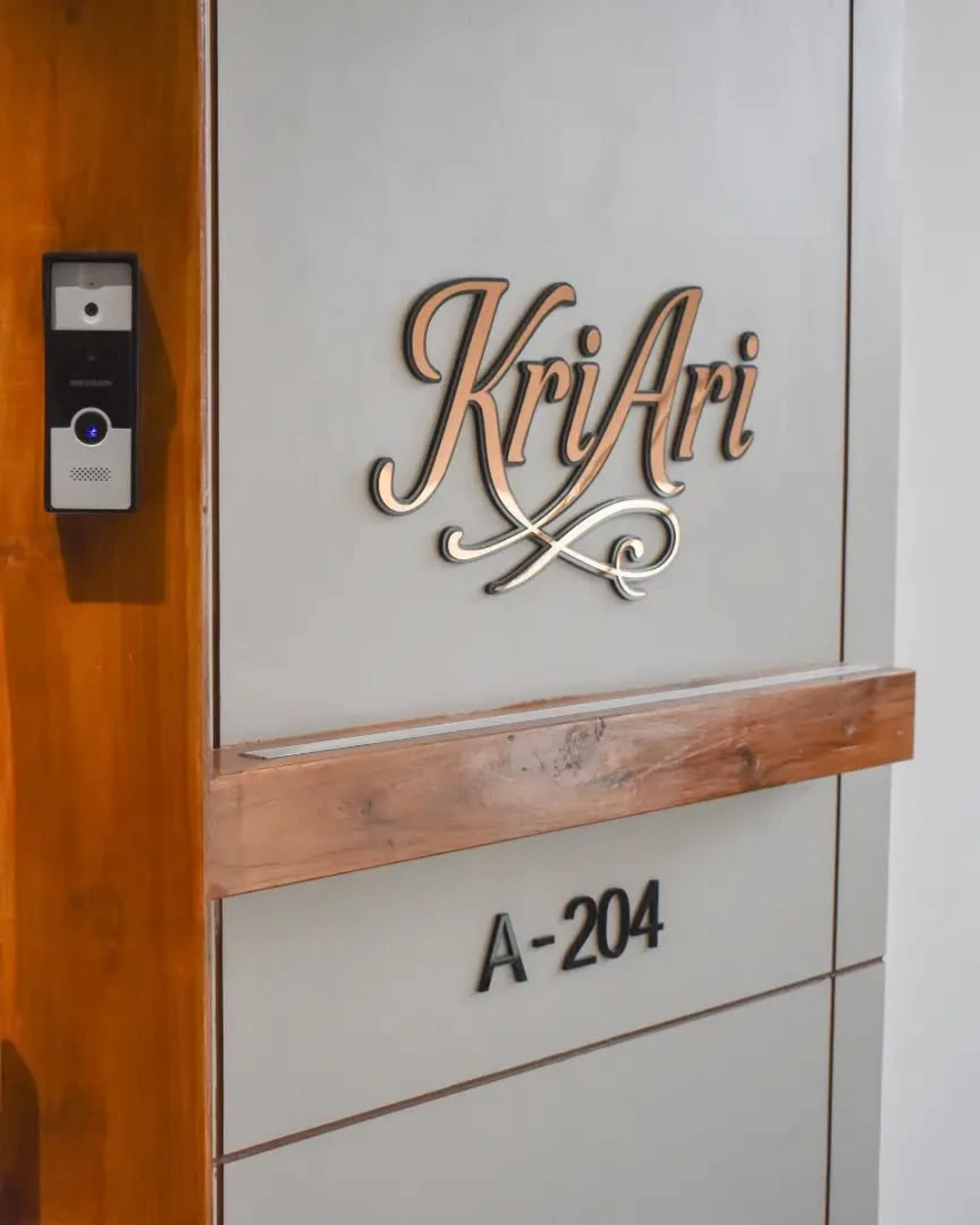
Acrylic suits a modern door because it looks clean, light, and precise. Here a double-layer acrylic nameplate in rose-gold script lettering is mounted directly on a modern entrance door, with the unit number below it and a video door-phone mounted on the wood trim beside the door. The sign shows a personal name in script, which the article does not print, and the door-phone is a scene element rather than part of the sign. The caption confirms this is a double-layer acrylic nameplate, and the layered construction is what gives the lettering its depth.
The practical point: mount an acrylic sign with standoffs so the letters float slightly off the door surface — the small shadow behind them is what makes the sign look expensive. Keep the script large and simple, since thin acrylic lettering is hard to read from more than a few steps away.
# Door Sign With a Family Name
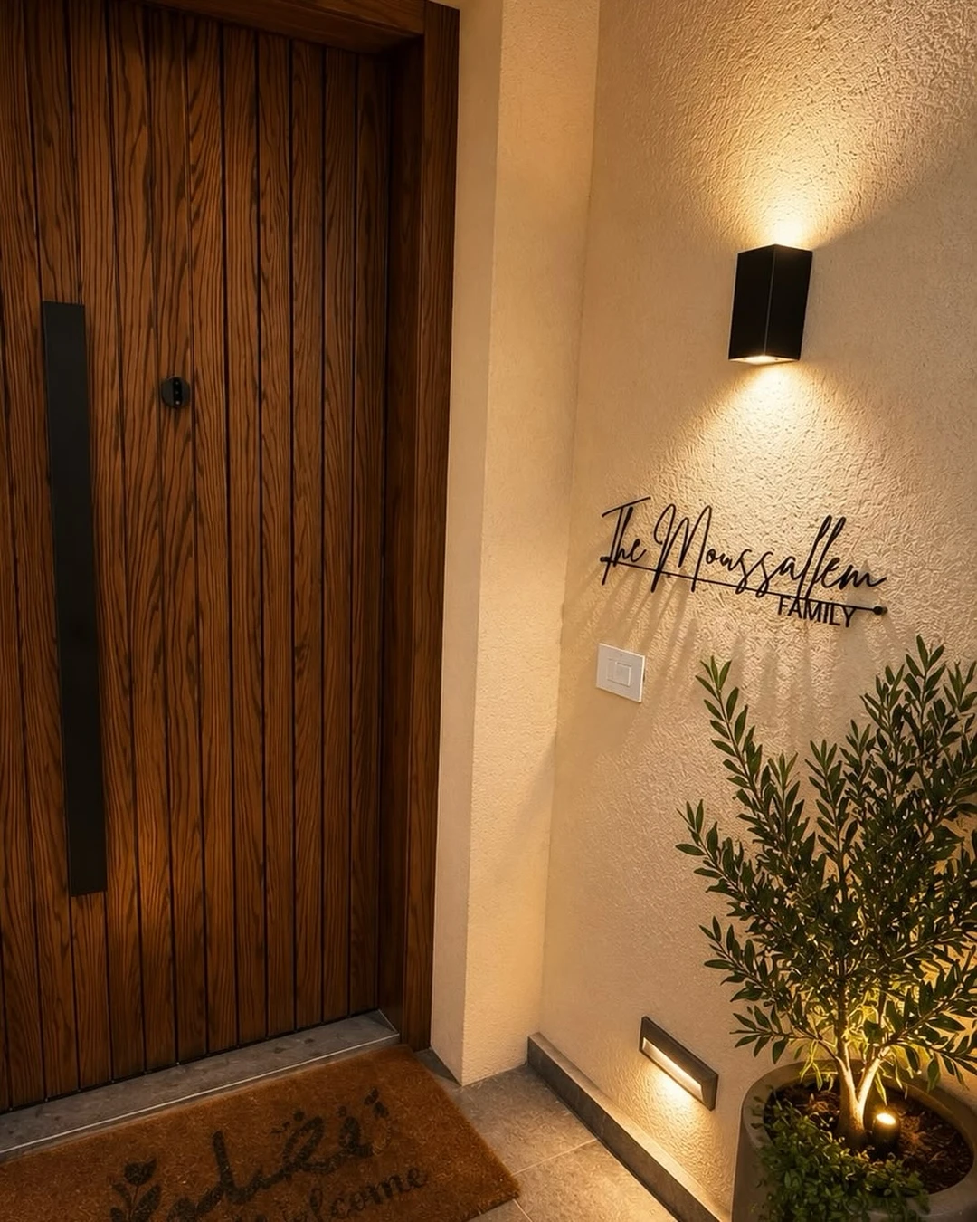
A family name beside the door is a quieter version of a name sign on the door. Here a black cursive metal family-name sign is mounted on the wall immediately beside a modern vertical-plank wooden front door, photographed at night under a wall sconce, with a potted olive plant and a welcome doormat below. A family surname is on the sign, and it is noted here only as a name being present, not printed. The night setting shows the sign at its best, since the sconce light catches the black metal letters.
The practical point: a name sign beside the door keeps the door itself clear for a wreath or a seasonal sign, and a wall light above it makes the name readable after dark. Mount it at the same height as the door handle, so the eye finds the name and the door in one look.
# Seasonal Door Sign
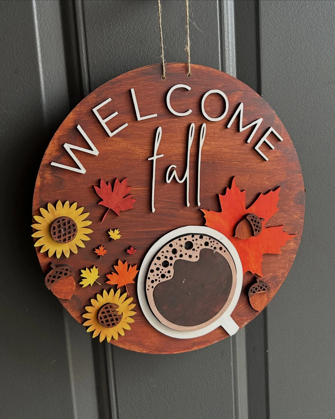
A seasonal sign is the easiest way to keep an entrance feeling current. Here a round wooden sign reading “WELCOME fall” in white block and script lettering hangs by twine on a dark gray paneled door, decorated with laser-cut sunflowers, red and orange maple leaves, acorns, and a small coffee cup. It is an autumn sign through and through, and the dark door makes the warm fall colours stand out.
The practical point: keep one round board and swap the seasonal decoration on it, rather than buying a new sign for every season. A small set of four signs — spring, summer, autumn, and winter — covers the whole year and costs less than a single large wreath.
# Funny Door Sign
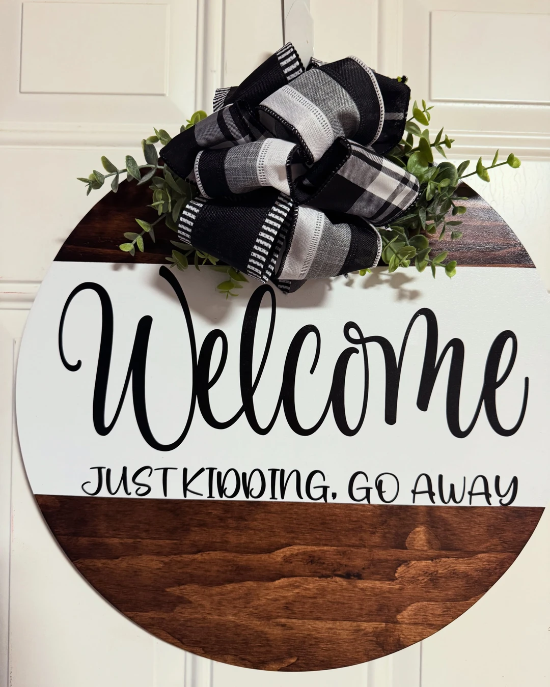
A funny sign works when the joke lands in one glance. Here a round wooden door hanger hangs on a white paneled door, reading “Welcome JUST KIDDING, GO AWAY” in black script and block lettering on a white-and-dark-wood round board, with a black-and-white plaid bow and eucalyptus at the top. The humour is clean and the message is short, so a visitor gets it before reaching for the doorbell.
The practical point: keep funny wording short and clean, since a joke that needs explaining is not a joke. One line is enough — a sign that tries to be funny in three lines reads as a poster, not a welcome.
# Door Sign With House Rules
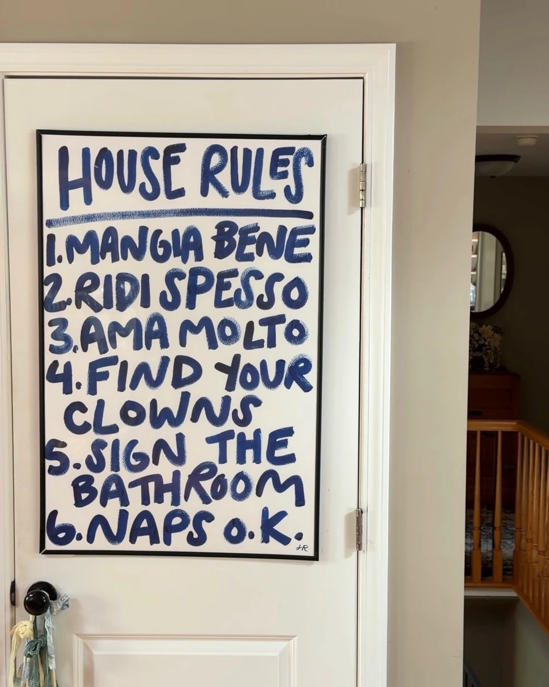
House rules belong where people actually stop and read them. Here a black-framed sign reading “HOUSE RULES” in blue hand-lettering is attached to a white interior door in a home hallway, with six rules listed below. The first three rules are in Italian and the rest are in English, which tells its own story about the household. Small artist initials sit at the bottom-right of the sign itself.
The practical point: put house rules on an interior door — a hallway, kitchen, or living room door — rather than the front door, since rules are for the people who live there and their guests, not for the street. Keep the list to six rules at most, since nobody reads a long list on a door.
# Vintage Enamel Door Sign
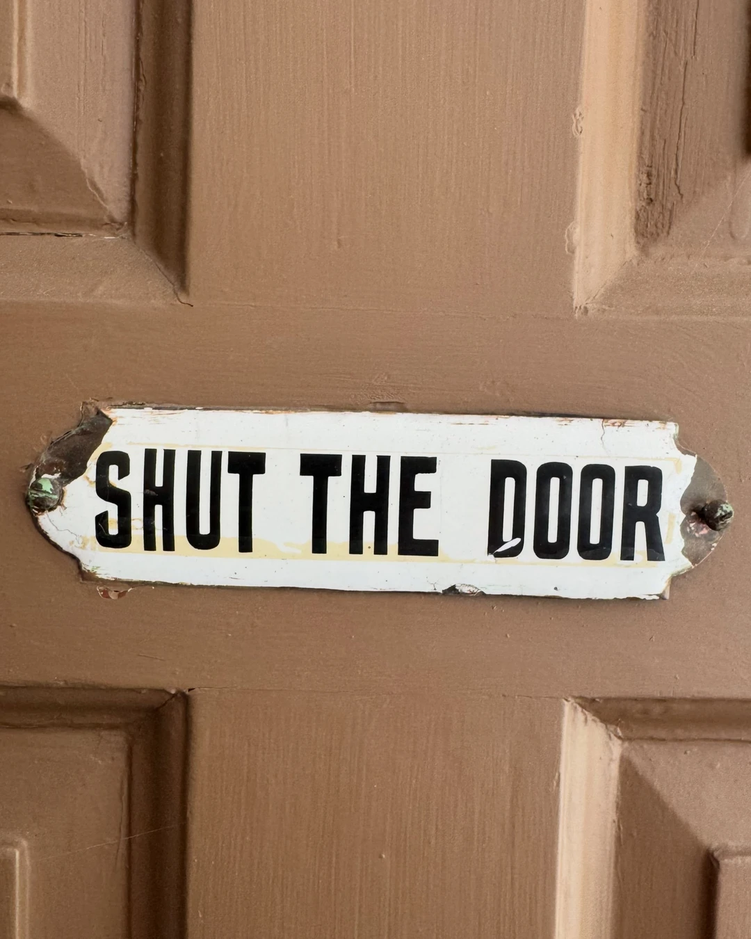
A genuinely old enamel sign has a character no new sign can copy. Here a small white enamel plaque reading “SHUT THE DOOR” in bold black capitals is screwed onto a brown paneled wooden door. The age is real — chipped paint at the corners, rust around the screws, and yellowed staining under the lettering. The sign is small, the message is blunt, and the wear is the whole point.
The practical point: look for chipped paint, rust at the screw holes, and uneven lettering when buying a vintage enamel sign, since those are the signs of real age. Mount it with short screws at the corners, and do not clean off the patina — the wear is what makes it worth having.
# Door Sign for a Home Office
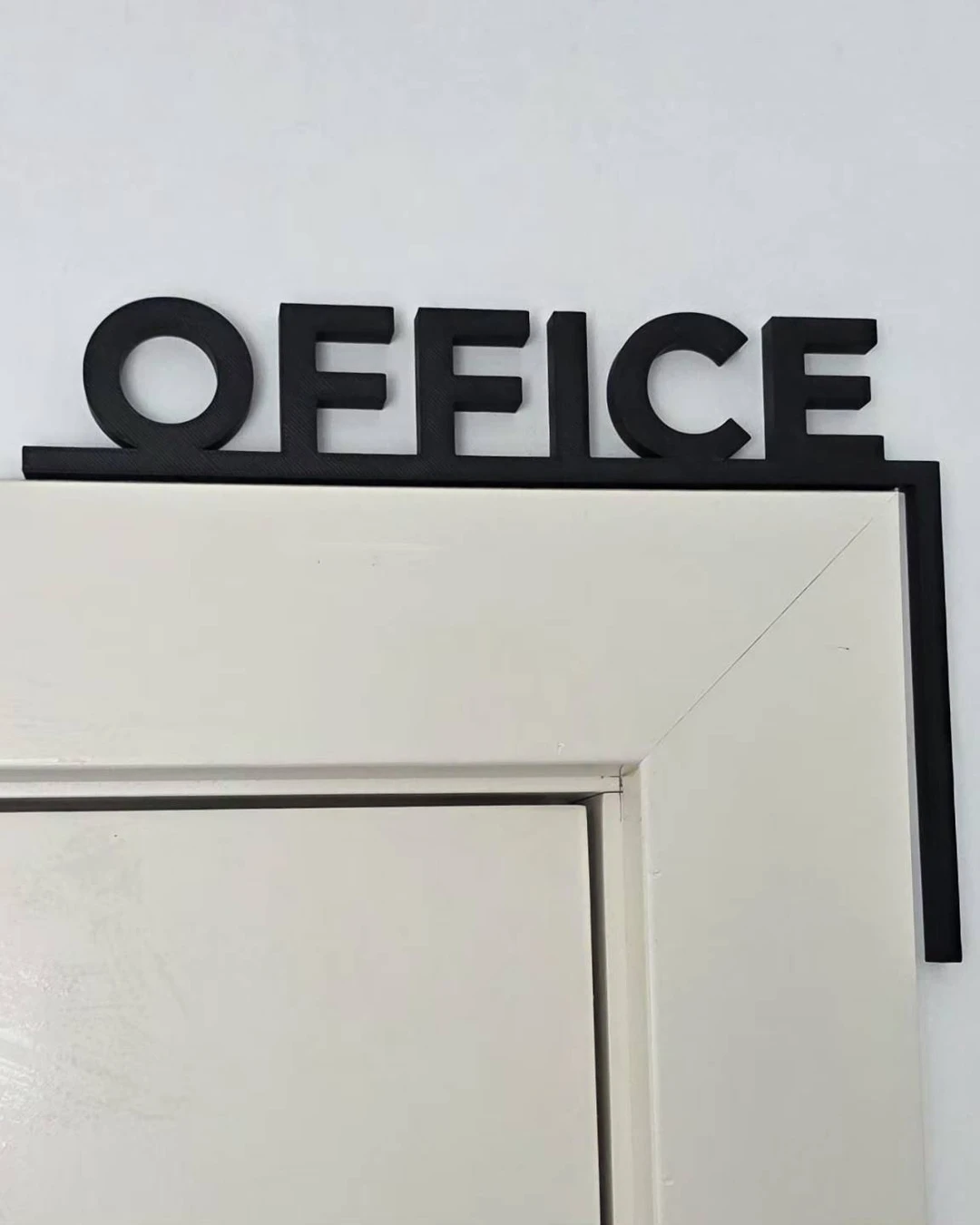
A home office needs a sign that says “working” without saying “do not enter” too harshly. Here matte black 3D letters spelling “OFFICE” sit on top of a white interior door frame as a door-corner sign, against a plain white wall. The sign sits on the door frame and corner rather than on the door face, which is the honest detail — and it is also why it works, since the door itself stays clear.
The practical point: a door-corner sign is the tidiest option for a room that needs labelling, since it does not block the door or catch on clothing. The same idea works for a playroom, a studio, or a laundry room — one word, in 3D letters, on the corner of the frame.
# Kids’ Room Door Sign
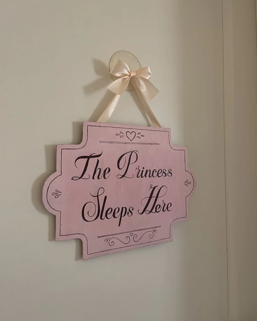
A child’s bedroom door is the one door where a sign can be purely playful. Here a pastel pink ornate plaque reading “The Princess Sleeps Here” in black script hangs by a satin ribbon on a light interior door, with a small heart at the top. No child is visible in the photo and no name is on the sign, which is exactly how a kids’ room photo should be.
The practical point: choose a theme sign rather than a name sign for a child’s room, since a theme lasts longer as the child grows. Hang it at the child’s eye level rather than an adult’s, so the sign belongs to the room’s owner and not just to the hallway.
# Door Sign With Greenery
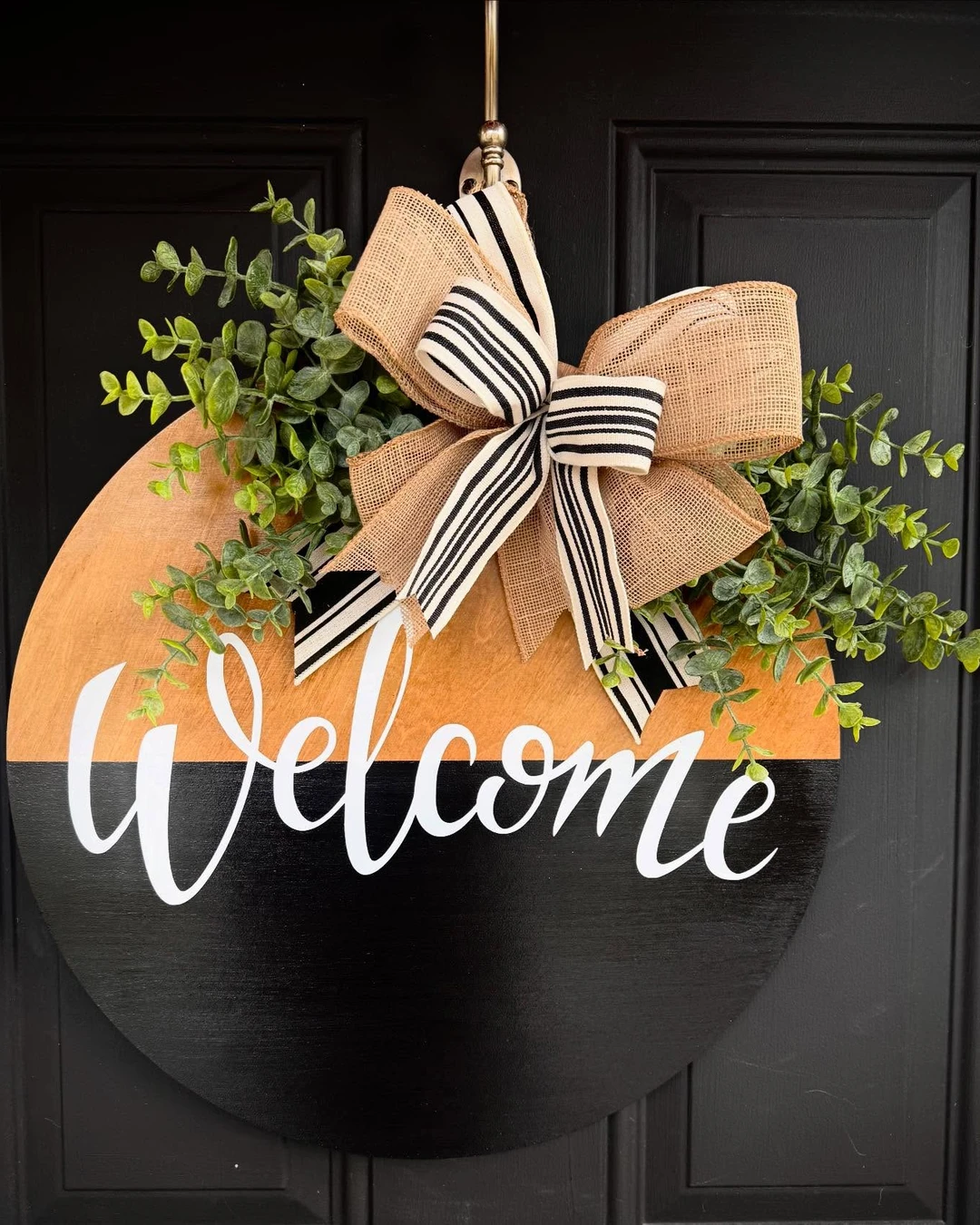
Greenery softens a sign and makes it feel alive, even when the leaves are not real. Here a round two-tone wooden “Welcome” sign — natural wood at the top, black at the bottom — hangs on a black front door, with a large bow of burlap and black-and-white striped ribbon and generous eucalyptus sprigs on both sides. The greenery is the point of this one, and there is plenty of it.
The practical point: use faux eucalyptus for a door sign, since real greenery dries out and drops leaves within days. Attach the sprigs with wire rather than glue, so you can refresh the arrangement or swap it for seasonal foliage without damaging the sign.
# Round Wooden Door Sign
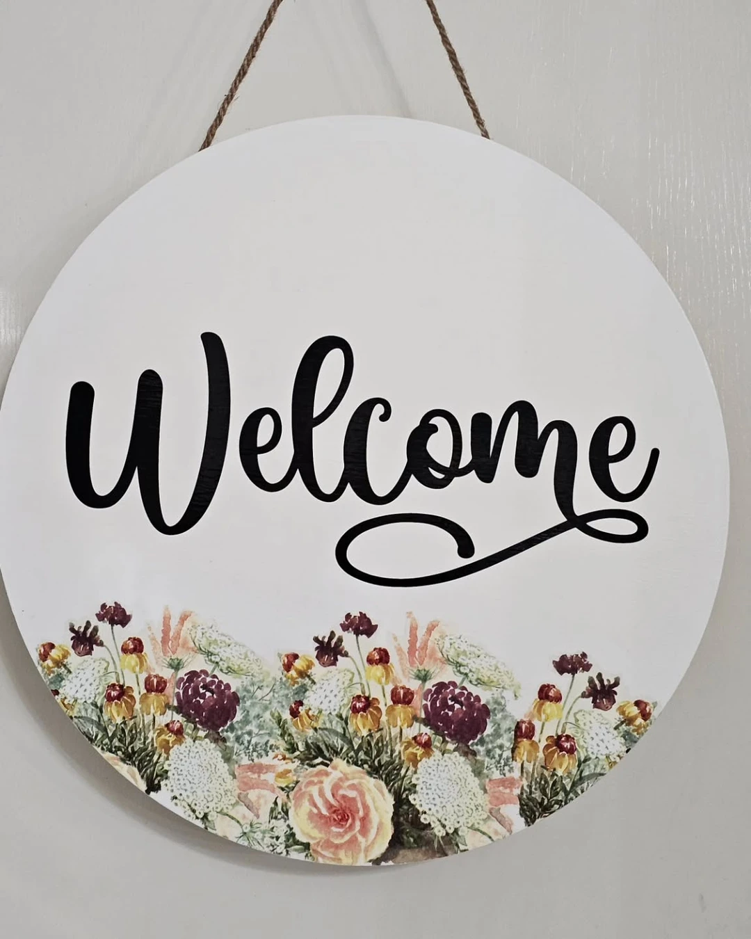
A round sign is the most forgiving shape for a door, since it suits almost any style. Here a circular white wooden “Welcome” sign in large black cursive hangs by twine on a light-colored door, with a watercolor-style floral arrangement along the bottom edge — peach, yellow, burgundy, and white flowers with green leaves. The circle reads clearly from the street, and the flowers keep the white board from looking plain.
The practical point: a round sign works best when the lettering fills most of the circle, with decoration kept to one edge. A round board with small lettering in the middle and empty space around it looks unfinished from more than a few steps away.
# Monogram Door Sign
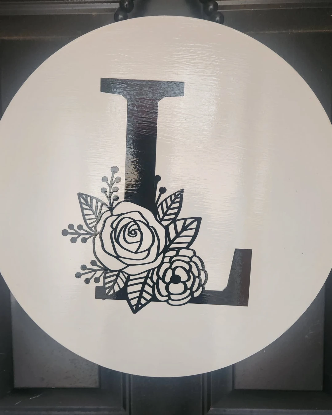
A single letter is the simplest personal sign there is. Here a round off-white wooden door sign hangs from a black beaded hanger on a dark paneled door, with a large black capital letter “L” and a black-and-white floral illustration — a rose, a smaller flower, leaves, and berry sprigs — at its base. Only one initial appears, with no surname and no name, and there is a slight glare on the sign’s surface from the light. One letter, done well, is enough.
The practical point: pair a monogram with one small detail — a flower, a sprig, or a thin border — so the sign does not look bare. Hang it at the centre of the door rather than off to one side, since a single letter needs the symmetry of the door behind it.
Let the Door Say It First
A door sign is a small thing, but it is the first thing a visitor reads, and it sets the tone for everything inside. Start with the message — a name, a welcome, a joke, a rule — then pick the material that suits your door, and keep the lettering big enough to read from the path. These door signage ideas work because each sign matches its door: wood on wood, metal on brick, acrylic on a modern panel, and a round board on a plain door. And if the door itself still feels bare once the sign is up, the same thinking applies to the wall beside it — Unexpected Ways to Fill a Blank Wall Beyond Paintings and Prints shows how a blank surface can carry a sign, a shelf, or a piece of art without looking crowded.