Your living room has been waiting for one brave wall — and stripes are the bravest thing you can paint on it and you do not need a decorator or a big budget — just two colours, a roll of tape, and a free weekend.
Vertical stripes do something no other wall treatment does: they pull the eye upward, so even a small living room feels taller the moment you walk in.
The trick is picking the right stripe for your room — soft and quiet for a calm corner, bold and dark for a wall that needs to carry the whole room. Painted stripes are forgiving in a way wallpaper is not: you can change the colours, widen the bands, or paint straight over them when you want something new.
Some of these walls are painted with a steady hand and a level, and a couple read more like wallpaper than paint — which is a look worth knowing about before you start, because the finish changes how the stripes feel in the room.
Here are 8 vertical striped wall paint ideas for a living room with character — one for every kind of wall, and every kind of nerve.
1. Tone-on-Tone Stripes for Quiet Character
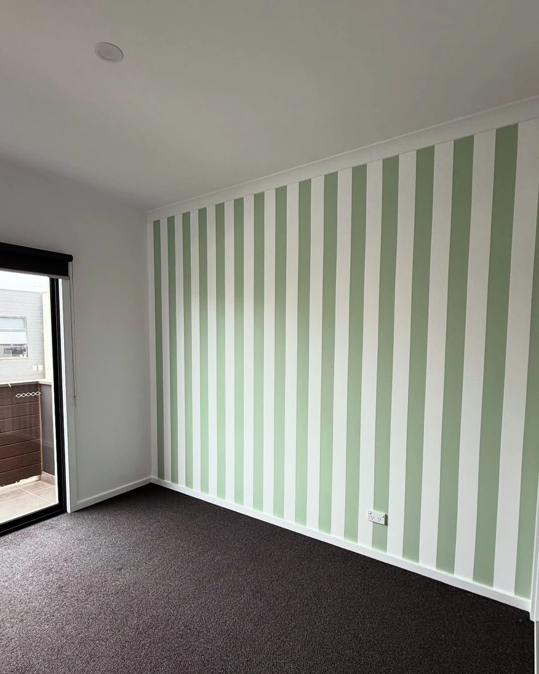
Pale green and white stripes run floor to ceiling on this wall, with a sliding door to the balcony on one side. The two shades sit so close together that the stripes read as a texture first and a pattern second — you notice the wall feels taller before you notice it is striped at all.
Tone-on-tone is the safest way into stripes, and the smartest first step if you have never painted a pattern before. The room stays calm, the furniture does the talking, and the wall quietly makes the ceiling feel higher than it is. This room is still empty — the dark grey carpet is the only thing on the floor — which actually shows the stripes off well, with nothing standing in the way of them.
The practical point: Keep the two shades close — one or two steps apart on the same paint card. Shades that sit too far apart stop being tone-on-tone and start being contrast, which is a different look entirely, and a much louder one.
2. Wide Bands in Two Warm Neutrals
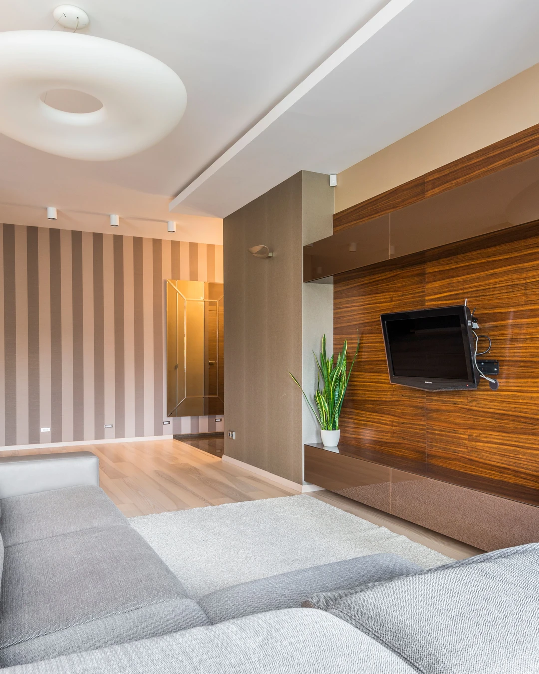
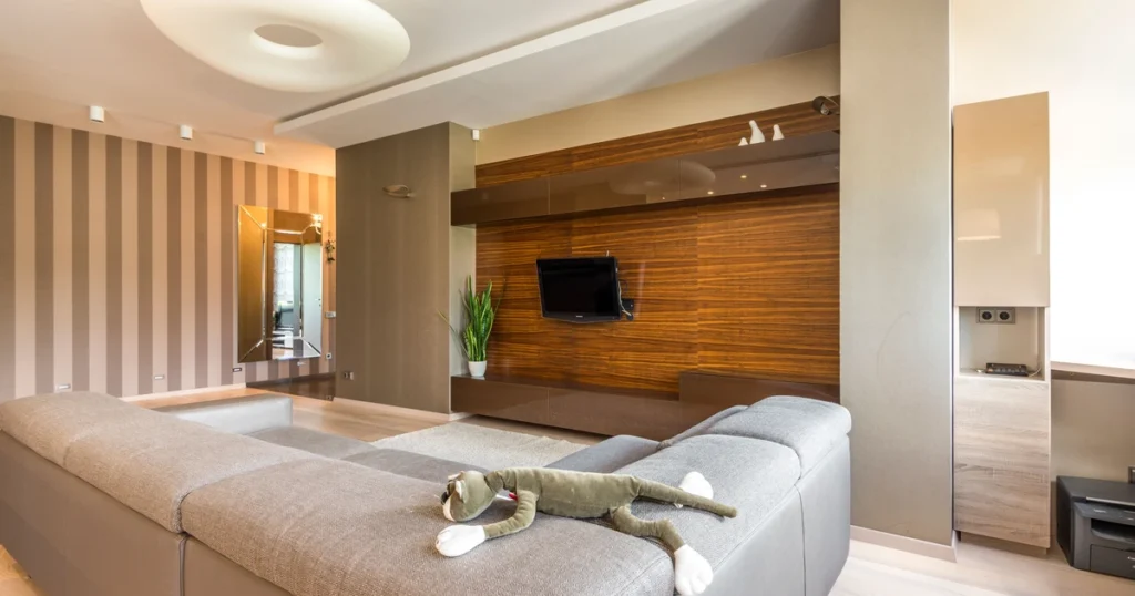
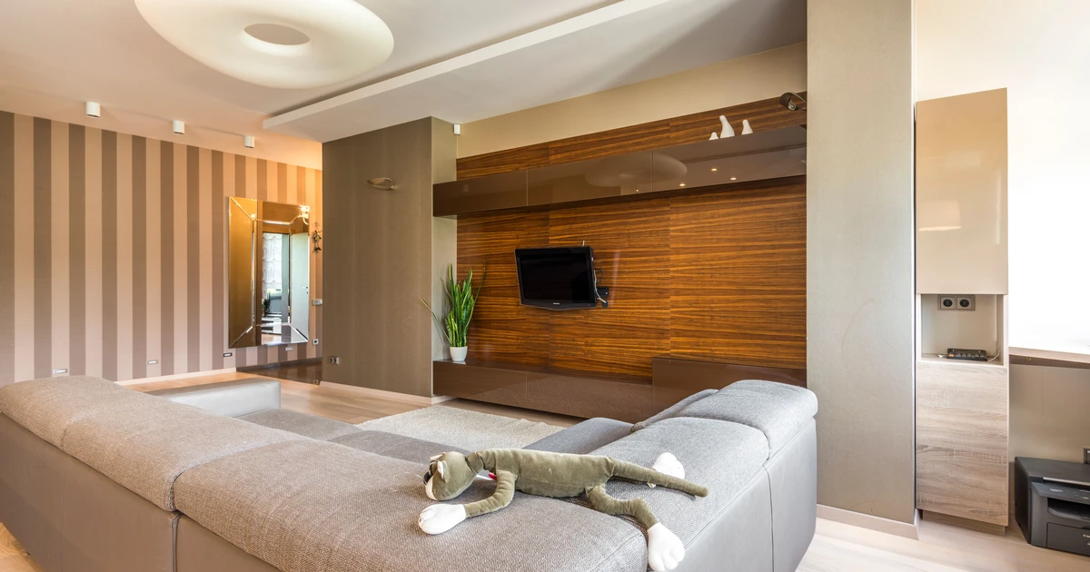
Wide bands of taupe and beige cover the far wall of this living room, behind a grey sofa and a wood-panelled TV wall. The bands are broad and calm, more like broad brushstrokes than stripes, and they warm up a room that would otherwise be all grey and wood.
Honest note first: these stripes sit far back in the photo, and they read more like striped wallpaper than paint — the edges are perfectly even and the surface has a slight sheen, so paint cannot be proved from the picture. The look is still worth studying, because wide warm bands are the most forgiving stripe of all: they suit big walls, they hide uneven plaster, and they never shout. This photo comes from the same apartment as the feature photo, shot from the other side of the room.
The practical point: Paint a test band before you commit to a whole wall — one wide band, left up for a week, tells you more than any paint card. If the wallpaper look appeals to you more than paint, here is How to Make Peel and Stick Wallpaper Look Expensive.
3. Stripes on One Accent Wall Only
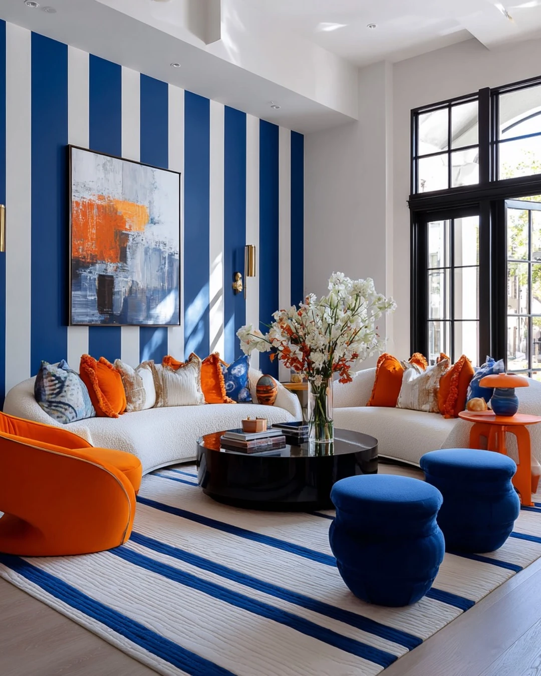
Royal blue and white stripes cover a single accent wall in this designer living room, behind a white sofa dressed with orange cushions and a rug that picks up the same blue. Everything else in the room stays pale, so the striped wall carries all the colour — and it carries it well.
One wall is the right amount of stripes for most living rooms. It gives the room a focal point without making the whole space feel busy, and it costs one wall’s worth of paint instead of four. Two honest notes: the blue here is royal blue rather than navy, and the finish is so polished that paint and wallpaper cannot be told apart from the photo — so treat this as a colour idea first and a paint idea second.
The practical point: Pick the wall your sofa faces, not the wall behind it. Stripes you sit looking at all evening earn their keep; stripes behind your head only impress your guests.
4. Stripes Above the Wainscoting
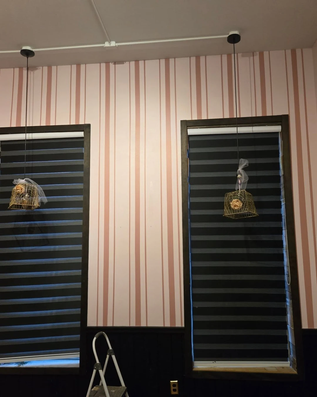
Pink and white stripes fill the wall above dark wainscoting, between two tall windows with black zebra blinds. The stripes stop where the wainscoting starts, so the lower half of the wall stays dark and solid while the upper half lifts the room.
Stripes above wainscoting work because the wainscoting does the grounding and the stripes do the lifting. Your eye travels up the pink bands, and the room feels taller than its low ceiling. Two things to know about this photo: a step ladder is still standing at the bottom-left corner, and no living-room furniture is visible, so the room itself is unconfirmed — the stripe idea is what matters here, not the room around it.
The practical point: Paint the wainscoting first and let it dry fully before you tape the stripes above it. Wet paint and painter’s tape are a bad combination, and the line between the two is the whole point of the look.
5. Striped Alcove or Fireplace Wall
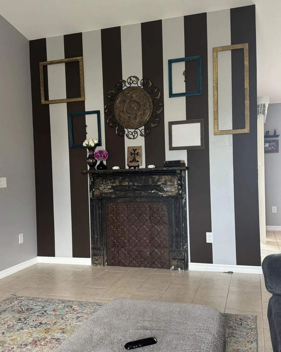
Bold black and light grey stripes cover the whole chimney breast, from floor to ceiling, with a dark distressed mantel halfway up. Empty frames and one ornate round piece lean on the mantel, and a rug and ottoman sit in front — the strongest stripe in this list, on the wall that can take it.
The fireplace wall is the best place for bold stripes, because the fireplace already anchors the room — the stripes just make it impossible to ignore. Black and light grey is the strongest contrast here, and it works because the rest of the room stays quiet: pale walls, a plain rug, and nothing competing for attention.
The practical point: Paint the chimney breast, not the whole room. Bold stripes on every wall close a room in; bold stripes on one fireplace wall make the room feel designed.
6. Stripes Framing the Window Wall
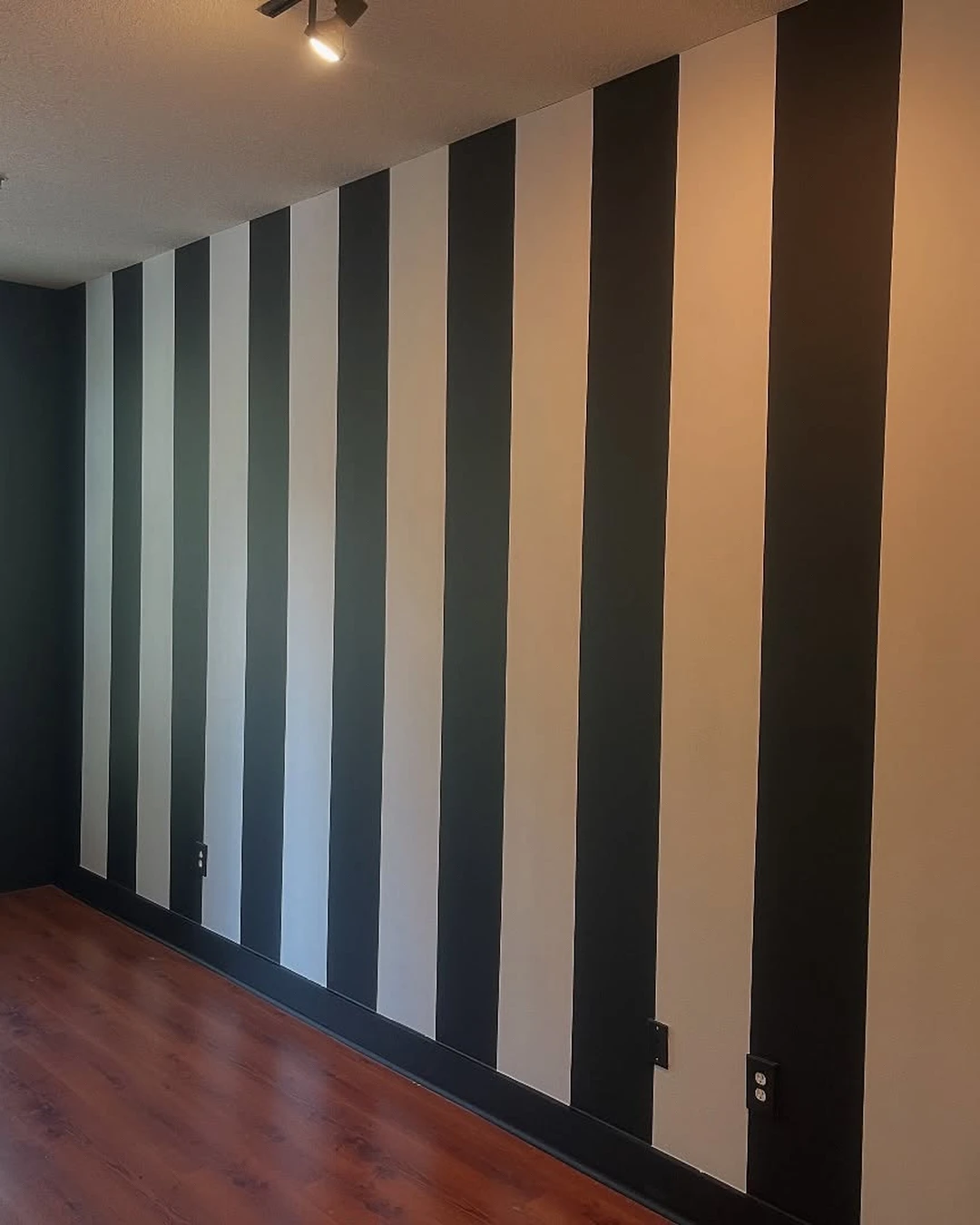
Bold black and off-white stripes run down this wall, with a tall window in the middle and a hardwood floor below. The stripes frame the window like a curtain that never needs washing, and the light from the window softens the black just enough.
Window walls take stripes well because the light does half the work — the bands catch the daylight and the contrast shifts through the day, so the wall never looks flat. This room is completely empty, so the stripes are doing all the talking, and the photo was enlarged by about a quarter to fit this page — the bands are still crisp, but the room is a blank canvas, not a lived-in one.
The practical point: Paint the stripes before you hang the curtains. Curtains hide the edges of the stripes, and any wobble in the line disappears behind the fabric.
7. Stripes in the Reading Corner
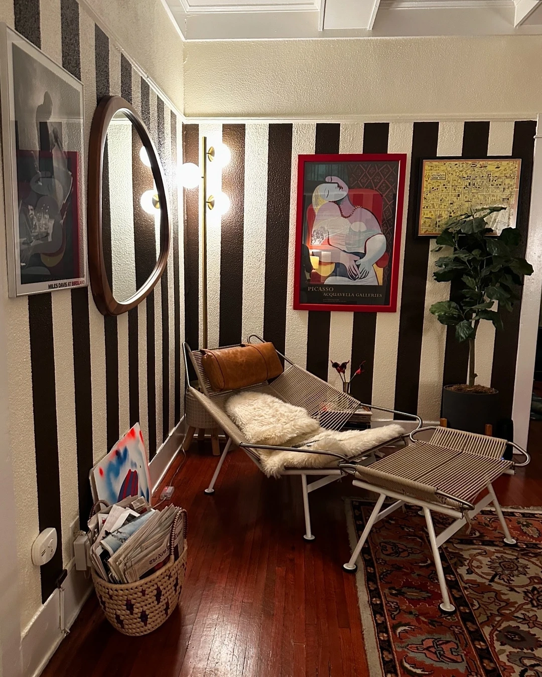
This corner holds a lounge chair and ottoman, with a magazine basket and a floor lamp close by, and black and white stripes covering the walls behind them. This is the only corner in the list that looks lived in — a chair with a cushion, a basket of magazines, and a lamp that gets used.
Stripes suit a reading corner because the corner is small and the stripes give it a boundary — the chair stops being furniture against a wall and starts being a place of its own. The two framed art prints on the wall carry legible artist names, which are part of the room, not part of the stripe idea, and they do not need naming here.
The practical point: Keep the chair light-coloured against dark stripes. A dark chair disappears into a dark stripe, and the corner loses the very thing that makes it inviting.
8. Stripes on an Arched Doorway
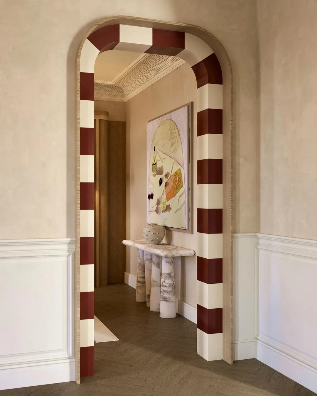
Bold red and cream stripes wrap the arch of this doorway, with a console table and framed art just beyond it. The stripes follow the curve of the arch, so the doorway itself becomes the decoration — no picture needed, no wreath, just the shape of the opening doing the work.
Honest note: this is a hallway, not a living room — but the idea travels well, because living rooms have arched doorways too, and a striped arch turns a plain opening into a frame. Red and cream is the boldest pairing in this list, and it works because the rest of the hallway stays pale and quiet around it.
The practical point: Use a flexible measuring tape around the curve and mark the stripes with a pencil before you paint. Straight tape will not follow an arch, and a wobbling stripe on a curve is the first thing anyone notices.
Stripes That Make the Room Feel Taller
Vertical stripes ask very little of a living room — two colours, a steady hand, and one wall you are willing to be brave about. In return they give height, character, and a wall that no one walks past without noticing.
Start with the quietest stripe that still excites you. You can always go bolder on the next wall — but a stripe you love living with beats a stripe you only love in a photo.
And when the wall is done, the colour is next — here are Popular Sherwin Williams Colors That Never Go Out of Style to help you pick the two shades that will live on it.