Magnolia has a reputation problem, and most magnolia living room colour schemes never even try to shake it off.
For years magnolia was the go-to landlord colour, the safe option nobody chose for themselves. It earned a slightly dull name for itself along the way, and most people assumed that was simply what the colour was.
That reputation is out of date. What matters is the undertone you choose and what you pair it with — get those two things right and magnolia becomes a warm, easy-going neutral that makes almost any other colour look better next to it. Get them wrong, and it drifts straight back into flat, forgettable territory.
This guide runs through the colour schemes keeping magnolia living rooms looking current in 2026, along with the one mistake that ages a magnolia scheme faster than anything else.
Magnolia at a Glance
- Magnolia’s yellow undertone makes it a warm neutral rather than a cold “safe” white — the version you pick should suit your room’s light.
- Contrast is what separates a dated magnolia room from a stylish one; pair it with a colour or material that has real depth.
- Sage green, terracotta, navy and warm wood tones are the four pairings designers keep returning to in 2026.
- The most common mistake is treating magnolia as a “no decision” colour and skipping the rest of the scheme entirely.
Magnolia Undertones Decide How a Living Room Feels
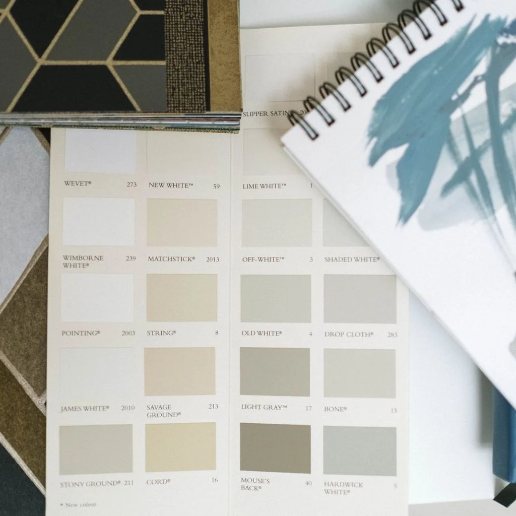
Not every magnolia is the same colour, even though most people talk about it as if it is. Some tins lean creamy and soft, others carry a warmer yellow, and a few have been reformulated with a hint of grey to feel more modern.
For a classic warm cream, Farrow & Ball’s Wimborne White or Dulux’s Natural Calico give a cosy, traditional feel without tipping into orange. If you want something a touch softer, look for shades with a peach undertone — Benjamin Moore’s Soft Satin is a good example, and it flatters rooms that get plenty of natural light.
For a more contemporary living room, Little Greene’s White Lead leans slightly grey, which cools the colour down without losing its warmth entirely.
Room orientation matters here too. Magnolia’s warm undertone works especially well in north-facing living rooms, where it balances out the cooler, bluer daylight. South-facing rooms have more flexibility and can handle a slightly cooler-leaning magnolia without the room feeling cold.
Warm Cream Magnolia Pairs Beautifully With Wood Tones
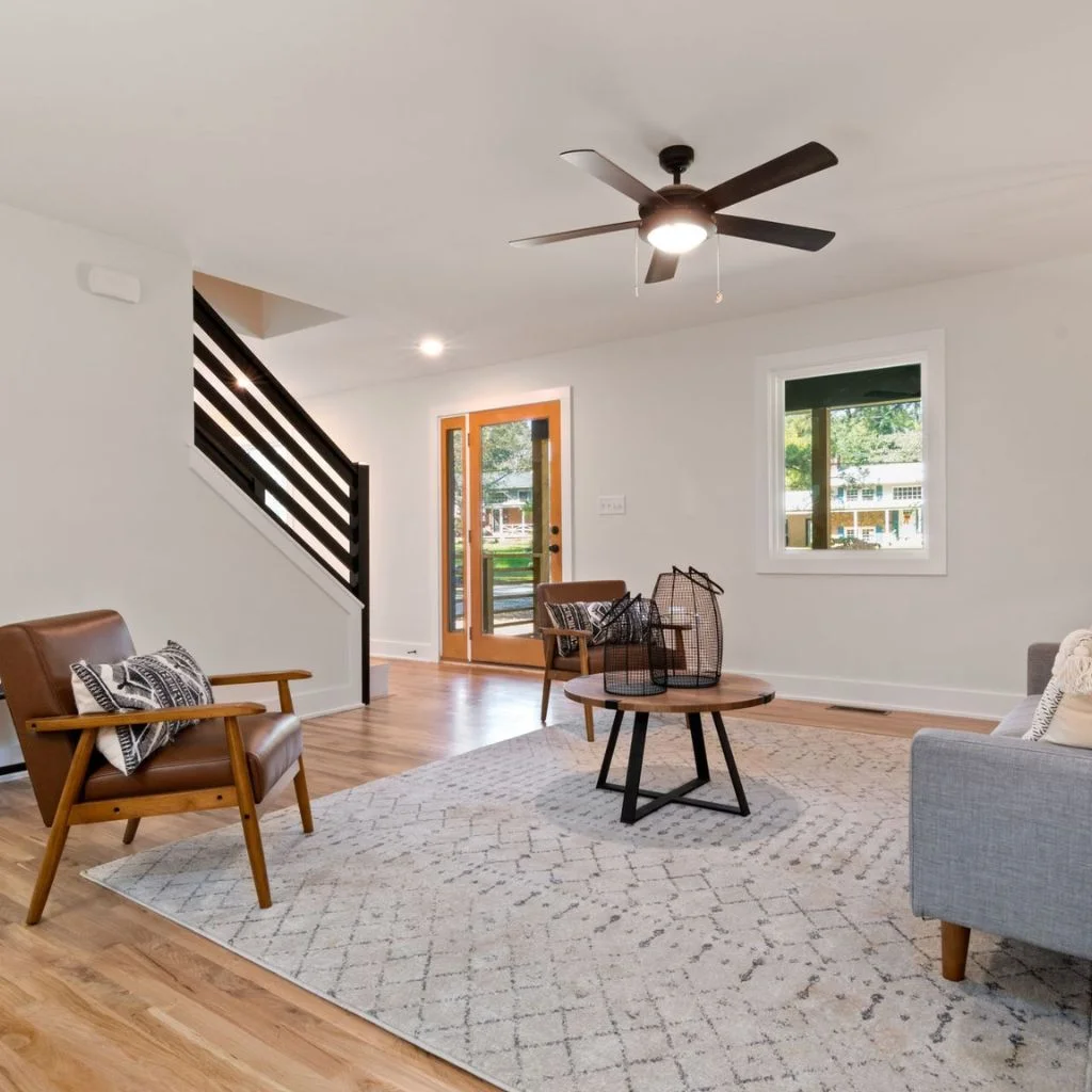
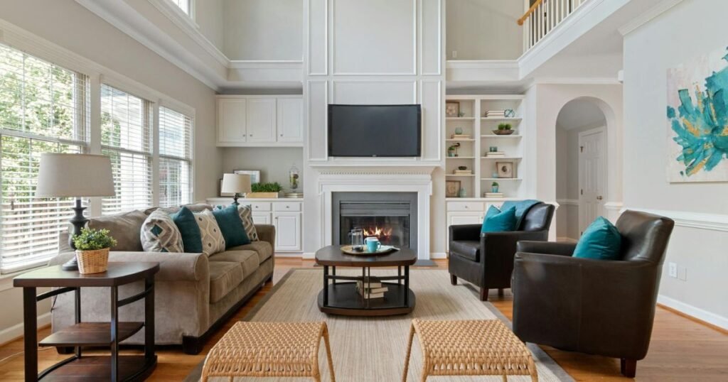
Picture a living room with honey-toned oak floors, a walnut coffee table, and magnolia walls warming everything up rather than fighting it. This is one of the easiest pairings to get right, because magnolia and natural wood share the same undertone family.
Oak, ash and light walnut furniture all sit comfortably against a warm cream magnolia, and the combination reads as cosy rather than dated because the wood grain adds texture that flat magnolia walls alone can’t offer.
A jute or wool rug in a similar tone keeps the palette calm, while a single darker wood piece — a vintage sideboard or a dark oak bookcase — stops the room from feeling too uniform. This is the scheme worth reaching for in a living room that gets a lot of everyday use, since it hides wear and tear better than a stark white ever could.
Grey Magnolia Schemes Suit Contemporary Living Rooms
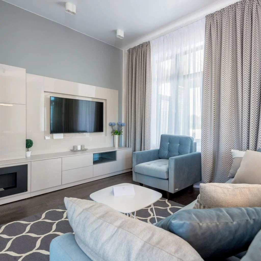
A grey-leaning magnolia is the better starting point for anyone after a more contemporary living room. Little Greene’s White Lead, or a similar cool-toned magnolia, keeps the warmth of the colour without it reading as overtly traditional.
Pair it with charcoal upholstery, black metal light fixtures, and a low-profile sofa, and the room takes on a much more architectural feel. Concrete-effect accessories and matte black picture frames work particularly well against this version of magnolia, since the coolness of the accents balances the warmth still present in the base colour.
This pairing suits open-plan living rooms especially well, where a warmer magnolia can sometimes feel slightly heavy across a larger expanse of wall.
Sage Green Accents Bring Magnolia Walls to Life
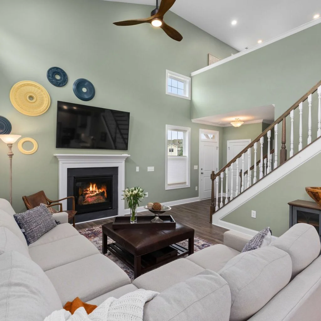
Green and magnolia is one of the pairings designers keep coming back to for 2026, and sage or olive tones in particular do a lot of work for very little effort.
A magnolia wall on its own can feel unfinished, but add sage-green cushions, an olive velvet armchair, or a cluster of houseplants, and the room suddenly has a focal point. Green works because it sits just far enough from magnolia’s warm undertone to create contrast, without clashing the way a cooler blue sometimes can.
Ceramic vases in a deeper moss green, a botanical print, or curtains in a muted forest shade all extend the palette without needing to repaint anything. This is the pairing worth trying first if you already own magnolia walls or furniture and want an update that doesn’t involve a paintbrush.
Terracotta and Rust Add Warmth to Magnolia Rooms
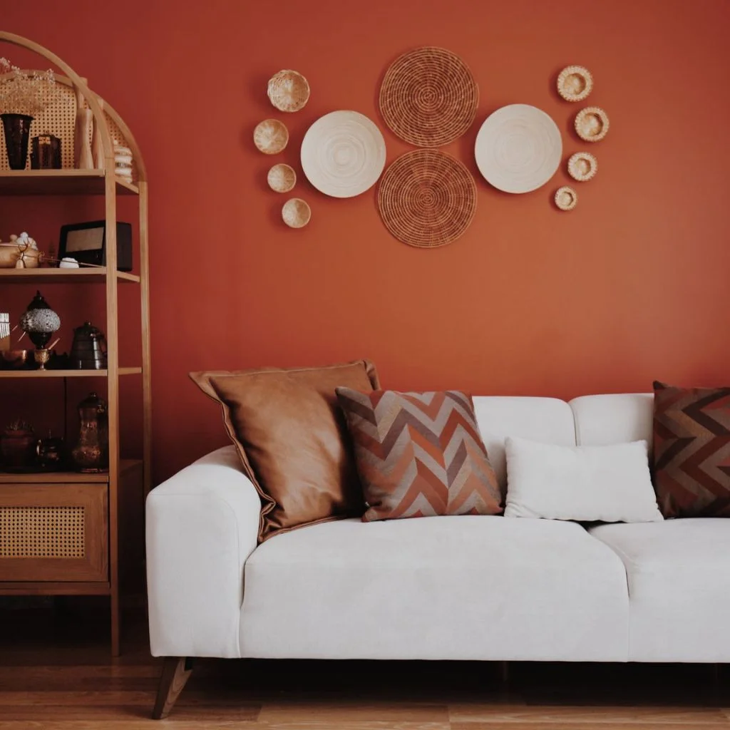
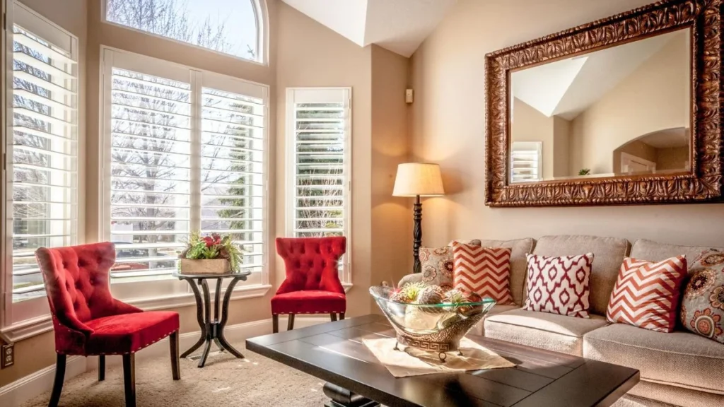
Terracotta is the pairing that stops a magnolia living room from feeling like a blank canvas. Because both colours share warm undertones, rust, clay and burnt-orange accents blend into a magnolia scheme rather than standing apart from it, which makes this an easy palette for anyone nervous about using strong colour.
A terracotta throw, a set of clay-toned ceramics, or a single rust-coloured armchair gives the room depth without needing a feature wall. This pairing works particularly well in living rooms with limited natural light, since the combined warmth of magnolia and terracotta stops the space feeling flat or cold.
Keep the terracotta to two or three spots in the room rather than spreading it everywhere — used sparingly, it reads as considered; used everywhere, it starts competing with the walls instead of complementing them.
Navy and Charcoal Create Bold Contrast Against Magnolia
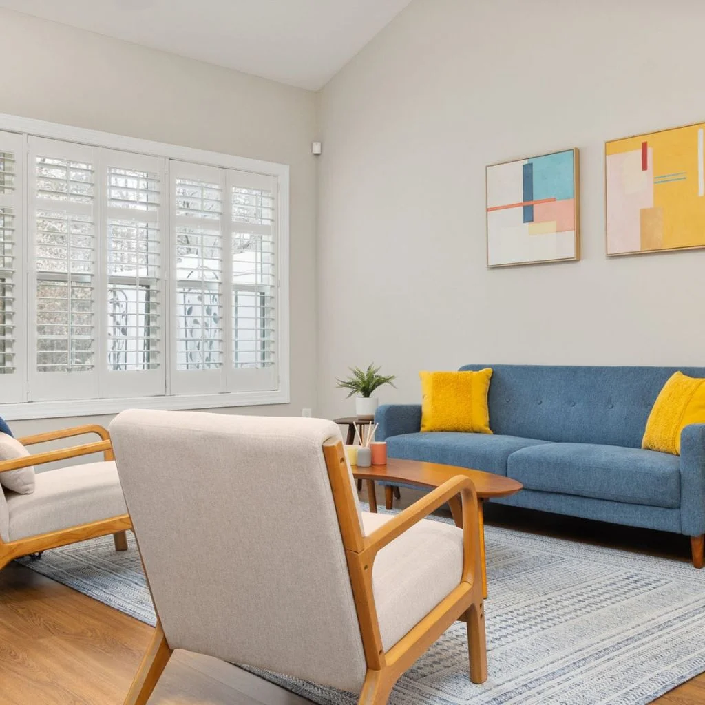
For a living room that needs more drama than warm neutrals can offer, navy or charcoal against magnolia walls creates the kind of contrast that photographs well and looks intentional in person too.
A navy velvet sofa against magnolia walls is a classic combination for a reason — the depth of the navy stops the room feeling washed out, while the magnolia keeps things from tipping into moody or dark. Charcoal works similarly, particularly on joinery, alcove shelving, or a media unit, where the dark tone anchors the room without covering too much wall space.
This pairing suits larger living rooms best, since a smaller room painted entirely in magnolia with heavy navy furniture can start to feel cramped. In a compact space, keep the navy to cushions, artwork or a single chair instead.
Tonal Magnolia Layering Adds Depth Without Colour
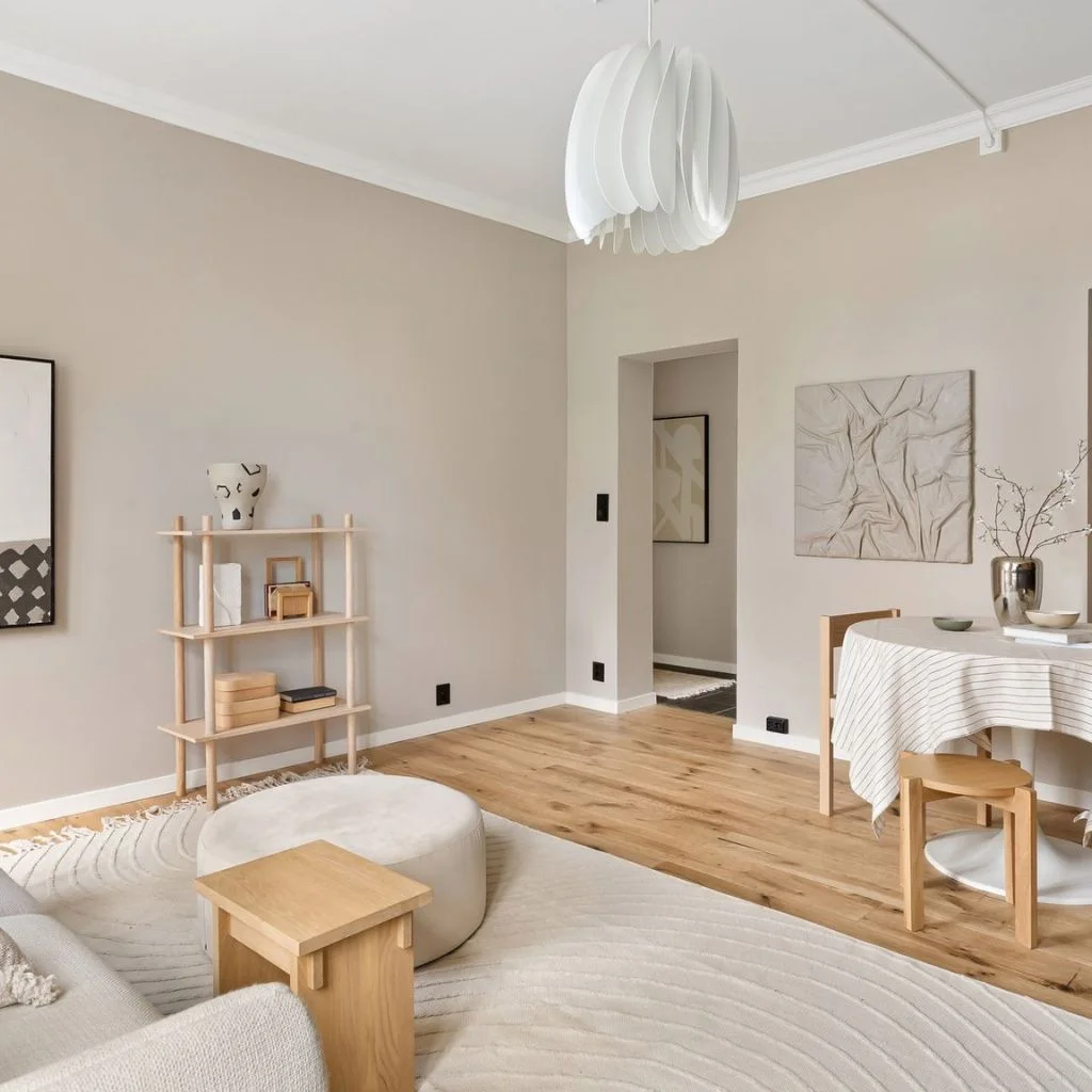
Not every magnolia living room needs a contrasting colour at all. A tonal scheme — layering magnolia with deeper beige, taupe and off-white — is a quieter option that’s become increasingly popular for living rooms that need to feel calm rather than characterful.
Paint the walls in magnolia, then bring in a taupe sofa, curtains a shade or two darker than the walls, and white accessories to finish the look. The lack of contrast is the point here — the room reads as cohesive and considered rather than plain, because every element sits within the same warm neutral family.
Painting an alcove or a run of shelving in a slightly deeper tone than the walls is a simple way to add dimension to a tonal scheme without introducing a new colour altogether.
Brass and Aged Gold Metals Complete a Magnolia Scheme
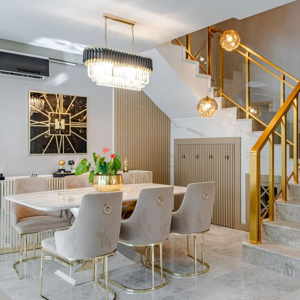
Metal finishes matter more in a magnolia living room than they do in most other colour schemes, because magnolia’s warmth clashes with cool silver or chrome far more obviously than plain white does.
Brass, bronze and aged gold are the metals that work with magnolia rather than against it. A brass floor lamp, a bronze-framed mirror, or a gold-rimmed coffee table all pick up on the warm undertone in the walls, tying the room together in a way that feels finished rather than half-decorated.
Save chrome and brushed steel for a grey-leaning magnolia scheme instead, where the coolness of the paint gives those metals something to work with. In a warm cream or peach-toned magnolia room, they tend to look slightly out of place.
Common Mistake Undermines Many Magnolia Colour Schemes
The mistake I see most often is treating magnolia as a colour that doesn’t need a plan. Because it’s neutral and easy to live with, it’s tempting to paint every wall magnolia and stop there — no contrast, no texture, no accent colour to give the room a focal point.
That’s exactly what gave magnolia its dated reputation in the first place. A magnolia living room without any contrast reads as unfinished rather than calm, and it’s the single biggest difference between a scheme that looks considered and one that looks like a rental nobody has personalised yet.
The fix isn’t complicated. Pick one of the pairings above — wood, sage, terracotta, navy or brass — and commit to it throughout the room, rather than adding a token cushion in a different colour and calling it done.
Magnolia’s Second Act Comes Down to Confidence
Magnolia was never really the problem — a lack of a plan was. Paired with the right wood tones, greens, terracotta or navy, it becomes one of the most flexible neutrals available for a living room, rather than the flat default it’s often mistaken for.
Pick one pairing from this guide and commit to it fully — new cushions, a rug, a single stand-out piece of furniture — rather than testing a little of everything at once. That’s what turns a magnolia living room from forgettable into genuinely well put together.
Our Pick: Mixing Wood Tones in a Living Room Never Looked This Effortless.
Frequently Asked Questions
Does magnolia work in a north-facing living room?
Yes. Magnolia’s warm undertone is particularly well suited to north-facing rooms, since it balances out the cooler, blue-toned daylight those rooms tend to get.
What colours clash with magnolia?
Cool greys and blue-toned whites tend to clash with magnolia because their undertones fight against its warmth. Stark, cool-toned accessories can also make a magnolia wall look slightly murky by comparison.
Is magnolia still in style in 2026?
Magnolia is back in favour with interior designers, though it’s being used differently than in the past — paired deliberately with texture, contrast and warm metals rather than left to stand alone.
What is the difference between magnolia and white?
Magnolia has a warm, often yellow-toned undertone, while white is a true neutral with no undertone bias. That warmth is what makes magnolia feel cosier and more forgiving in everyday living rooms.