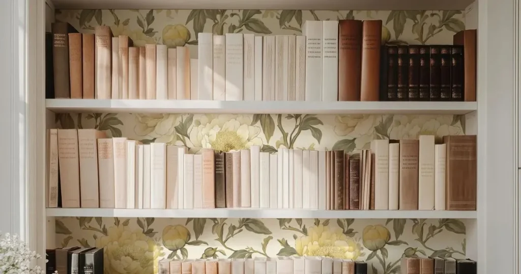
Bookshelf wallpaper is the quickest way to make a mass-produced bookcase look made for your room. IKEA estimates a Billy sells somewhere in the world every five seconds, so plain white units are everywhere, and a patterned backdrop is what makes yours different.
Fixing a roll of removable paper to the back panel costs far less than commissioning a built-in, and it peels away again if your taste changes. Below are eight looks, from leafy greens to blue and white chinoiserie, each with a practical note on making the pattern work behind real books.
Bookshelf Wallpaper Choices That Suit Billy’s Slim Fibreboard Back
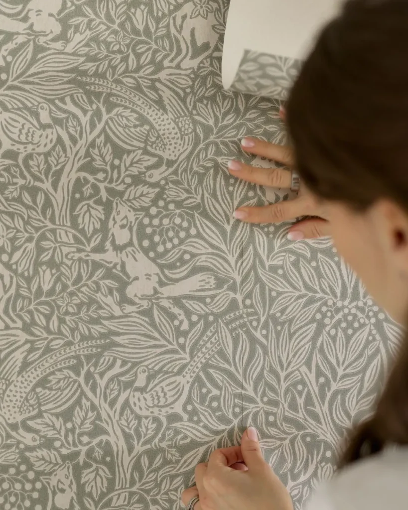
Photo Credit: borastapeter
Bookshelf wallpaper has to cope with a surface most owners never inspect. IKEA lists the Billy back as fibreboard with a paint or paper foil finish, and each unit is only 28 cm deep, so there is little room for anything thick or fussy.
Removable peel-and-stick paper is the sensible default. It skips paste, can be repositioned while you work, and lifts away later, which matters on furniture you might sell or move. Pre-pasted rolls also work, but fibreboard and water are not natural friends.
Smooth, dry, clean surfaces give the best grip, and taking the shelves out makes smoothing far easier. Most makeovers save the back for last, just before styling, and this step-by-step bookcase guide shows the process in detail.
If you are assembling a fresh unit, papering the back panel while it lies flat is easier than working upright. Check your model’s instructions for how the panel fixes in place first.
White Billy units are the easiest starting point, because a pale frame lets the wallpaper do all the talking. Choose the colour story first, then the pattern, then the objects that will sit in front of it; working in that order stops the shelves from becoming a collision of unrelated ideas.
One trade-off worth knowing: peel-and-stick grabs fast, and bubbles are hard to chase out once the paper is down. Slow, patient smoothing from the top corner beats speed every time.
Greenhouse Glow With Botanical Leaf Prints
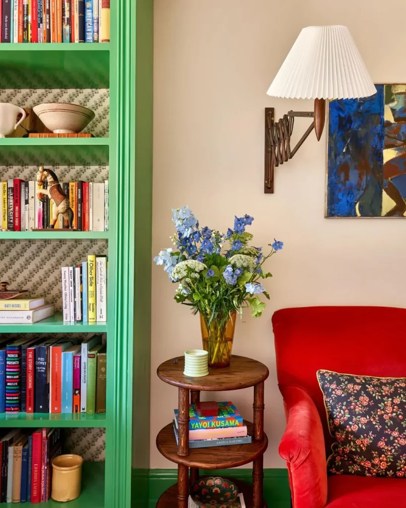
Photo Credit: lonikachande
Deep green leaves on a darker ground turn a white Billy into a miniature conservatory for books. Palm, fern and monstera prints work best, because their large shapes still read clearly in the slivers of wall between book spines.
Cream spines, brass candlesticks and a trailing plant on the top shelf complete the garden-room feel. Natural motifs soften the rigid grid of shelving, and green sits happily beside almost every book-cover colour.
Greenery also works as a bridge between indoors and out, which is handy in rooms with a garden view. If real plants struggle in your light, a few faux trailing stems on the top shelf keep the effect going all year.
Styling tip: choose a print with lighter gaps between the leaves. Solid, dense green can swallow dark books completely.
Moody Navy Florals Behind Bright Book Spines
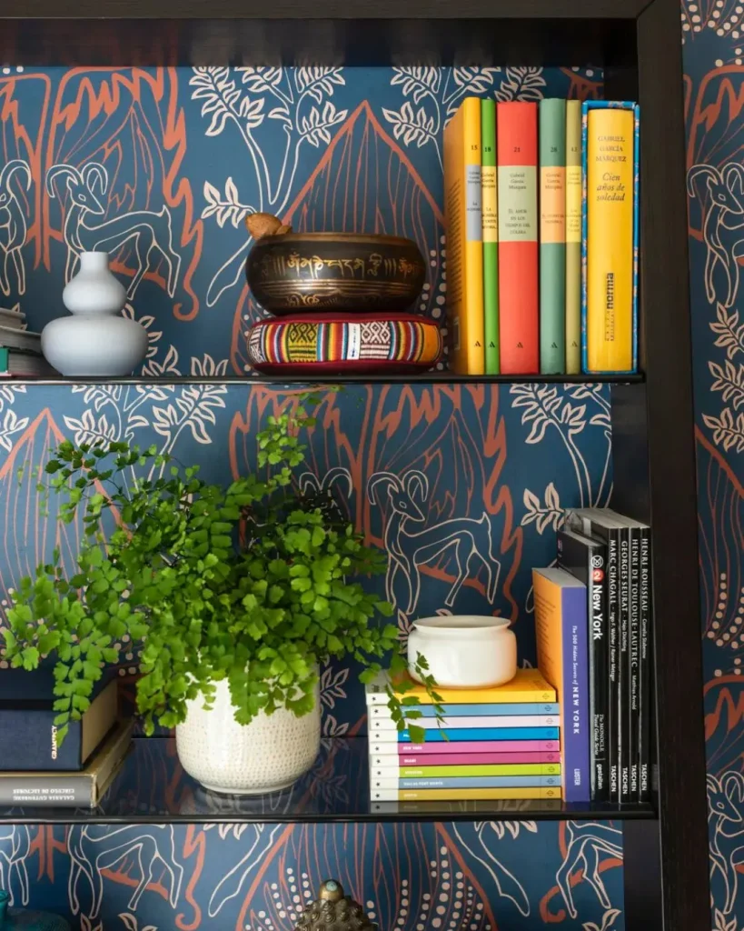
Photo Credit: (Emily June Designs Photograph: Julie Soefer)
Dark navy paper scattered with blooms gives a bookcase the drama of a private library without the cost of real joinery. Bright spines, white ceramics and a few gilt frames glow against the deep ground, and the whole unit starts to look like a deliberate feature wall.
Navy also hides the shadows that gather between shelves, so a crowded arrangement looks intentional rather than messy. Keep the florals medium in scale, because ditsy prints turn into a blur once books stand in front. This look is at its best in a snug, softly lit corner.
Warm white lamp light brings out the blue, so a small plug-in picture light or a lamp on the nearest side table pays off. Pale spines and cream ceramics give the strongest contrast, while navy books on navy paper tend to disappear.
Grasscloth Texture Without the Grasscloth Price
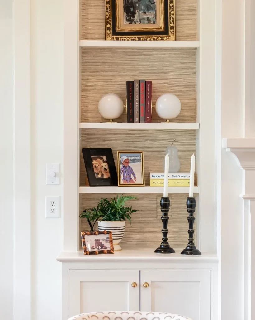
Photo Credit: wynnepeace
Textured peel-and-stick papers now imitate woven grasscloth in oatmeal, sand and soft taupe. Its surface adds depth behind the shelves without adding pattern, which suits anyone who wants calm rather than colour.
Rattan baskets, linen-covered boxes and pale wooden frames feel right at home against it. Texture also helps disguise small flaws on a budget board, though thicker textured papers can be fiddlier at corners, so trim with a fresh, sharp blade.
This is also the safest bet for a first attempt, since a soft, uniform texture has no repeat to match and no stripes to keep straight. Layer in colour through book jackets and ceramics, and the shelves still feel full of life.
Terracotta Geometrics for a Warm Mid-Century Mood
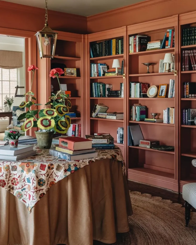
Photo Credit: louiseroehome
Rust, burnt orange and cream geometrics, such as arches, circles and repeating scallops, suit mid-century and boho rooms. Walnut-toned frames, cream and olive ceramics and a single warm lamp pull the palette together.
Warm tones make white laminate feel intentional, and muted book jackets glow against them. Pick a design with plenty of cream in it, since heavy terracotta coverage can make narrow shelves feel cramped.
Mixing materials keeps the look from feeling like a theme. Try a woven basket, a wooden bowl and a matt ceramic vase together, and keep metallics to one or two warm brass touches so the pattern remains the star.
One Patterned Bay Between Two Plain Ones
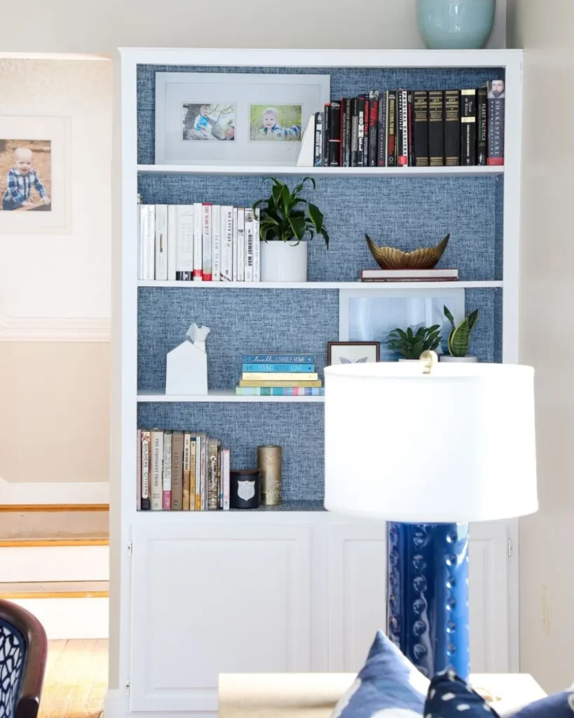
Photo Credit: thehomesihavemade
Papering every bookcase in a room can overwhelm it. Try placing three Billy units side by side and papering only the middle one, so the outer pair stays calm and the centre bay becomes a framed display for art, vases or a treasured collection.
Because each unit has its own back panel, the paper never needs matching across units, which saves effort and wallpaper. Bolder prints are easier to live with here, since they only fill one slim column.
Styling the plain units more simply makes the patterned one pop. Try books arranged by colour on the outer pair and a mix of art, vases and a single sculptural piece in the middle bay, so the eye travels to the centre first.
Blush and Sage Storybook Prints for Children’s Corners
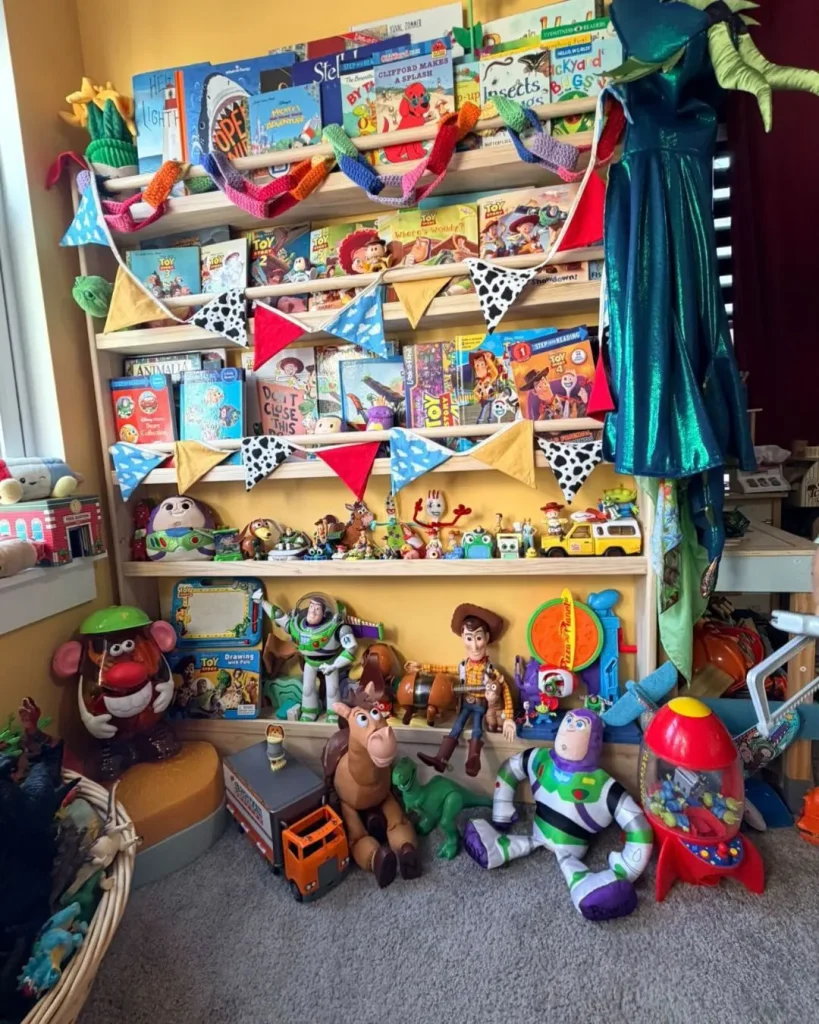
Photo Credit: joykids.original
Soft blush paper with sage leaves or woodland animals gives a child’s bookcase a gentle storybook feel. Face-out picture books, a basket of soft toys and a small lamp turn the shelves into a reading nook.
Removable paper suits children’s changing tastes, and a wipeable vinyl finish copes better with sticky fingers. Any bookcase in a child’s room should also be fixed to the wall, as IKEA’s own instructions require for the Billy.
Keep heavier books on the lower shelves and lighter soft toys higher up, and leave the lowest shelf open for small hands. Pastel paper also brightens a dim bedroom, which makes evening story time feel calmer.
Chinoiserie Blue and White for Traditional Rooms
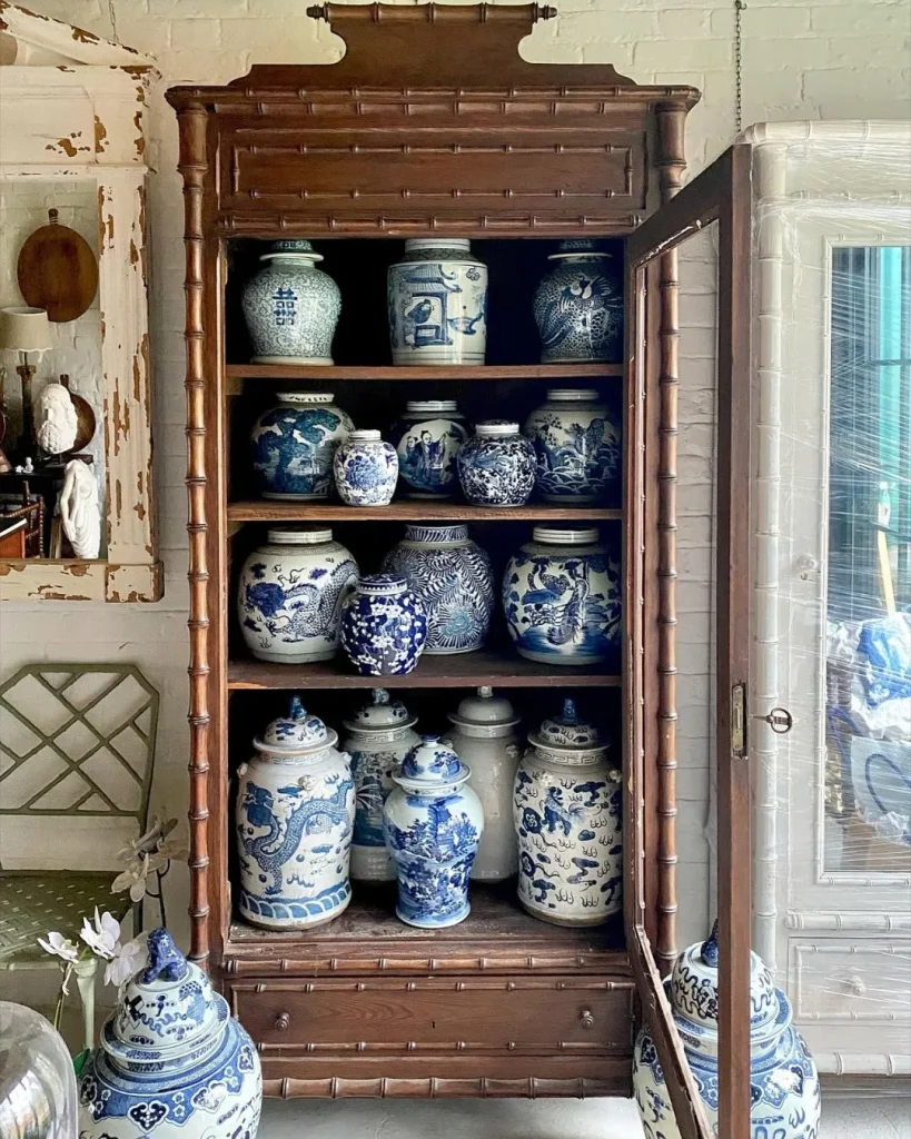
Photo Credit: relic_interiors
Pale blue branches, birds and blossoms on white are a classic for good reason. Ginger jars, blue and white porcelain and a touch of brass give the shelves the air of inherited furniture rather than flat-pack.
Keep the objects within the same palette, and let a few white-jacketed books sit among the colour. This look is a natural fit for dining rooms, hallways and formal living spaces.
Symmetry suits the style, so try matching pairs of vases or candlesticks on either side of the bay. Chinoiserie papers often come in softer colourways such as grey-green or blush on cream, which are worth considering if blue feels too formal for your room.
Black and White Graphics That Let Colourful Books Lead
Monochrome stripes, Art Deco fans or bold geometrics create a gallery-style backdrop where colourful book jackets and objects stand out sharply. This look feels modern, graphic and surprisingly versatile.
Choose a pattern with thinner black lines rather than heavy blocks, otherwise the shelves read as busy. Grouping books by colour and leaving small gaps lets the pattern breathe.
Monochrome backdrops also forgive a mixed collection, because mismatched jackets look curated rather than chaotic against a strong, neutral ground. Add a single colour accent, such as a red vase or an emerald lamp, to tie everything together.
Is Your Pattern Too Busy for the Shelves?
Scale is the quietest mistake in bookcase makeovers. Large, high-contrast prints compete with the books for attention, while very small prints vanish the moment a stack of paperbacks stands in front.
Before ordering, lean a sample against the back of a shelf and arrange a typical pile of books in front. If the eye keeps jumping to the wallpaper instead of the objects, choose a quieter version of the same colour.
Strong stripes deserve extra caution, since few bookcases are perfectly square and every wobble shows. Softer, organic patterns forgive crooked edges far better.
Colour temperature matters as well. Cool blues and greys can look flat in a north-facing room, while warm creams and terracottas can feel heavy in a very sunny one. Holding a sample in the room at different times of day takes a minute and prevents an expensive misjudgement.
Small Backdrop, Big Personality for Budget Shelves
Budget bookcases rarely need replacing; they need a better backdrop. One roll, one colour story and a quick scale test with real books are enough to make a flat-pack unit feel designed for the room.
Whether the shelves live in a hallway, a nursery or a home office, let the pattern be the backdrop and the books be the stars. If the look ever feels tired, peel it off and start again.
Our Choice: Billy Bookcase Media Wall Ideas for Small and Large Living Rooms
Bookshelf Wallpaper Questions Answered
How much wallpaper do I need for one bookcase?
Measure the visible back area between the sides and beneath the top, then add a few centimetres on every edge for trimming. Roll widths vary by brand, so a narrow roll may need two drops across a single bookcase, and patterned rolls need extra for matching repeats.
Will removable wallpaper damage the back panel when it comes off?
Removable papers are designed to lift cleanly when peeled slowly at a low angle, with a hairdryer warming any stubborn patches. Budget furniture finishes are thinner than a painted wall, though, so test an offcut on a hidden corner first and check it peels away cleanly.
Is bookshelf wallpaper suitable for bathrooms or kitchens?
Peel-and-stick works best in dry rooms such as bedrooms, living rooms, nurseries and hallways. Steamy bathrooms and splash zones near cookers are harder on adhesive and on fibreboard, so keep wallpapered shelves in drier spaces.
How full should the shelves be so the pattern still shows?
Leave roughly a third of each shelf open, using gaps, books lying flat and objects with space around them. Varying book heights and keeping the top shelf airy gives the wallpaper room to read as a backdrop.