Peel and stick wallpaper has a reputation problem. In the shop it looks like a quick fix, and on the wall it can look like one too — shiny, thin, and a little too eager to peel at the corners. But the paper itself is rarely the reason a wall looks cheap. The difference between a rental-looking wall and a designer-looking one is in the choices you make before the first strip goes up, and in the care you take while it goes up. The same roll can look flat and temporary, or it can look like it was always meant to be there.
These 17 steps cover both halves of that job: choosing paper that already looks rich, installing it the way a professional would, and styling the finished wall so nothing about it reads as a shortcut.
# Choose a Thick, Textured Wallpaper
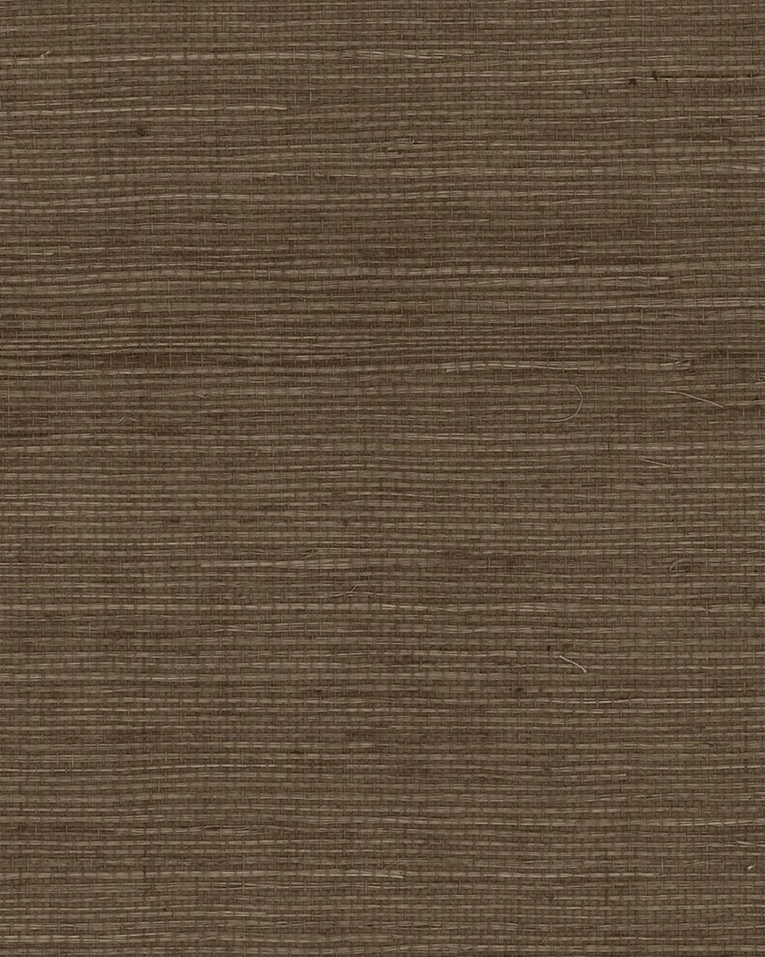
The first decision is the one that matters most. Thin, glossy vinyl catches the light in a way that gives the game away at once, while a thicker paper with a real texture — grasscloth, linen, plaster, or a heavy embossed vinyl — reads as a material, not a sticker. Run your hand over the sample before you order. If you can feel the weave or the raised pattern, the wall will have depth even before the furniture goes back. If the woven look in the photo appeals to you, Beautiful Ways to Use Grasscloth Wallpaper for a Rich, Textured Look shows how that texture works across a whole room.
The practical point: order a sample first and look at it in the room’s own light, morning and evening. A paper that looks rich in the shop can look flat under your ceiling lights, and a sample costs far less than a full roll you regret.
# Prep the Wall Before You Start
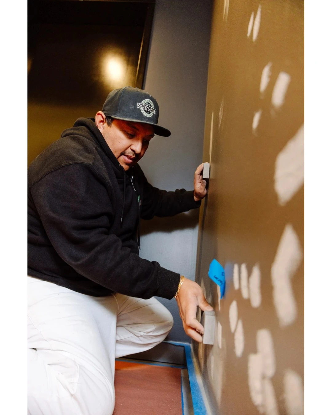
Peel and stick wallpaper is honest about the wall underneath it. Every bump, old nail hole, and patch of flaking paint will show through, and the adhesive will grip unevenly on a dirty or dusty surface. Fill the holes, sand the patches smooth, wipe the wall down, and let it dry completely. If the wall was recently painted, give the paint a few days to cure so the paper does not pull it off later.
The practical point: the photo shows the unglamorous truth of prep — a wall covered in white spackle patches being sanded smooth, blue tape along the baseboard. Nobody sees this step when the room is finished, but everyone sees it if you skip it.
# Measure Twice and Plan the Pattern
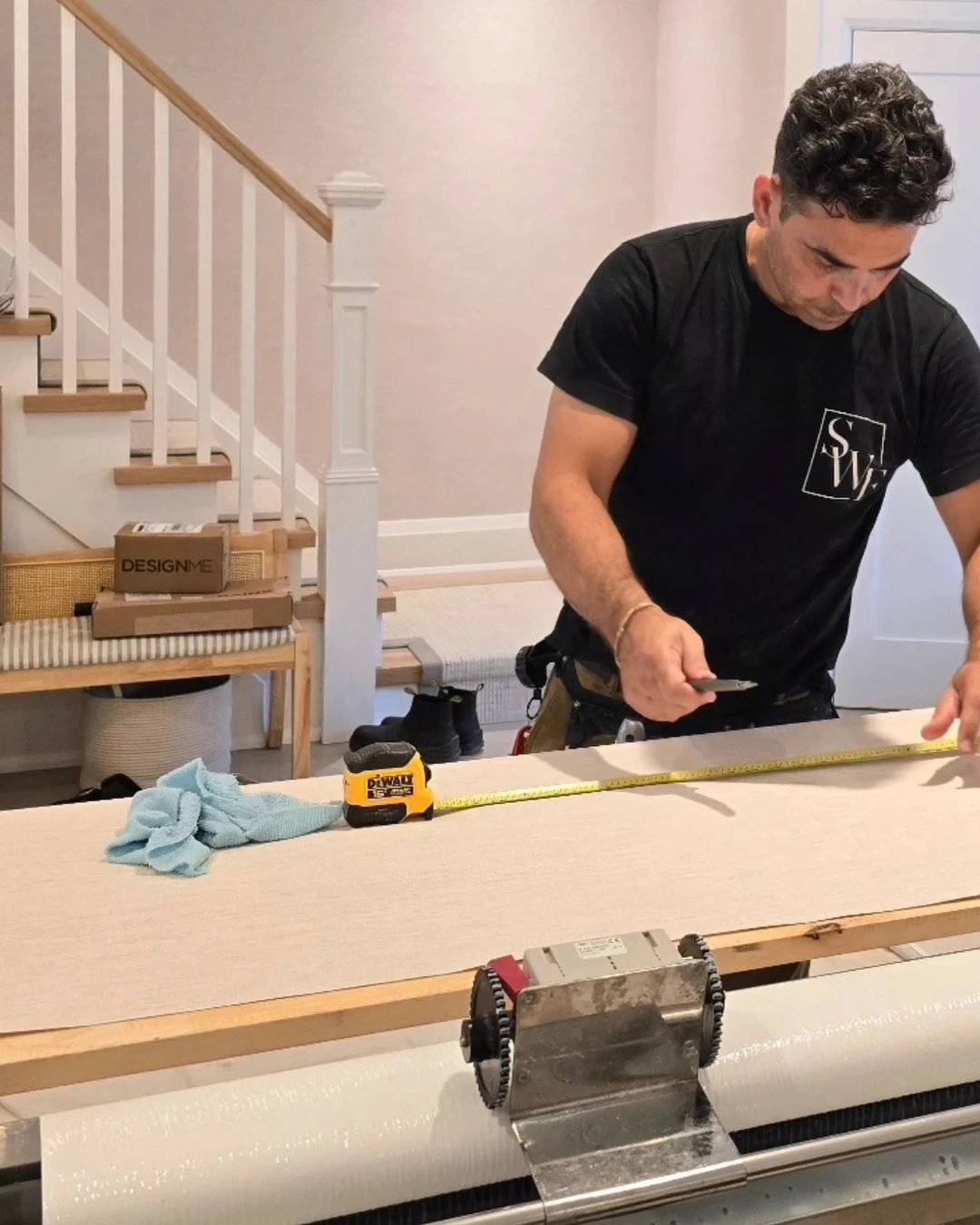
A professional never starts hanging and hopes the pattern works out. Measure the wall’s width and height, work out how many strips you need, and plan where each strip will start so the pattern repeat falls sensibly — ideally with a full motif at eye level rather than a half-cut flower staring at you from the middle of the wall. Buy one extra roll beyond your calculation for mistakes and for pattern matching.
The practical point: lay the first strip out on a table and measure it there, as the installer in the photo is doing with a tape measure and a cutting machine. Planning the pattern on the table is ten minutes; fixing a bad match on the wall is an afternoon.
# Start From a Straight Line
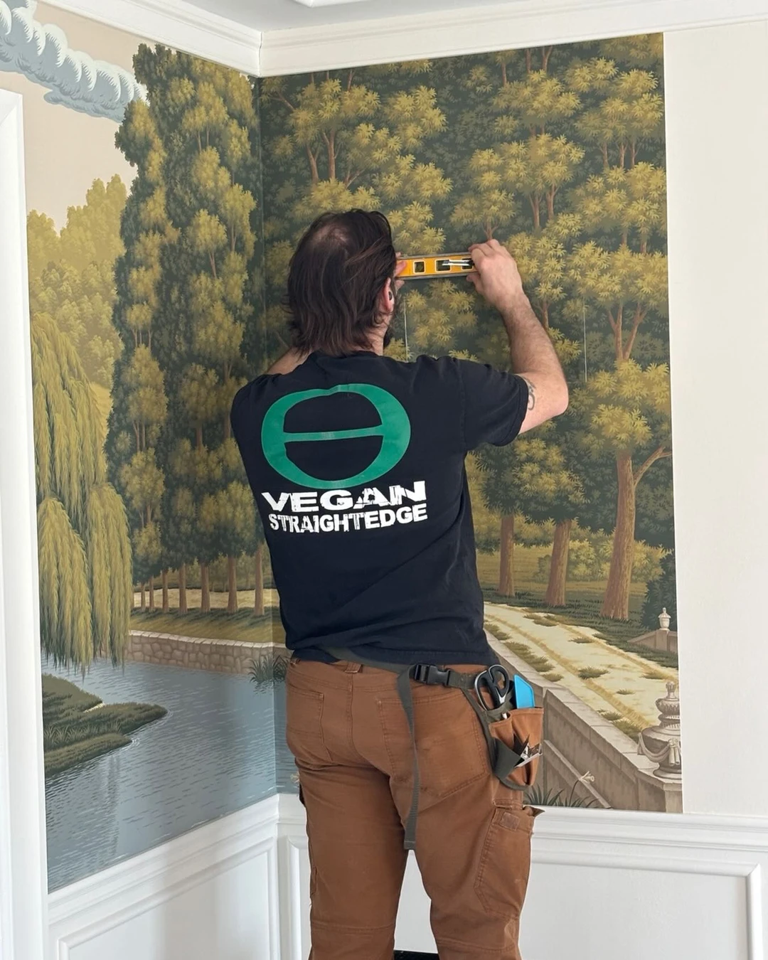
Walls are rarely as straight as they look, and a strip that starts even slightly crooked will drift further with every strip after it. Mark a plumb line with a spirit level before you hang anything, and line your first strip up to that mark — not to the corner, the ceiling, or the skirting, all of which can be out of true. That first straight strip becomes the reference for everything else.
The practical point: check the line with a level, not by eye. In the photo, a paperhanger holds a yellow spirit level against a forest mural while the next strip goes up — the slogan on his T-shirt is part of the scene, but the level is the lesson.
# Smooth Out Every Bubble
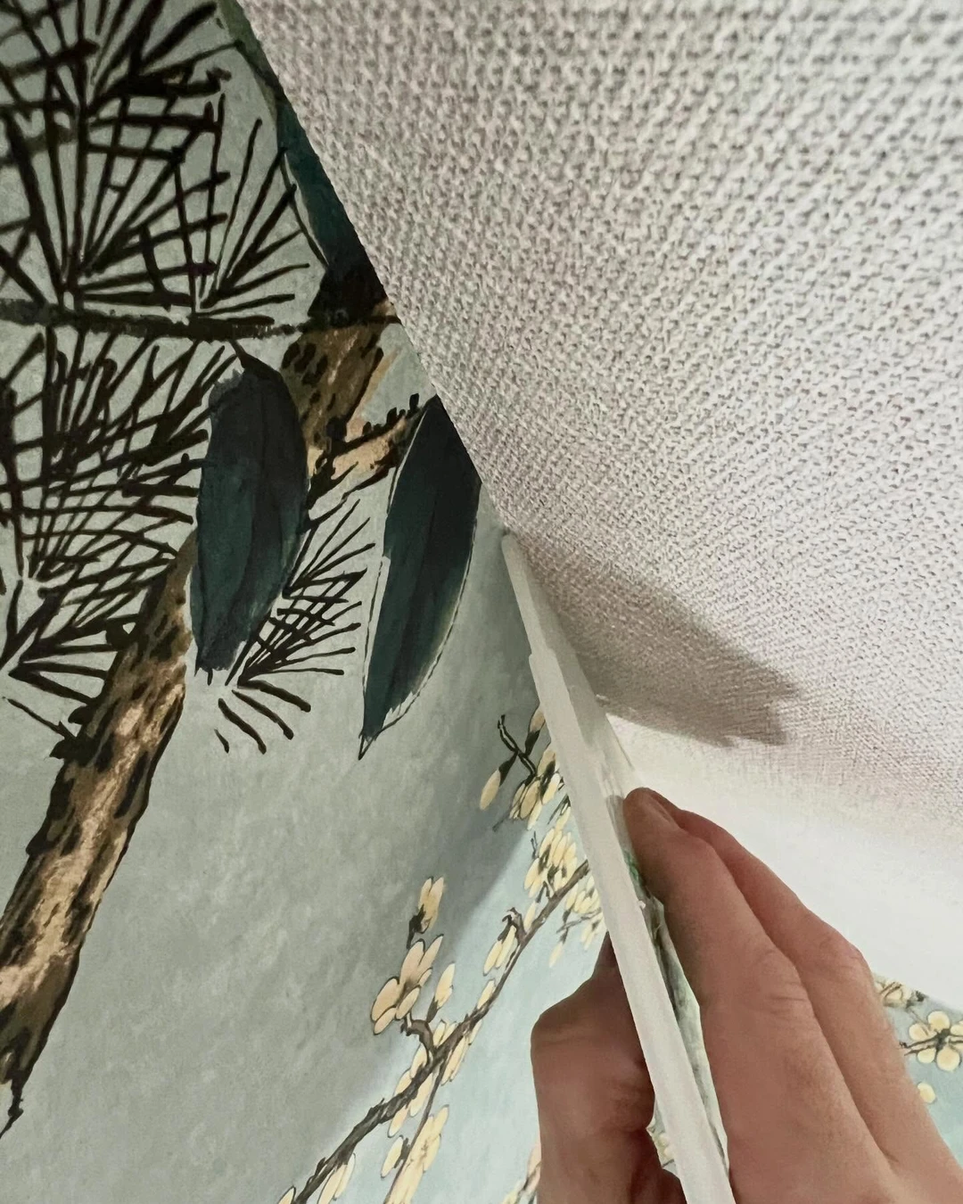
Air bubbles are the single biggest giveaway that a wall was papered in a hurry. Work from the centre of each strip outward with a plastic smoothing tool, pressing firmly and steadily, and chase each bubble to the nearest edge before it sets. Small bubbles can be pricked with a pin and smoothed flat, but a bubble left under the paper will catch the light every single day.
The practical point: smooth as you go, a section at a time, rather than hanging a whole strip and trying to fix it afterwards. Once the adhesive has gripped, a bubble is much harder to move than it was in the first minute.
# Match the Pattern at the Seams
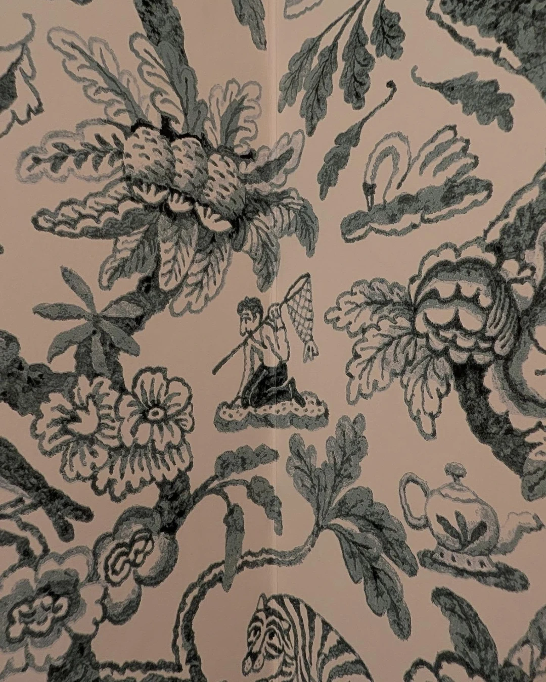
Nothing says cheap faster than a pattern that breaks at the seam — a flower cut in half, a stripe that jumps a centimetre sideways. Every roll has a pattern repeat, and each new strip has to be lined up so the motif continues across the join. Take the time to slide the strip up or down until the pattern meets, even if it means trimming more off the top.
The practical point: this close-up shows a toile pattern matched across an inside-corner seam — the oak leaves, peonies, and even the fisherman with his net continue across the join, so the seam is barely visible. That is the standard to aim for, even though this particular photo comes from a professional installer’s work rather than a peel-and-stick job.
# Trim Cleanly at the Edges
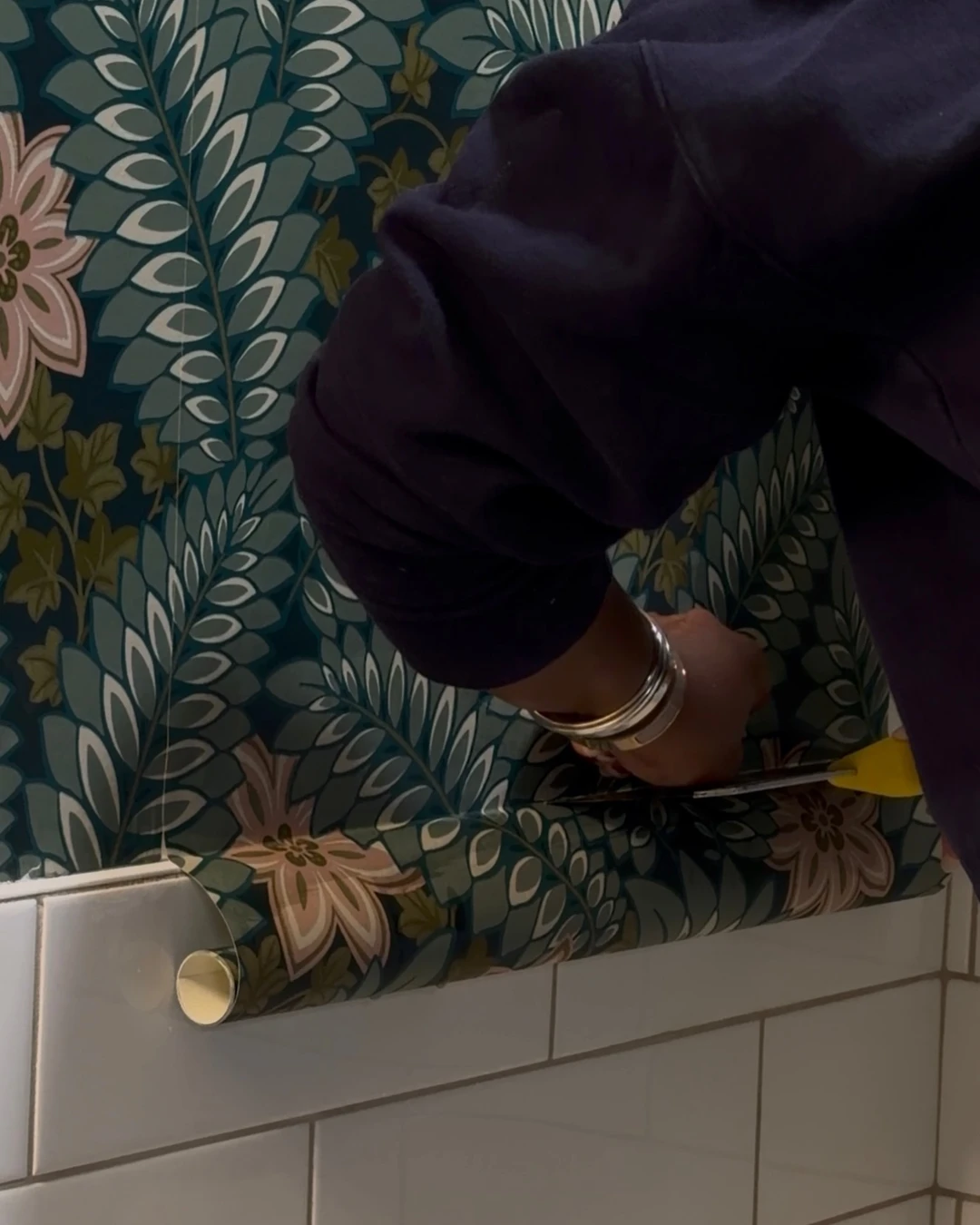
Ragged edges at the ceiling, the skirting, or a door frame undo all the careful work in the middle of the wall. Use a fresh, sharp blade and a straight edge, and change the blade the moment it starts to drag. A single confident cut leaves a crisp line; a sawing motion with a blunt blade leaves a torn edge that no amount of smoothing will hide.
The practical point: here the excess paper is being trimmed where the wallpaper meets white subway tile, the paper curling away cleanly under a yellow utility knife. The same sharp-blade habit applies at ceilings and baseboards — snap the blade often, and never trim with a dull one.
# Wrap It Neatly Around Corners
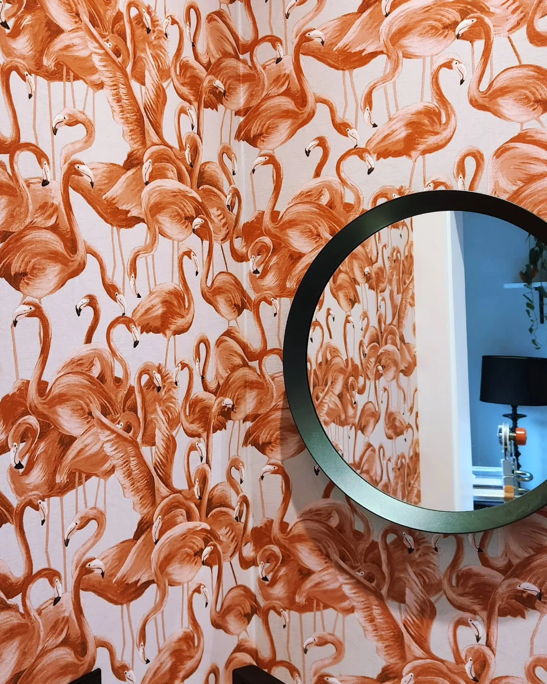
Corners are where peel and stick wallpaper most often betrays itself, because the paper wants to spring back and leave a gap or a crease. The trick is to take the strip a few centimetres past the corner onto the next wall, press it firmly into the angle with a smoothing tool, and then start the next strip from the corner with a small overlap rather than trying to fold one strip around in a single piece.
The practical point: in this photo the pink-orange flamingo paper runs around an inside corner on both walls, the pattern continuing across the angle with no gap and no lift. A corner done this neatly looks intentional; a corner with a visible gap looks unfinished from across the room.
# Keep It to One Accent Wall

Covering every wall in a bold pattern is the fastest way to make a room feel busy and a paper feel cheap. One accent wall — behind the bed, behind the sofa, or on the wall you face when you walk in — gives the pattern room to breathe and makes it look like a deliberate design choice rather than a cover-up. The plain walls around it do half the work of making the paper look expensive.
The practical point: this bedroom has a single green plaid peel-and-stick wall behind the bed, and the other walls are plain. The pattern gets all the attention, and the plain walls make it look like a feature, not a flood.
# Frame It With Moulding or Trim
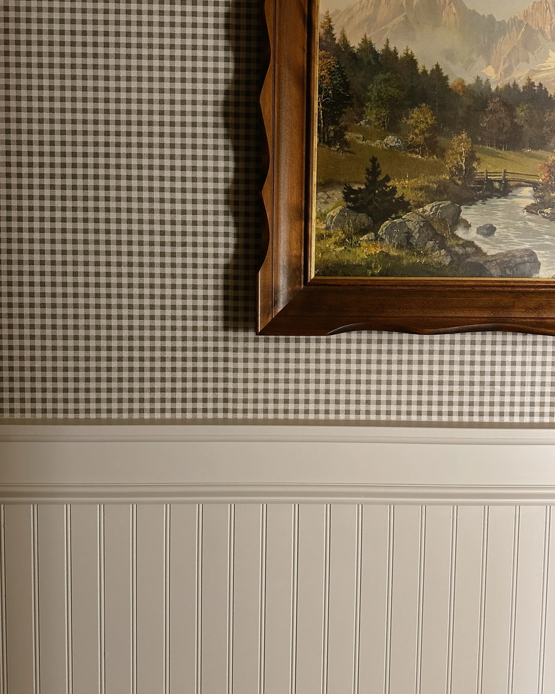
A strip of trim turns a wallpapered wall into a panelled wall. A chair rail, a beadboard wainscot below, or a simple picture-frame moulding over the paper gives the wall architecture — and architecture is what makes a room look custom rather than temporary. The moulding also hides the cut edge of the paper, which is one more place a cheap finish can show.
The practical point: here a small-scale green and white gingham paper sits above a white chair rail and beadboard wainscoting, with a framed landscape painting on top. The trim frames the paper the way a mat frames a print, and the whole wall suddenly looks built-in.
# Match the Pattern Scale to the Room
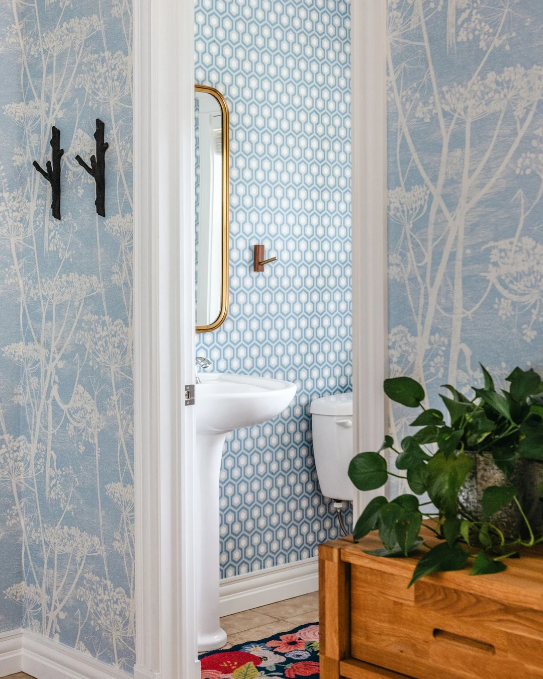
A large, bold motif in a tiny powder room can overwhelm the space, and a tiny, fussy print in a big living room can disappear into nothing. Small rooms suit smaller-scale patterns, and large rooms can carry a big, confident print. Getting the scale right is one of those invisible decisions — nobody notices it when it works, and everyone feels it when it does not.
The practical point: this small powder room wears a small-scale blue and white geometric paper, and it fits the room the way a tailored jacket fits. Through the doorway you can even see a larger-scale botanical print on the next wall — the contrast shows exactly why scale matters.
# Pick Colours From the Room, Not the Roll
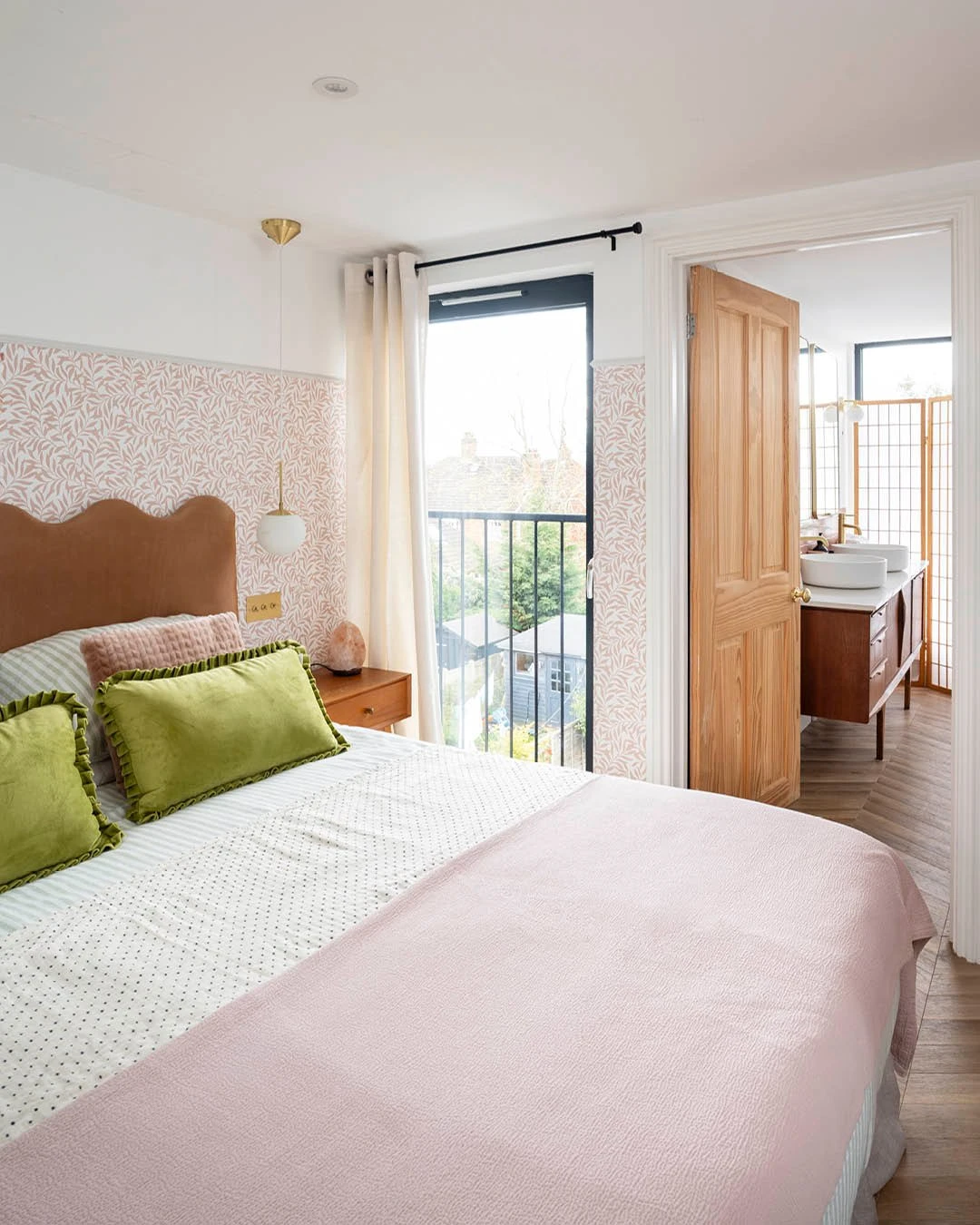
The most expensive-looking wallpaper is the one that looks like it was chosen for the room it is in. Pull your colours from what is already there — the sofa, the bedding, the rug, the art — and choose a paper that repeats one or two of those colours. A paper that matches nothing in the room will always look like it was bought on impulse, however pretty the roll was.
The practical point: in this bedroom the pink and white leaf paper covers the lower half of the wall behind the bed, and the pale pink blanket picks up the pink in the paper while green velvet pillows echo the leaves. The room and the paper are talking to each other, and that conversation is what makes it look considered.
# Light the Wall the Right Way
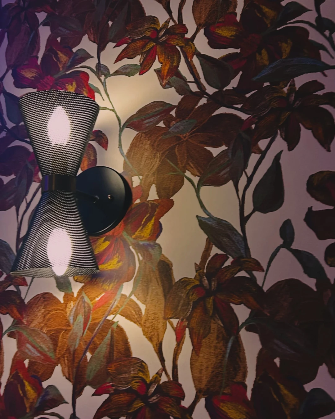
Wallpaper lives or dies by its lighting. A flat overhead light washes out texture and flattens pattern, while a warm sconce or a picture light raking across the surface brings the texture forward and makes the colours glow. If the paper has any texture at all, it needs light from an angle to show it.
The practical point: a double-headed black mesh sconce throws warm light up and down across a vibrant floral paper here, and the glow is doing as much work as the pattern. Before you judge a paper, look at it under the light it will actually live with.
# Use It on Furniture and Built-Ins Too
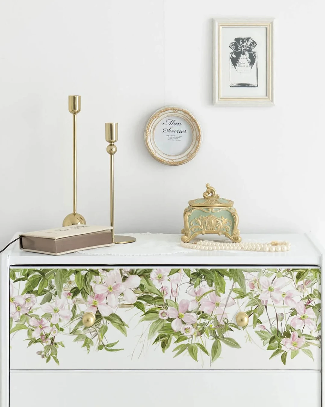
Peel and stick paper does not have to stop at the walls. A strip on the back of a bookshelf, a drawer front, or the inside of a cabinet door gives a piece of furniture the same custom treatment as the wall, and it ties the room together. It is also the cheapest way to practise — a drawer front is a much smaller commitment than a whole wall.
The practical point: only the top drawer of this white dresser is covered, in a peel-and-stick tape with a pale pink clematis print, and that small amount of pattern is enough. A little pattern on furniture goes a long way — covering every surface would undo the effect.
# Seal the Edges So Nothing Peels
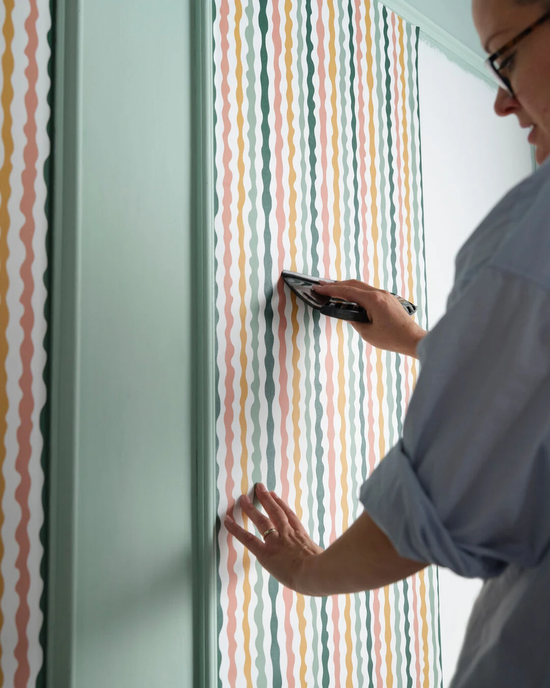
A peeling corner is the one flaw nobody can ignore, because the eye goes straight to it. Once every strip is up, go back over every edge — top, bottom, and seams — and press it firmly into place with a smoothing tool so the adhesive makes full contact. In a bathroom or kitchen, where steam and humidity work against the adhesive, this step matters twice as much.
The practical point: the photo shows the smoothing tool in use during application, pressing colourful striped paper firmly onto the wall near a door frame. Think of it as the final pass, not an afterthought: firm pressure at the edges is what keeps the paper on the wall for years instead of months.
# Hide the Seams With Decor
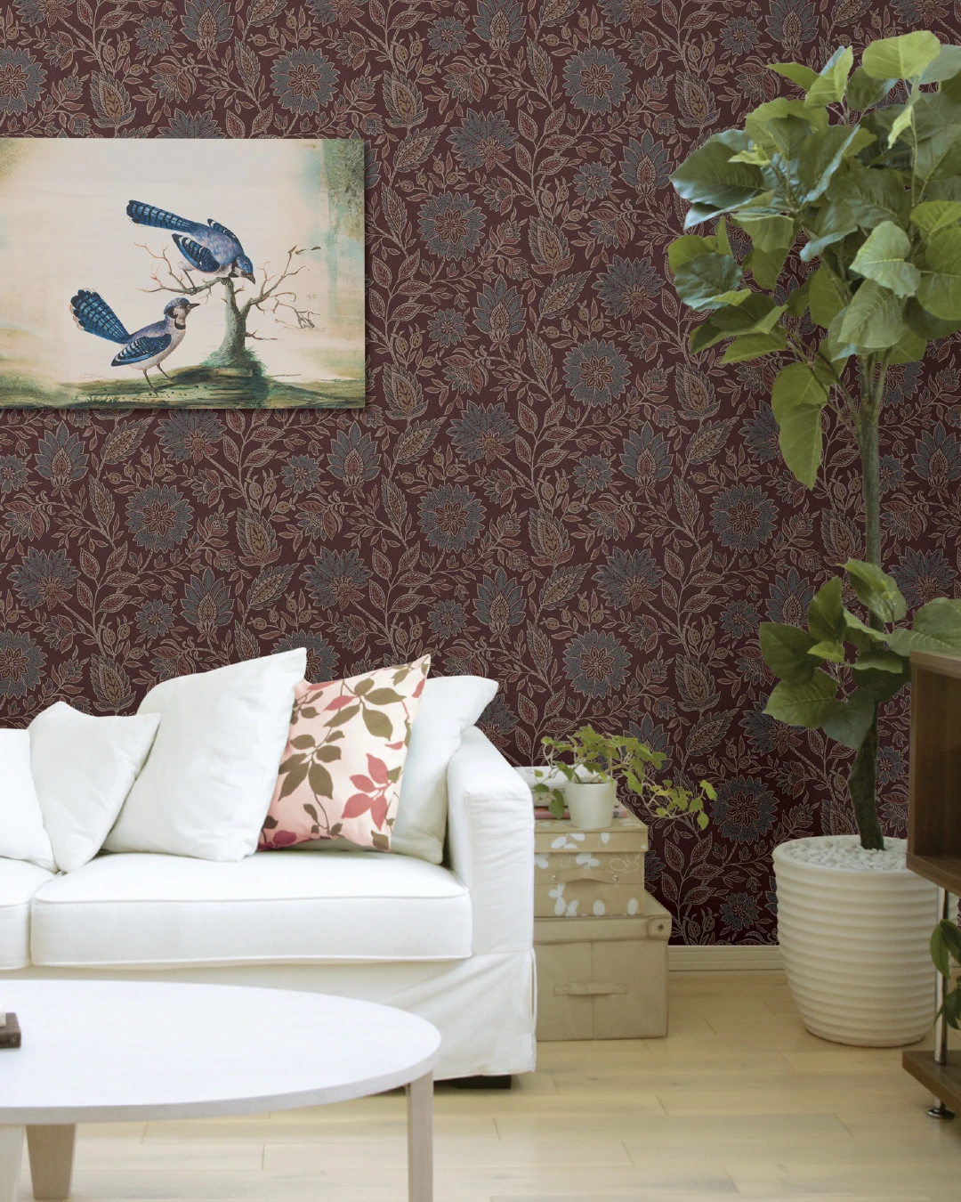
Even a well-matched seam is still a seam, and the easiest way to make it disappear is to put something beautiful in front of it. A framed print, a mirror, or a tall plant placed over a join breaks the line and gives the eye something better to look at. This is not cheating — it is styling, and every designer does it.
The practical point: on this burgundy floral wall, a large blue-jay art print hangs where a seam would run, and a tall green plant in a white pot stands at the side. The art and the plant are not hiding a mistake; they are finishing the wall.
# Step Back and Style the Whole Wall
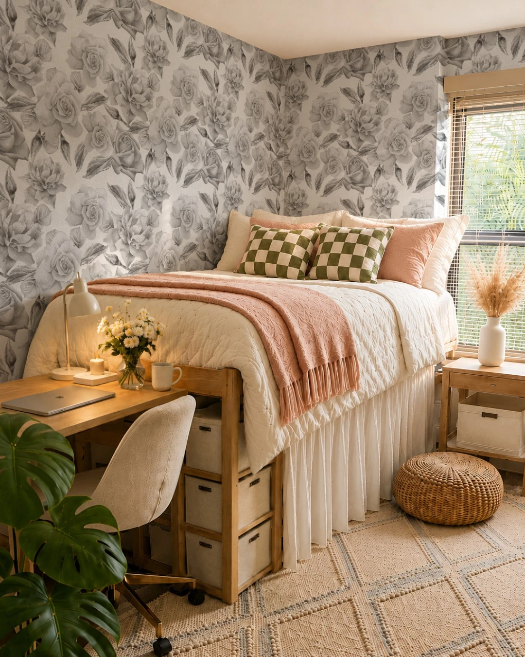
The last step is the one that has nothing to do with wallpaper. Once the paper is up, style the wall as a whole — the bed or sofa against it, the art on it, the lamp beside it, the textiles in front of it. A wallpapered wall with bare furniture in front of it still looks like a work in progress; the same wall with the room finished around it looks like a design.
The practical point: this dorm bedroom has two walls of large-scale rose floral peel-and-stick paper, and the room is finished around it — lofted bed, lit desk lamp, monstera plant, pouf and rug. The paper is only one ingredient, but it is the ingredient that makes the whole room feel put together.
Let the Paper Do the Talking
Expensive-looking peel and stick wallpaper is not about spending more on the roll. It is about choosing a paper with real texture, prepping the wall properly, hanging it straight, matching the pattern, trimming cleanly, and then styling the room so the paper looks like it belongs. Do those things, and nobody will ask whether it peels off — they will ask where you found it. If you want more ideas for walls with real texture, Modern Textured Wall Designs for a Sophisticated, Timeless Home shows how texture works on a larger scale.