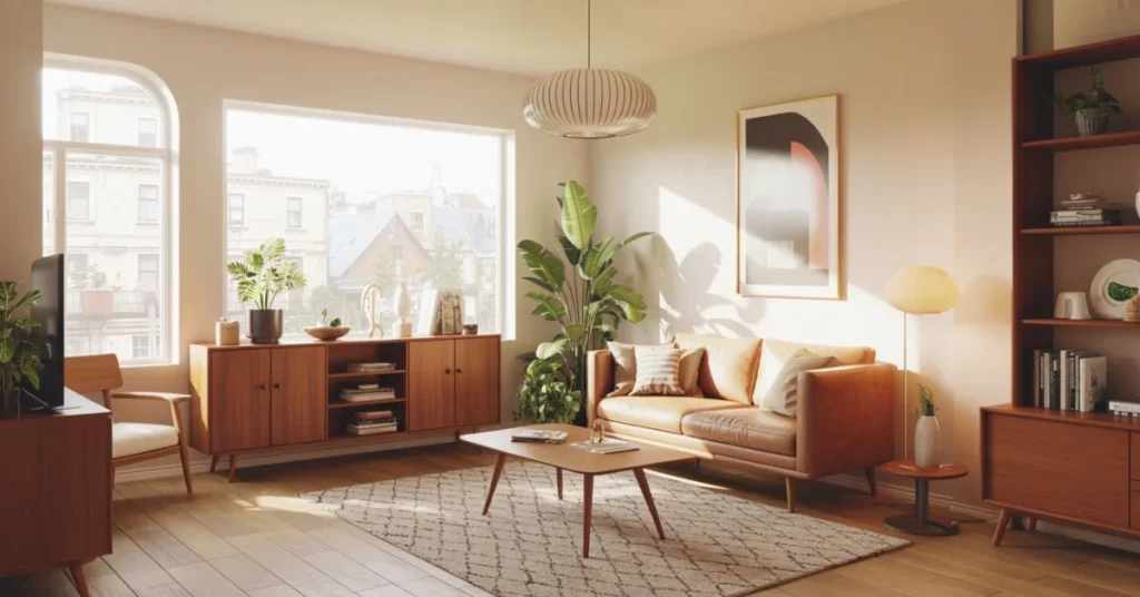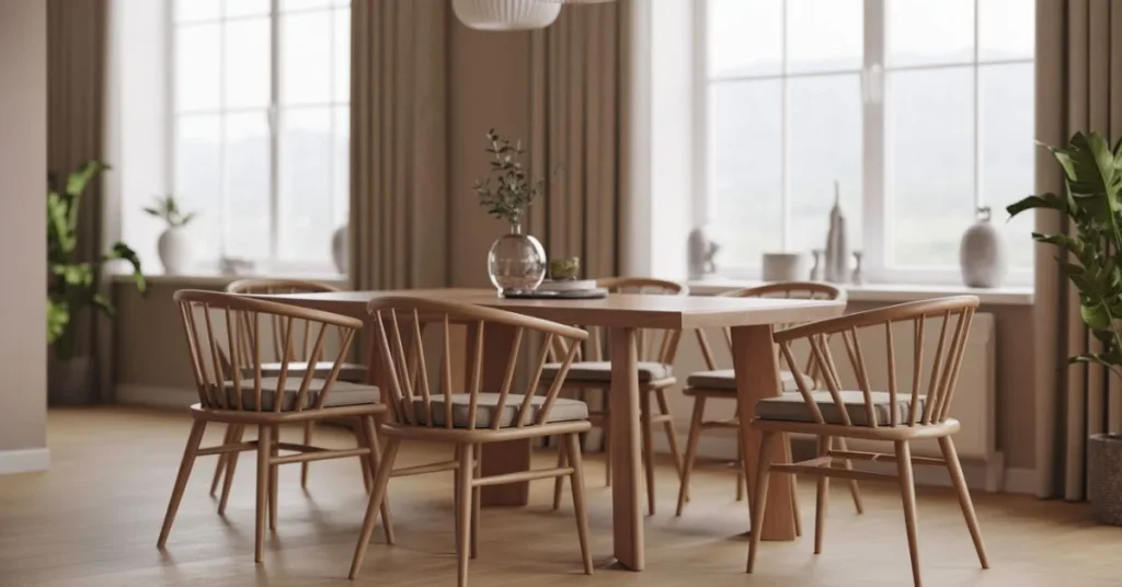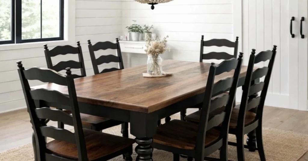
A Joanna Gaines dining room never shouts and you do not need a farmhouse, a big budget, or a matching furniture set to get that feeling.
Joanna Gaines built her look on Fixer Upper, the HGTV show she hosted with her husband Chip. Her dining rooms mix shiplap, warm wood, and vintage finds, and they always look lived in rather than staged.
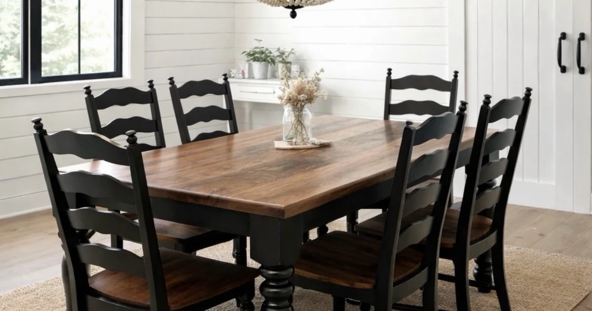
Her dining rooms are the warmest version of modern farmhouse. White walls, a scarred wood table, chairs that do not match, and one big chandelier, with greenery and candles that keep the room from feeling brand new.
Picture a long wood table under a beaded chandelier, mismatched chairs pulled up close, and a sideboard full of dishes you actually use. None of it is fussy, and all of it is easy to copy one detail at a time.
These 13 design details from Joanna Gaines dining rooms explain why the look feels so calm, with a photo for every detail and a practical point at the end of each one.
Wood Table That Shows Its Age
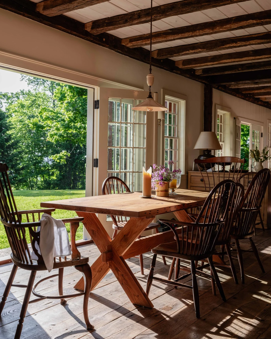
A wood table that shows its age is the heart of a Joanna Gaines dining room, and this one could not make the point clearer. The table is a reclaimed-chestnut sawbuck table with an X-trestle base, and the grain, the knots, and the wear are all on display. Windsor chairs sit around it, dark ceiling beams cross overhead, and French doors open onto a green lawn, with a tall candle and purple wildflowers on the table. The table in this photo comes from a reclaimed-wood furniture maker, and it is the reclaimed chestnut itself — not the styling around it — that carries the room. Sunlight falls across the wood floor, and the whole room feels warm because the table looks like it has already lived a long life. The practical point: buy the table for its wear, not despite it, because a new table that pretends to be old never fools anyone, and a genuinely worn one sets the tone for everything else in the room.
Mismatched Chairs That Still Match
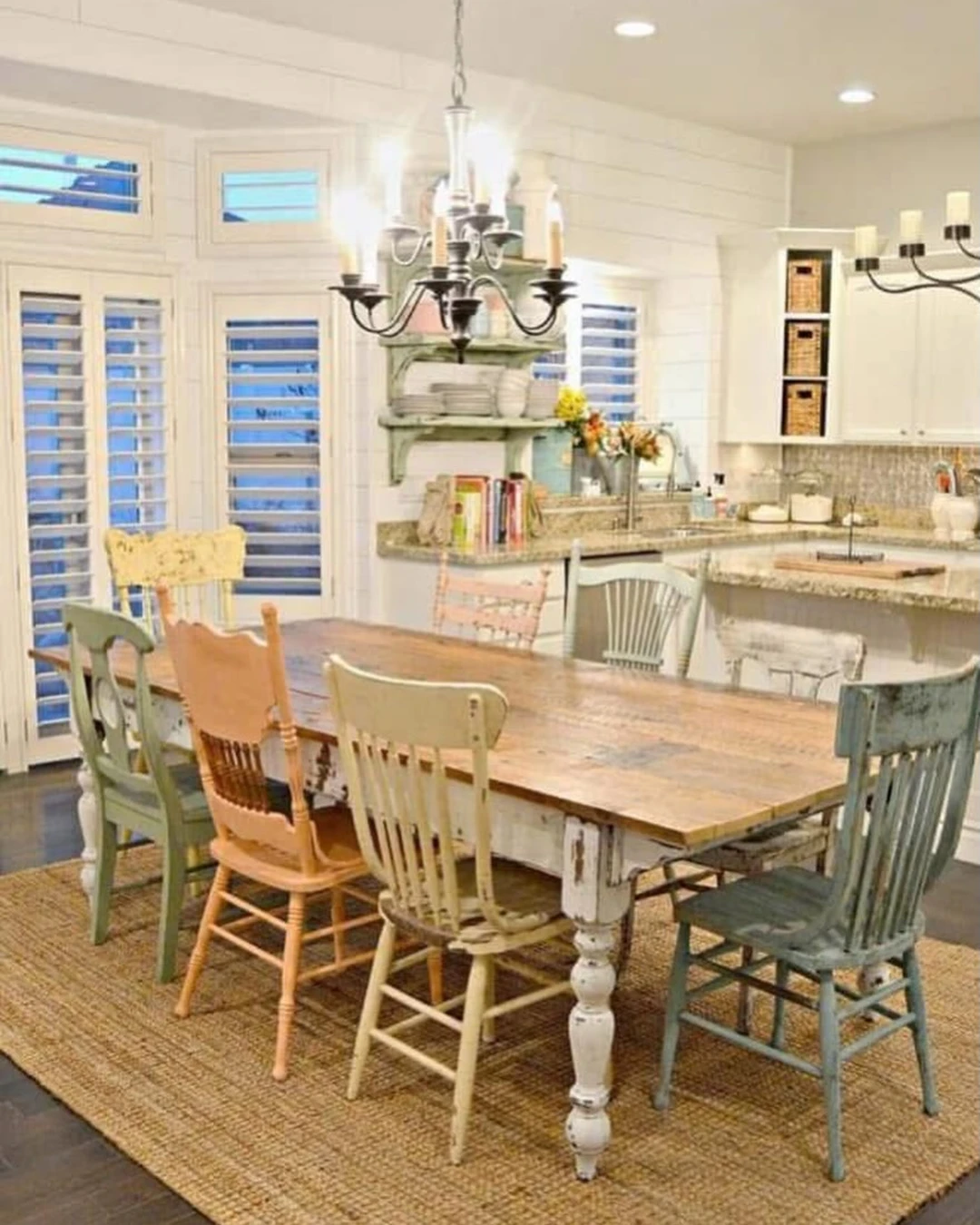
Mismatched chairs are the easiest way to make a dining room feel collected instead of bought in one trip, and here seven of them sit around one table. The chairs come in pastel shades — green, peach, cream, pink, and blue — and every one is a different vintage shape, from a spindle back to a slatted seat. The table itself is wood with a distressed white base, and a jute rug, a black chandelier, shiplap walls, and plantation shutters hold the room together. The kitchen sits just beyond the table, so the chairs belong to an open kitchen-dining space rather than a formal room. What keeps the mix from looking random is the shared wear: every chair is painted, chipped, and softened in the same way. The practical point: keep one thing the same across all the chairs — the same wood tone, the same seat height, or the same worn paint — because one shared thread turns a jumble into a set.
Linen Tablecloth, Never a Stiff One
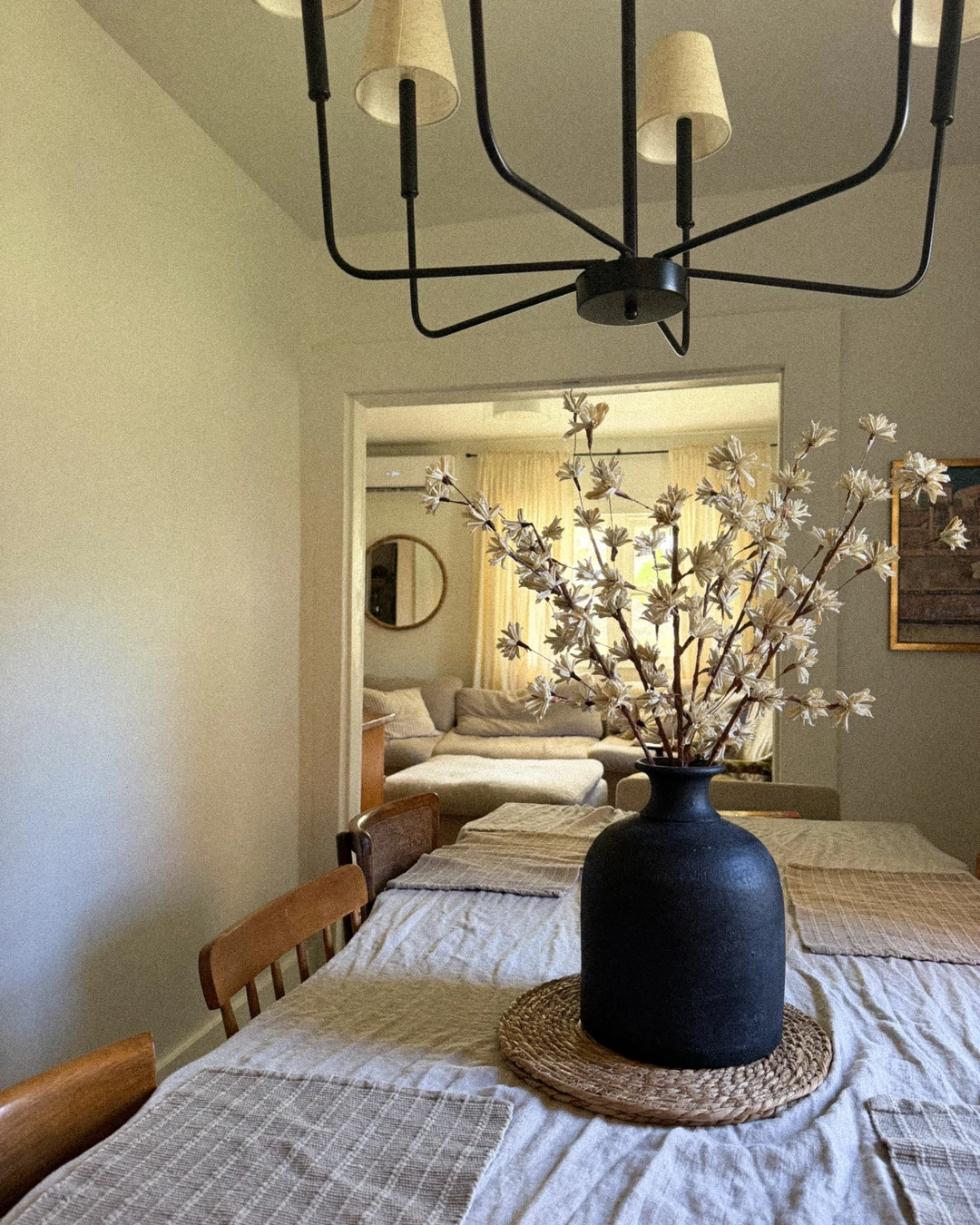
A linen tablecloth should look soft, and this one does — wrinkled, relaxed, and clearly never ironed flat. The natural linen cloth covers the table with woven placemats on top, a black vase of dried flowers in the middle, and wooden chairs pulled up on both sides. The cloth in this photo is a thrifted linen find, and the wrinkles are the whole point: they are what make it read as linen instead of cotton. A black chandelier hangs overhead, cut off at the top of the frame, and through the doorway behind the table you can see the living room sofa, so this is a dining table in an open-plan home rather than a closed-off room. The cloth drapes instead of sitting stiff, and that softness is what makes the table feel inviting. The practical point: choose real linen and never iron it flat, because a pressed tablecloth looks like a restaurant, and a wrinkled one looks like home.
One Big Chandelier, Nothing Else Overhead
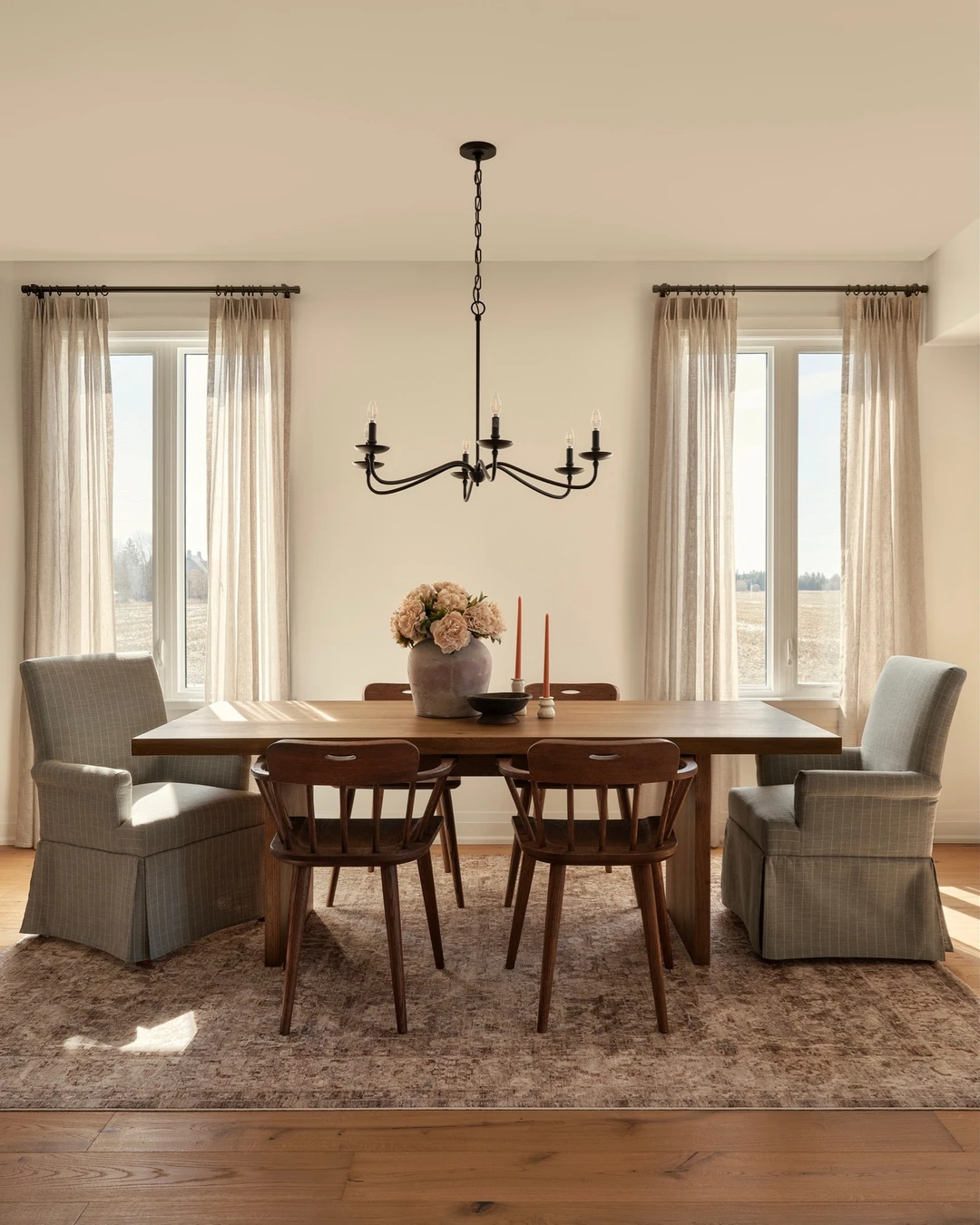
One big chandelier is all a Joanna dining room needs overhead, and this photo proves it. A single black metal chandelier hangs centred over a wood table with six chairs — two upholstered armchairs and four wooden ones — with peonies in a vase, orange taper candles, linen curtains, and bright windows around it. There is no second fixture, no row of pendants, and nothing else competing for attention above the table. The chandelier is the subject of the room, and because it stands alone, it reads as a statement instead of a light. The style here is minimal modern farmhouse rather than rustic, but the rule is the same: one fixture, hung with confidence. The practical point: hang the chandelier low enough to light the table and high enough to see across it, because a fixture that hangs too high lights the ceiling, and one that hangs too low blocks the conversation.
White Walls That Let the Wood Speak
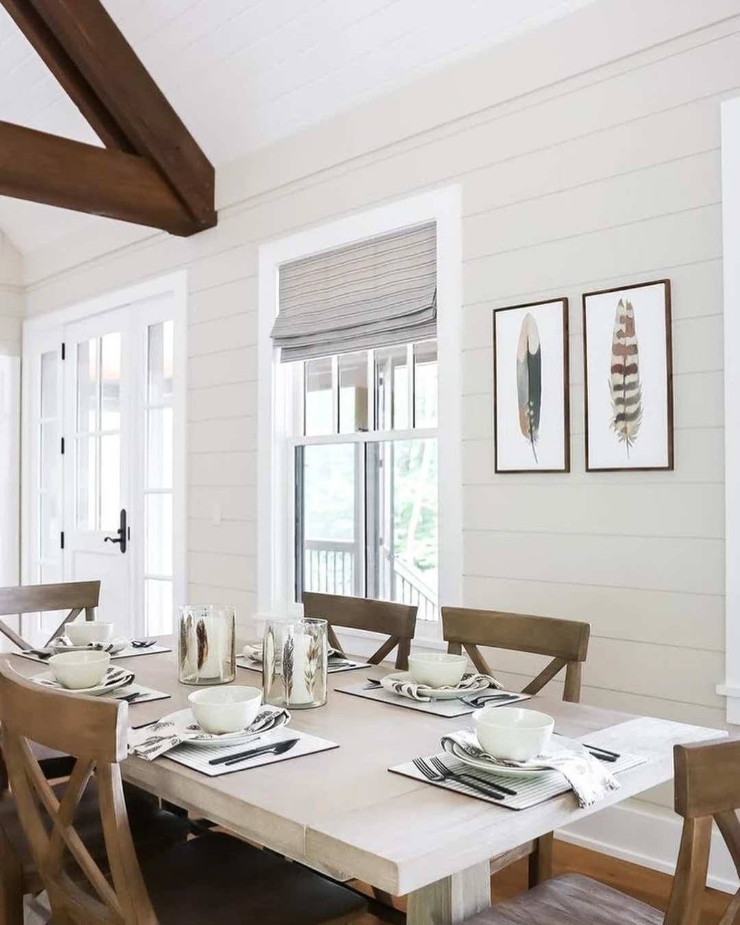
White walls are the quiet base of the Joanna look, and this room shows exactly what they are for. White shiplap covers the walls, a dark wood ceiling beam crosses above, and a light-washed wood table set for six sits in the middle, with white bowls, striped placemats, and feather-print hurricane candle holders. Wooden cross-back chairs, two framed feather artworks, French doors, and a window with a striped roman shade fill out the room. The wood here is light-washed rather than deep rustic brown, so the white walls and the pale table speak in the same soft register. Nothing on the walls competes with the table, and that is the point: the white is a backdrop, not a feature. For help picking the right white for your walls, see Popular Sherwin Williams Colors That Never Go Out of Style. The practical point: pick a warm white, not a bright white, because a cold white makes wood look grey, and a warm white lets the grain glow.
Built-In Hutch Full of Everyday Dishes
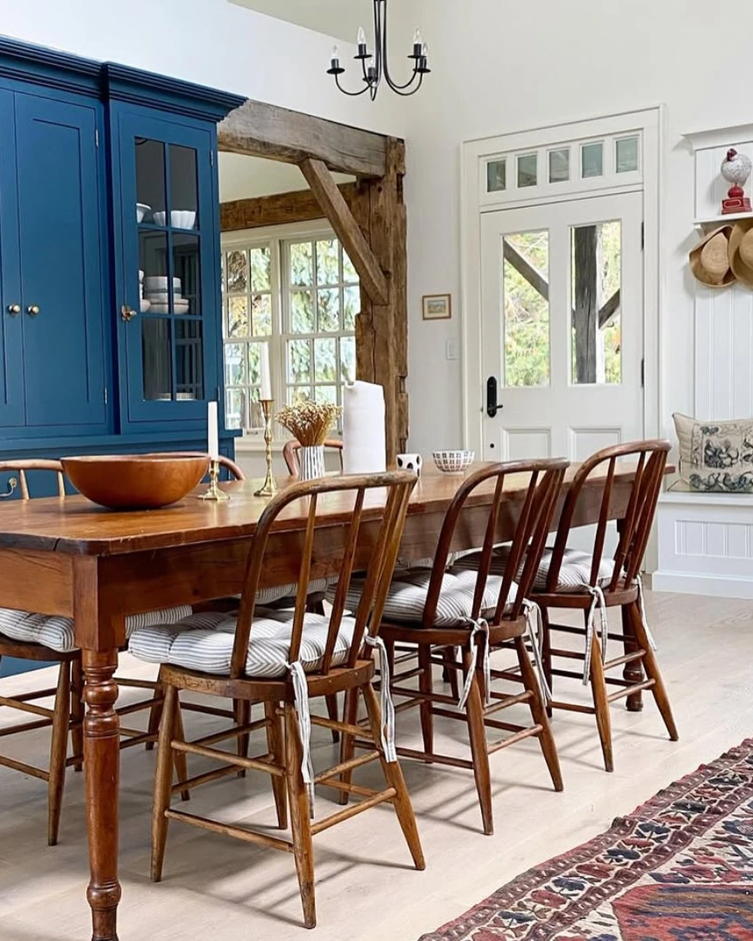
A built-in hutch full of everyday dishes is the most Joanna detail in this whole article, and this one is a true built-in. The cabinet is painted a deep blue, with glass-front doors showing white dishware on the shelves, and it runs past the left edge of the frame — you see most of it, not all of it, which is how a real built-in looks in a real room. A wooden table with Windsor chairs sits in front of it, with exposed timber beams, a door with glass panes, a red rooster figure on the shelf, and hats hanging on the wall. The blue is a strong colour note against the white walls, and it works because everything else in the room is quiet: pale wood, white walls, and plain dishes. The hutch holds the pieces the family actually uses, not a display set. The practical point: keep everyday dishes in the built-in and special pieces somewhere else, because a hutch full of things you never touch is a museum, and one full of daily dishes is a kitchen that works.
Slipcovered Chairs You Can Actually Sit On
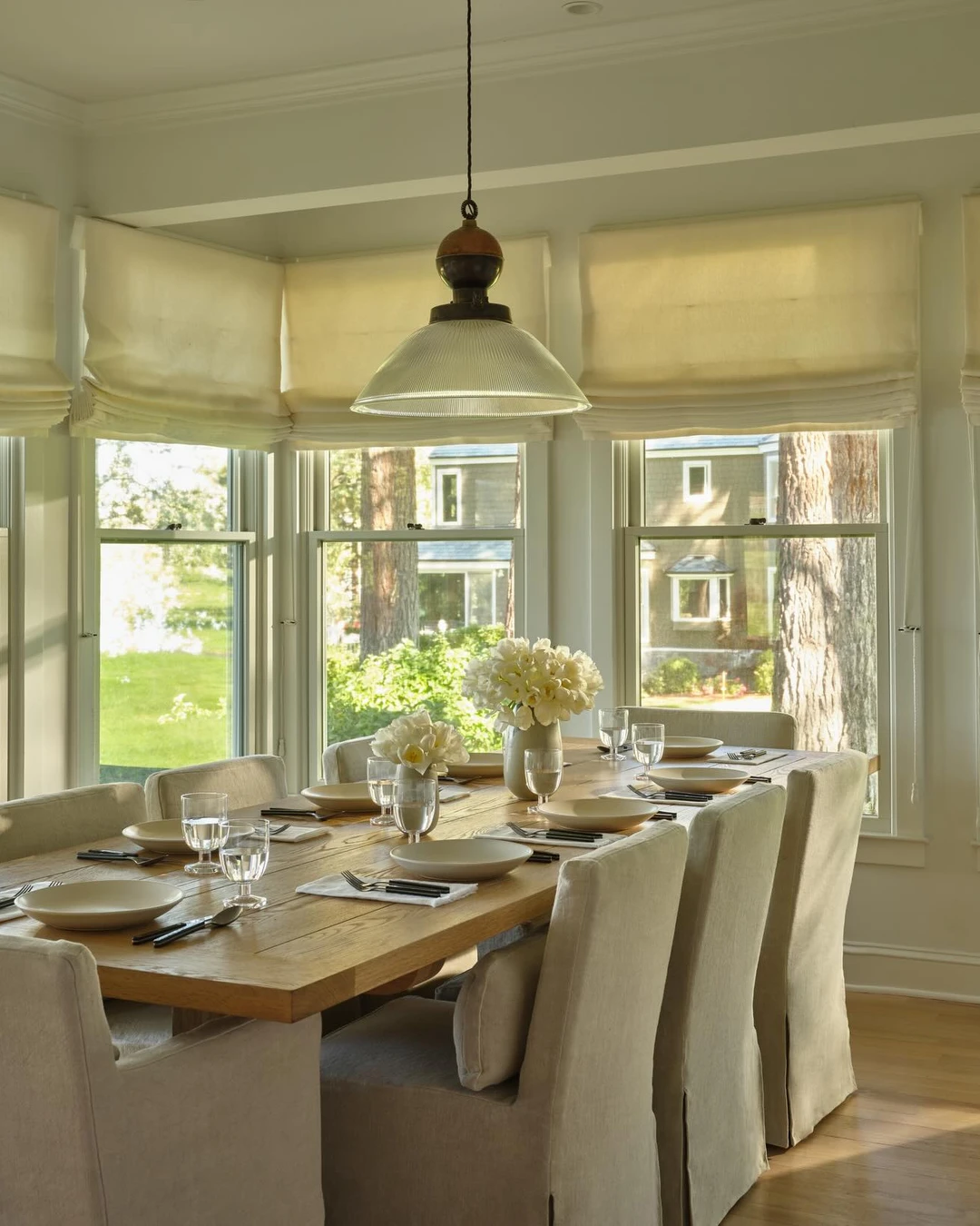
Slipcovered chairs only work if people actually sit on them, and these eight do the job. A long wooden table is set for eight with cream slipcovered parsons chairs, and the loose linen covers with skirted bottoms are clearly visible on every chair — the seams, the skirts, and the soft drape are all plain to see. Bright bay windows with cream roman shades run behind the table, with white flowers in vases and a large glass pendant overhead. The covers look comfortable rather than precious, which is the whole idea: a slipcover is meant to be lived on, washed, and put back. The room is bright and calm, and the chairs are the reason it feels that way. The practical point: choose washable linen covers in a light colour, because a slipcover you are afraid to sit on is just upholstery, and one you can wash is furniture you actually use.
Greenery Down the Centre of the Table
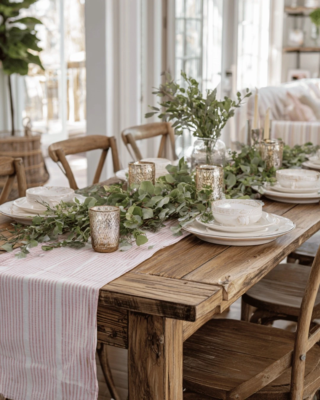
Greenery down the centre of the table is the simplest centrepiece in the Joanna playbook, and this one runs the full length of the table. A long eucalyptus garland lies down the middle of a rustic wooden table, over a pink-and-white striped runner, with mercury-glass candle holders, white plates and bowls, and wooden cross-back chairs on both sides. Bright windows sit behind the table, and a striped sofa is visible in the next room, so the greenery belongs to a lived-in house rather than a styled set. The garland is the only decoration on the table: no flowers, no fruit, no extra pieces competing with it. One long line of green is all it takes. The practical point: use one garland and nothing else down the centre, because three small centrepieces split the table into pieces, and one long line pulls the whole table together.
Black Accents in Small Doses
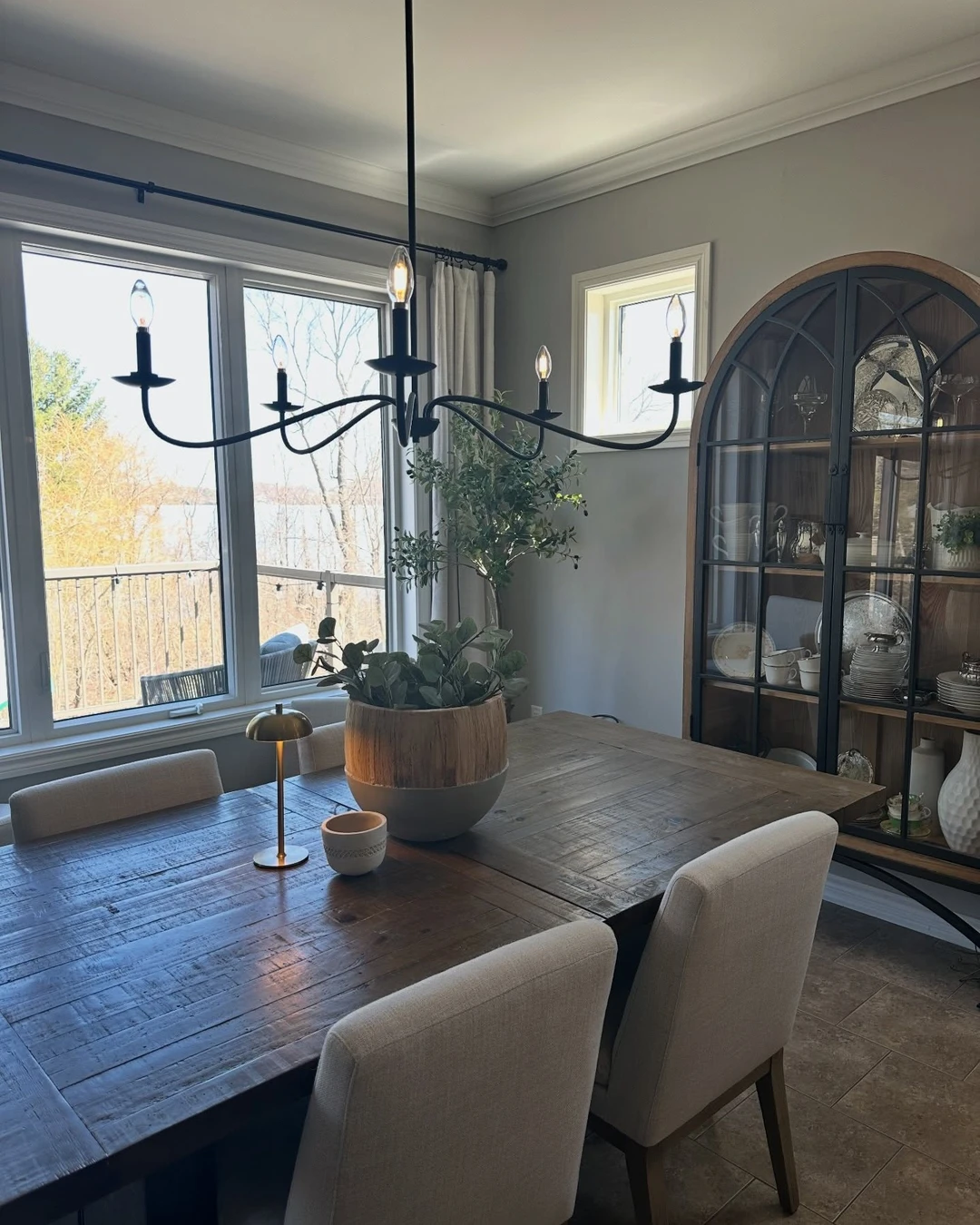
Black accents work in a farmhouse dining room only when they stay in small doses, and this room gets the balance right. A large black six-arm chandelier hangs over a dark wood table with light upholstered chairs, and the second dose is a black-framed arched glass china cabinet with dishes on the right, plus a black curtain rod. Bright windows with a lake view and grey walls keep the room light, so the black reads as punctuation, not as the main colour. The room leans a little more transitional than classic farmhouse, but the rule holds in any version of the style: black is an accent, never the base. The practical point: repeat the black twice and stop there, because black in one place looks accidental, black in two places looks deliberate, and black in five places takes over the room.
Rug That Grounds the Table
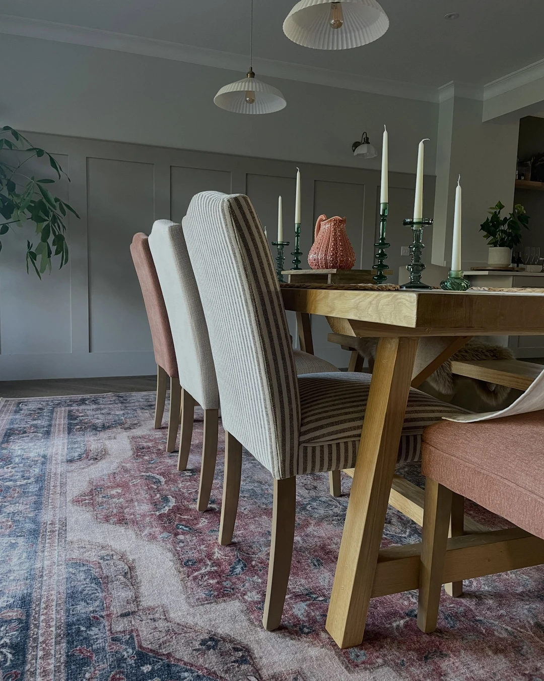
A rug grounds a dining table when it is big enough to hold the whole setting, and this one does exactly that. A large vintage-patterned rug in muted reds, blues, and creams fills the lower half of the frame under a light-wood table, with mismatched upholstered chairs in stripes and dusty pink around it. Paneled walls, two white pleated pendants, a terracotta pitcher, and green-glass candlesticks finish the room. The rug is unmistakably the subject of the photo: its pattern is busy by nature, but that is the point of the detail — the rug is what makes the table feel settled instead of floating on bare floor. The colours are all muted, so the pattern adds warmth without shouting. The practical point: size the rug so the chairs stay on it when they are pulled out, because a rug that ends under the table legs looks like a mat, and one that catches the chairs looks like part of the room.
Vintage Finds on the Sideboard
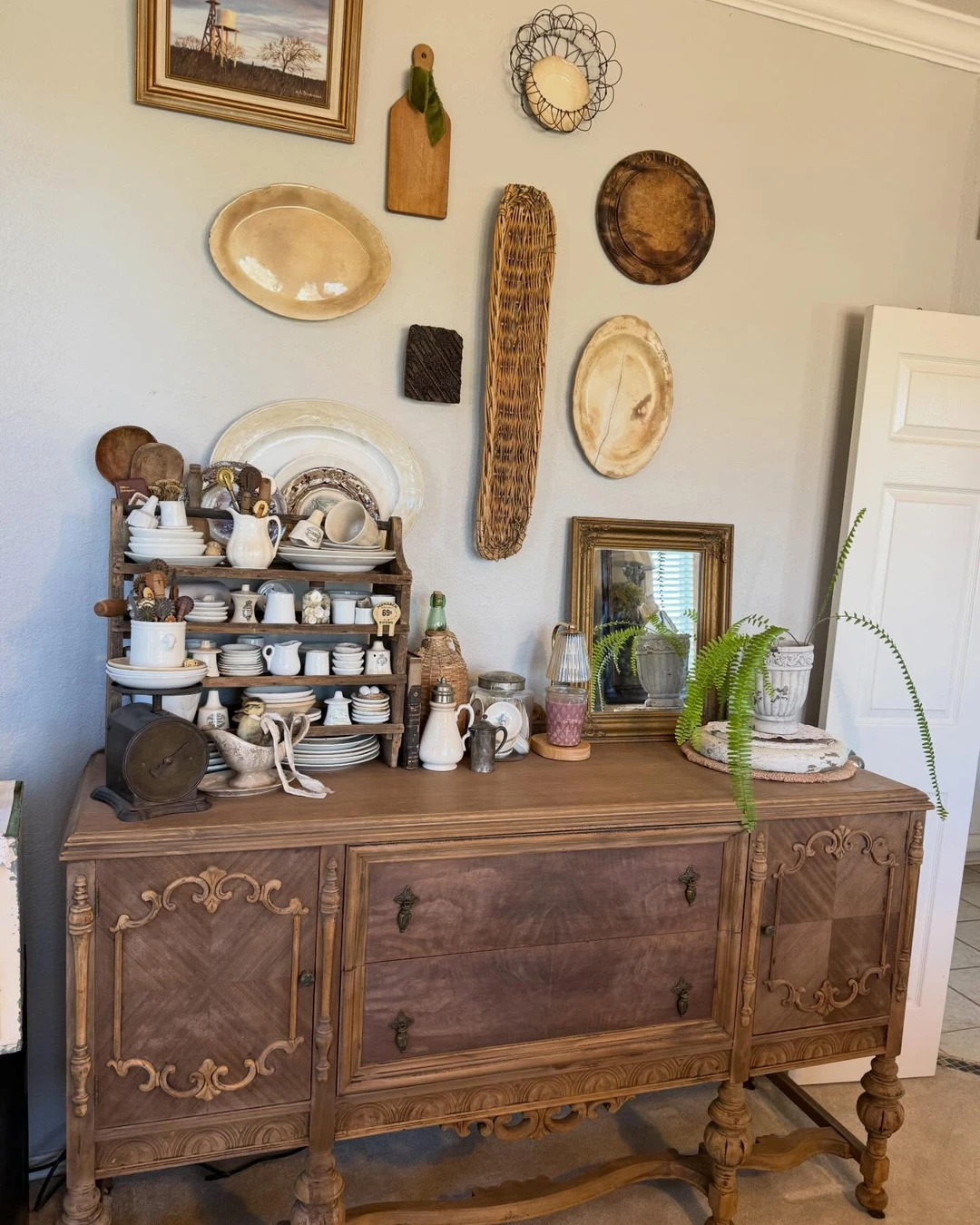
Vintage finds belong on the sideboard, and this one is styled the way Joanna styles hers: densely, and with pieces that look collected over years. An ornate carved-wood sideboard holds a tiered wooden plate rack full of white ironstone dishware, pitchers, cups and plates, an old kitchen scale, bottles, a small gilt mirror, and a fern in a stone urn. Above it, a gallery wall of antique plates, a windmill landscape painting, cutting boards, and baskets fills the wall. Every piece looks like it arrived at a different time, and that is the whole idea: the sideboard is a collection, not a set. Nothing here is new, and nothing here matches, but the white ironstone ties it all together. The practical point: group the finds by material rather than by size, because ironstone with ironstone and wood with wood looks collected, and a row of same-sized pieces looks like a shop shelf.
Candles, Not Clutter
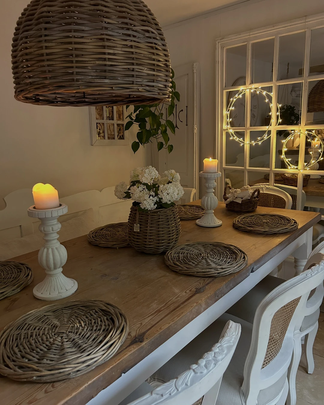
Candles, not clutter, is the rule for a Joanna table, and this evening shot shows why two candles beat ten. Two lit pillar candles on white candlesticks glow on a rustic wood table, with wicker placemats, a basket of white hydrangeas, and a large wicker dome pendant above. Fairy-light rings glow on the mirrored windows behind the table — plain warm-white light rings, not Christmas decor — and they add to the evening mood without adding clutter. The table holds almost nothing else: no runner, no extra dishes, no scatter of small objects. The candles are the decoration, and the empty wood around them is what makes them stand out. The practical point: put two candles on the table and leave the rest of the wood bare, because a table crowded with decor leaves nowhere for the candles to glow, and an empty table makes two flames feel like plenty.
Windows Left Bare (or Nearly)
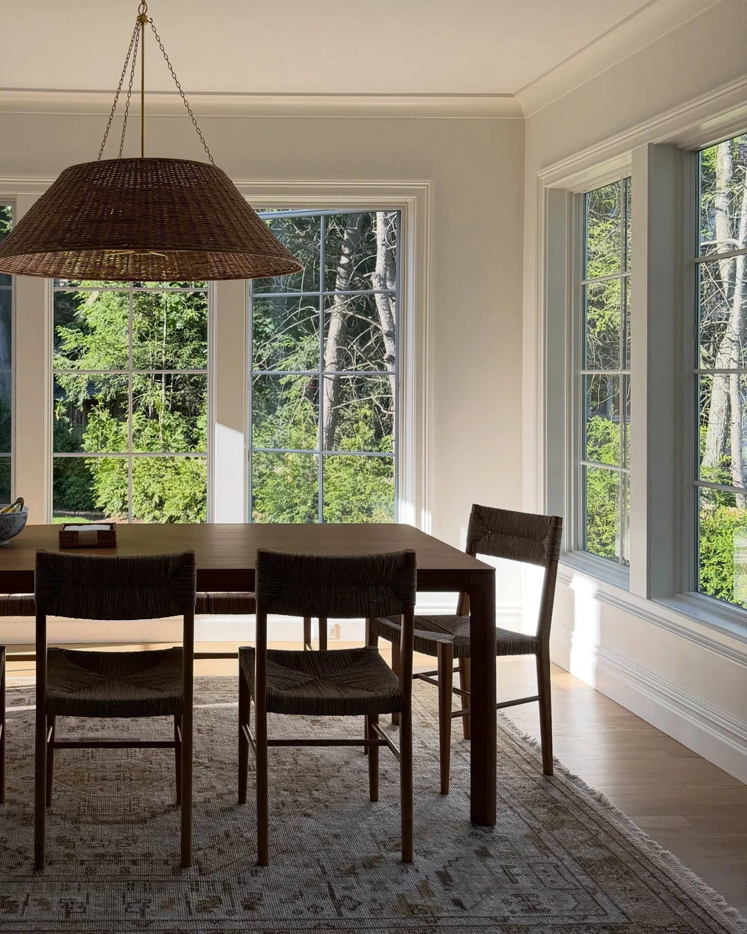
Windows left bare are the boldest choice in a Joanna dining room, and this room makes the case for them. Large multi-pane windows cover two walls, completely bare — no curtains, no shades, no blinds — with green trees and sunlight streaming in. A dark-wood table, woven rope chairs, a big wicker pendant, and a muted rug fill the room, and the windows and the light are the dominant subject of the photo. This is a cleaner, more modern take on the look than the rest of the article — the same bare windows, fewer layers — but the natural materials keep it in Joanna’s orbit. The view does the decorating here, and nothing on the glass gets in its way. The practical point: leave windows bare only where the view earns it, because bare glass onto a fence looks unfinished, and bare glass onto trees looks like a picture you did not have to hang.
The Room Works Because Nothing Tries Too Hard
A Joanna Gaines dining room works because nothing in it tries too hard. The table is worn, the chairs do not match, the walls are white, and the windows are bare — and the room is calm because every detail is doing one simple job. Start with the detail that fits the dining room you already have: the rug under the table, the candles instead of clutter, or the one big chandelier. Add the next detail when the right piece turns up, and let the room grow the way these rooms did — slowly, and one honest piece at a time. If you love this style in the rest of the house too, see The Design Details That Define Joanna Gaines Kitchens for the same look in the kitchen. A dining room that grows slowly looks more like home than one that arrives all at once.