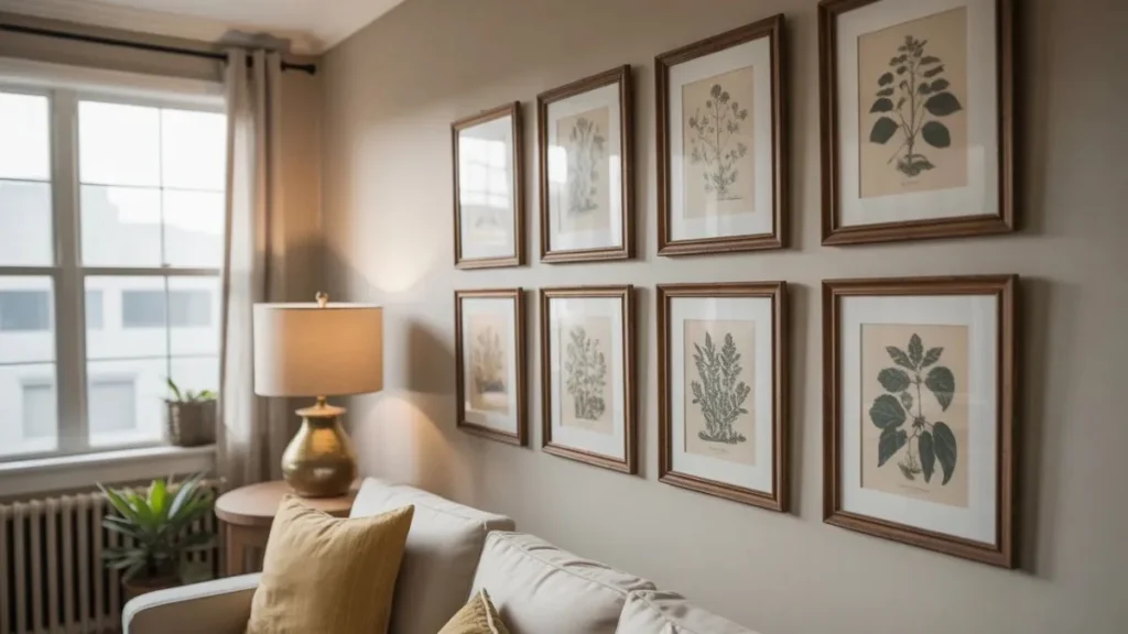
A blank wall is either a missed opportunity or your next favorite thing in the room — and a botanical gallery wall is one of the fastest ways to make it the latter. Nature-inspired art has a way of grounding a space, softening hard edges, and making a room feel like it was designed rather than just furnished.
The tricky part? Getting it to look intentional. Without a few key styling moves, even the most beautiful prints can end up looking like a random collection of frames. These tips are here to fix that — and turn your wall into something that genuinely looks like art.
Choose Your Art Style First
The foundation of any great botanical gallery wall is the art itself — and not all botanical art is the same. Knowing which style speaks to you makes every other decision easier.
Vintage botanical illustrations are the most popular pick right now. Think 18th-century engravings with detailed linework, sepia tones, and Latin plant names printed below each specimen. They carry an instant sense of history and look beautiful in everything from cottagecore rooms to modern farmhouse spaces.
Watercolour botanical prints feel looser and softer, with washes of green, blush, and ivory bleeding together. They suit spaces that lean romantic, airy, or Scandinavian.
Minimalist line art — single-stroke plant outlines on white or cream backgrounds — works best in contemporary or urban loft interiors where you want nature without the visual noise.
Before you buy a single frame, settle on one style. Mixing two or three botanical art styles can work, but mixing four usually doesn’t. Decide your direction, then source art within that lane.
Pick a Frame Strategy That Actually Works
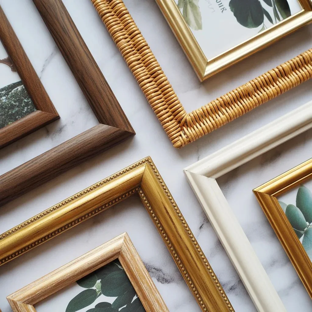
Your frames are the visual architecture of your botanical gallery wall. They determine whether the whole thing reads as curated or chaotic.
Matching frames create a grid-style gallery wall that looks neat, formal, and editorial. This approach works especially well when you have a large collection of similarly sized prints — think six to twelve matching black or dark wood frames in a precise arrangement.
Complementary frames use a shared finish (all wood tones, all metallics, all white) but allow for variation in shape and size. This is the sweet spot for most home decorators. The collection feels cohesive but not rigid.
Eclectic frames mix finishes, materials, and styles intentionally. This works only when you have a strong unifying element elsewhere — a consistent color palette in the art, or a repeating mat colour that ties everything together.
Natural materials — rattan, bamboo, raw wood — have become the go-to for botanical gallery walls in 2025, reinforcing the nature theme at the frame level and not just the print level.
One practical tip: hang each frame with two nails rather than one. It keeps frames from rotating, stays level far more reliably, and makes grid arrangements dramatically easier to adjust.
Plan Your Layout Before You Touch a Nail

This is the step most people skip — and the reason most botanical gallery walls end up looking slightly off. Planning on the wall before hanging anything saves you from unnecessary holes and removes the guesswork from spacing.
The easiest method is to trace your frames onto craft paper or newspaper, cut out the shapes, and tape them to the wall with painter’s tape. Arrange and rearrange until the composition feels right. Only then do you commit to nails.
A few layout formulas that consistently work:
- The Grid: Even rows and columns of same-sized frames. Clean, structured, and very editorial.
- The Salon Style: A dense, layered arrangement with varying sizes that radiates out from a central anchor piece.
- The Horizontal Row: Three to five frames in a clean horizontal line, especially effective in hallways and above sofas.
- The Staircase Follow: Frames that follow the diagonal angle of a staircase, each one stepping up as the stairs do.
Keep spacing between frames tight but breathable — two to three inches between frames is the sweet spot for most layouts. Too much space makes the collection feel disconnected; too little makes it feel cramped.
If hanging above furniture, position the bottom of the lowest frame eight to ten inches above the piece. This anchors the art to the furniture rather than making it look like it’s floating in space.
Use Colour to Tie Everything Together
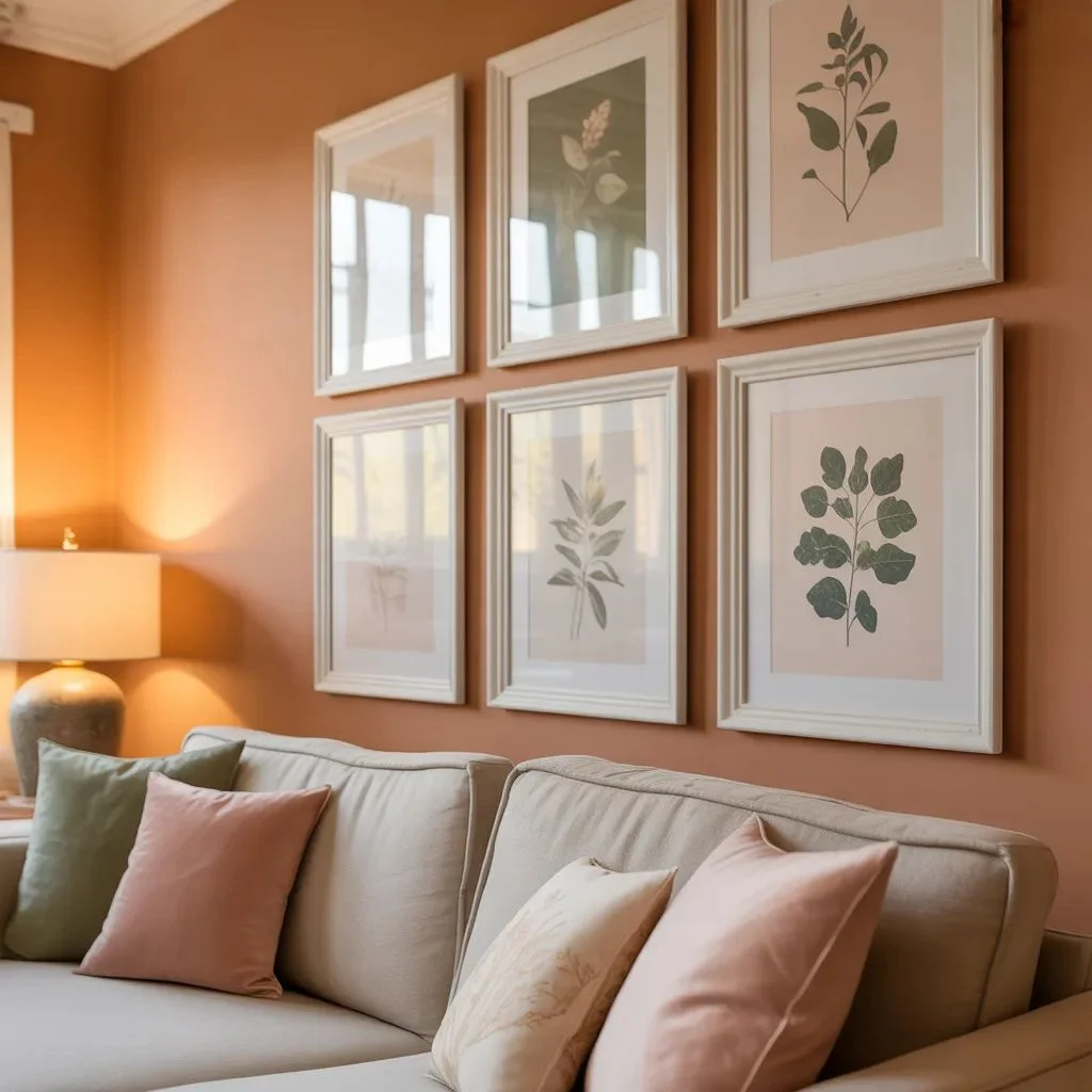
One of the biggest secrets to a botanical gallery wall that looks professionally styled is colour discipline. Even when art pieces are wildly different in style and scale, a shared colour palette makes the whole wall feel intentional.
Green is the obvious common thread in botanical art, but green comes in dozens of shades — sage, hunter, olive, emerald, eucalyptus. Decide early which family of greens dominates your collection and stick within it.
Background tones matter just as much. Cream and ivory backgrounds read as warm and vintage. White backgrounds feel crisper and more modern. If you mix both, use mats to standardize the visual background across the collection.
Your wall colour is part of the palette too. Deep forest greens, terracotta, warm taupe, and dusty blush all make botanical prints pop beautifully. Stark white walls work but can feel a bit clinical — a warm white or linen tone is often more flattering.
When sourcing prints, hold them against each other in person before buying if possible. Colores that look cohesive on screen sometimes clash dramatically when printed.
Layer in Texture and Dimension
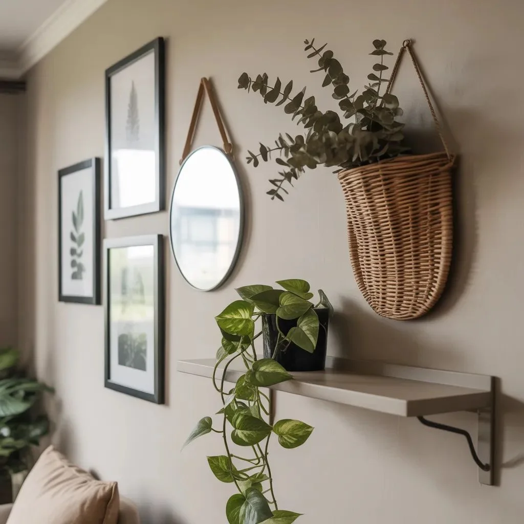
A truly beautiful botanical gallery wall is rarely just flat frames on a flat wall. The spaces that stop people in their tracks tend to layer different dimensions and materials into the arrangement.
Consider these additions:
- Real plants: A small trailing pothos on a floating shelf below the gallery, or a hanging plant at the corner, bridges the gap between art and living nature.
- Dried botanicals: Pressed flower frames, dried pampas grass in a wall-mounted vase, or a single dried fern in a shadow box add organic texture that printed art can’t replicate.
- Mirrors: A small mirror within a gallery wall adds light and depth. Round mirrors especially complement the organic shapes in botanical prints.
- Wall-mounted vessels: A small ceramic or rattan wall pocket with a sprig of dried lavender or eucalyptus adds three-dimensionality to the arrangement.
- Woven elements: A small macrame piece or woven textile brings warmth and handmade texture that prints alone can’t achieve.
The goal is to make the wall feel like it grew there over time — collected, layered, and loved — rather than purchased and installed in one afternoon.
Scale Your Wall Correctly
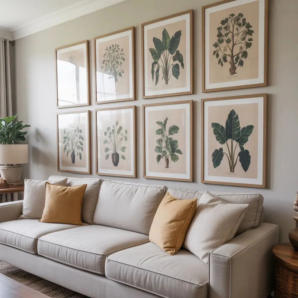
Scale is the element most people get wrong when building a botanical gallery wall. Too small and the art disappears into the room. Too large and it overwhelms. The key is treating the gallery wall as a single visual unit and sizing that unit to the wall or furniture piece it anchors.
A general rule: your gallery wall arrangement should span roughly two-thirds the width of the furniture piece below it. For a sofa that’s seven feet wide, aim for an arrangement that spans around four and a half to five feet.
For large walls, resist the temptation to fill every inch. Negative space — the empty wall around and between frames — is part of the composition. Some of the most striking botanical gallery walls use only five or six carefully placed pieces with generous breathing room between them.
For small walls, choose tighter spacing and smaller frames. A grid of nine 5×7 prints can feel just as impactful as a large canvas if the composition is tight and deliberate.
Always step back and view the arrangement from at least ten feet away. What feels balanced up close sometimes looks completely different from across the room — and that’s the view that matters most.
Style by Room: Where to Hang Your Botanical Gallery Wall
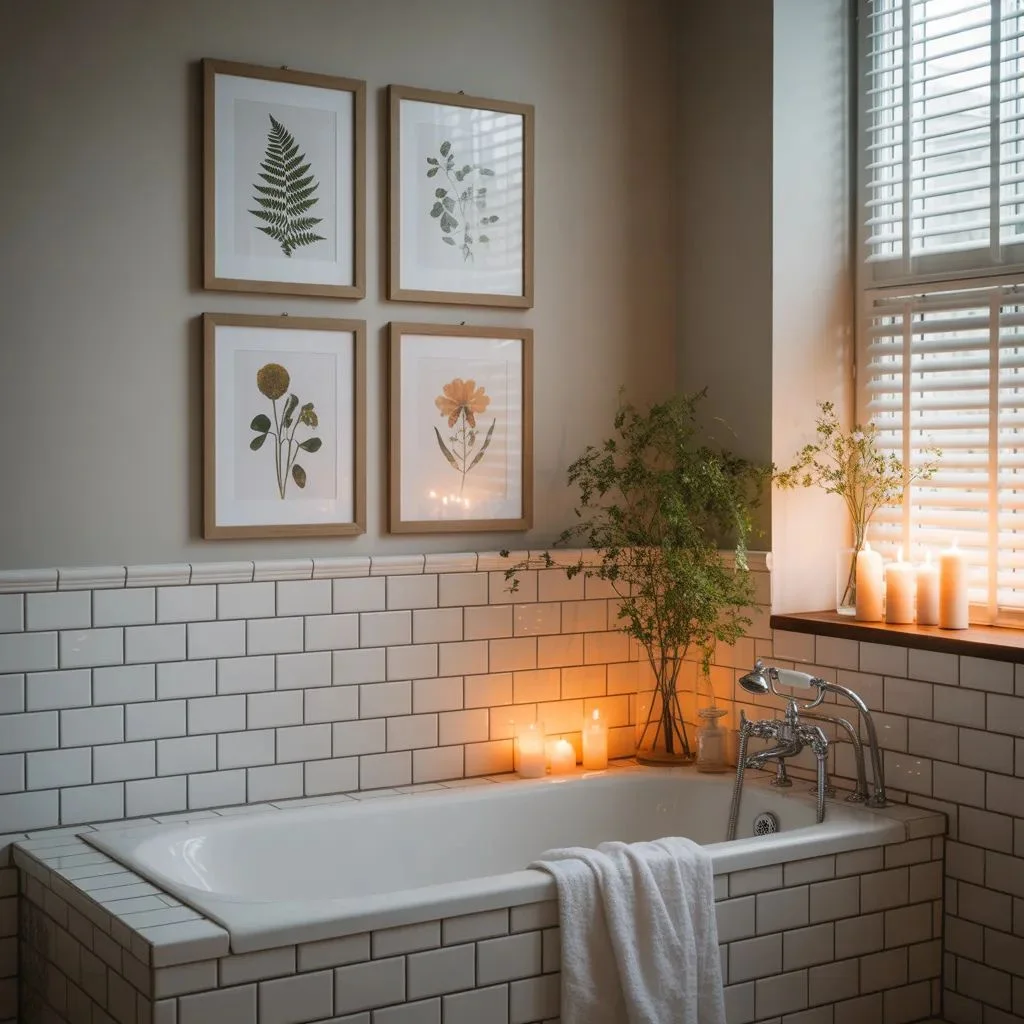
Different rooms call for different approaches to the botanical gallery wall — and matching the styling to the space makes all the difference.
Living Room
The living room allows for your most ambitious arrangement. Salon-style layouts with varying frame sizes work beautifully above a sofa or along a main feature wall. Mix in a few sculptural elements — a wall-mounted vase, a small mirror — to create a layered effect.
Bedroom
Keep it calm. A botanical gallery wall above the bed works best with a symmetrical layout — matching frames, consistent spacing, nothing too bold or busy. Soft watercolour prints or delicate line art maintain the restful atmosphere a bedroom needs.
Bathroom
Bathrooms are underrated botanical gallery wall territory. A small arrangement of four to six frames over the toilet or alongside a vanity brings in spa-like energy. Stick to prints with lighter, airier backgrounds to complement the room’s natural humidity and steam.
Hallway
Hallways beg for horizontal arrangements — a clean row of three to five same-sized frames at eye level. Because hallways are transitional spaces, the art should be easy to read quickly rather than needing you to stop and study it.
Kitchen
Herb prints, fruit botanicals, and garden illustrations feel right at home in a kitchen. Keep frames smaller and arrangements lighter so they don’t compete with cabinetry and countertop surfaces.
Common Mistakes to Avoid
Even with great prints and beautiful frames, a few common missteps can prevent a botanical gallery wall from reaching its potential. Here’s what to watch for:
- Hanging too high: The center of your arrangement should sit at roughly eye level — 57 to 60 inches from the floor. Most people hang art too high, which disconnects it from the rest of the room.
- Mixing too many frame styles without a unifying thread: If you’re going eclectic, make sure your mat colour or art palette does the work of pulling it together.
- Using low-resolution prints: Prints that look fine on screen can become blurry or pixelated when enlarged. Always source files at 300 DPI minimum.
- Ignoring the wall colour: Botanical prints often have cream or white backgrounds. On a similarly light wall, they can disappear. Choose a wall colour that gives the art contrast.
- Overcrowding: More frames doesn’t always mean more impact. Edit down. Leave space. A tighter, smaller arrangement often makes a stronger statement than a sprawling one.
Make Your Walls Worth Looking At
A botanical gallery wall isn’t just decoration — it’s the kind of thing that makes people stop, look closer, and ask where you found it all. The good news is that most of what makes it work isn’t about budget. It’s about intention: choosing art you love, giving it the right frame, and placing it where the room can breathe around it.
Start with one wall. Pick your style, gather your prints, and plan before you hang. Your walls have more potential than a blank coat of paint — this is how you unlock it.
Also Read About : DIY Upcycled Garden Ideas: Creative Ways to Repurpose What You Already Have.