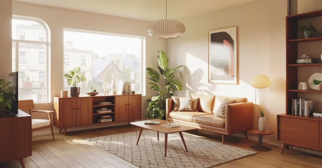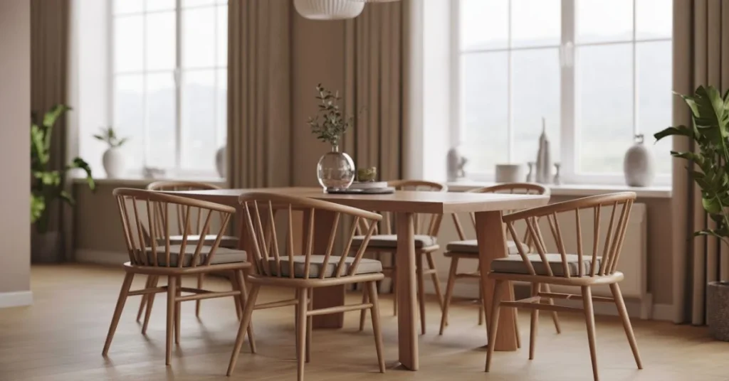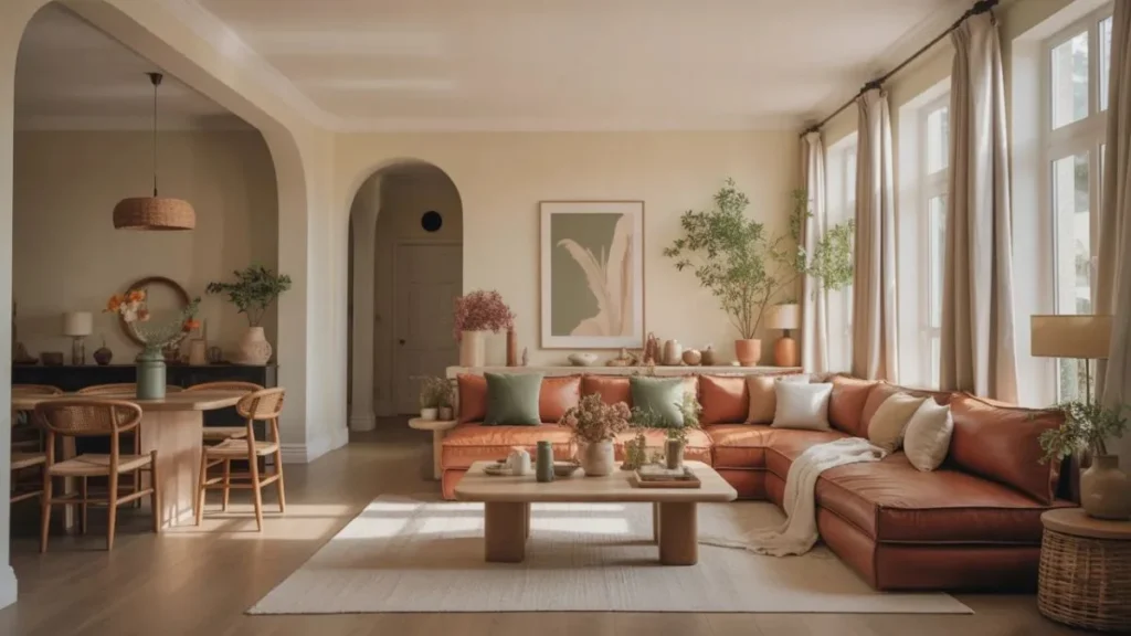
The most admired homes don’t rely on expensive furniture or rare finds — they rely on colour used with intention. Walk into a space that feels effortlessly pulled together and you’ll sense it before you can name it: every shade belongs, every tone connects, and nothing jars.
That feeling isn’t luck. It’s the result of deliberate cohesive colour secrets that interior designers use to create harmony across every room. Whether you’re starting from scratch or trying to make sense of a space that never quite clicked, understanding these principles will change how you see — and style — your home.
The 60-30-10 Rule: The Foundation of Every Cohesive Home
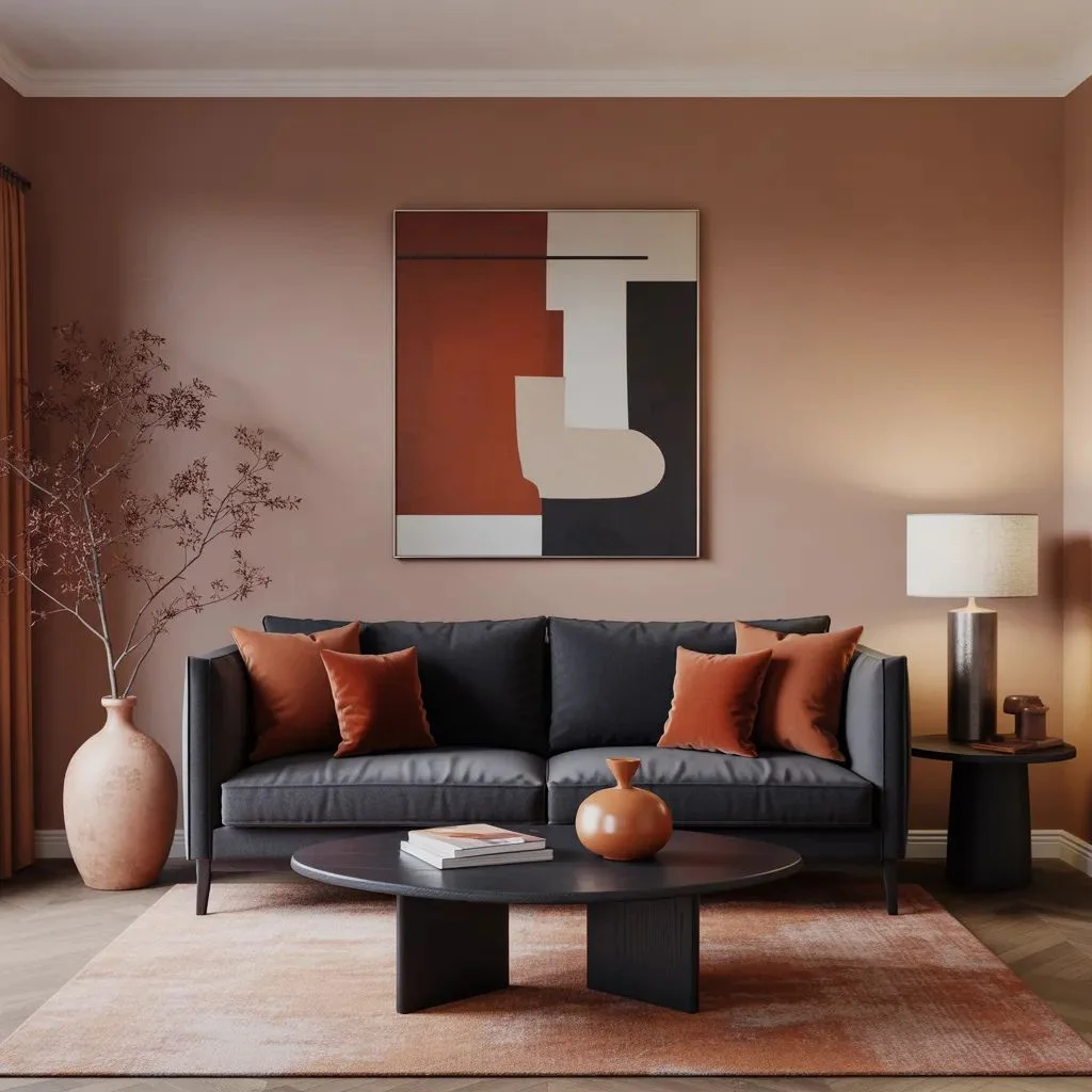
If there’s one principle every designer reaches for first, it’s the 60-30-10 rule. It’s the backbone of balanced, cohesive colour — and it works in any style, any size of room.
Here’s how it breaks down:
- 60% dominant colour: Your walls, large rugs, or big upholstered pieces. This is the room’s grounding shade — usually neutral, calm, and liveable.
- 30% secondary colour: Sofas, curtains, cabinetry, or accent chairs. This is where personality starts to emerge — a deeper, more character-driven tone.
- 10% accent colour: Cushions, artwork, vases, throws. The pop. The punctuation. Used sparingly so it stays interesting.
The rule works because it creates visual rhythm. Too much of one colour makes a room feel flat. Too little structure makes it feel chaotic. The 60-30-10 split gives the eye a clear path through the space.
Apply it not just within a single room, but across your whole home. If your dominant whole-home colour is warm ivory and your secondary is sage green, let those proportions guide every space — even if the individual accents shift.
How to Choose a Whole-Home Colour Palette
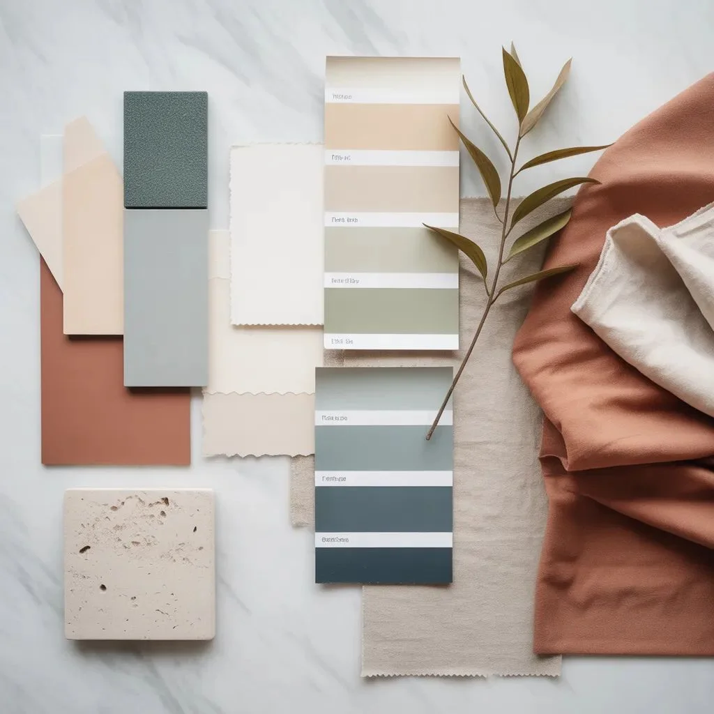
A whole-home palette sounds complicated, but it’s just one decision made early that saves hundreds of indecisive ones later. Instead of choosing colours room by room, you choose a colour family and let every room pull from it.
Start with your largest, most fixed element — often your flooring. Warm-toned floors (honey oak, terracotta tile, natural jute) pull towards warmer palettes. Cool-toned floors (grey stone, whitewashed wood, concrete) push towards cooler, more airy schemes.
From there, build outward using three to five colours that share a visual relationship:
- One dominant neutral (walls, large surfaces)
- One mid-tone that connects spaces (a shared cabinetry or flooring colour)
- One or two accent colours that repeat throughout (cushions, art, accessories)
- One contrast colour used rarely for drama
The key phrase here is visual relationship. Your colours don’t need to match — they need to speak the same language. Terracotta, dusty sage, and warm cream all carry warm undertones. They feel related even though they’re entirely different hues.
A practical tip from many designers: choose your palette from a single fabric or artwork you love. If you’re drawn to a kilim rug with rust, ochre, and faded indigo, those are your colours. The work is already done.
The Secret Role of Undertones
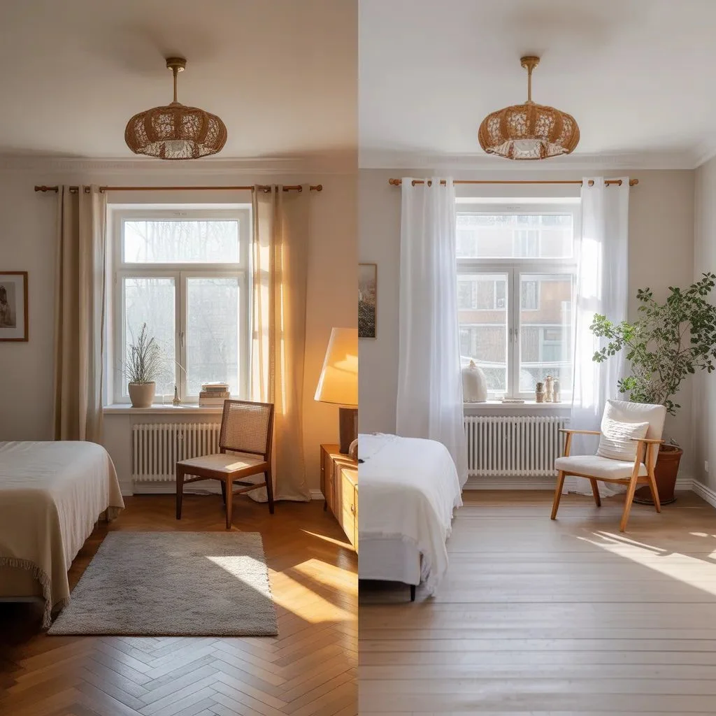
This is where most DIY decorators lose the thread. You’ve chosen a warm beige for the living room and a cool grey for the hallway — and somehow, they look wrong together even though both feel neutral. The problem isn’t the colours. It’s the undertones.
Every colour, including white and neutral, carries an undertone. It might be pink, yellow, green, blue, or purple. When two colours with clashing undertones sit next to each other, the eye reads the clash even if it can’t name it.
How to Identify Undertones
Hold a paint swatch next to a pure white card. Whatever direction the swatch ‘leans’ — warmer, cooler, greener, redder — is its undertone. Do this with every colour you’re considering and compare them against each other.
The rule: warm undertones live together; cool undertones live together. A blush pink with a peach undertone will clash with a blush pink with a lavender undertone — even though both read as ‘pink’ in isolation.
Designers often choose a palette of whites, creams, and neutrals from the same paint brand’s undertone family — for example, all Benjamin Moore ‘warm whites’ — to ensure harmony throughout.
Undertones Across Finishes
The same principle applies to materials. A brass hardware finish with a warm golden undertone will clash with cool silver-toned cabinetry. Natural rattan with warm honey tones won’t harmonise with blue-grey stone countertops without a bridging element. When you understand undertones, you stop blaming the colour and start solving the actual problem.
Using Colour Flow to Connect Every Room
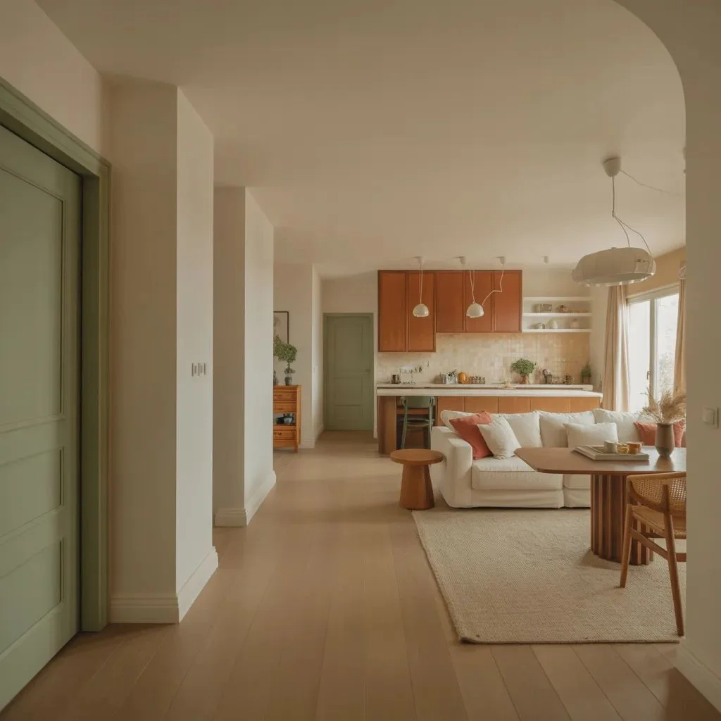
Colour flow is one of the most underrated cohesive colour secrets — and one of the most visible when it’s missing. Colour flow is the deliberate movement of colour from one room to the next so that transitions feel natural rather than jarring.
Think of your home as a single visual experience. When someone walks from the entryway to the living room to the kitchen, the colours they encounter should feel like chapters of the same story — not separate novels.
The Hallway as Your Anchor
Your hallway or entry is the one space that connects to everywhere else. Whatever colour you place here sets the expectation for the whole home. Designers often paint hallways in the same neutral as the adjacent rooms or use it to introduce the whole-home palette’s dominant tone.
The Door-Frame Trick
One of the most practical colour flow techniques: stand in the centre of a room and look through each doorway. What do you see? Each view is a ‘frame within a frame.’ The colours visible through each doorway should feel intentional and connected, not random.
If your teal dining room door frames a terracotta-red kitchen wall, that’s a clash — even though both rooms may feel fine individually. Adjust the accent colour in one room to create a visual bridge. A shared throw pillow colour, a repeated art print, or even matching hardware can create that link.
The Power of Repeat: How Designers Anchor a Space
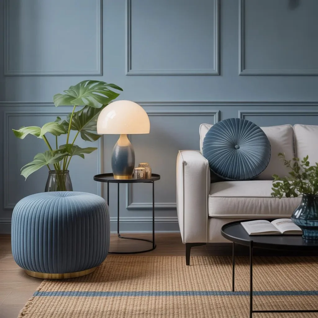
The most elegant cohesive colour secret isn’t about using more colours — it’s about using fewer in more ways. Repetition is what makes a palette feel intentional rather than accidental.
A single accent colour appears much richer when it shows up three or four times in a room. That dusty blue you love? Put it in a cushion. Repeat it in a ceramic lamp base. Echo it in a thin stripe on the rug. Now it feels considered, layered, and real — not a single decorative whim.
Designers call this ‘anchoring.’ Each repetition anchors the colour in the room’s visual landscape, making the eye feel it belongs there. Without repetition, even the most beautiful colour can feel like a mistake.
How Many Times Should a Colour Repeat?
The general rule: an accent colour should appear at least three times in a room. Two feels like coincidence. Three feels deliberate. Beyond five can start to feel heavy unless the colour is very muted.
Apply the same logic across rooms. If terracotta appears as a cushion in the living room, find a way to bring it into the dining area through a candle, a side plate, or a piece of art. That thread, running through multiple spaces, is the essence of a cohesive home.
Texture, Pattern, and Finish: The Hidden Colour Variables
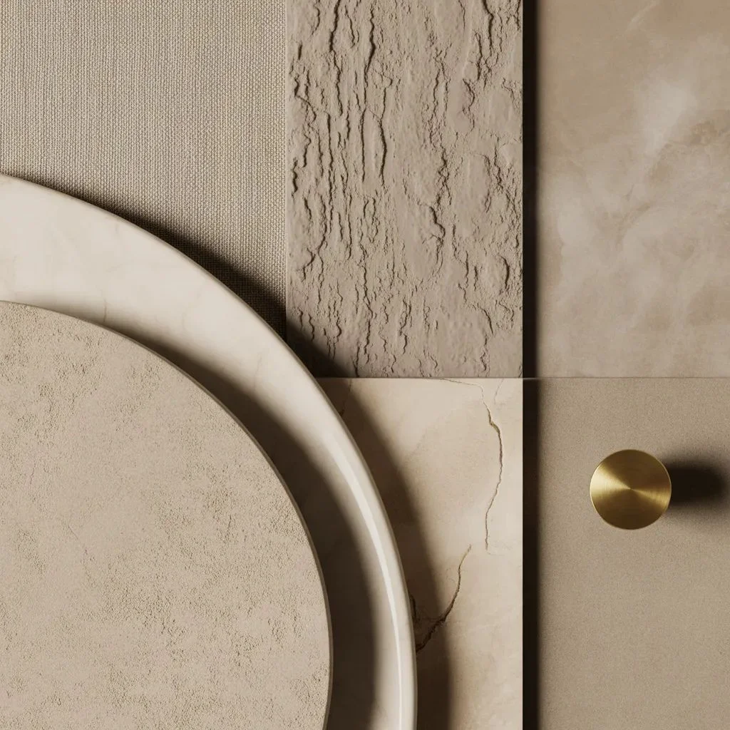
Colour doesn’t exist in isolation — it exists in relationship with texture, pattern, and finish. These three variables change how any colour reads in a space, which is why two rooms painted the same shade can feel completely different.
Finish Changes Everything
A matte finish absorbs light and makes colours feel softer, more withdrawn. A satin finish reflects light and adds a subtle warmth. A high-gloss finish bounces light dramatically, intensifying colour and adding energy.
In a cohesive palette, mixing finishes of the same colour family adds richness without visual noise. Matte walls in the same ivory as a satin-finish cabinet door creates depth without contrast. This is a trick commonly found in Scandinavian and Japanese-influenced interiors.
Pattern as a Colour Carrier
If you’re afraid of bold colour on walls or large furniture, pattern is your ally. A patterned rug, curtain, or cushion carries multiple colours simultaneously — and because they’re balanced within the pattern, they feel safer to the eye.
Choose your pattern first, then pull your whole palette from the colours within it. This is one of the oldest designer tricks: the pattern becomes the palette guide, and every other colour choice simply echoes what’s already there.
Texture as a Neutral
Natural textures — linen, jute, rattan, raw wood, stone — act as visual neutrals that don’t compete with colour. They add depth, warmth, and character while allowing your chosen palette to stay in focus. Layering textures in a single-colour scheme (think all-ivory with linen, silk, and chunky knit) is one of the most sophisticated applications of cohesive colour theory.
Common Cohesive Colour Mistakes — and How to Fix Them
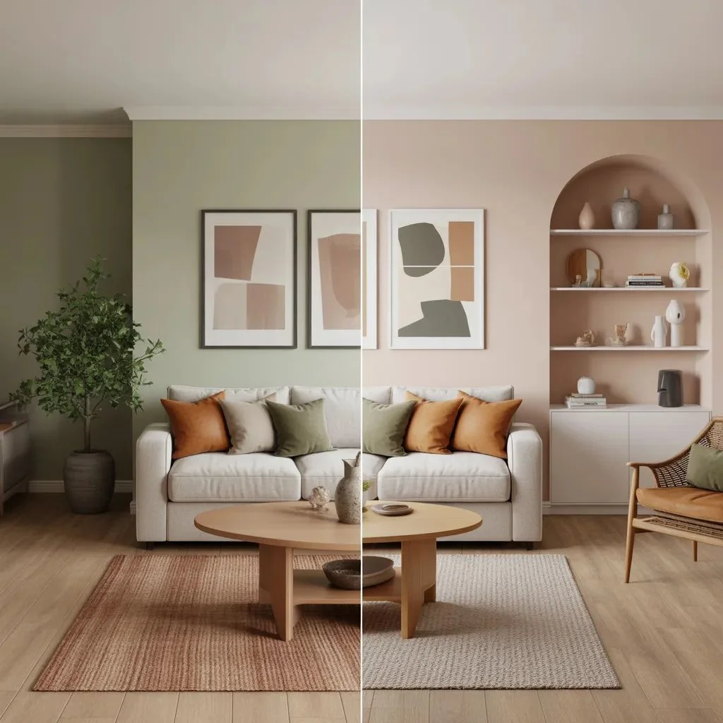
Even with the best intentions, certain patterns derail an otherwise beautiful scheme. Knowing the most common cohesive colour mistakes helps you spot them — and fix them — before they become permanent.
- Ignoring undertones: The single most common error. Two ‘neutrals’ that clash because one runs warm and one runs cool. Fix: test every colour against a pure white card and compare undertones before committing.
- No dominant colour: Using equal amounts of three or four colours makes a room feel busy and unresolved. Fix: return to the 60-30-10 rule and reassign proportions.
- Isolated accent colours: A single bright cushion or artwork that appears nowhere else. It reads as afterthought, not intention. Fix: repeat the colour at least twice more in the room.
- Room-by-room colour decisions: Each room chosen independently without considering the whole-home flow. Fix: stand at each doorway and evaluate what colours are visible from multiple rooms simultaneously.
- Too many accent colours: The desire to include everything you love leads to a palette that says nothing. Fix: limit accent colours to two, maximum three, and hold firm.
Testing Before You Commit
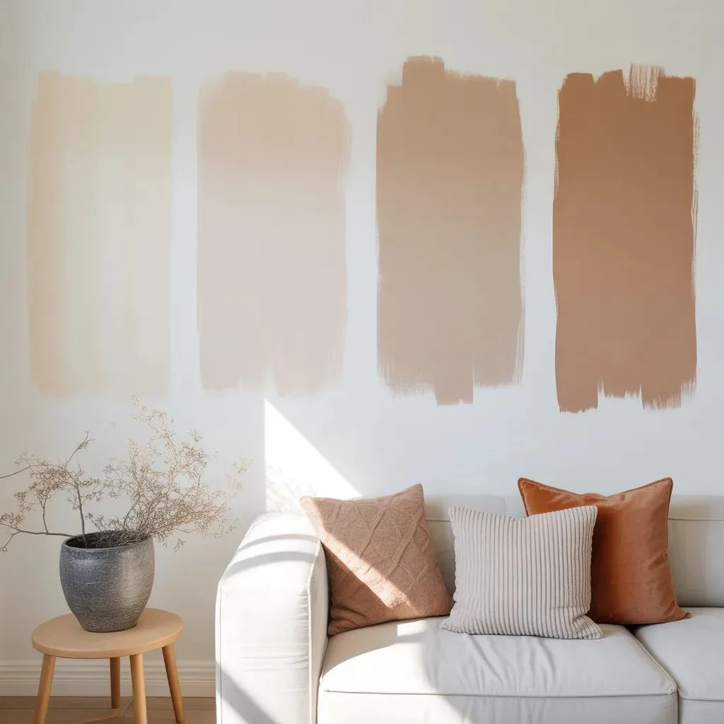
The most expensive colour mistake is one you make at full scale. Before any cohesive colour secret can work, you need to see the colours in your actual space, at different times of day, before committing to a full tin of paint or a large piece of furniture.
Paint large test patches — at least 30cm x 30cm — directly on the wall, positioned near both natural light sources and artificial lighting zones. Live with them for two to three days. Look at them in morning light, afternoon sun, and evening lamp light. Colours shift significantly depending on your light sources.
For soft furnishings, order samples before purchasing. Most premium fabric suppliers offer returnable sample swatches, and furniture stores often provide fabric swatches for sofas. Lay samples against your existing floors, walls, and neighbouring fabrics before ordering.
Digital tools can help — apps like Dulux Visualiser or Benjamin Moore’s Colour Portfolio let you preview paint colours in photos of your own rooms. But these should supplement, not replace, physical testing. No screen accurately replicates how light behaves in a real space.
The Homes That Look Effortless Are the Most Deliberately Planned
Cohesive colour secrets aren’t mysterious — they’re methodical. The 60-30-10 rule, undertone awareness, whole-home palette building, colour flow, and repetition are the pillars that every great interior rests on. Used together, they don’t just make individual rooms look better — they make your entire home feel like it was made for you.
Start with one principle. Audit your undertones. Map your whole-home palette. Look through your doorways. The adjustments are often small, but the results — that feeling of walking into a home that just works — are anything but.
Also Read About: Rugs for Bedroom: How to Choose the Right Size, Style, and Placement.