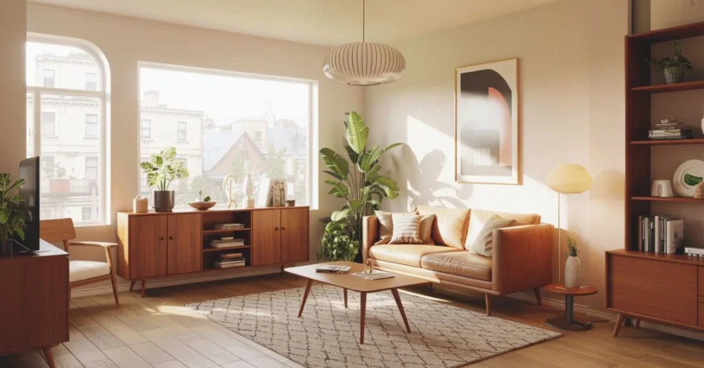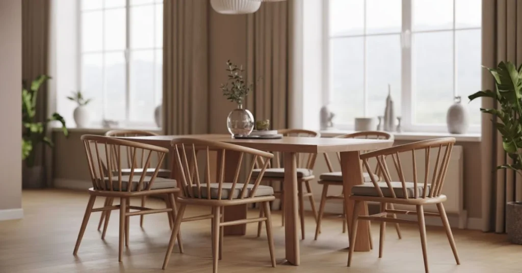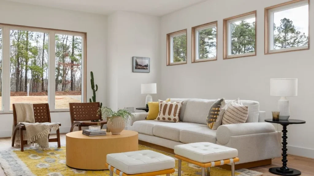
Most neutral living rooms look flat. Joanna Gaines’ rooms never do, and that gap comes down to a formula, not luck. Her Magnolia-famous spaces stick to a soft palette of creams, warm greiges and taupe, yet they still feel layered, lived-in and warm. The trick isn’t the colour itself. It’s what happens on top of it: texture, contrast and restraint, stacked in a specific order.
This guide breaks down that formula piece by piece, so you can bring the same warmth into your own neutral living room without hiring a designer or repainting every wall.
The Colour Rule Behind Every Gaines Room
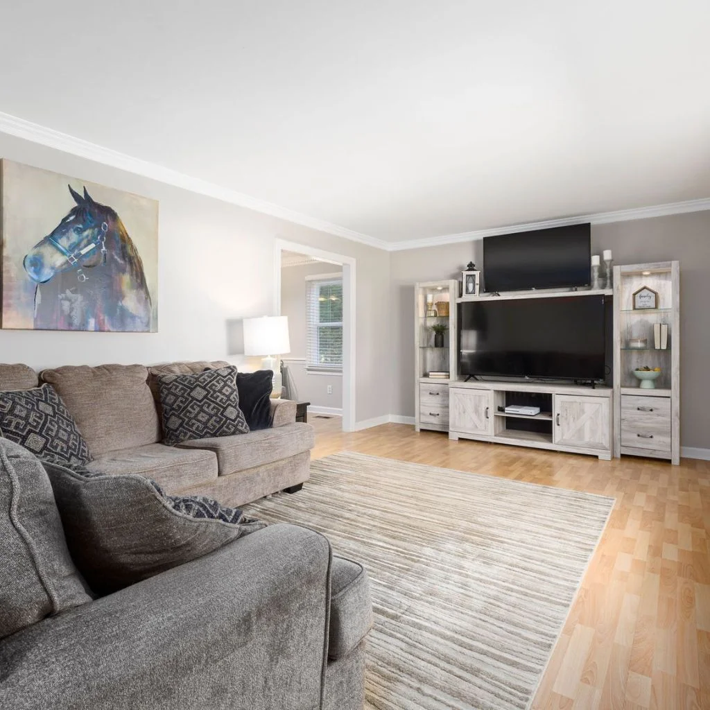
Joanna Gaines rarely uses stark white. Her walls lean towards warm off-whites, soft greige or a muted taupe, chosen specifically because they hold warmth in changing light rather than turning cold and clinical.
The formula works because it limits colour decisions to one dominant neutral, one secondary tone a shade darker, and small pops of black or deep green for contrast. Keeping the palette this tight is what makes a Joanna Gaines living room feel calm instead of busy, even before a single accessory goes on a shelf.
If you’re repainting, test your shade in both morning and evening light first. A colour that looks perfectly neutral at noon can shift distinctly pink or grey once the sun drops, and that’s usually where a “neutral” room goes wrong before it’s even furnished.
Key Takeaways
• Stick to one dominant neutral and one secondary tone, not five different “off-whites”.
• Texture does more work than colour in making a neutral room feel warm.
• Leave breathing room around furniture rather than filling every wall.
• Swap in warm metals and natural wood before buying anything new.
Layering Texture So Neutral Never Reads Flat
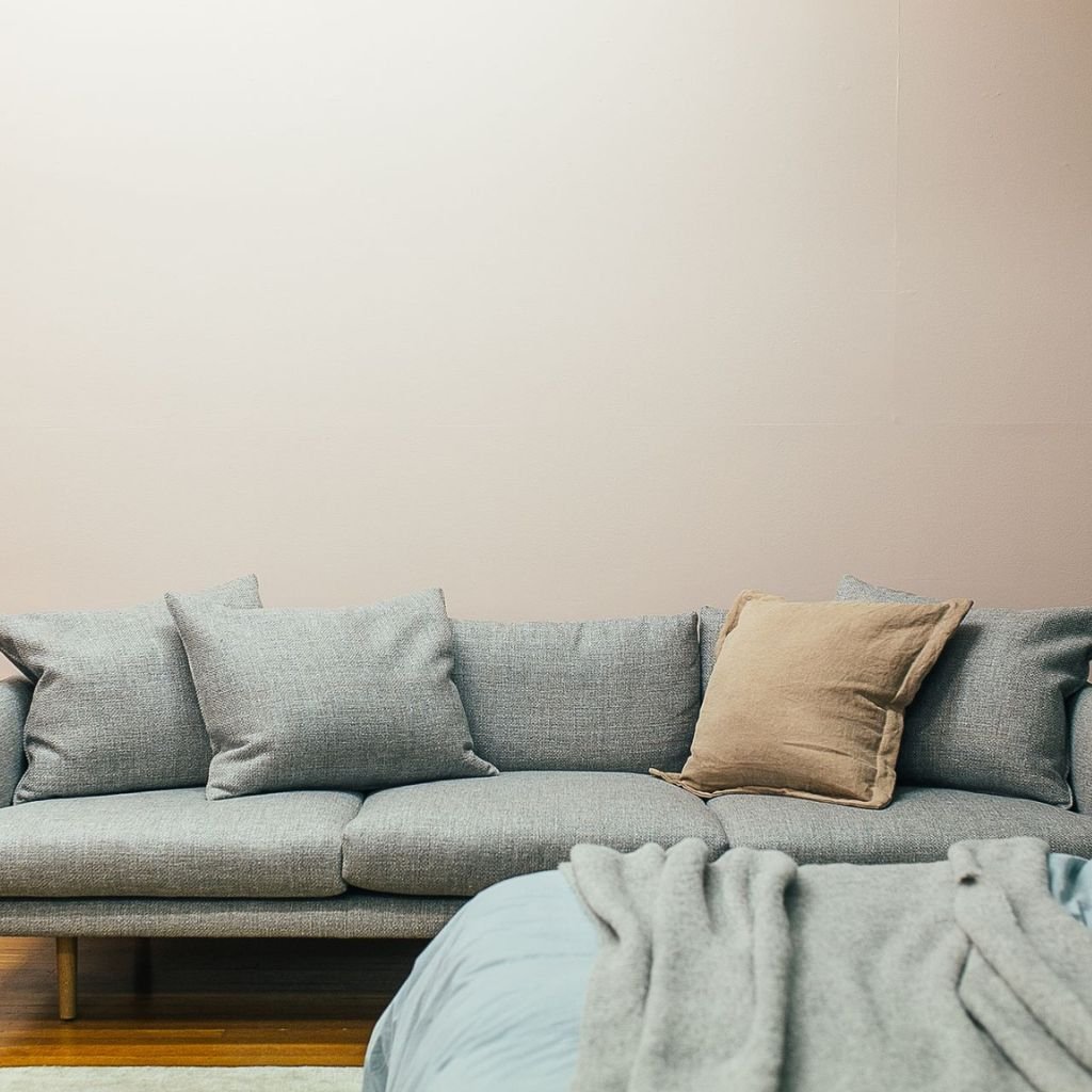
This is the part most homeowners skip, and it’s the actual engine behind the Gaines look. A neutral palette needs texture to avoid feeling sterile, so every surface in the room earns its place through material contrast rather than colour contrast.
Think chunky knit throws against a smooth leather armchair, a jute rug under a polished wood coffee table, or a linen sofa paired with a woven rattan side table. None of these fight the neutral palette because they’re all still within the same tonal family. They feel different to the touch, and that’s what reads as “designed” rather than “matched.”
Why this works: the human eye reads texture as detail even in low-contrast colour schemes, so a room can look rich and considered without ever introducing a bold colour.
Furniture Placement That Keeps Rooms Breathing
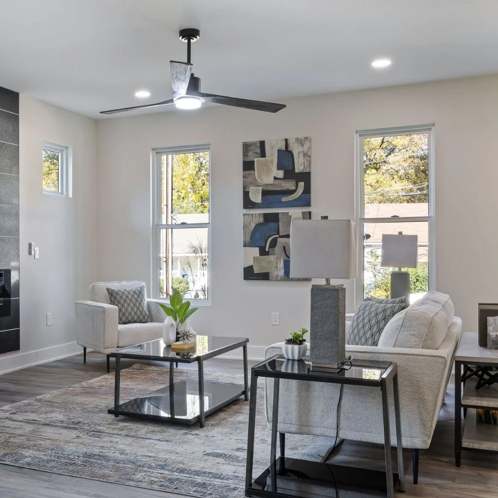
Gaines-style rooms rarely feel crowded, and that’s a placement decision as much as a styling one. Furniture sits with visible space around it rather than pushed flush against every wall, which is what gives these rooms their signature calm.
A simple rule to borrow: leave at least 45 to 60 centimetres of walking space around your main seating area, and resist the urge to fill every corner with a plant or a side table. Negative space is doing real work here, not sitting empty.
Large pieces, like a substantial sofa or an oversized coffee table, actually help this look more than smaller matching sets do. One or two statement pieces read as intentional. Six small ones read as clutter, no matter how neutral the colours are.
Wood, Metal And Linen: The Material Mix
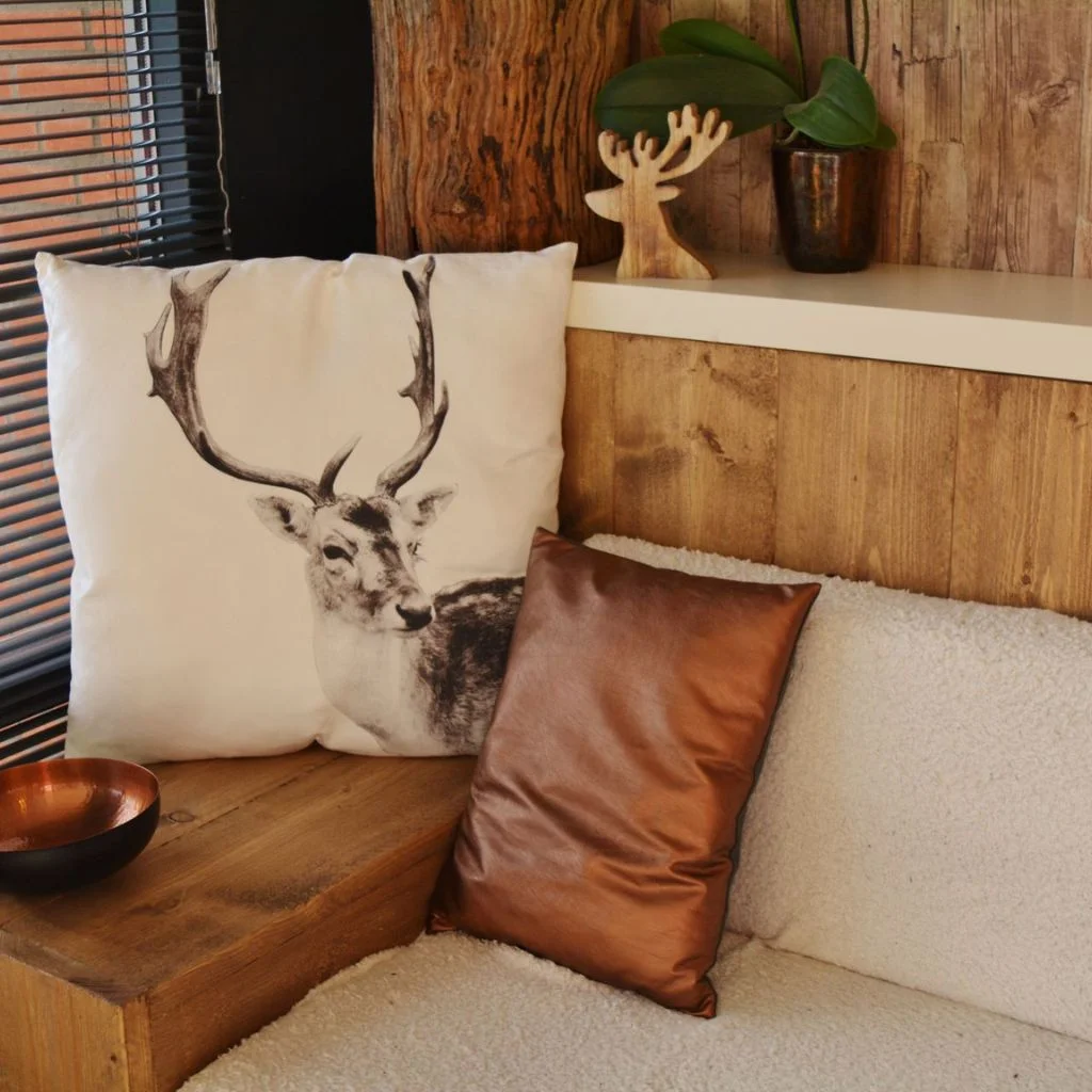
Every Gaines-inspired room leans on three materials working together: warm wood tones, aged or matte metal, and natural fabric like linen or cotton. None of these needs to match exactly, and that’s actually the point.
A weathered oak console, brushed brass or matte black hardware, and a linen-upholstered sofa can sit in the same room without ever looking coordinated in a showroom way. The slight variation between them is what makes the space feel collected over time rather than bought in one trip.
If you’re starting from scratch, prioritise wood first. It grounds the room and gives every other material something to sit against.
A Common Mistake That Flattens The Whole Look
The single biggest mistake people make when trying to copy this style is buying everything in the same shade of beige. It sounds like it should work, but a room built entirely from one flat tone reads as unfinished, not calm.
Real Gaines-style rooms always include at least one darker anchor, whether that’s a black metal light fixture, a charcoal throw pillow, or a dark wood frame. Without that anchor, the eye has nowhere to rest, and the whole room can start to feel washed out rather than warm.
A good fix if this has already happened to your space: add one genuinely dark object before buying anything else. It will do more for the room than another cream cushion ever could.
Lighting Layers For Evening Warmth
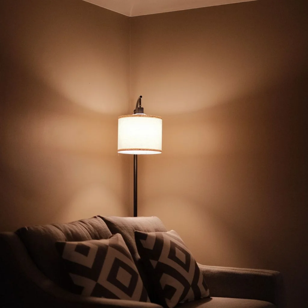
Daytime light is easy. The real test of a neutral room is how it feels after dark, and this is where a lot of otherwise well-styled living rooms fall short.
Gaines-style spaces avoid relying on a single overhead fixture. Instead, they layer table lamps, a floor lamp, and sometimes wall sconces, all using warm-toned bulbs rather than cool white ones. This keeps the neutral palette from turning flat and grey once natural light disappears.
If you only change one thing this week, swap your bulbs to a warmer colour temperature. It’s the cheapest fix on this list and often the most noticeable.
Budget Swaps That Still Nail The Formula
You don’t need custom millwork or a full furniture overhaul to get this look. A few targeted swaps go further than a total refresh:
• Replace one cool-white lamp with a warm-toned option.
• Add a jute or wool rug under existing furniture rather than replacing it.
• Introduce one dark accent object, like a black-framed mirror or dark ceramic vase.
• Swap synthetic throw pillows for linen or cotton covers in your existing palette.
• Rearrange furniture to open up walking space before buying anything new.
Small, deliberate changes like these tend to move a room closer to this formula faster than one expensive statement purchase.
Bring The Formula Home
The strongest tip in this whole guide is worth repeating: texture and one dark anchor point do more for a neutral living room than any amount of extra beige ever will. Start there before you buy anything else, and the rest of the formula falls into place far more naturally.
Editor Choice: Easy Ceramic Vase Painting Projects For Weekend Crafting.
FAQs
What paint colour is closest to Joanna Gaines’ living rooms?
Warm greiges and soft taupes tend to match her rooms most closely. Look for shades described as “warm neutral” rather than “cool grey” on the paint strip, and always test a sample on your own wall before committing.
Can this style work in a small living room?
Yes. Keeping the palette tight and leaving open space around furniture actually helps small rooms feel larger, not smaller. Avoid overcrowding the space with too many accessories.
Do I need to repaint to get this look?
Not necessarily. Texture, lighting, and one dark anchor piece can shift a room a long way without touching the walls at all.