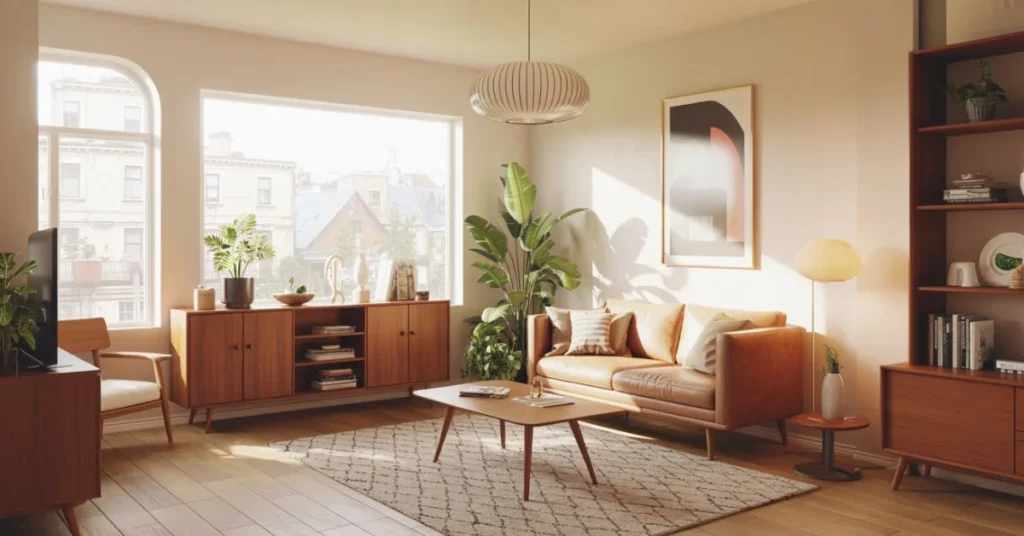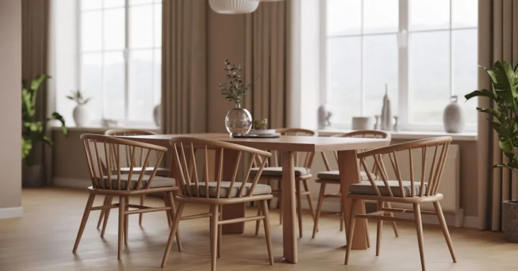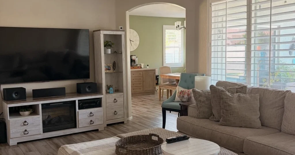
Some paint colors look dated within a few years, while others keep showing up in homes decade after decade. The difference is rarely about being bold or boring. Sherwin Williams colors that last tend to sit in a comfortable middle ground: warm enough to feel welcoming, muted enough to work with changing furniture, and flexible enough to suit more than one room. The ten colors below have earned that staying power, and each one is shown in a real room so you can see how it actually behaves on a wall, not just on a swatch.
A note on the photos in this guide: where a post or page names the exact Sherwin Williams color for the room shown, the text says so. Where a photo is used to show the shade’s look, the text describes that look without claiming the walls carry that exact paint. Either way, the color facts are what you should shop by: undertones, best rooms, and pairings, always confirmed with a sample tested in your own light.
1. Alabaster SW 7008
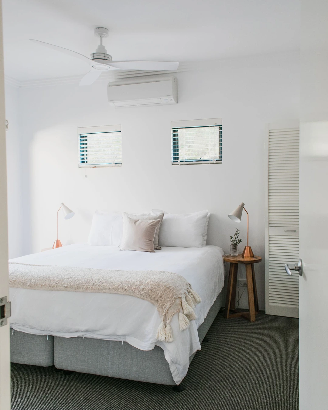
Photo by Rachel Claire
A bright bedroom with soft white walls, white bedding, a beige throw, and two copper-toned lamps shows the Alabaster look at its best: warm, calm, and never stark. The walls read as white, but the warmth in the bedding and wood nightstand keeps the room from feeling cold or clinical, which is exactly why this shade suits bedrooms so well. Warm white is the key idea here, because Alabaster leans creamy rather than icy, and that softness makes it forgiving in rooms that get little natural light.
Use it when a room needs to feel lighter without going brilliant white. It pairs well with natural wood, linen, and muted metals, and it works as a whole-house white because it does not fight with warmer trim or flooring. For trim, a clean white keeps the contrast gentle, while matching the trim to the wall color gives a quieter, more seamless look.
2. Pure White SW 7005
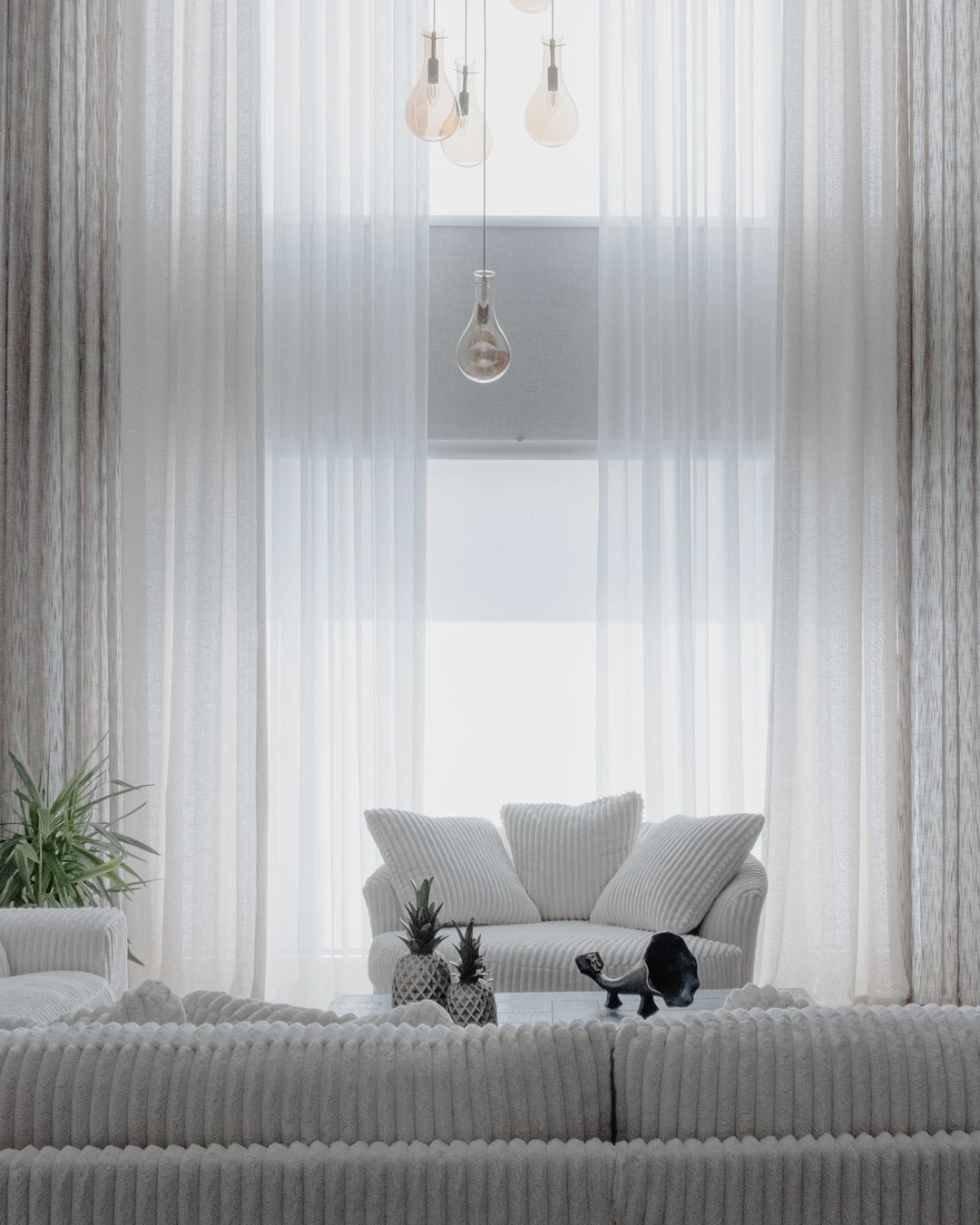
Photo by Beyza Kılıçdere
A bright living room with white sofas, sheer white curtains, and hanging pendant lights shows how Pure White creates an airy, open feeling. Much of the wall is softened by the sheers, but the overall effect is unmistakably crisp and clean, with the white upholstery and pale rug carrying the same tone through the room. Crisp white is the point of this shade: it reflects the most light and gives a room a fresh, uncluttered backdrop.
Pure White suits modern rooms, small spaces, and any room where you want the furniture and art to stand out rather than the wall color. It needs enough light to avoid feeling flat, so it works best in bright rooms or alongside warm textures like wood, boucle, and linen that stop it from feeling sterile. If your room faces north or stays dim, test a sample first, since even a pure white can look gray in low light.
3. Repose Gray SW 7015
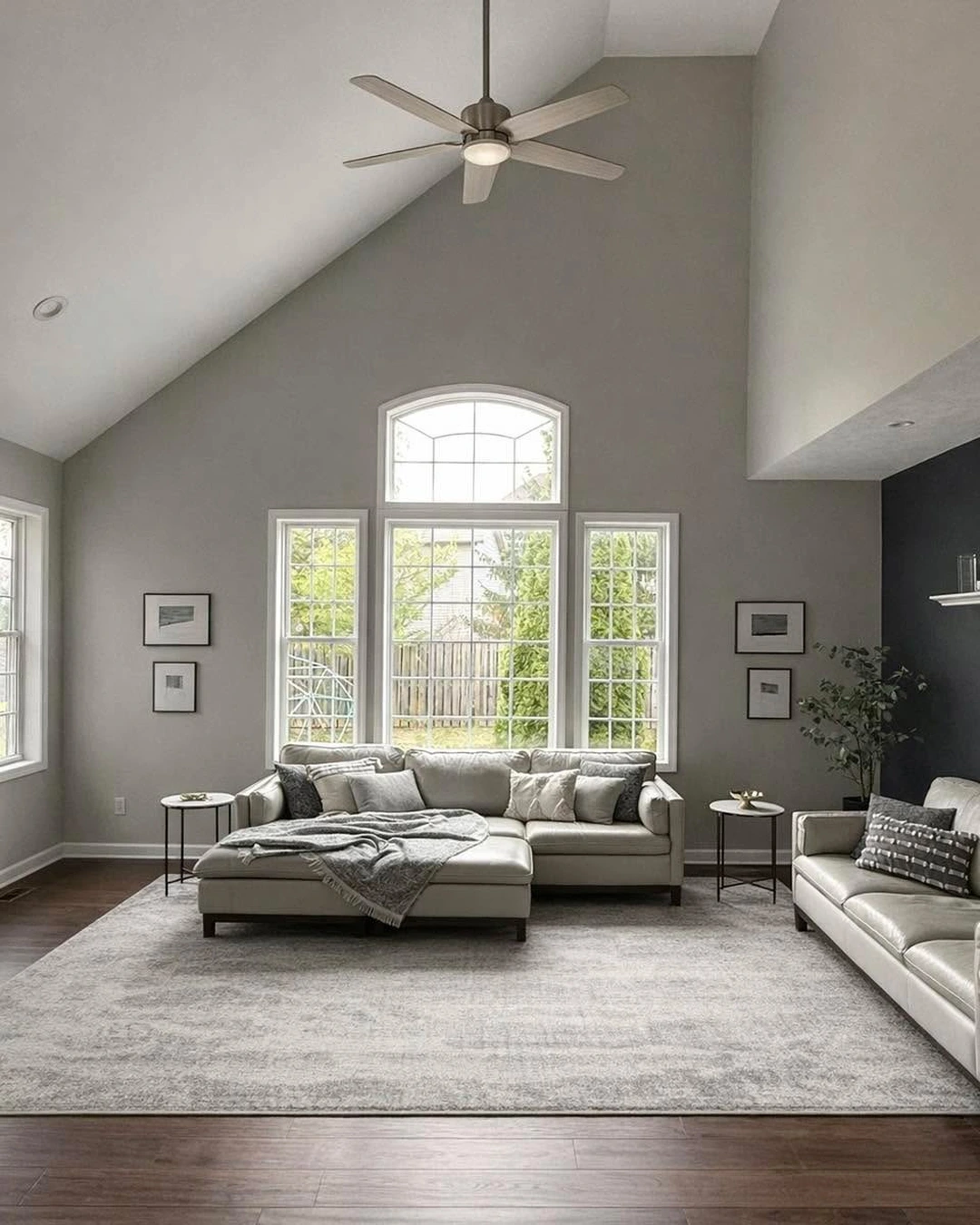
Photo by @clearcutpaint
A spacious living room with light gray walls, tall windows, light leather sofas, and a large gray rug shows Repose Gray as a true greige: gray at first glance, with a warmth that keeps it from feeling cold. One wall on the right is painted a much darker shade, which shows how well this color handles contrast, since the light gray field makes the dark accent look deliberate rather than harsh. Warm gray is what separates Repose Gray from cooler grays, and that warmth is why it has stayed popular through changing trends.
This is a safe choice for open-plan spaces, because it connects rooms without demanding attention. It works with both warm wood floors and cooler finishes, and it takes white trim beautifully. The practical point is undertone: compare it against your flooring and countertops in your own light, since a gray that looks warm in one home can read cooler next to blue-toned stone or tile.
4. Accessible Beige SW 7036
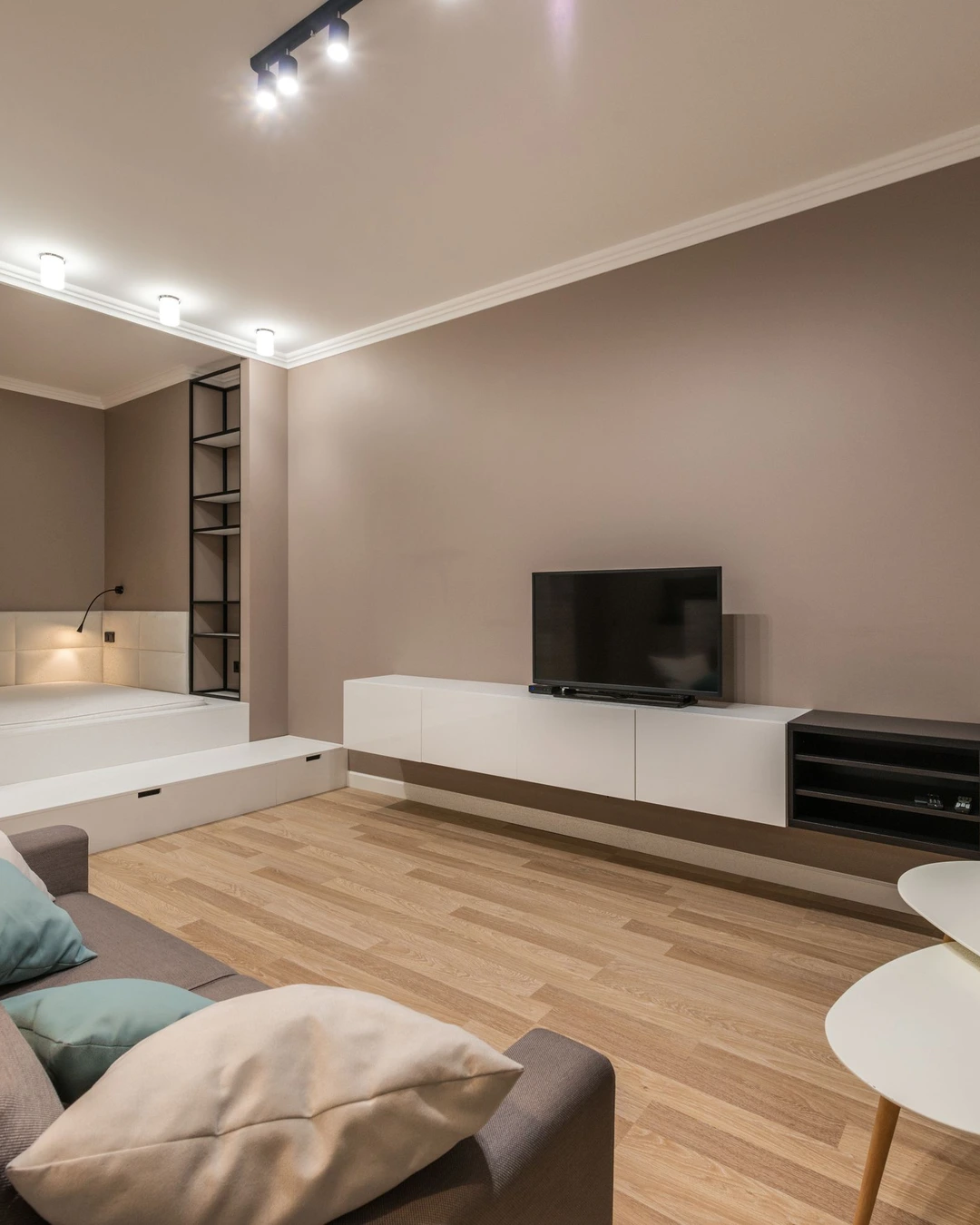
Photo by Max Vakhtbovych
A living room with warm beige-taupe walls, a wall-mounted television, white storage units, and a small sleeping nook shows Accessible Beige as a grown-up neutral: clearly beige, but muted enough to feel current rather than dated. The taupe depth gives the walls presence without darkening the room, and the white furniture keeps the overall look light. Warm beige is the defining quality, since this shade sits between gray and tan and borrows the best of both.
Accessible Beige is a good answer when gray feels too cold and cream feels too pale. It suits living rooms, hallways, and bedrooms, and it pairs naturally with wood floors, black accents, and soft white trim. An eggshell finish suits it well in living spaces, since it gives a soft glow without the glare of a shinier sheen.
5. Shoji White SW 7042
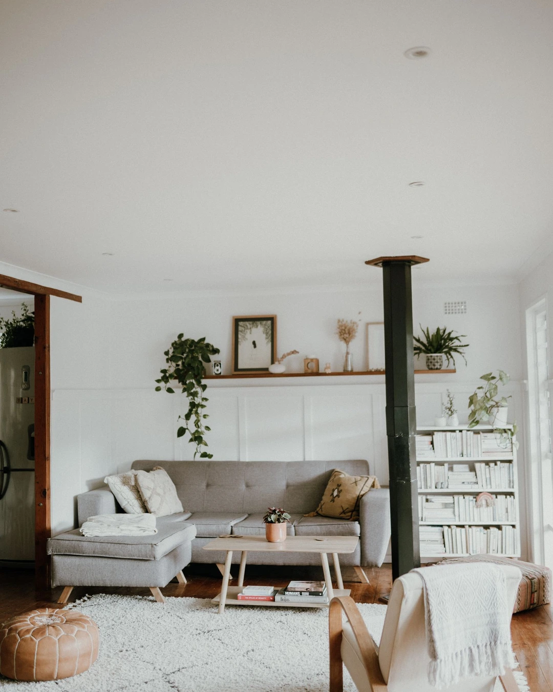
Photo by Taryn Elliott
A warm Scandinavian-style living room with soft off-white walls, a gray sofa, indoor plants, and a white bookshelf shows Shoji White as a gentle in-between: warmer than a pure white, cooler than a creamy yellow-white. The walls feel calm and slightly greige, which lets the plants, wood floor, and gray upholstery set the mood without competing with them. Soft off-white is the right description, because this shade’s appeal is its restraint rather than any single strong undertone.
Shoji White works well in homes that mix warm and cool elements, since it does not commit hard to either side. It is a strong choice for living rooms and bedrooms where you want a light backdrop with a little more character than plain white. Pair it with white trim for a subtle contrast, or with a slightly deeper greige on an accent wall if the room needs more definition.
6. Creamy SW 7012
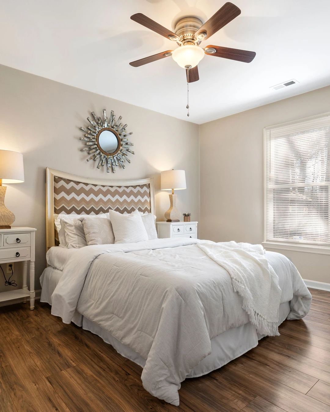
Photo by Curtis Adams
A bedroom with warm creamy walls, white bedding, a chevron-patterned headboard, and wooden floors shows Creamy as a welcoming, yellow-warm off-white. The walls have a visible warmth that makes the room feel cozy even with mostly white bedding, and the wood floor deepens that warmth rather than fighting it. Warm cream is the character of this color, and it is what makes it a favorite for bedrooms and traditional rooms.
Creamy suits rooms where comfort matters more than crispness, and it pairs beautifully with brass, warm wood, and soft patterns. Keep the ceiling and trim a clean white rather than matching the cream, so the room keeps its definition instead of turning into one warm blur.
7. Iron Ore SW 7069
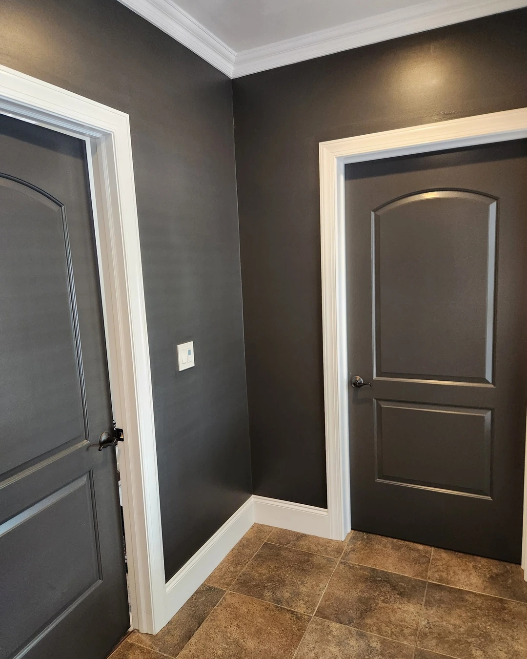
Photo by @colorful_remedies
A painted corner with deep charcoal walls, matching charcoal doors, and white trim shows Iron Ore as a soft black rather than a harsh one. This is not a furnished room, so the color itself is the subject: the charcoal reads rich and warm against the bright white crown molding and baseboards, without the blue coldness some near-blacks carry. Soft black is the key distinction, because Iron Ore gives drama without the severity of a true jet black.
Use it on an accent wall, built-ins, doors, or cabinetry when a room needs grounding. It pairs well with brass, warm wood, and creamy whites, and it makes white trim look crisp by contrast. Because it is dark, it works best as an accent or in a room with good light and pale companions; painting a small, dim room entirely in it will shrink the space visually.
8. Evergreen Fog SW 9130
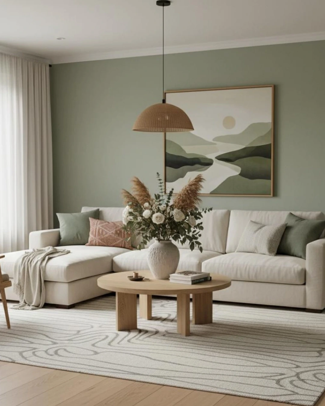
Photo by @unwind_and_relax_living
A living room with muted sage-green walls, a white sectional, a round wooden coffee table, and a large landscape painting shows Evergreen Fog as a calm, gray-green that feels natural rather than trendy. The green is softened by gray, so it reads as a neutral with character, and the white sofa and light rug keep the room feeling open. Muted sage is the heart of this color, and it is why it works in both modern and traditional rooms.
This shade suits living rooms, bedrooms, and sunrooms, especially alongside natural wood, linen, and plants. It pairs well with warm whites on the trim and ceiling, which stop the green from feeling heavy. If your room gets little light, use it on one or two walls rather than all four, since sage-greens deepen quickly in shade.
9. Tricorn Black SW 6258
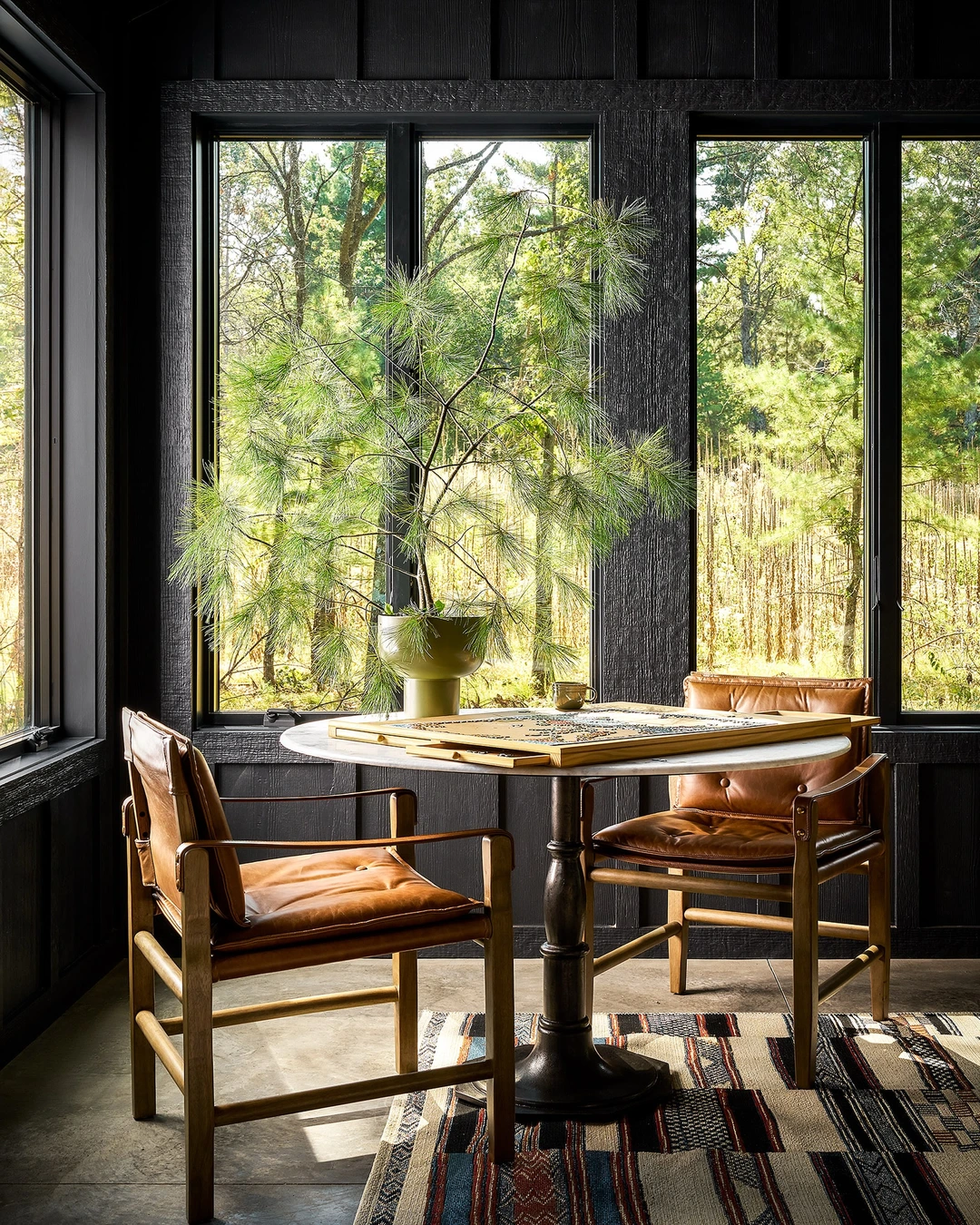
Photo by @ruemagazine
A dramatic sunroom with black paneled walls, large windows looking onto green trees, leather armchairs, and a round marble-top table shows Tricorn Black used at full strength. The black walls frame the view instead of closing the room in, because the glass and the greenery beyond balance the darkness. True black is what makes this shade different from softer charcoals: it is deep, neutral, and unapologetic. For more ideas on sunroom wall colors, see Cozy Or Crisp? Sunroom Wall Colour Ideas For Every Style.
Tricorn Black works best where there is something to balance it: large windows, white trim, light furniture, or natural wood. It is a strong choice for a sunroom, study, or accent wall, and it makes artwork and brass details stand out. Avoid using it wall-to-wall in a small room with little daylight, where it can feel enclosing rather than dramatic.
10. Urbane Bronze SW 7048
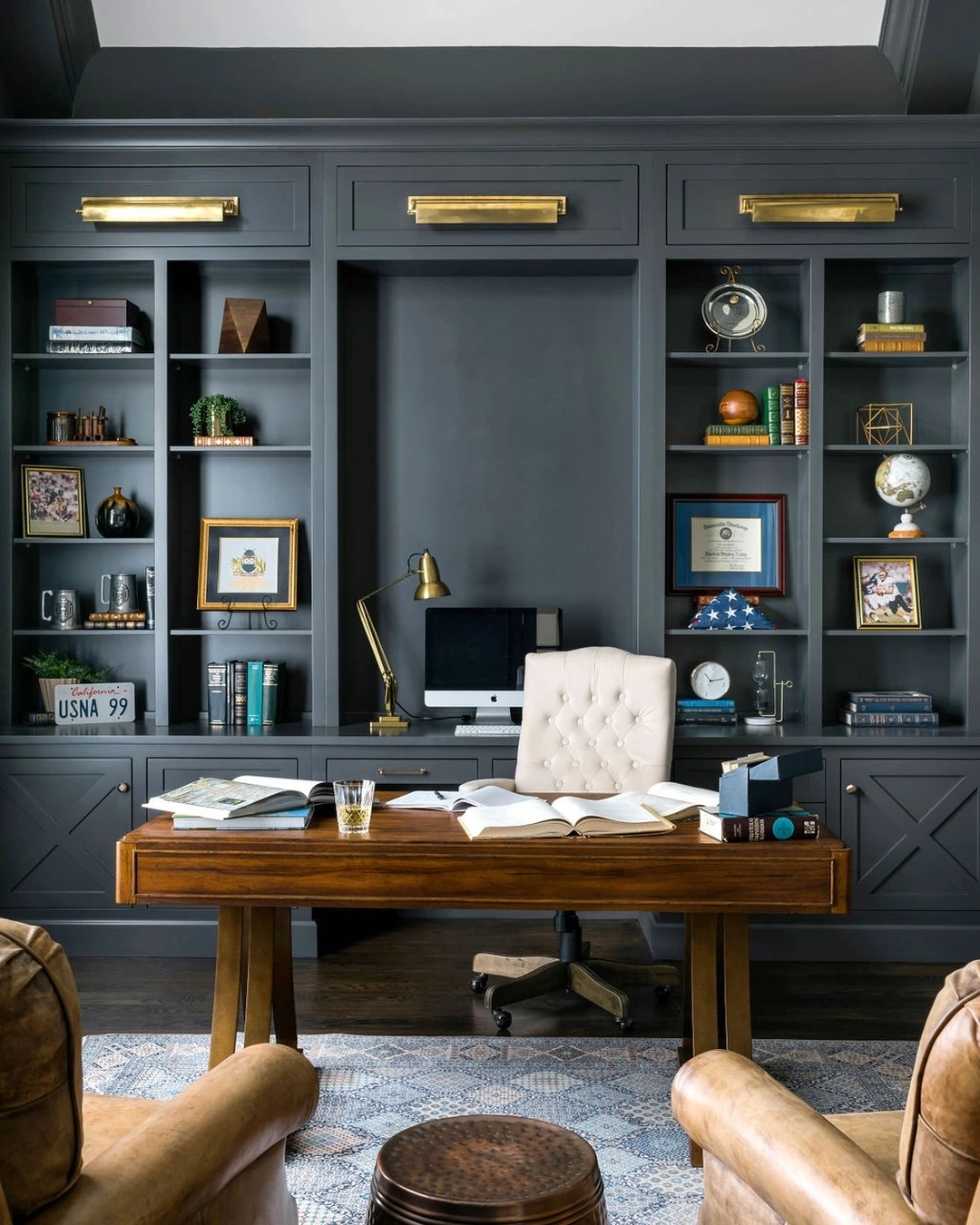
Photo by Webber Coleman Woodworks
A home office with dark bronze-gray built-in bookcases, a wooden desk, a tufted office chair, and leather armchairs shows Urbane Bronze as a deep, warm dark tone with brown rather than gray at its core. The built-ins, walls, and trim share the color, which gives the room a tailored, library-like feel, while the brass picture lights and warm wood keep it from feeling cold. Dark bronze is the defining note, and it is what keeps this shade from reading as plain charcoal.
Urbane Bronze suits offices, libraries, dining rooms, and accent walls where a moody, grounded feeling is welcome. It pairs well with brass, cognac leather, and warm wood, and it looks best with warm white ceilings or trim to give the eye a resting place. In a built-in wall like the one shown, painting the shelves and the wall behind them the same color makes the whole unit read as furniture rather than a patchwork of boxes.
Pick the Sherwin Williams Color That Fits Your Light
The most timeless choice is rarely the most fashionable one in the store. Your light decides the color: a shade that looks perfect in a bright, south-facing room can turn gray or yellow in a dim one, so test samples on two walls and check them morning and evening before committing. Start with the room you use most, choose the undertone that matches your floors and fixed finishes, and let the darker shades work as accents rather than whole-room commitments. For more paint inspiration, see Modern Bathroom Paint Ideas Designers Are Loving In 2026. A color that survives your light, your furniture, and your daily life is the one that will still look right years from now.