Few wallcoverings change a room as quietly as grasscloth. It is woven from natural plant fibers like jute, sisal, and seagrass, so the wall gains a texture you can see from across the room and feel up close, without a single loud pattern. Grasscloth wallpaper suits rooms that need warmth and depth rather than another coat of flat paint, and it works in far more places than a single accent wall. The eleven ideas below show it in real rooms, from bedrooms and dining rooms to ceilings, staircases, and the backs of bookshelves.
A note on the photos in this guide: where a caption names grasscloth for the wall shown, the text says so. One idea uses a printed jungle mural made on grasscloth rather than a plain weave, and the text says that plainly too. Practical notes are included with each idea, because grasscloth has real quirks: visible seams, dye-lot variation, and a surface that does not like scrubbing or steam.
Living Room Accent Wall
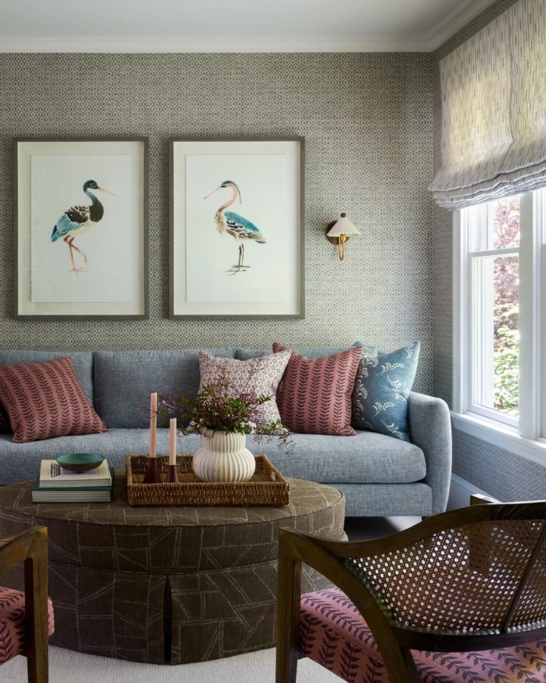
Photo by @jamiekeskindesign
A bright sitting area with a light blue-gray sofa, two framed bird illustrations, and small wall sconces shows patterned grasscloth used as a full living room accent wall. The small woven pattern gives the wall a quiet texture that reads almost like fabric, and the sofa, ottoman, and cane chairs sit comfortably against it without competing. Patterned grasscloth is the appeal here, because it adds interest to a plain wall while staying calm enough for everyday living.
A living room accent wall is the easiest first use of grasscloth, since one wall delivers the texture while the rest of the room stays painted. Keep the furniture and art simple so the weave stays visible, and choose a pattern scale that suits the room: small patterns suit small rooms, while larger weaves suit bigger walls. For more accent wall ideas, see Hand Painted Accent Wall Patterns Worth Trying In Your Home.
Bedroom Headboard Wall
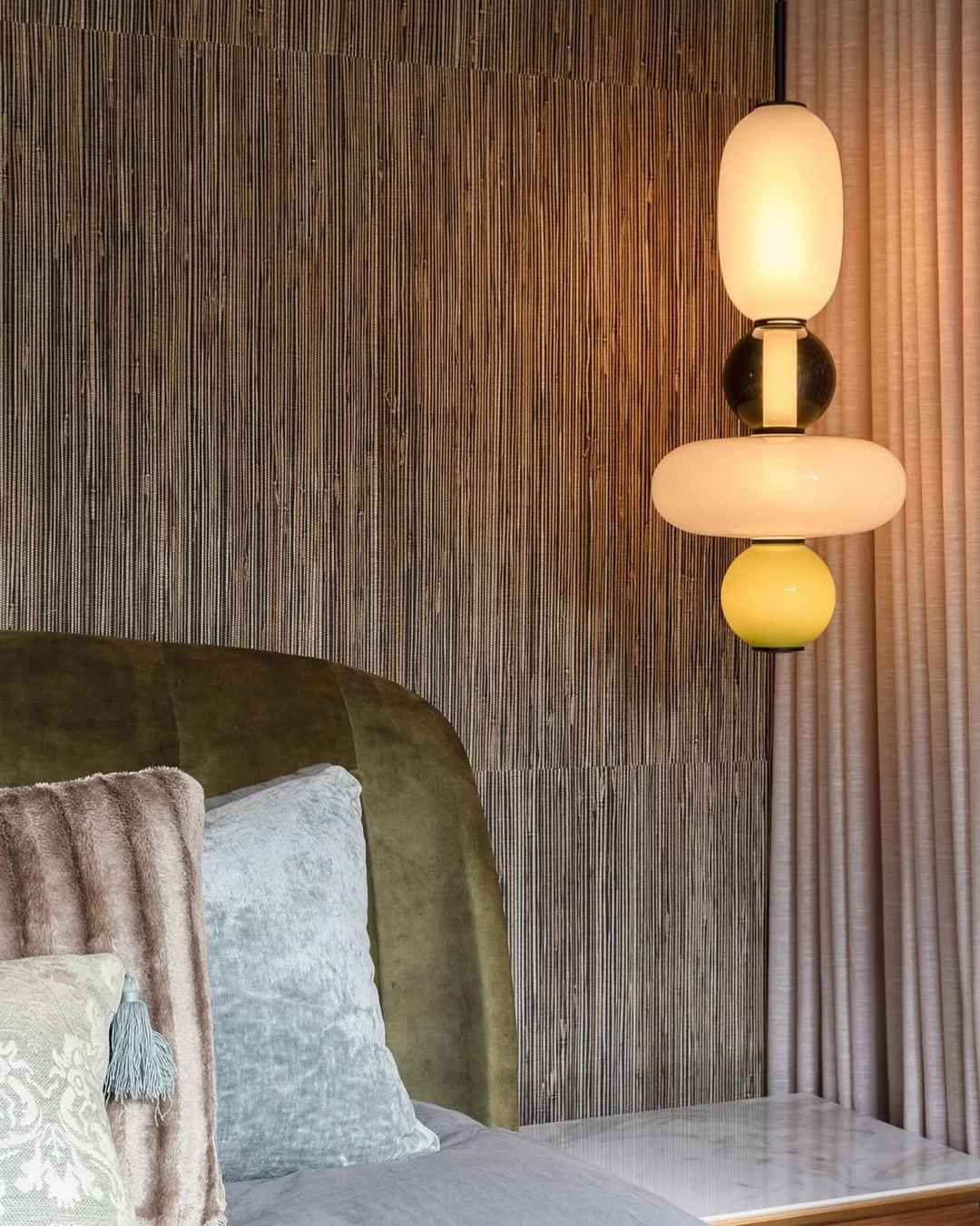
Photo by @thorntonandblake
A bedroom wall covered in vertically hung grasscloth behind an olive-green velvet headboard shows how direction changes the effect. Hanging the paper sideways, so the weave runs vertically, draws the eye upward and makes the ceiling feel taller, and the deep woven texture contrasts beautifully with the soft velvet. Vertical grasscloth is the detail worth copying, because most grasscloth is hung horizontally by default, and turning it changes the whole feeling of the wall.
A headboard wall is a natural home for grasscloth, since the bed anchors the wall and the texture frames it like a backdrop. Keep bedding and pillows in solid or lightly patterned fabrics so the wall stays the star, and use warm bedside lighting, which brings out the weave far better than harsh overhead light. One practical note: order all rolls for one wall from the same dye lot, because natural fibers vary in tone between batches.
Dining Room
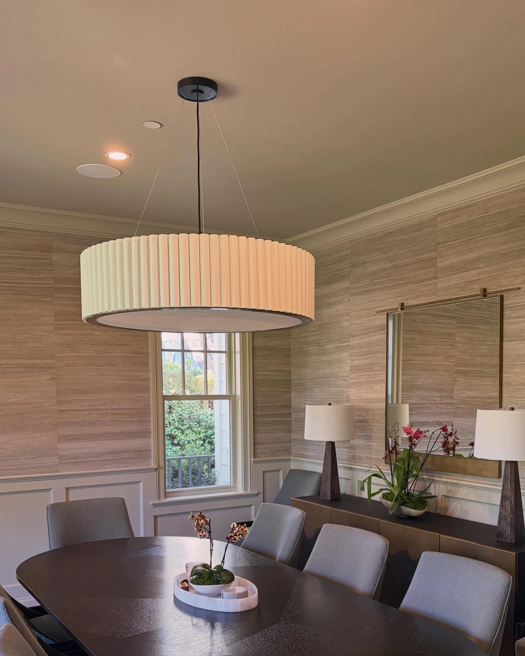
Photo by @theosfinewallpaper
A formal dining room with grasscloth above white wainscoting, a round dark wood table, a large drum pendant, and a sideboard with lamps and orchids shows grasscloth at its most classic. The woven wall softens the formality of the room, the white wainscot keeps it crisp, and the pendant light warms the whole composition. Grasscloth above wainscoting is a combination worth noting, because the painted lower wall protects the paper from chair scuffs while the texture does its work up high.
Dining rooms suit grasscloth well, since they are used in the evening when warm light makes texture glow. Choose a mid-tone weave that flatters both daylight and lamplight, and keep the chairs pulled slightly away from the wall where possible, since grasscloth marks more easily than paint. If the room doubles as a homework or work space, pick a tighter, smoother weave that wipes more easily.
Entryway
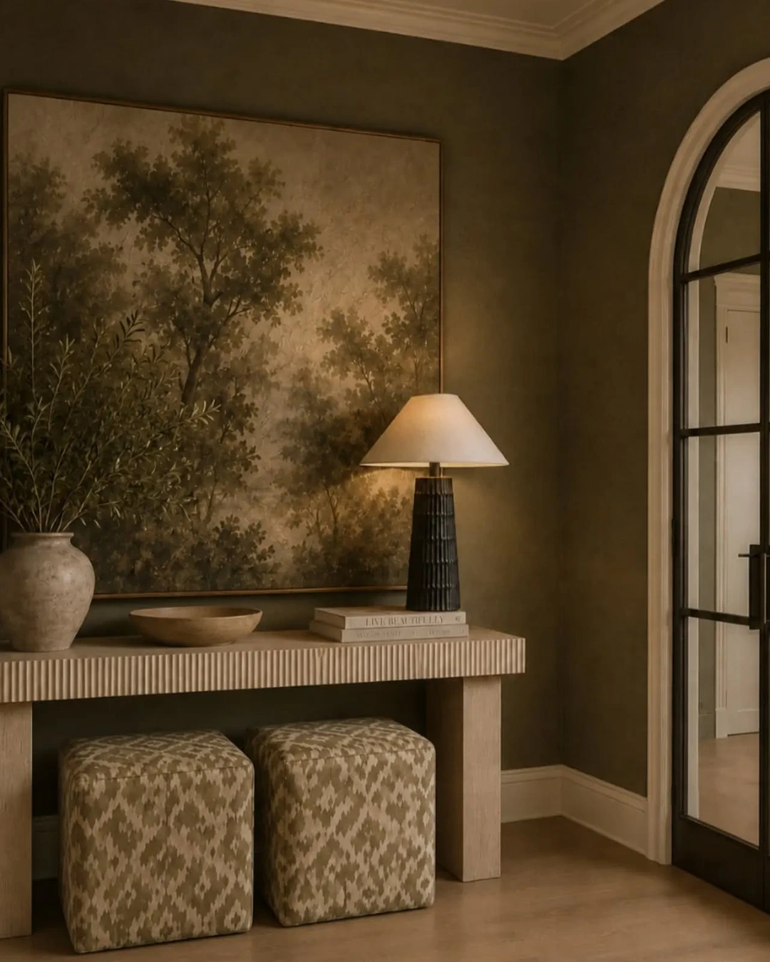
Photo by @joannaandrewsinteriors
An entrance hall with olive-toned grasscloth walls, a reeded console table, two patterned ottomans, a large landscape painting, and an arched glass door shows how grasscloth makes a first impression. The olive tone is rich without being dark, and the woven surface gives the passage a layered, architectural feeling the moment you walk in. Olive grasscloth is the color story here, because it reads as a neutral with character, pairing with wood, stone, and pattern all at once.
Entryways are high-traffic spaces, so grasscloth there needs a little care: it is not washable like paint, and bags, keys, and shoes can scuff it. The payoff is a hallway that feels finished rather than transitional, especially when the paper runs the full length of the passage. Use a console and art to break up long runs, and keep the paper away from the wettest spots near the front door.
Powder Room
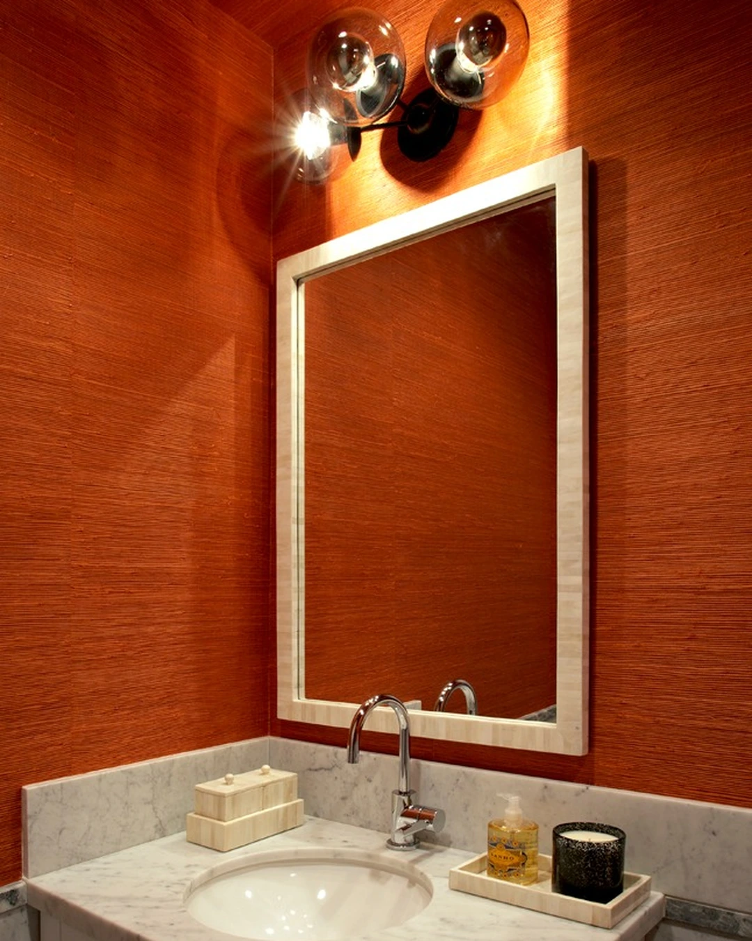
Photo by @hlsinteriordesign
A small powder room wrapped in rust-toned grasscloth on the walls and ceiling, with a marble vanity, a framed mirror, and globe sconces, shows how a tiny room can take a bold wallcovering. The warm rust color makes the small space feel intentional and cocooning rather than cramped, and the sconces cast light across the weave so the texture stays visible. Rust grasscloth is the brave choice here, and it works because the room is small enough that one strong color feels like a jewel box, not an overload.
Powder rooms are among the best rooms for grasscloth, with one important condition: use them in powder rooms, not steamy full bathrooms, because moisture and steam can damage natural fibers. Keep the paper off the wall directly behind the sink splash zone where possible, and choose a darker or warmer tone, which hides the small marks a guest bathroom collects over time.
Sloped Ceiling
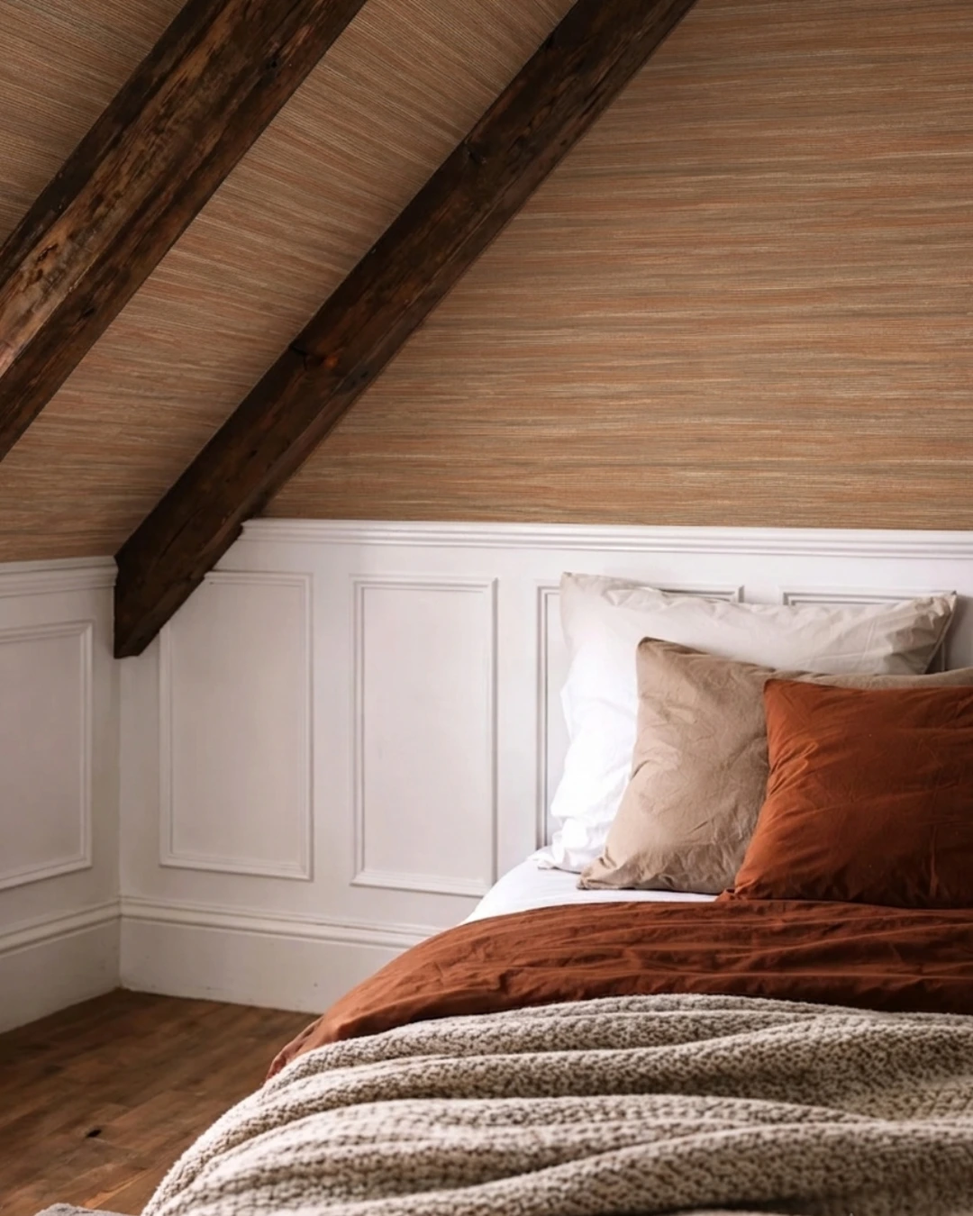
Photo by @wallpapershop.co.uk
An attic bedroom with a sloped ceiling lined in warm beige and orange grasscloth, dark rustic beams, white wainscoting, and rust-toned bedding shows grasscloth overhead. The woven ceiling softens the angles of the room and makes the low slopes feel intentional rather than awkward, while the beams give the texture a frame to work against. Grasscloth on a sloped ceiling is the idea to steal, because ceilings are usually left plain, and papering them changes the whole shape of a room.
Ceiling applications need professional installation more than walls do, since gravity, seams, and pattern matching all get harder overhead. The post for this room identifies the paper as a beige-orange grasscloth, and the warm tone is part of why it works: pale ceilings disappear, while a warm woven ceiling feels like a canopy. Keep the lower walls simple, as here, so the ceiling carries the interest.
Built-in Shelves
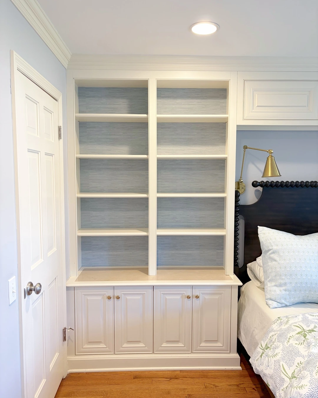
Photo by @mcs.design.studio
A bedroom with white built-in bookshelves backed in light blue-gray grasscloth shows how a small amount of paper can transform cabinetry. The woven backing gives the empty shelves depth and color, turning plain storage into a feature, and the pale blue-gray tone keeps the unit feeling light. Grasscloth shelf backing is a clever use, because it delivers texture in a small dose, uses offcuts efficiently, and can be changed later without repapering a whole room.
This idea works for bookcases, entertainment units, and built-in wardrobes alike. Use a lighter tone than the room’s walls so objects on the shelves stay readable, and remember that books and objects will hide much of the paper, so choose a weave with enough texture to read in the gaps. It is also a good test: if you are unsure about grasscloth, try it behind shelves before committing to a full wall.
Nursery
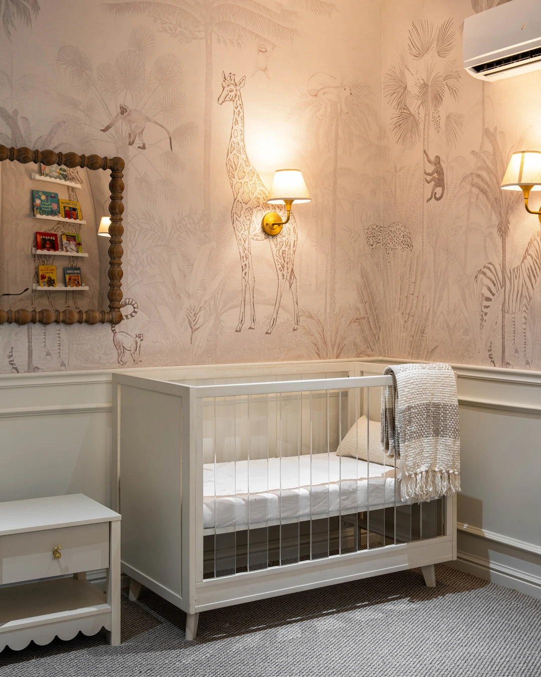
Photo by @isdliving
A serene nursery corner with a white crib against a muted jungle mural, brass sconces, and a wood-framed mirror shows grasscloth in its printed form. The wallcovering carries hand-drawn giraffes, monkeys, a leopard, and a zebra among palm foliage, printed onto a grasscloth base, so the room gets both a storybook mural and a woven texture. Printed grasscloth is the honest description here, because this is not a plain weave: the pattern is printed on the natural fiber, which is a different product from the plain grasscloth in the other ideas.
Nurseries suit printed grasscloth because the mural does the decorating, leaving the rest of the room calm. Choose a muted palette so the room stays restful, and keep the mural to one or two walls, with plain paint or wainscoting elsewhere. One practical note matters here: grasscloth is delicate, so keep it out of reach of climbing toddlers where possible, and accept that it will not survive scrubbing like a vinyl wallcovering would.
Staircase Wall
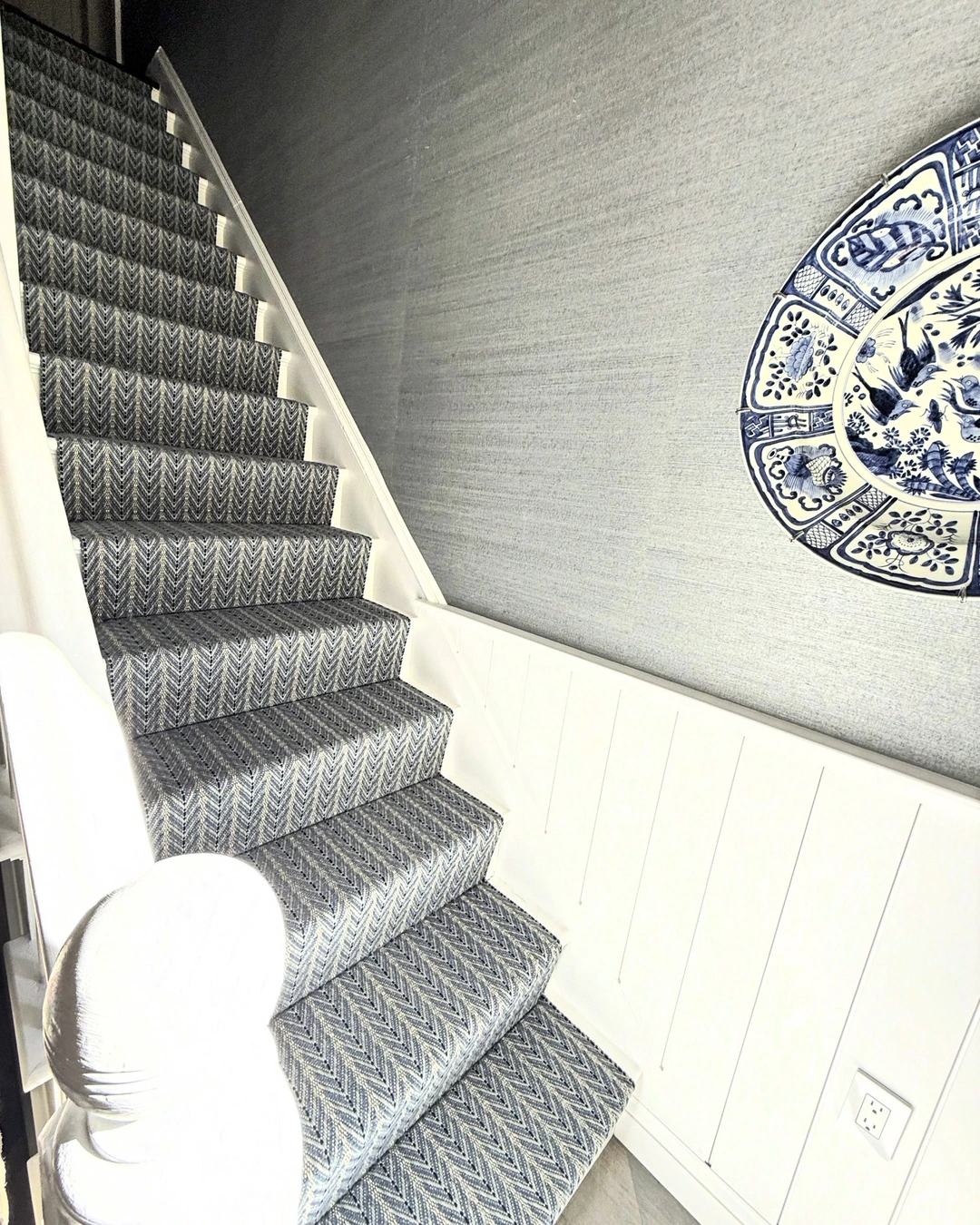
Photo by @kristenmeissner
A staircase with a gray and cream chevron runner, white trim, and a gray grasscloth wall with white wainscoting below shows grasscloth on a wall most people leave blank. The woven gray wall gives the stairwell a finished, tailored feeling, and the large decorative plate mounted on it proves the paper can hold its own as a backdrop for art. Gray grasscloth is the right tone for a stairwell, because it adds texture without darkening a space that usually borrows its light from elsewhere.
Staircase walls are long, tall, and hard to paint well, which is exactly why a textured paper suits them: it hides minor wall imperfections and makes the journey between floors feel designed. Measure carefully and expect more waste than a flat wall, since the paper must follow the slope of the stairs. Keep the wainscot or handrail white so the wall reads as one clean plane.
Neutral Tones
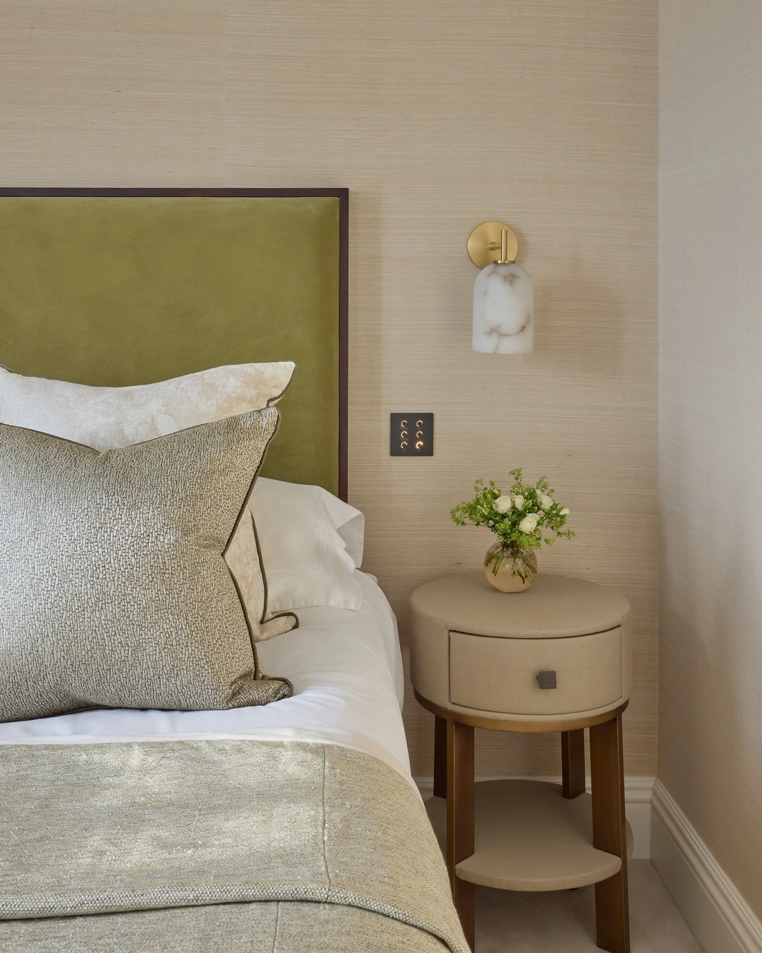
Photo by @katharinepooleyltd
A guest bedroom with warm beige grasscloth walls, an olive-green upholstered headboard, a marble-shaded sconce, and a round bedside table shows neutral grasscloth at its best. The beige weave is barely a color at all, yet the wall feels rich because the texture catches the light, and the olive headboard and brass details give it a quiet luxury. Warm beige grasscloth is the safest and most versatile choice in this guide, because it adds texture without committing the room to any color.
Neutral grasscloth suits bedrooms, living rooms, and hallways where the furniture and art should lead. It pairs with almost any wood tone and metal finish, and it is the easiest grasscloth to live with long term, since it never dates and never fights a redecoration. The caption for this room notes the design started with the grasscloth itself, which is good advice: choose the paper first, then build the palette around its undertone.
Bold and Dark Grasscloth
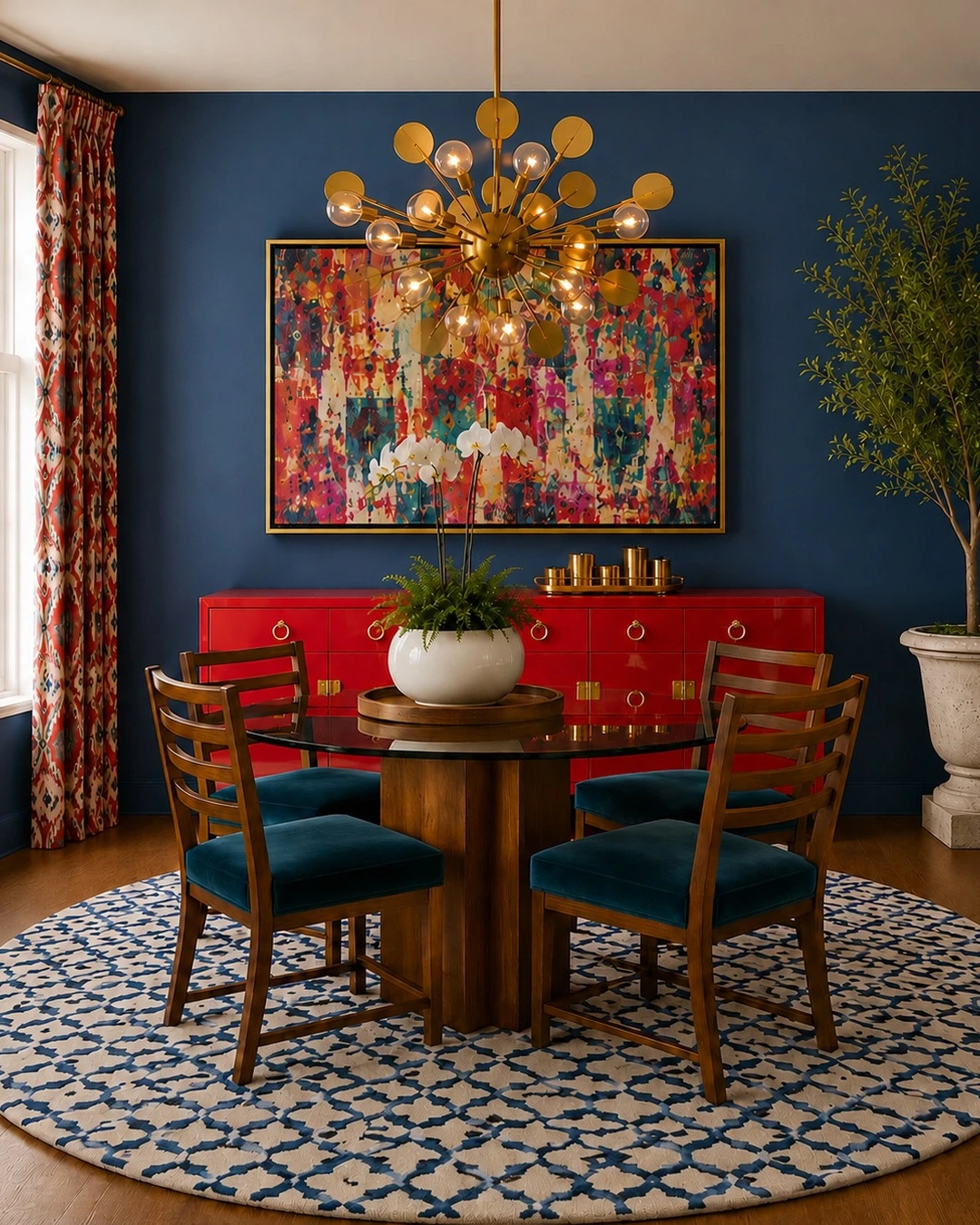
Photo by @adriennemorganinteriors
A dining room with deep navy grasscloth walls, a glossy red credenza, teal velvet chairs, a gold sputnik chandelier, and a large colorful abstract painting shows grasscloth going bold. The navy wall is dramatic, but because the weave softens it, the room feels rich rather than severe, and the red and teal accents play against it instead of clashing. Deep navy grasscloth is the statement here, and its texture is what keeps a dark wall from looking flat: the weave catches light and gives the color movement.
Dark grasscloth suits dining rooms, studies, and bedrooms where drama is welcome. Pair it with strong accent colors and metallic finishes, keep the ceiling and trim light so the room does not close in, and use warm lighting, which is what makes the weave visible after dark. The weave reads subtly in this photo from a distance, so view a sample in your own room before committing: dark grasscloth looks different under every light. For more ways to use texture on walls, see Rustic Barn Wall Ideas For Cosy Country Interiors.
Start Small, Then Go Further
Grasscloth rewards a careful start. Try it behind shelves or in a powder room first, where the dose is small and the effect is immediate, and move to a full accent wall or a ceiling once you know how the texture behaves in your light. Check samples against your flooring and furniture, order from one dye lot, and hire a paperhanger who has worked with natural fibers before. Done well, a grasscloth wall does not shout; it simply makes the whole room feel richer, warmer, and more finished.