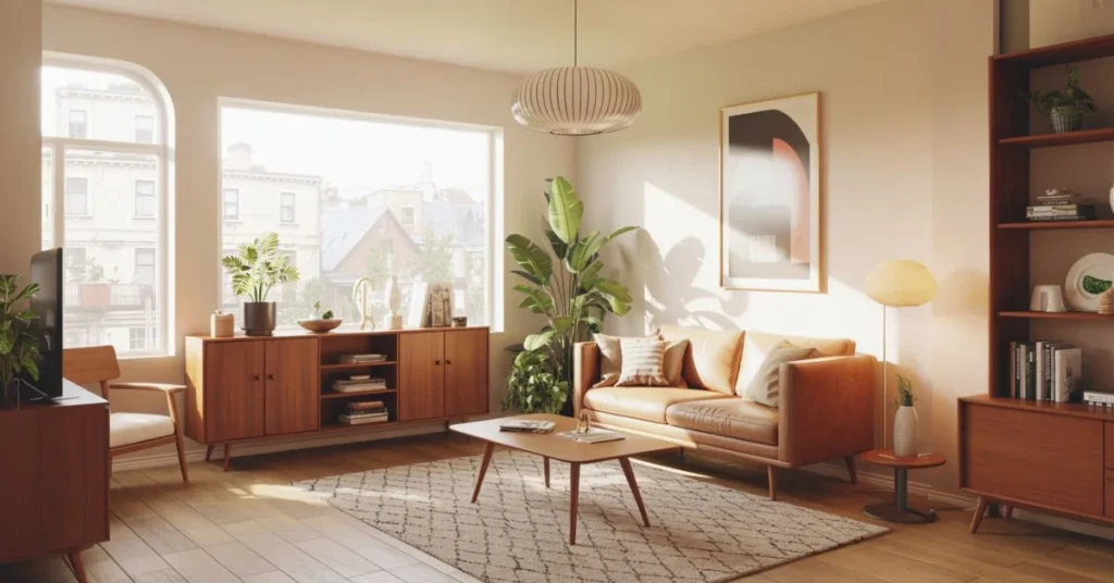
Most walls decorated with generic prints all start to look exactly the same. Album cover wall decor is the fix nobody talks about enough — it turns blank walls into something personal, striking, and completely yours.
There is a reason music lovers who put their favourite records on display never look at a plain botanical print the same way again. Album covers carry culture, memory, and meaning in a way mass-produced artwork simply cannot replicate.
This guide covers every angle — from gallery wall layouts and framing choices to room-specific ideas and sourcing strategies — so your walls finally say something worth hearing.
Why Album Covers Belong on Your Walls
Album cover wall decor works because it layers story into your space. Every piece on your wall doubles as a conversation starter, a memory trigger, and a design statement simultaneously.
Generic prints are beautiful — but they are anonymous. Nobody knows if you genuinely love the artwork or simply picked it because it matched your sofa. Album covers carry context. They communicate your taste, your era, your identity in a way that a faceless landscape print never can.
From a design standpoint, album artwork was created by serious artists and graphic designers. Some of the most iconic visual compositions of the last century live on album covers. Pink Floyd, Fleetwood Mac, Kendrick Lamar — the imagery is bold, layered, and built to hold attention.
That is precisely why it outperforms generic wall art every time.
Gallery Wall Layouts That Actually Work
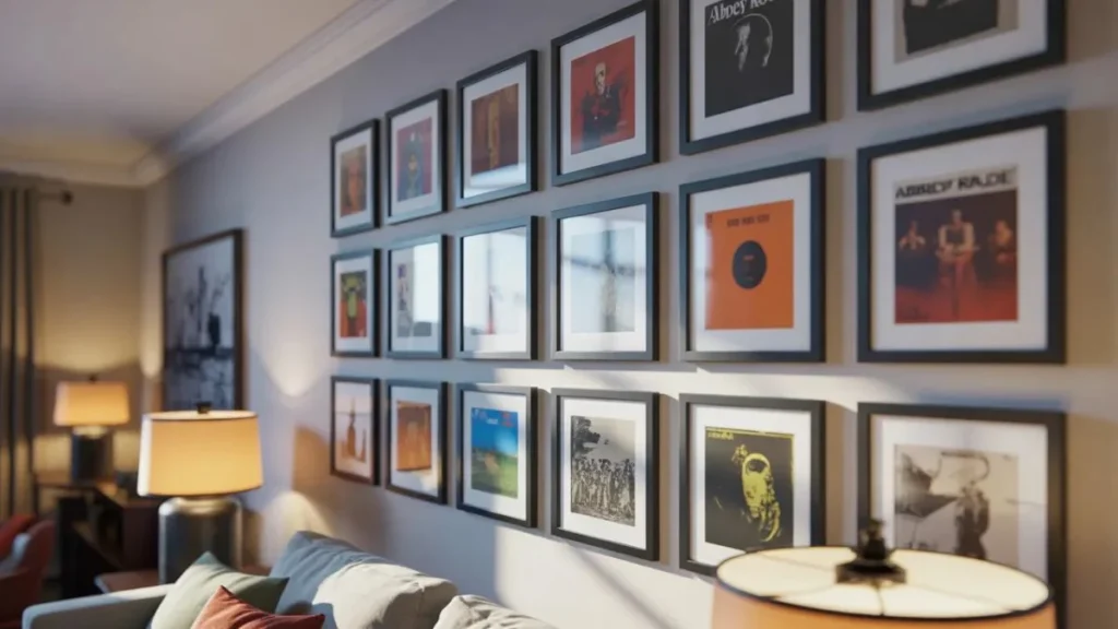
Layout is the first decision that separates a great album cover wall decor arrangement from a chaotic collection of frames. Getting this right before anything goes on the wall saves time and avoids damage.
The Symmetrical Grid
Best for collectors who want a clean, organised look. Use matching frame sizes — typically 12×12 or 14×14 inches — and space them evenly. A 3×3 or 4×3 grid reads as deliberate and graphic. Works especially well in hallways and home offices.
The Organic Gallery Mix
Combine different sizes with intention. Anchor with one or two larger frames — 18×18 or 20×20 — and fill in with smaller pieces. Lay everything out on the floor first, photograph it, then transfer to the wall. The key is keeping the outer edges roughly aligned even if the internal arrangement varies.
The Single Row
Underrated and very effective in narrow spaces. A horizontal line of four to six album covers at consistent height reads as a considered editorial statement rather than a collection. Works brilliantly along stair walls and above low console tables.
The Stacked Column
Vertical arrangements draw the eye upward and make ceilings feel higher. Three to five covers stacked with small gaps between them create a clean column that fills vertical wall space without overwhelming a room.
Single Statement Pieces vs. Full Collections
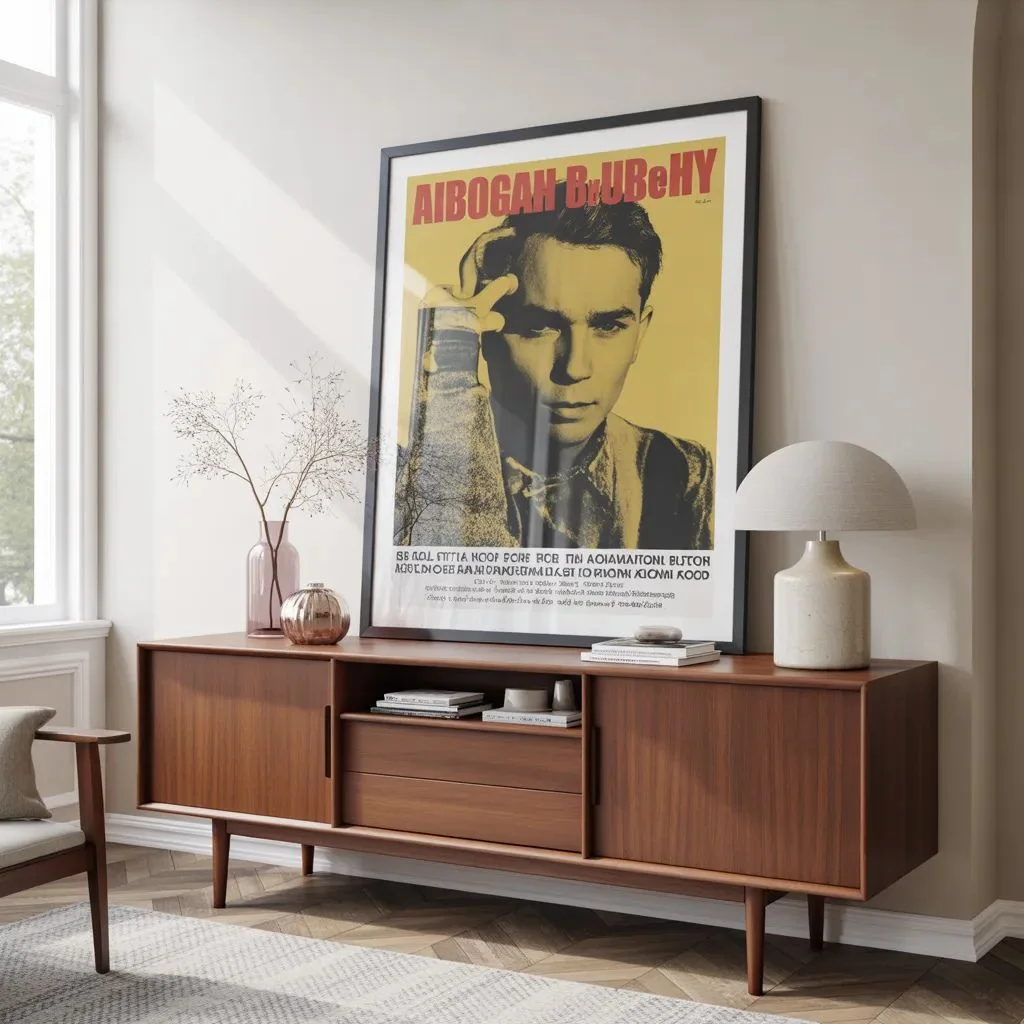
Album cover wall decor does not require a full gallery. Sometimes one oversized print placed with intention has more visual impact than twenty smaller ones fighting for attention.
Going Big With One Cover
Enlarging a single album cover to 24×24 or 30×30 inches transforms it into genuine fine art. Choose artwork with strong graphic composition — high contrast, bold colour, or iconic imagery. Pair with simple, minimal furnishings to let the piece breathe.
Building a Full Collection
Collections work when there is visual cohesion. That cohesion can come from a consistent frame finish, a shared colour palette across the covers, a single genre or decade, or a combination of all three. Without cohesion, a large collection reads as clutter rather than curation.
Mixing Both Approaches
One large anchor cover surrounded by smaller secondary pieces creates hierarchy and depth. The large cover sets the tone; the smaller pieces add context and personality. This approach suits living rooms and creative studios especially well.
Framing Options That Change Everything
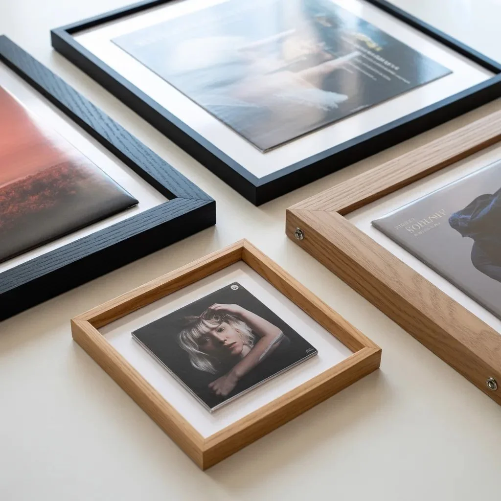
The frame choice determines whether album cover art reads as casual cool or gallery-grade sophisticated. Both are valid — they simply serve different spaces.
Black Frames
The most popular choice for good reason. Black frames work with almost every interior colour scheme and make album artwork pop without competing with it. Matte black reads modern; gloss black feels more traditional.
Natural Wood and Oak Frames
Warm, organic, and ideal for bohemian, Scandinavian, or mid-century interiors. Natural wood softens the graphic intensity of bold album art and creates a more relaxed, collected over time feel.
Clip Frames and Frameless Displays
Clip frames and acrylic standoffs lean into the casual, underground aesthetic. They suit music rooms, studios, and teenage bedrooms where the point is the art itself, not the presentation. Cost-effective and easy to swap covers as tastes evolve.
Floating Frames
Floating frames place the cover inside a larger frame with a visible gap between the art and the edge. This treatment elevates album artwork to fine art territory and is particularly effective for limited-edition or especially meaningful covers.
Mixing Album Cover Art With Other Wall Decor
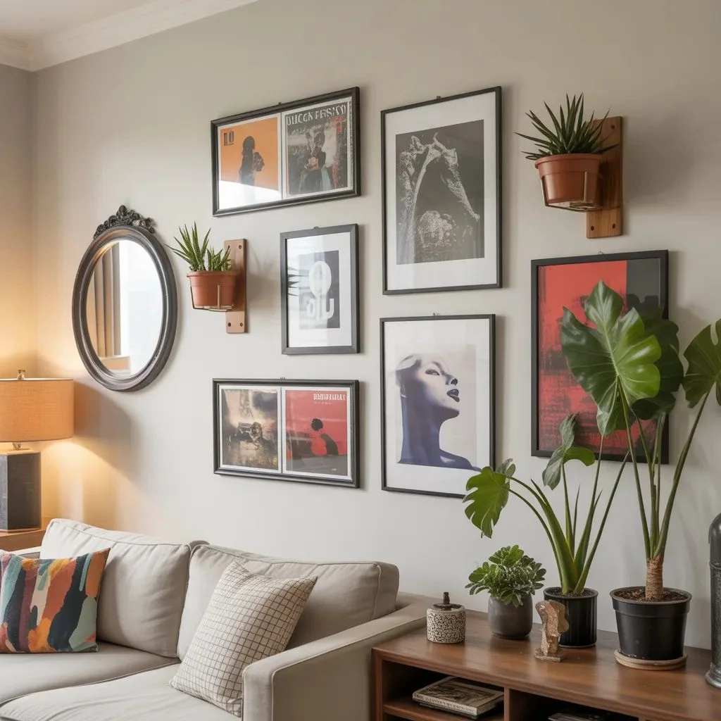
Album cover wall decor does not have to live in isolation. Mixing it with other wall elements creates a layered, lived-in look that feels genuinely personal rather than showroom perfect.
With Mirrors
A round or arch-shaped mirror placed adjacent to a cluster of album covers adds dimension and light reflection. The contrast between the reflective surface and graphic album art creates natural visual interest.
With Botanical Prints or Photography
Pairing album covers with fine art photography or botanical prints works when there is a shared colour theme. Keep frames consistent across both types of art to unify the mix.
With Shelving and 3D Objects
Wall-mounted shelves displaying vinyl records, small ceramics, or trailing plants alongside framed covers create a gallery-meets-living-space look. The combination of flat art and dimensional objects adds depth that a flat wall arrangement alone cannot achieve.
With Neon Signs
A custom neon sign above or beside an album cover gallery adds an electric, nightlife-adjacent energy that suits music rooms and entertainment spaces. Keep the palette in check — too many colours compete badly.
Room-by-Room Album Cover Wall Ideas
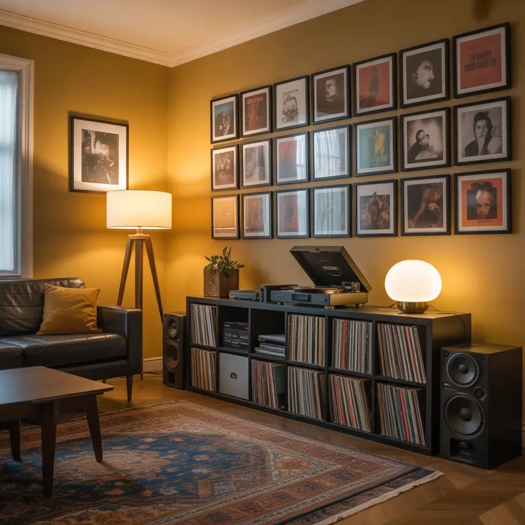
Living Room
Position album cover wall decor on the main feature wall above a sofa or console table. A grid of six to nine covers in matching frames creates a focal point strong enough to anchor an entire room. Choose covers with colours that echo existing furnishings.
Bedroom
Above-bed placements work particularly well in bedrooms. A single oversized album cover acts as a headboard alternative; a triptych of three related covers flanking the bed creates symmetry. Keep framing calm — matte black or natural wood — to maintain bedroom atmosphere.
Home Office
Home offices benefit from personality. A curated wall of covers behind a desk camera setup creates an interesting, characterful background for video calls. Choose covers that represent your creative identity without being visually chaotic.
Hallway
Long, narrow hallways suit single-row arrangements at eye level. A linear run of five to eight covers guides the eye down the space and transforms what is usually a dead zone into something worth pausing at.
Music Room or Studio
No rules apply here. Floor-to-ceiling arrangements, mixed frame styles, original vinyl displayed alongside framed covers — a dedicated music space can absorb it all. Let instinct lead over design convention.
How to Curate Your Personal Collection
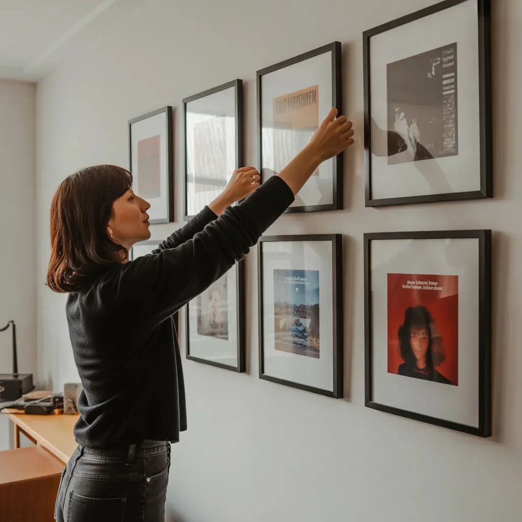
Curation is what separates a meaningful display from a random assemblage. Great album cover wall decor tells a story — of taste, era, influence, or personal history.
Start With Meaning
Begin with the covers that genuinely matter. First concert, formative album, gift from someone important. Emotional connection gives a collection its backbone before design consideration enters.
Build a Visual Theme
Once core pieces are chosen, look for visual commonality — warm tones, monochrome artwork, graphic minimalism, maximalist collage. Having a loose visual thread pulls diverse covers into a coherent display.
Limit the Palette
If cover artwork varies wildly in colour, unify through frame finish. All matte black frames make even the most colourful collection feel curated. All natural wood does the same with a warmer register.
Edit Ruthlessly
Not every favourite cover deserves wall space. Curating well means leaving some out. Ten strong pieces arranged well outperform twenty mediocre ones competing for attention.
Where to Source Album Covers for Wall Display
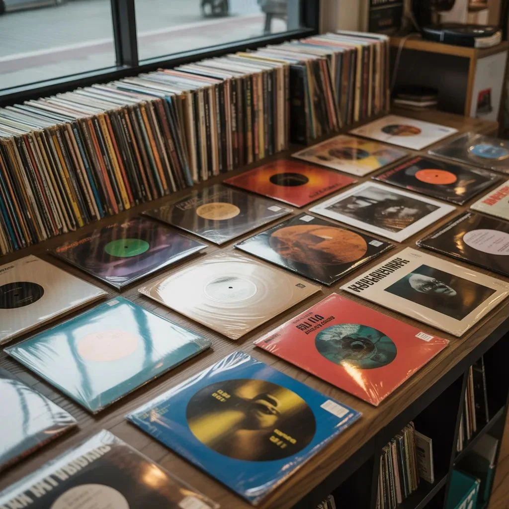
Album cover wall decor can be sourced from multiple routes depending on budget and how authentic the finish needs to be.
Original Vinyl Records
The most authentic option. Original album sleeves — particularly vintage pressings — have texture, age, and tactile quality that prints cannot replicate. Source from record fairs, charity shops, and specialist vinyl dealers.
Art Prints and Reproductions
Licensed art print shops and print-on-demand platforms offer high-quality reproductions at scale. Prints allow larger formats than original sleeves and open up access to iconic covers that would otherwise cost significantly more.
Custom Printing
For personal or niche albums, custom printing from a high-resolution scan gives full control over size and finish. Matte fine art paper produces the most gallery-appropriate result.
Second hand and Vintage Markets
eBay, Etsy, Depop, and local record fairs frequently surface original sleeves, posters, and promotional artwork at reasonable prices. Vintage sourcing adds provenance and character that new prints cannot provide.
Sizing, Spacing, and Height Guidelines
Getting sizing, spacing, and height right is the technical foundation every great wall arrangement depends on.
Standard Sizing
Original album sleeves are 12×12 inches. Frames sized for vinyl fit this exactly. Prints can scale up to 18×18, 20×20, or larger for statement pieces. Mixing sizes adds visual rhythm — just ensure the largest piece anchors the composition.
Spacing
Two to three inches between frames is the standard for gallery-style grids. Tighter spacing — one inch — creates a more intense, editorial feel. Wider spacing — four inches plus — reads as considered and airy. Match spacing to the energy of the room.
Height
Centre album cover arrangements at approximately 145 to 150 centimetres from floor to the middle of the display — consistent with standard eye level. Above furniture, centre the arrangement relative to the piece below, leaving 15 to 20 centimetres of gap between the furniture top and the lowest frame.
Seasonal and Rotational Display Strategies
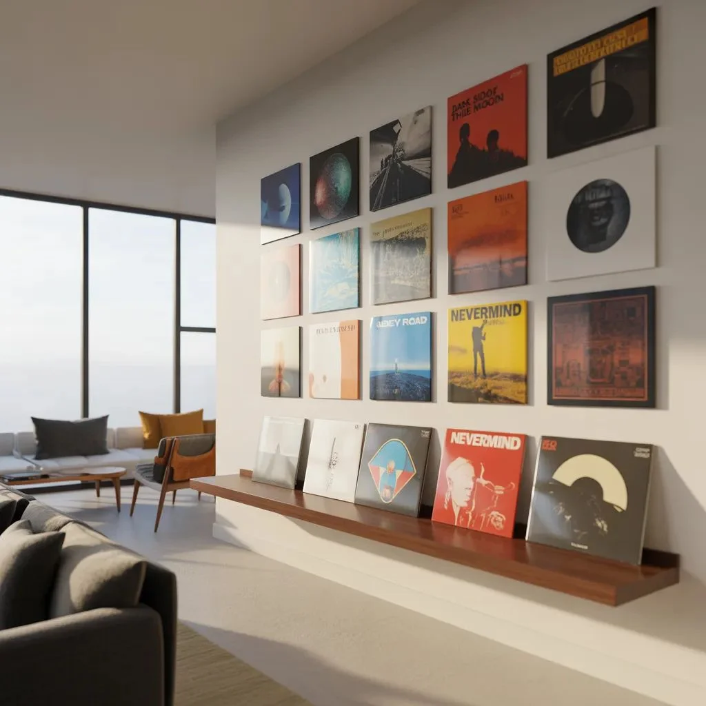
Album cover wall decor should evolve. A static display that never changes eventually fades into visual background noise.
Seasonal Rotation
Swap two or three covers each season. Warmer, more textured artwork suits autumn and winter; lighter, graphic minimalism reads better in spring and summer. Rotation keeps the display feeling fresh without requiring a full redesign.
Celebrate New Discoveries
When an album genuinely moves you, make space for it. Rotating in new releases or recent discoveries keeps the collection alive and current rather than purely nostalgic.
Leaning vs. Hanging
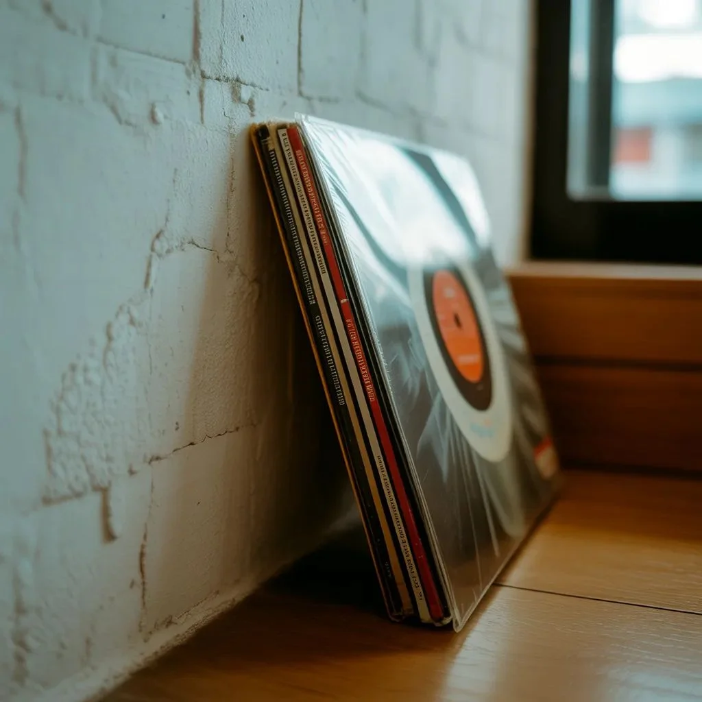
Not every piece needs to be hung. Leaning oversized covers against a wall or on a shelf creates a relaxed, impromptu feel and makes rotation effortless. A mix of hung and leaned pieces adds visual depth and dimensional layering.
Where Your Walls Find Their Voice
Generic prints have their place — but album cover wall decor occupies territory that nothing else can. It brings personal history, cultural depth and genuine artistic intention into spaces that might otherwise settle for decoration over meaning.
Start with what matters most to you. Build the layout around those anchor pieces. Frame with intention, curate ruthlessly and rotate regularly. Walls that evolve with you are always more interesting than walls that simply match the furniture.
Your collection is already out there — it just needs a wall worthy of it.
Our Pick: Printable 4th of July Poster Ideas for a Seriously Stylish Celebration.