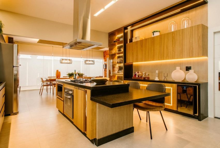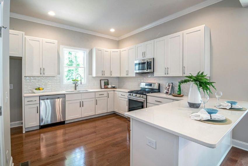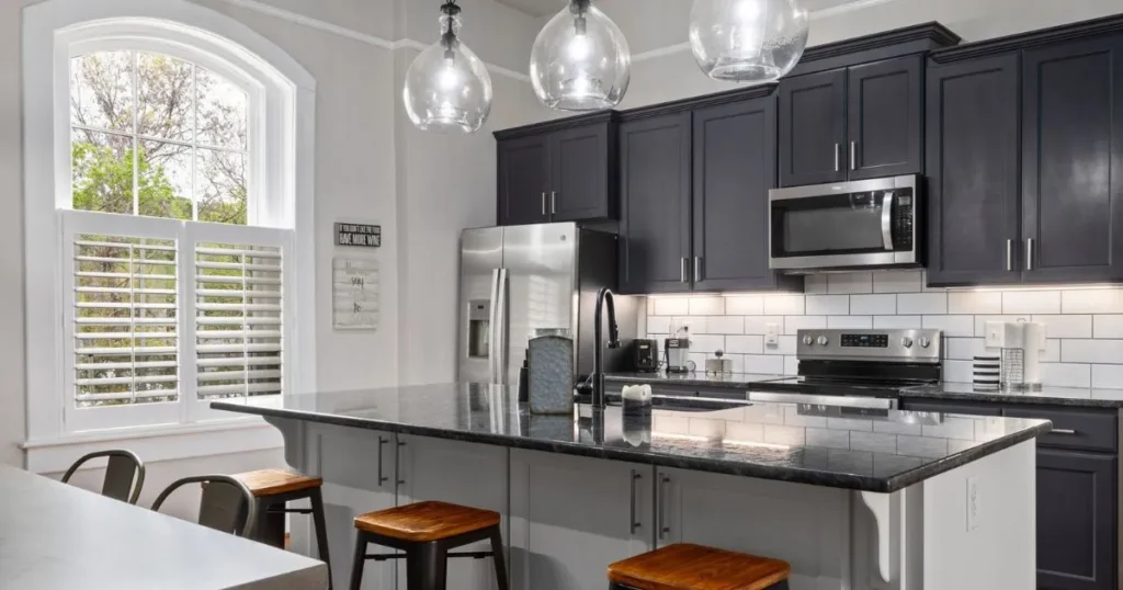
Monochrome style kitchen design proves that two shades can look richer than twenty. Strip back the colour clutter and every line, surface and shadow suddenly gets a moment to shine.
Hotels, boutique restaurants and glossy magazine spreads all lean on black, white and grey for one reason: it photographs beautifully and ages gracefully. Ordinary rooms can borrow the same polish without a designer budget.
Nine ideas follow, covering cabinets, hardware, stone, tiles, wood and styling, each with the reasoning behind why it works. Pick one or mix several, and your own cooking space can feel quietly luxurious by the weekend.
Monochrome Style Kitchen Foundations Built on Contrast and Balance
Every successful monochrome style kitchen starts with a simple split. Choose one dominant shade for roughly sixty per cent of the room, a supporting shade for thirty, and keep the final ten for sharp accents.
Grey is the secret bridge. Soft dove grey, warm greige or deep graphite sits between black and white and stops the scheme feeling like a chessboard.
Why this works: the eye reads clear proportions as calm and deliberate. When shades fight for equal attention the room feels busy, but when one leads it feels designed.
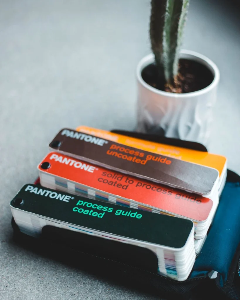
Before buying anything, tape paint swatches beside your windows and check them at morning, noon and evening. North-facing kitchens often turn cool whites bluish, so warmer whites usually behave better there.
Fixed elements deserve attention first. Floors, worktops and large appliances rarely change, so match everything else to their undertone. Cool greys with blue hints sit best beside stainless steel, while warm greys flatter oak and brass.
Write a one line brief before shopping, such as “white base, black accents, grey bridge”. It stops impulse buys from drifting off palette.
Black Cabinets Bring Instant Gallery Drama
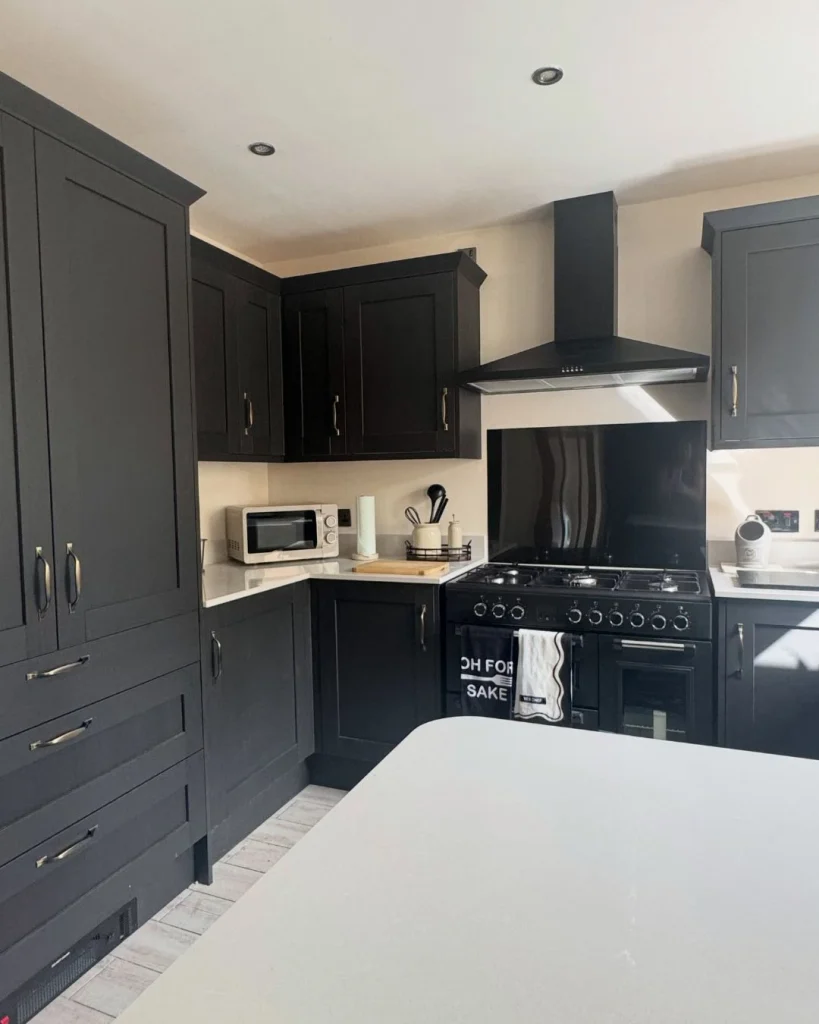
Credit: gladerenovation
Matt black cabinetry is the boldest move on this list, and the most photogenic choice in any monochrome style kitchen. Flat finishes hide fingerprints, soften harsh light and make brushed metal handles look like jewellery.
Keep the scale in check. Black base units paired with white or pale grey wall cabinets give drama without heaviness, which suits kitchens under ten square metres.
Fluted or ribbed door fronts add shadow lines that read as pattern, so plain black never looks flat. Slim Shaker profiles feel more traditional, while handleless slab doors push the look towards ultra modern.
Why this works: dark colours tend to recede, so black cabinets can make walls seem further away. Pair them with good under-cabinet lighting so the corners never disappear.
Finish matters as much as colour. Satin black shows fewer marks than gloss, and a slight texture hides everyday wear. Sample doors in your own light, because black can lean towards navy, green or brown depending on the pigment.
Hardware sets the tone. Black on black feels sleek and secretive, while brushed brass or stainless steel adds a flash of jewellery. Either works, provided you repeat the metal in at least two other places.
Sunday Brunch Looks Better in White Kitchens With Black Hardware
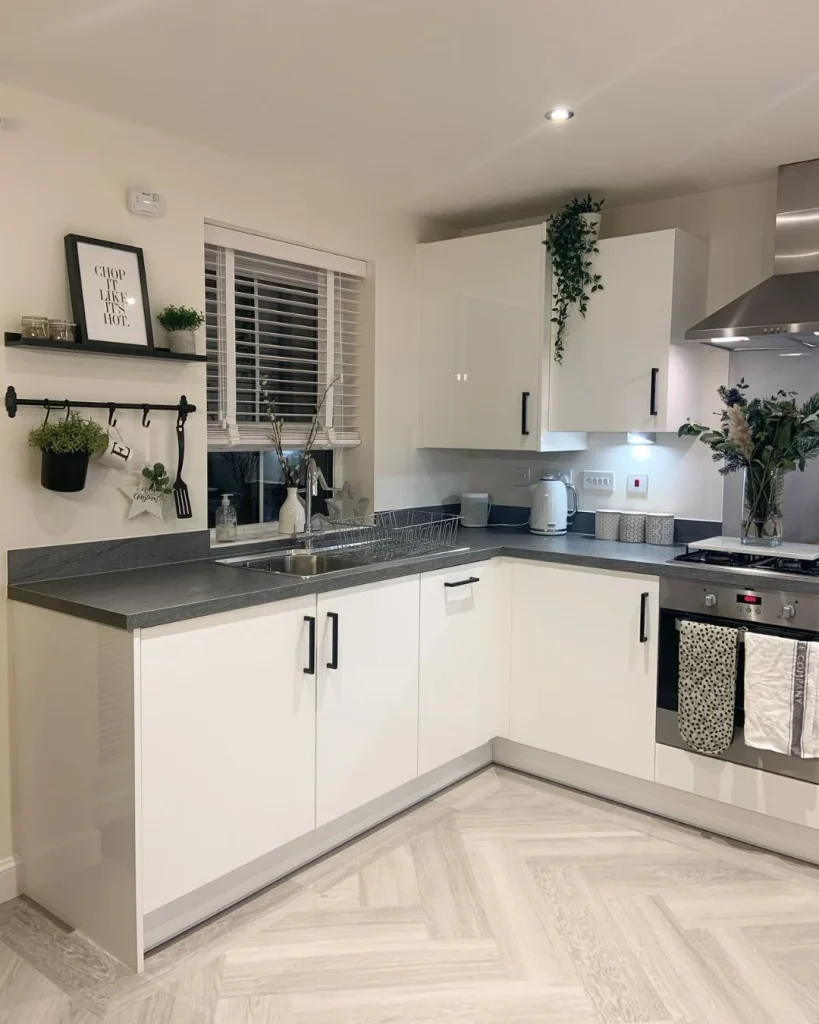
Credit: thegreenfieldhome_
Pancakes on a bright island, sunlight bouncing off white Shaker doors, a row of slim black handles ticking along each drawer like punctuation. That is monochrome style kitchen design at its friendliest.
Swapping brass or chrome knobs for matt black handles, taps and cabinet pulls is the cheapest refresh here. It costs a fraction of new doors, and renters can often keep the originals safe in a drawer.
Add a black window frame, a black pendant or a black kettle, and the scheme starts to repeat itself. Repetition is what makes contrast look intentional rather than accidental.
Keep the white warm. Soft off whites with a hint of cream feel inviting at breakfast, while stark brilliant white can look clinical by evening.
Walls can stay white too. Painting walls and cabinets in the same soft white creates a seamless backdrop, letting black accents do all the talking. One black framed mirror or clock on the wall echoes the handles nicely.
Grey makes a gentle middle step. Pale grey islands between white cabinets and black stools link the two extremes, so nothing feels pasted on.
Marble and Stone Surfaces Turn Veining Into Living Artwork

Credit: fastcabinetdoors
White marble with grey veins is the quiet hero of the monochrome style kitchen. Running the stone up the wall as a full-height splashback creates one continuous gesture, which feels more expensive than tiling in short segments.
Real marble stains and etches, so many homeowners choose quartz or porcelain slabs that copy Calacatta or Carrara patterns. Look at large format samples in daylight, because tiny offcuts hide the true pattern.
Black granite or honed charcoal worktops flip the formula. Paired with white cabinets, they anchor the room like a dark frame around a bright painting.
Why this works: natural veining gives the eye organic movement inside a strict palette, so the room never feels flat or sterile.
Quartz is the practical sibling. It resists staining, needs no sealing and comes in dramatic veined patterns that suit a monochrome style kitchen on a realistic budget. Edge detail also matters: a thick mitred edge looks bold, while a slim edge feels refined.
Splashback height deserves a thought too. Stopping at the worktop edge is tidy, but carrying stone to the ceiling behind the cooker creates a feature wall that anchors the whole layout.
5 Tile Patterns Giving Black and White Real Personality
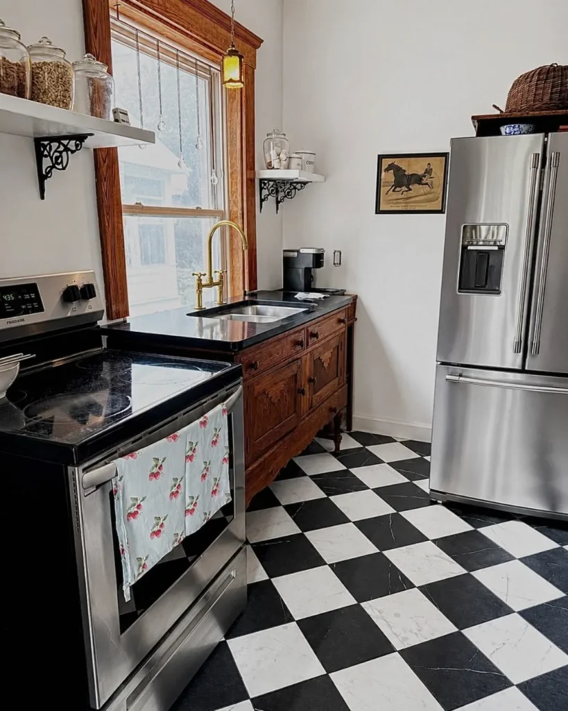
Credit: bickellsflooringstratford
Floors and splashbacks are where pattern can enter without breaking the colour rule. These five favourites never go out of date:
- Classic checkerboard. Large squares laid on the diagonal feel playful and retro, while standard squares feel formal. Matt porcelain is easier to keep clean than polished tile.
- Herringbone. Black and white strips laid in a zigzag add movement, and grey grout softens the jump between shades.
- Graded hexagons. Honeycomb tiles fading from charcoal to pale grey create a soft ombre effect on a splashback.
- Metro tiles with dark grout. Gloss white bricks outlined in charcoal make a graphic grid on a modest budget.
- Geometric encaustic prints. Black and white patterned floor tiles act like a built-in statement rug, so keep the walls plain.
Grout colour is the quiet decider. White grout keeps patterns crisp and airy, while charcoal grout turns every tile into a graphic outline. Mid grey is the safest compromise and hides dirt best on busy floors.
Scale matters as well. Large tiles make small rooms feel calmer with fewer grout lines, while small tiles add intricate texture to a feature wall.
Choose only one patterned surface per kitchen. One busy element surrounded by calm is the rule that keeps pattern looking stylish rather than chaotic.
Can Warm Wood Soften All That Contrast?
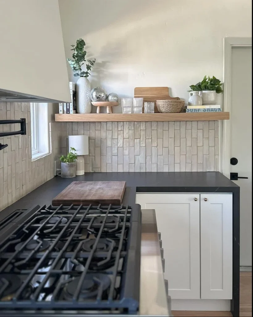
Credit: lyonscrafted
Yes, and often it should. One natural material keeps a black and white kitchen from feeling like a showroom. Oak open shelves, a stack of walnut chopping boards or a timber stool seat adds warmth without introducing another colour.
Stay with one wood tone. Pale oak suits Scandinavian leaning rooms, while darker walnut works with black cabinetry and feels moodier.
Woven baskets, rattan stool seats and linen tea towels count too. Beige and tan fibres read as texture rather than colour, so the palette stays disciplined.
Why this works: warm timber tones counterbalance cool greys, so small doses lift the whole room.
Metal pairs well here too. Matt black taps, brushed steel handles or a single brass lamp add a glint without clashing with timber. Keep to two metals at most so the look stays tidy.
Open shelving suits wood best. Style it with white plates, black bowls and one plant, and leave gaps between items so the shelf can breathe.
Small Kitchens Gain Space When Shades Stay Disciplined
Credit: orchardhouse_homeaccount
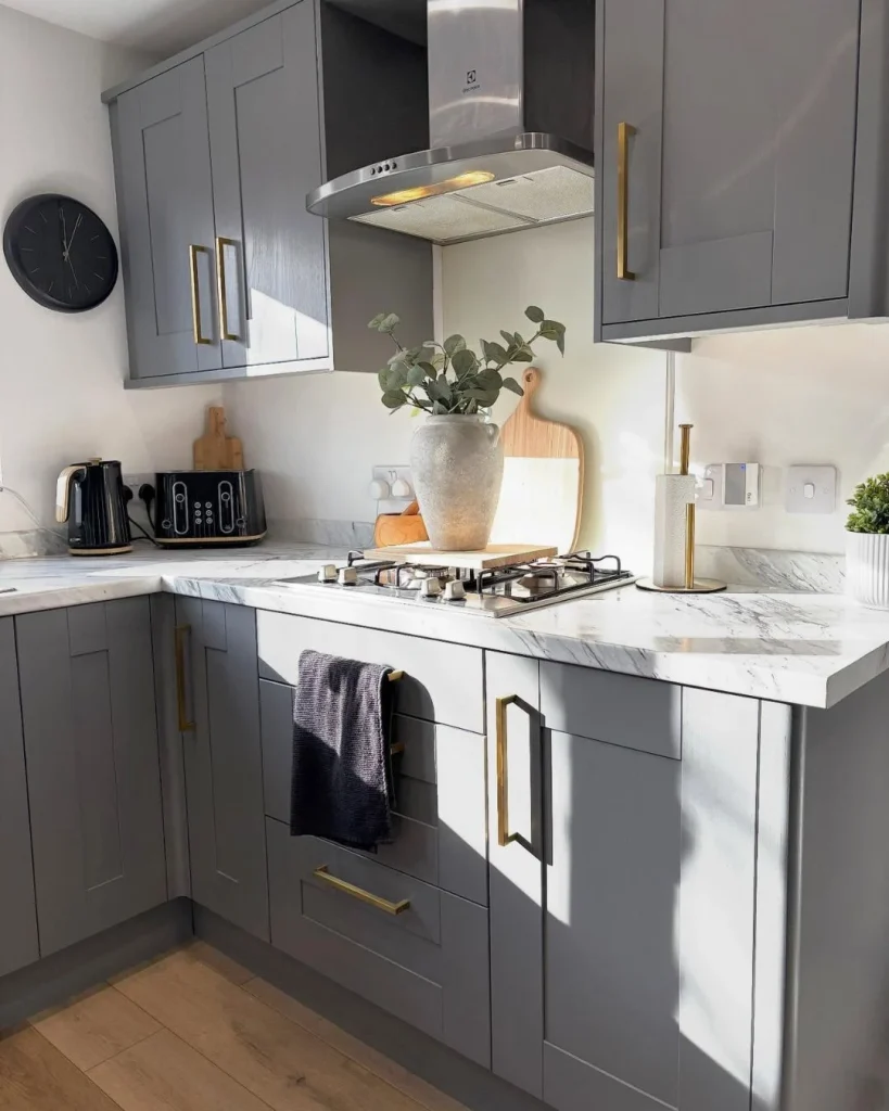
Compact kitchens suit a monochrome style kitchen scheme better than most people expect. Painting walls, cabinets and even the ceiling in related light greys blurs boundaries and makes edges disappear, which helps the room feel larger.
Gloss doors bounce light around, and glass-fronted wall cabinets lined with white crockery keep displays tidy. Open shelving works only when the contents stay inside the palette.
Choose one dark feature instead of many: a black splashback, a charcoal island or a single run of base units. Everything else stays light, so the room never closes in.
Slim black framed pendant lights over a breakfast bar add height and personality without taking any floor space.
Reflective surfaces are allies. Glossy white splashbacks, mirrored cabinet panels and steel kettles multiply available light, so even a windowless galley feels brighter.
Storage deserves the same discipline. Handleless doors, matching appliance fronts and hidden bins keep surfaces clear, which matters more in small rooms than any accessory.
Where Monochrome Kitchens Go Wrong and Easy Fixes
Credit: kabati_za_jikoni
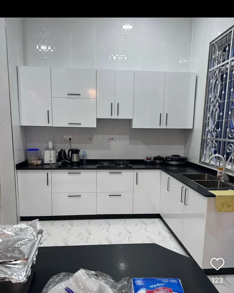
In my view, the biggest mistake is going flat everywhere. Matt black cabinets, matt white walls and matt grey floors produce a room with no depth, and it can feel more like a waiting room than a home.
Layered finishes are the fix. Pair matt doors with a gloss splashback, honed stone with a polished tap, or a textured tile with a smooth worktop.
Cold lighting is another trap. Bulbs above 4000K make white look blue and black look dead, while warm white bulbs around 2700K to 3000K keep things welcoming.
Too much black at eye level can also feel heavy. If your kitchen has little daylight, keep wall cabinets pale and save black for the island or base units.
Mixing too many whites is a quieter problem. Cool white tiles beside cream cabinets can look accidental, so gather samples together before ordering and view them side by side.
Finally, remember practicality. Pure black worktops show dust and water marks, while very pale grey floors show footprints, so choose mid tones where the room works hardest.
Finishing Touches Make Monochrome Feel Lived In
Credit: a_s_ruma
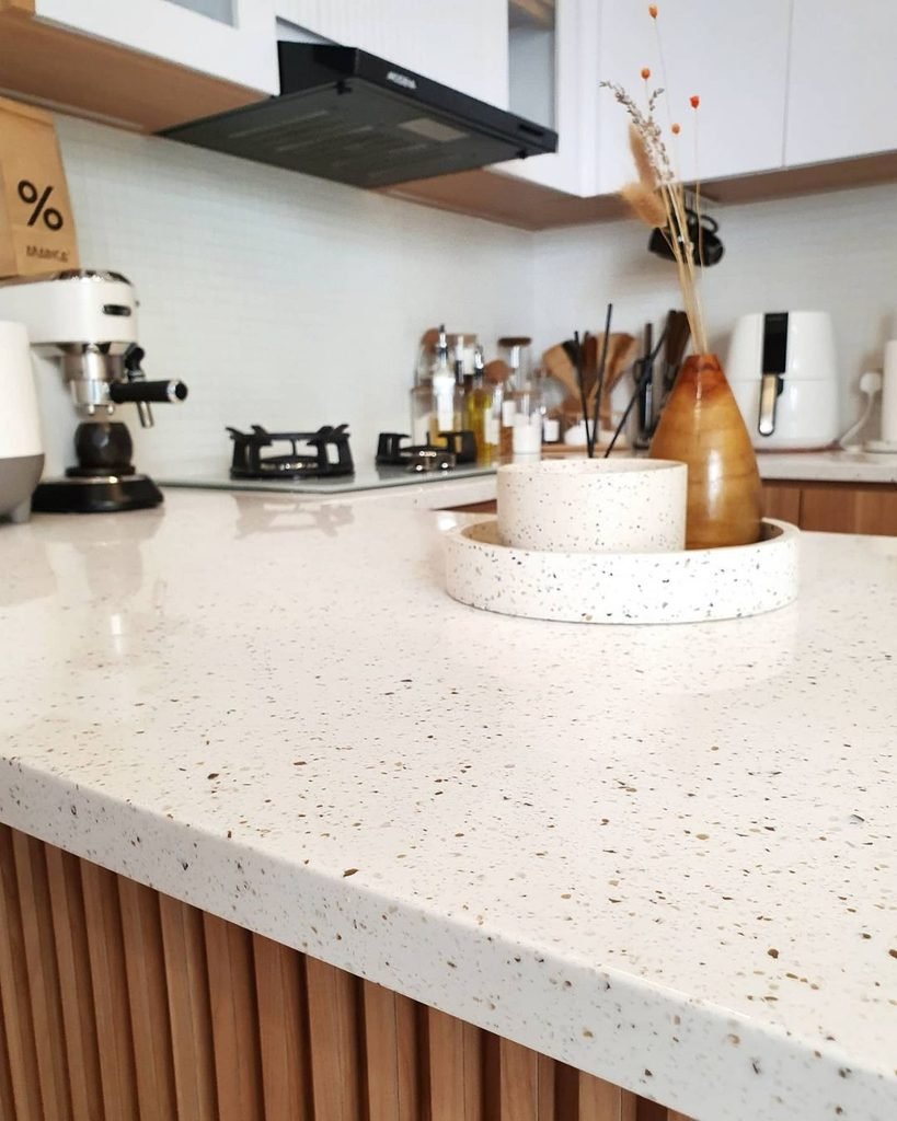
Accessories decide whether a monochrome style kitchen feels curated or cold. Stick to a repeating trio of ceramics, greenery and one piece of art.
Matt black canisters, white stoneware bowls and a charcoal linen runner give consistent texture along the worktop. Trailing pothos or a small herb pot is the only colour needed, and green looks fresher against black and white than almost anything else.
Frame one graphic print in a thin black frame, such as a line drawing or a greyscale food photograph. Keep the gallery small so the cabinetry stays the star.
Swap tea towels, pendant shades and cushions seasonally if you want change without a renovation.
Lighting counts as décor too. Two or three black pendants over an island give height and rhythm, while plain white shades keep things airy. Hang them around 75 to 85 centimetres above the surface so everyone can see across.
Textiles soften hard surfaces. Striped black and white runners, grey linen blinds or a chunky knit stool cover add comfort while staying inside the palette.
Two Shades, Endless Style
Monochrome kitchens reward restraint. Confident palettes layered textures and one warm natural touch can turn an ordinary cooking space into something that belongs in a magazine.
Start small if a full makeover feels daunting. Black handles, one marble splashback or a repainted island will show you quickly how well the idea suits your home.
Remember the simple formula: one leading shade, one supporting tone, grey as the bridge and texture everywhere.
Which monochrome style kitchen idea will you try first? Share your plans in the comments.
Also Read About: DIY Spice Rack Hacks for Tiny Kitchens With Almost No Counter Space.